We present you the Polish designer who already designed for IKEA, and we also talk about the city of Chrzanów, which has just become extremely cool. The Polish studio whom we can thank for Autor Rooms design hotel in Warsaw reemerges. And we even notice the beauty in the window bars of the ‘70s.
Mamastudio
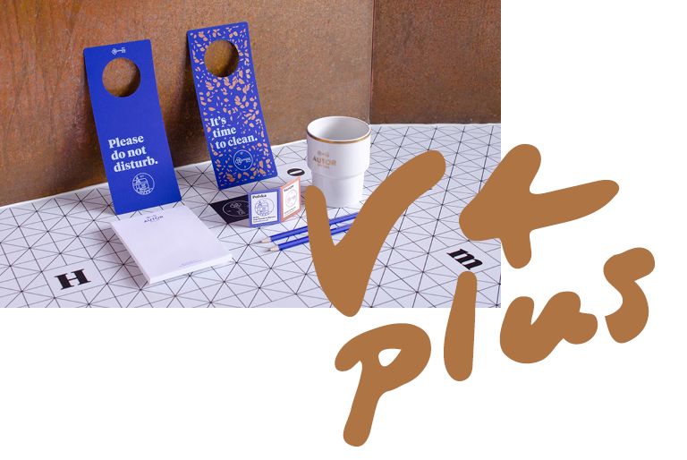
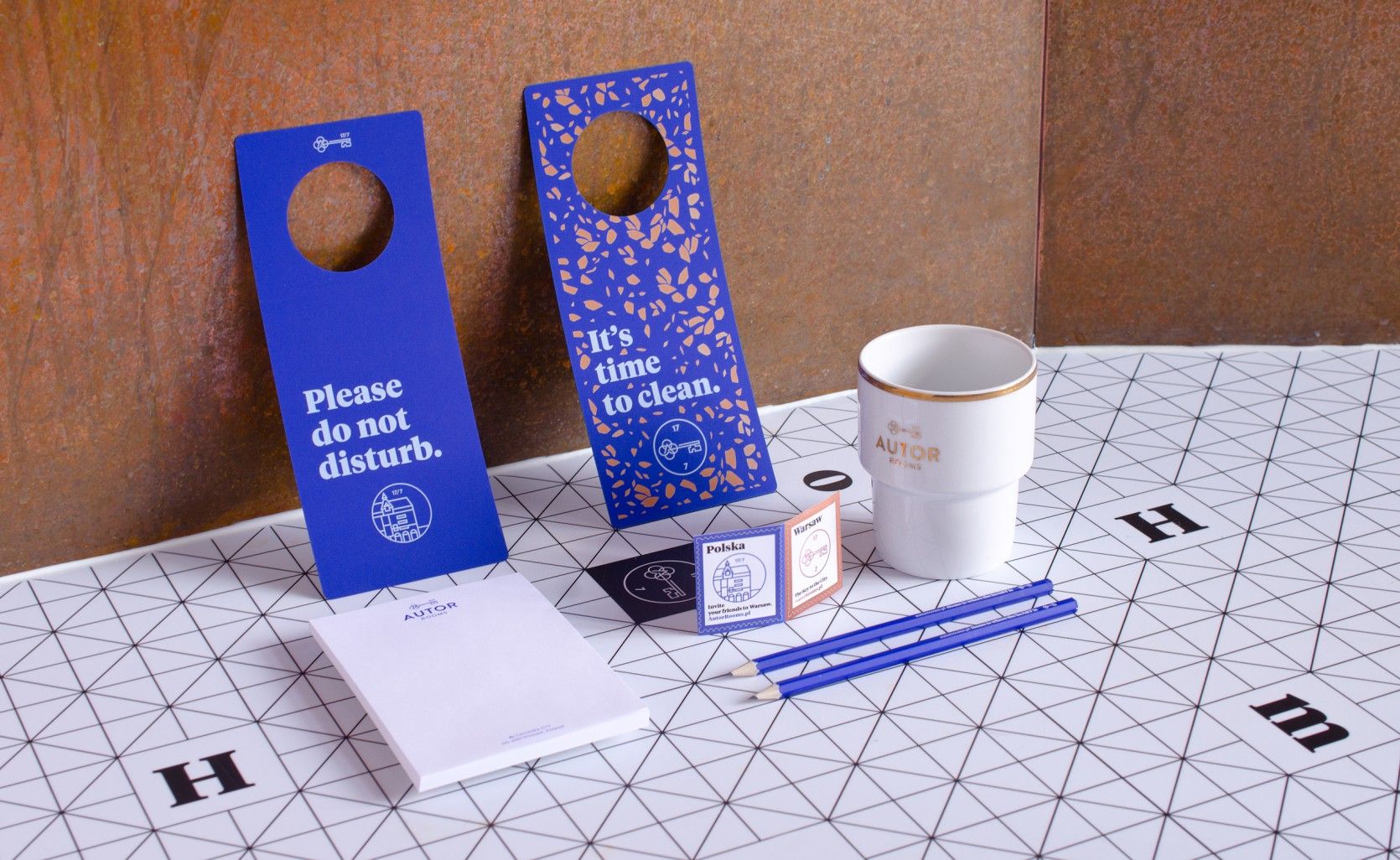
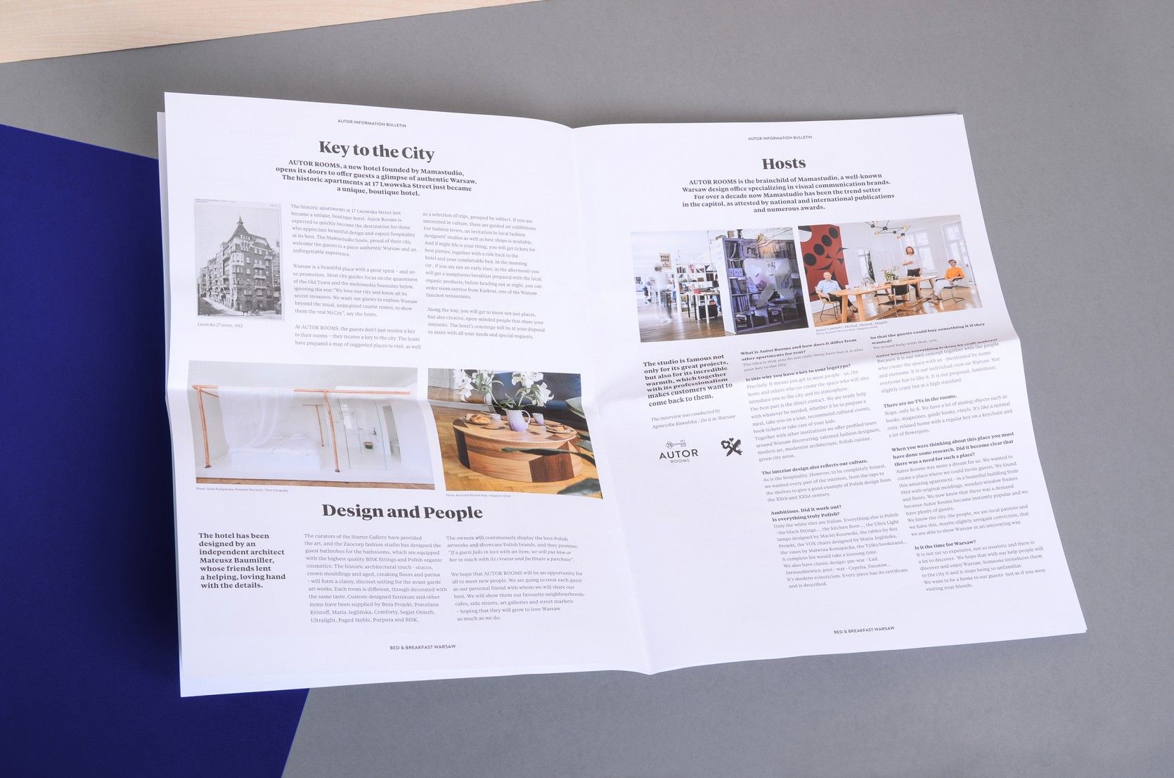
We have already covered the team of the Polish Mamastudio in one of our previous V4 articles: they were involved in the looks of Autor Rooms design hotel in Warsaw pretty seriously (which is quite awesome, as a different designer team was asked to design each and every room – the ed.). Along the motto of the uniquely designed hotel with a special atmosphere – „The Key to Warsaw” – the key motif became emphatic in the case of the logo (this symbol also appears at Mamastudio), while the other image elements contain the terrazzo pattern reflecting on the history of the hotel.
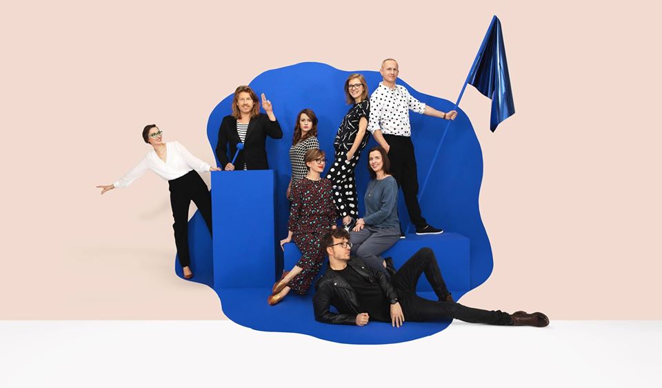
The studio was founded by Magda Ponagajbo, Michał Pawlik and Piotrek Ręczajski: their company started off in the city of Żoliborz in Poland, from a cellar, and today they have won several international awards, including, for example, the Red Dot Award. They have been working with visual communication and branding for fifteen years. They define themselves as a studio that tells the story of a brand through the universal language of colors, shapes and symbols.
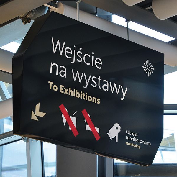
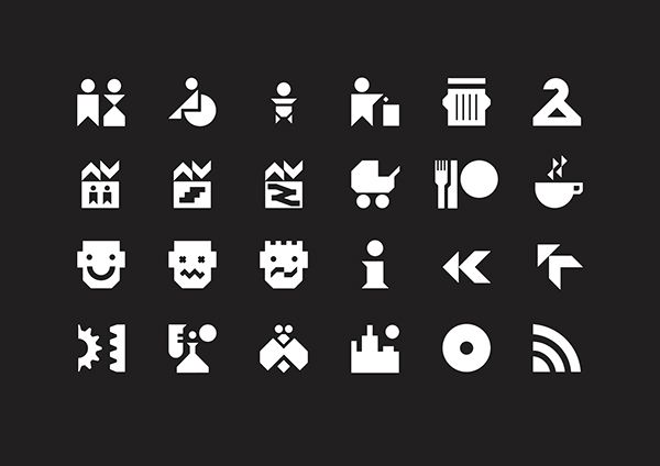
They won the mentioned Red Dot Award for designing the navigation system of Copernicus Science Centre back in 2011: they designed the visual language assisting the orientation of visitors based on the architecture of the building – the different pictograms, infographics and information booths fit into the space with their squareness and reduced colors organically.
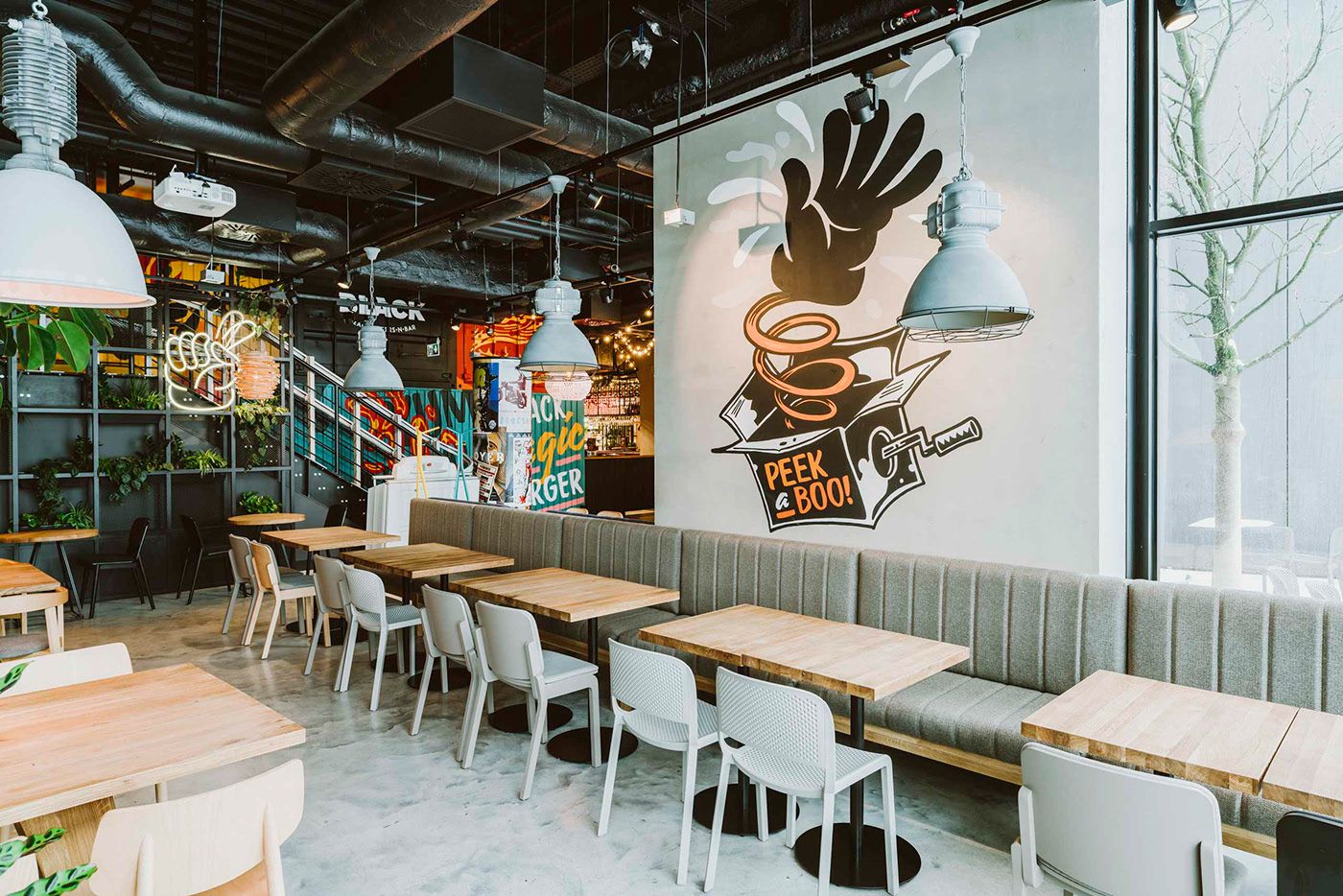
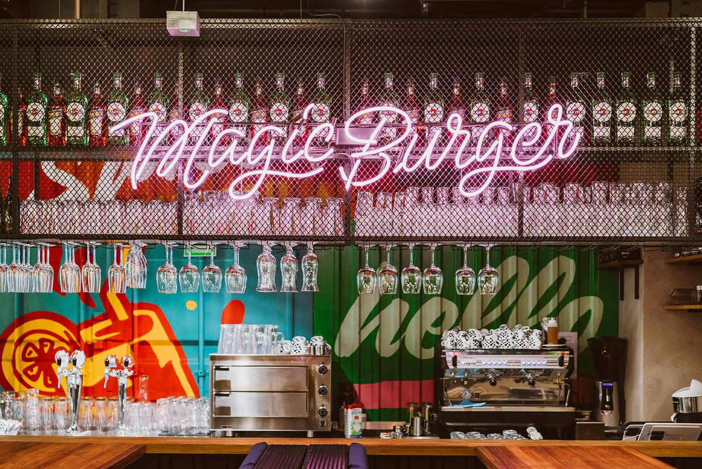
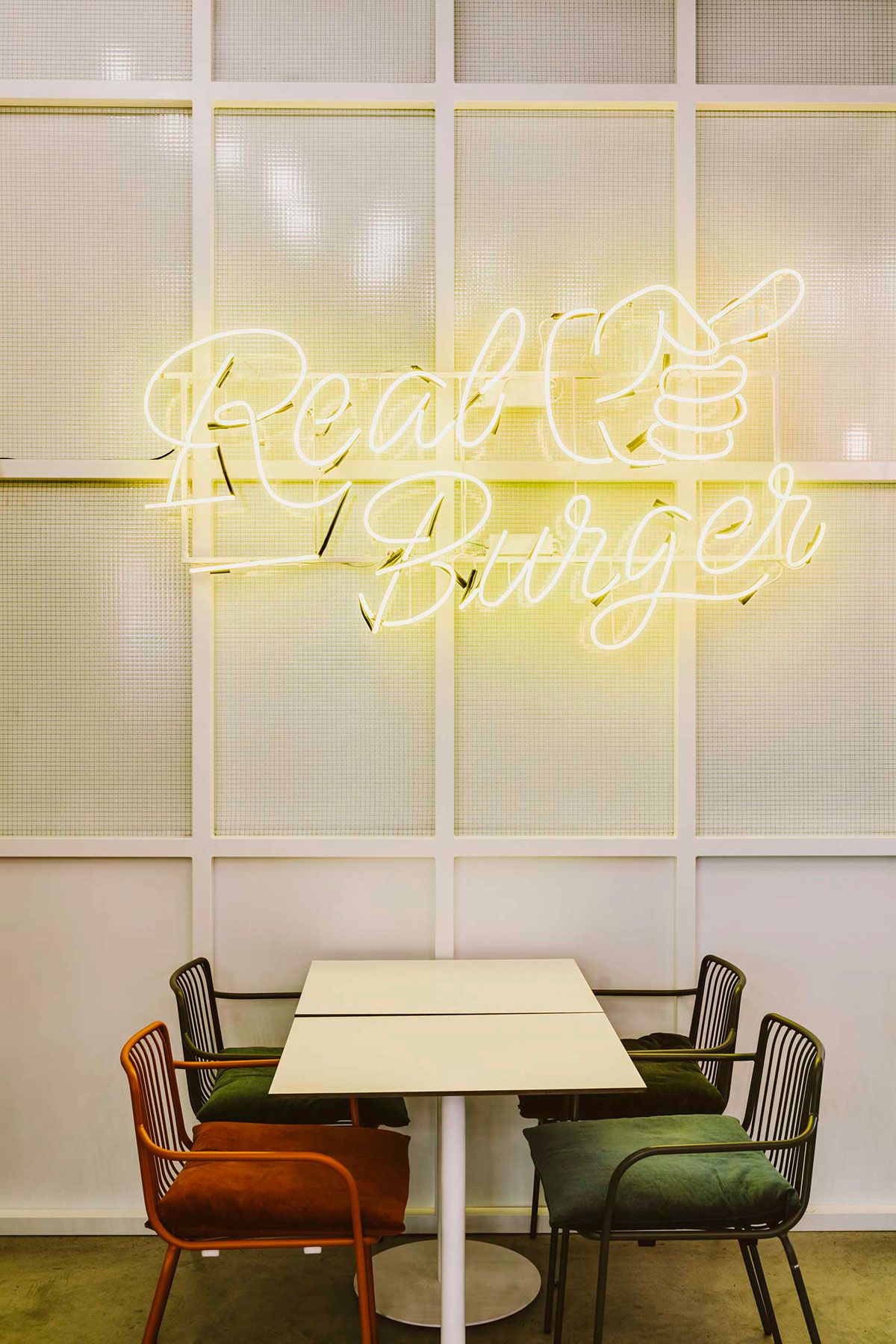
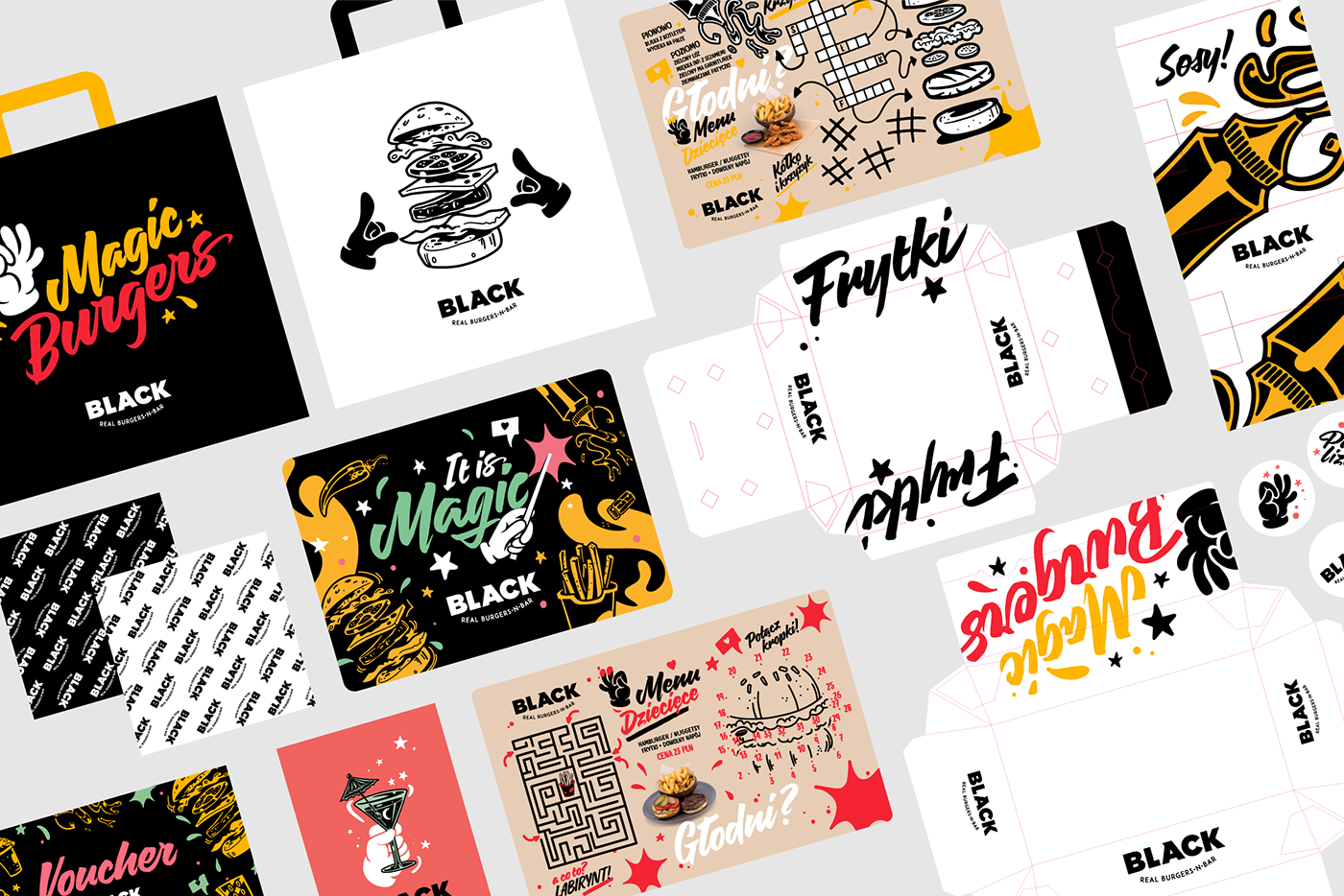
Another thing they did and we loved was the image of Black Magic Burger Bar: the team of Mamastudio created the different icons and the illustrations decorating the wall of the hamburger place together with graphic designer Amadeusz Mierzwa.
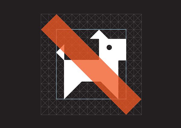
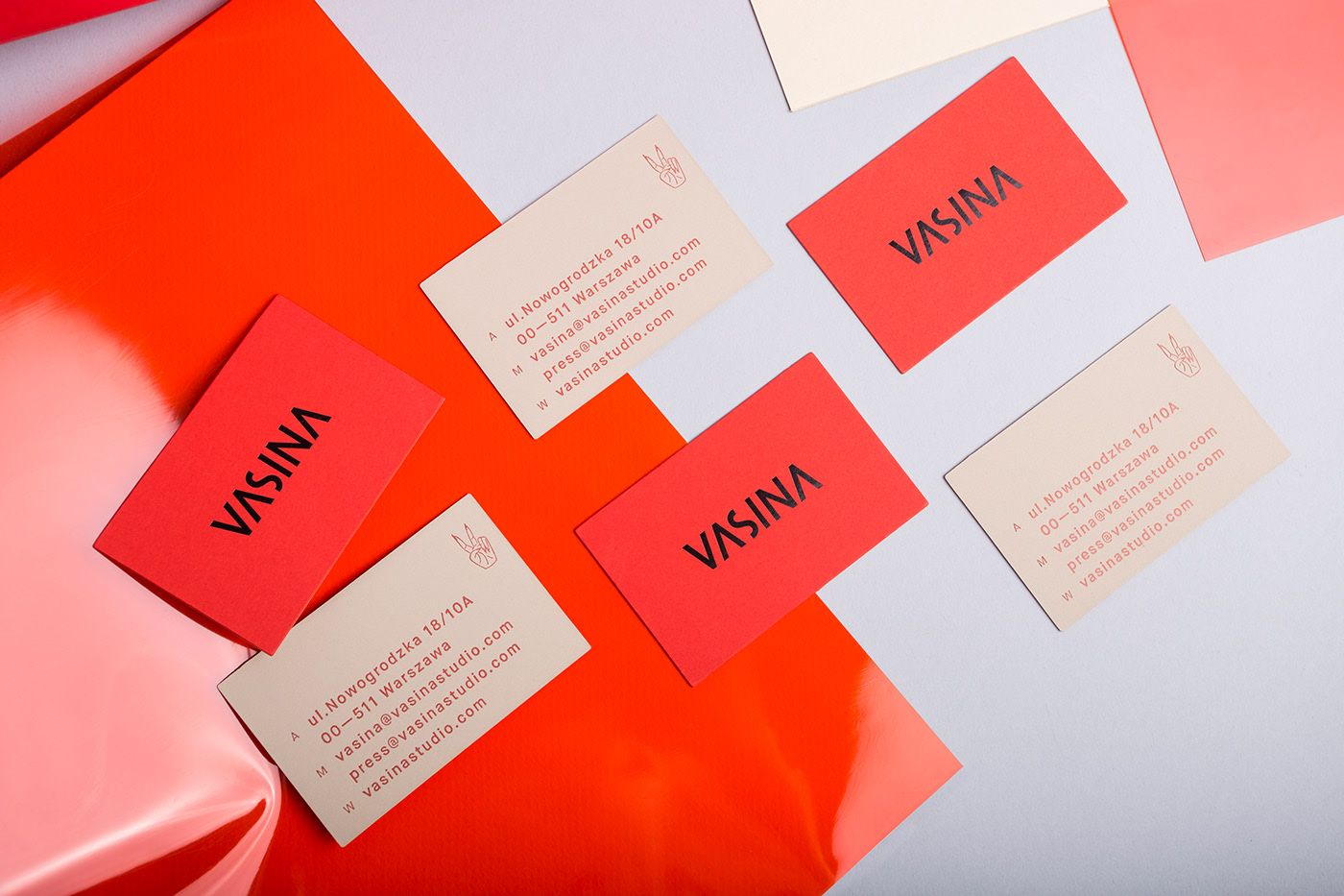
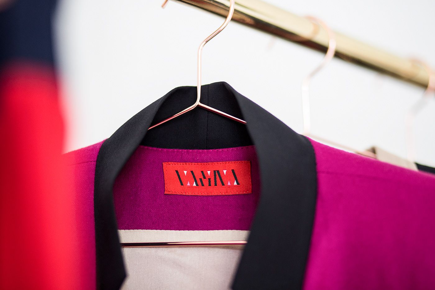
They designed a similarly minimalist logo for the brand of Polish stylist and fashion designer Vasina Maćkowiak: in the case of ready-to-wear clothing items, a simpler hard-edge kind of moving emblem is placed on the labels, while the clothes ordered individually receive a more playful and geometric VASINA sign.
In terms of packaging design, we would like to mention the Under Twenty cosmetic product family targeting the members of the young generation. After reimagining the logo of the brand, they reduced the graphical elements to the minimum, and marked the different products with three different colors instead.



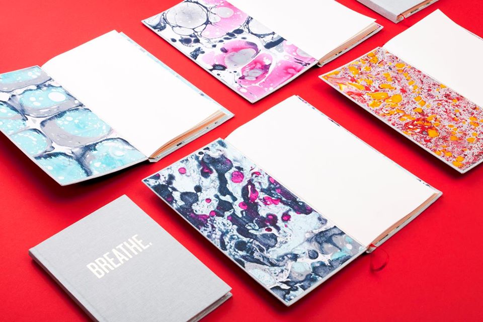
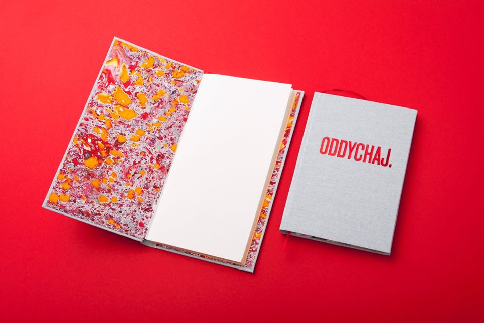
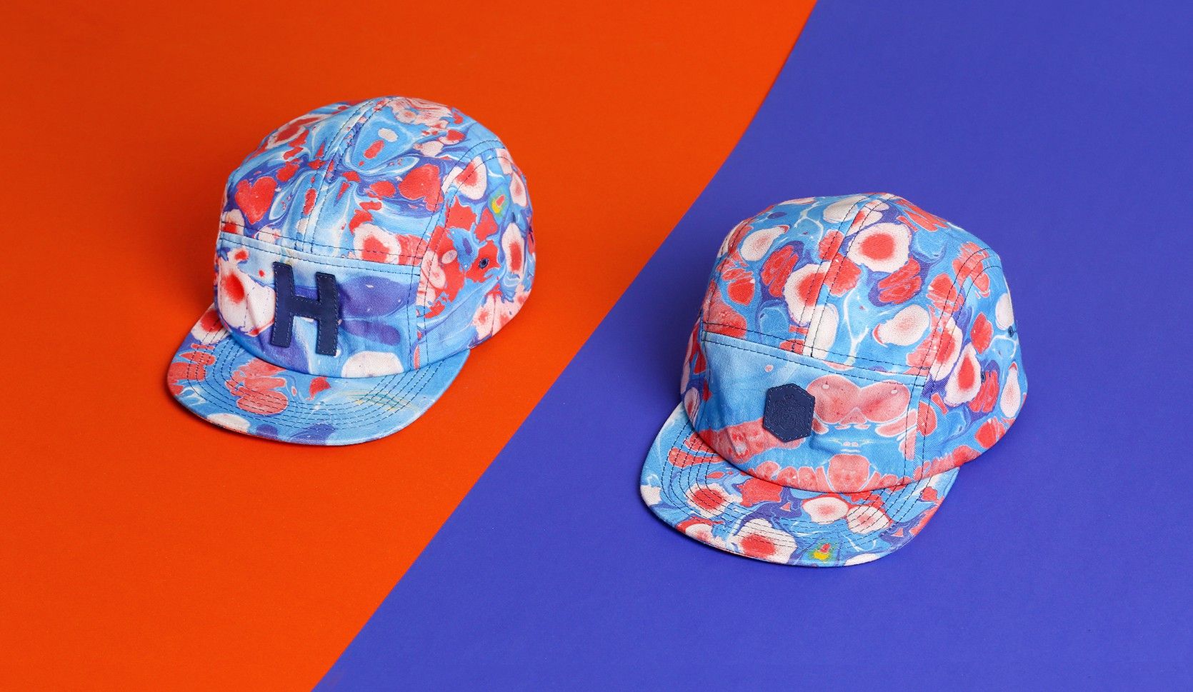
In their project BREATHE, they combined traditional paper making with contemporary graphics and a modern bookbinding procedure. The result is a colorful, vibrant and exciting pattern, which not only manifested in unique notebooks, but also in the form of baseball caps. Must have!
Falbanka
We could already see the textile collection of the Polish Falbanka at the exhibitions Design Without Borders and Texhibition IV held here, in Budapest last year. The brand was founded by Julia Cybis and Izabela Sroka, graduates of Akademia Sztuk Pięknych, that is the academy of visual arts in Warsaw, with the purpose of designing unique home decor textiles by using local raw materials.
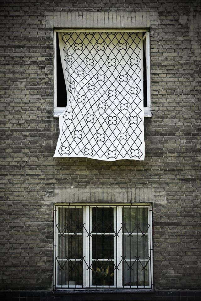
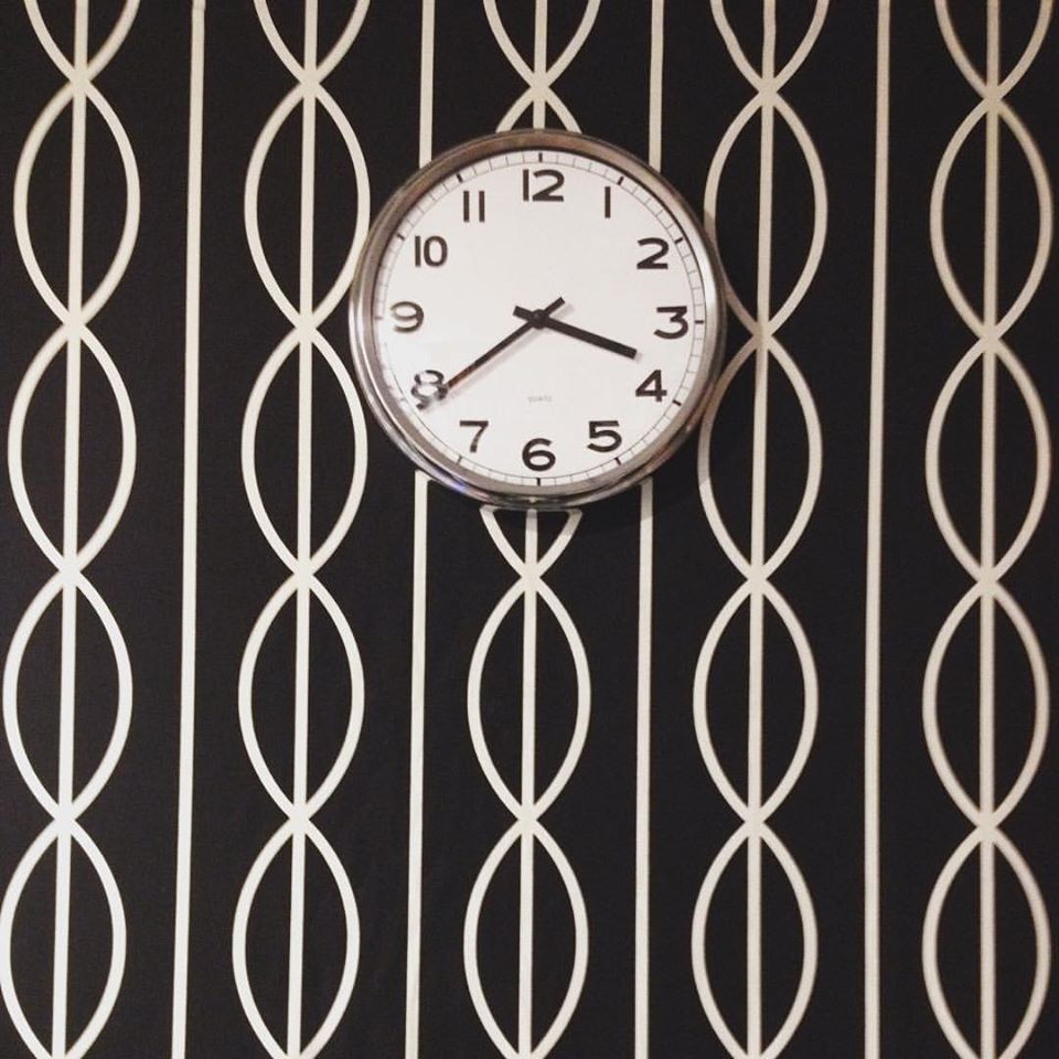
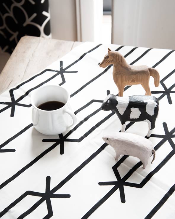
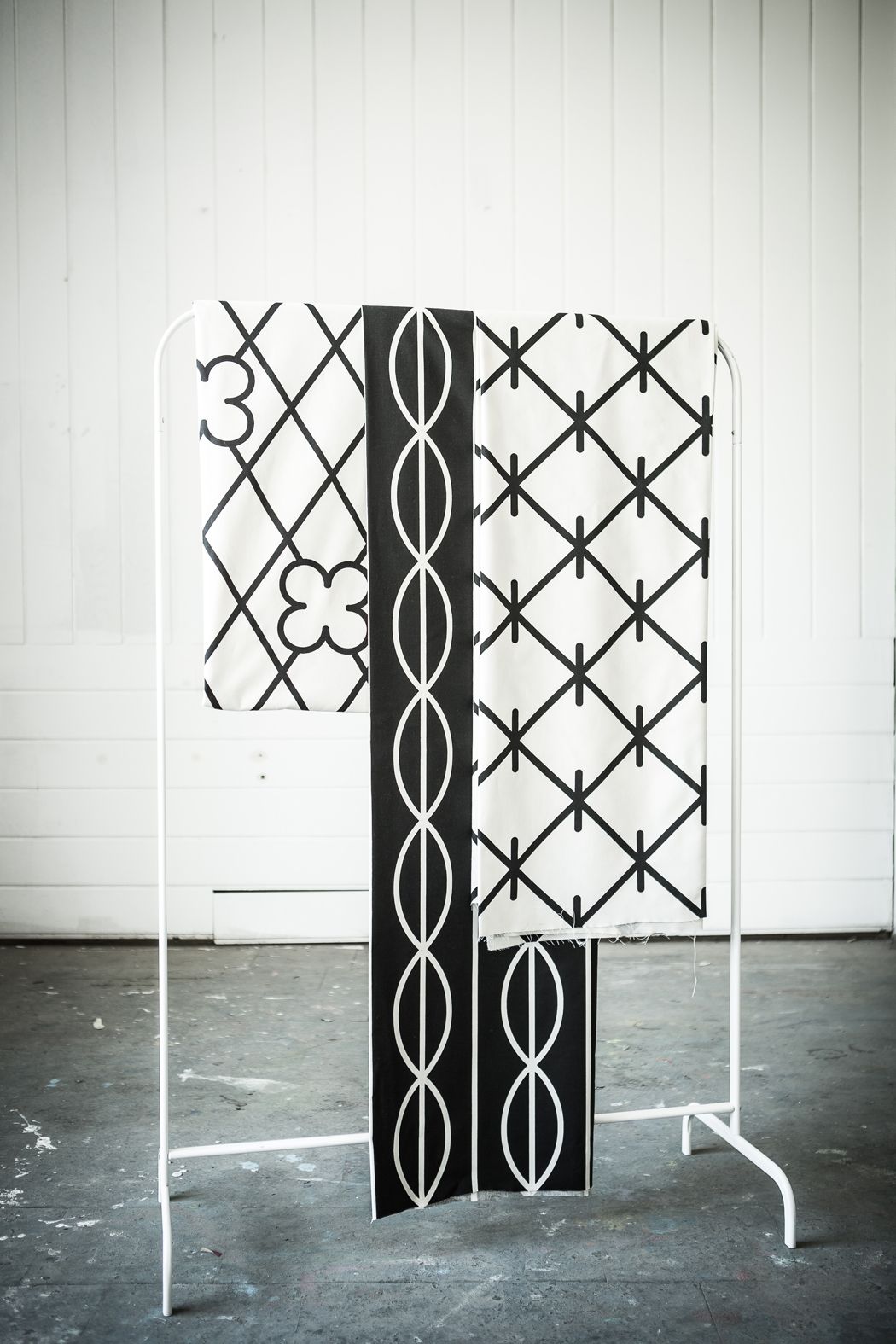
They used their direct environment, the urban landscape, as inspiration for their collection named „Grids”: we can welcome the window bars of the ‘70s on their black and white textiles, organized into geometric patterns. At first sight, perhaps we couldn’t even tell that it was a Polish brand, the entire collection looks so Scandinavian. The textiles are made in the capital of the Polish textile industry, in Łódź, but they have already debuted in New York, Reykjavik, as well as at the Helsinki and Vienna Design Weeks, too.
Redkroft.
It seems that the increasing number of positive settlement communication projects is not limited to the Czech Republic. The city of the Polish Chrzanów now also has a new visual identity, too, thanks to the design team of Redkroft. Almost 3000 young people moved away from Chrzanów situated between Kraków and Katowice in the past 15 years, so the town management decided that it was time the settlement received a new momentum, at least in terms of its visuality.
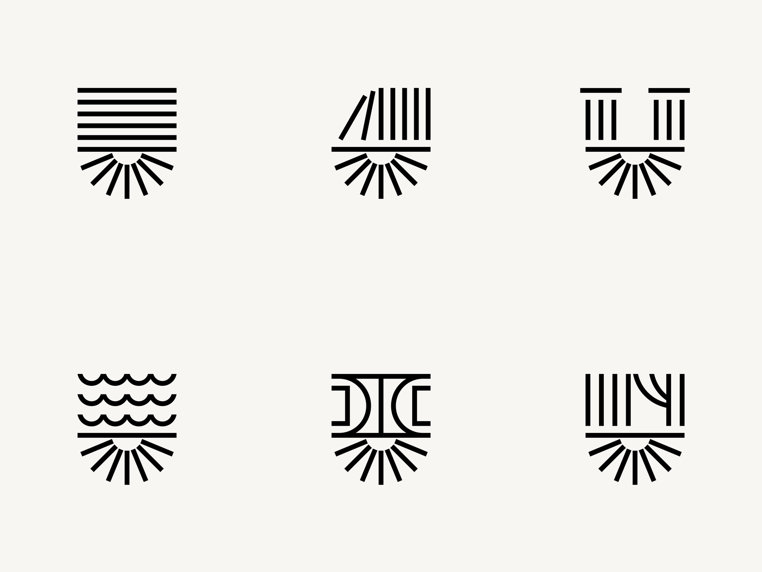
In their concept, Redkroft. kept the traditions related to the city in mind, at the same time, they approached the topic in a brave and fresh-eyed manner: the city’s coat of arms also received some touch up, and a minimalist logo was also created in harmony with the new image, which can be changed flexibly. The crescent motif located in the bottom half of the modularly variable logo alludes to the former Fablok factory (the first locomotive factory of Poland operated in Chrzanów), while the upper part of the logo can be varied freely depending on the given reference it tries to make: to schools, libraries, museums, swimming pools or sport centers.
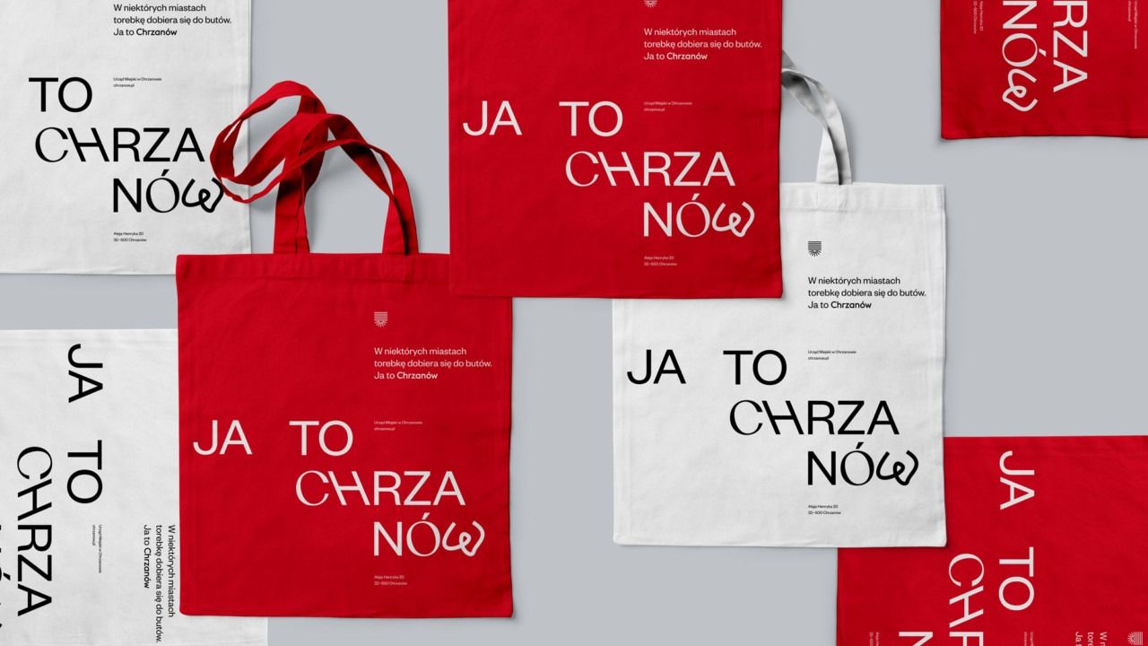
In the communication campaign, Chrzanów is portrayed as the antipole of the big cities nearby, offering an alternative to those longing for a diverse, yet calm urban atmosphere. On the different carrier surfaces, the city light posters, locals can see messages that can strengthen their connection to the town. This can be, for example, a motto printed on a canvas tote (“In other cities, people choose bags that match their shoes. This is Chrzanów style.) or the sign displayed on to-go paper cups (“Other cities are full of plastic. This is Chrzanów style.)
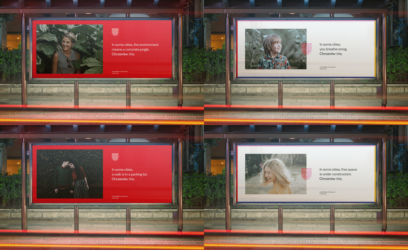
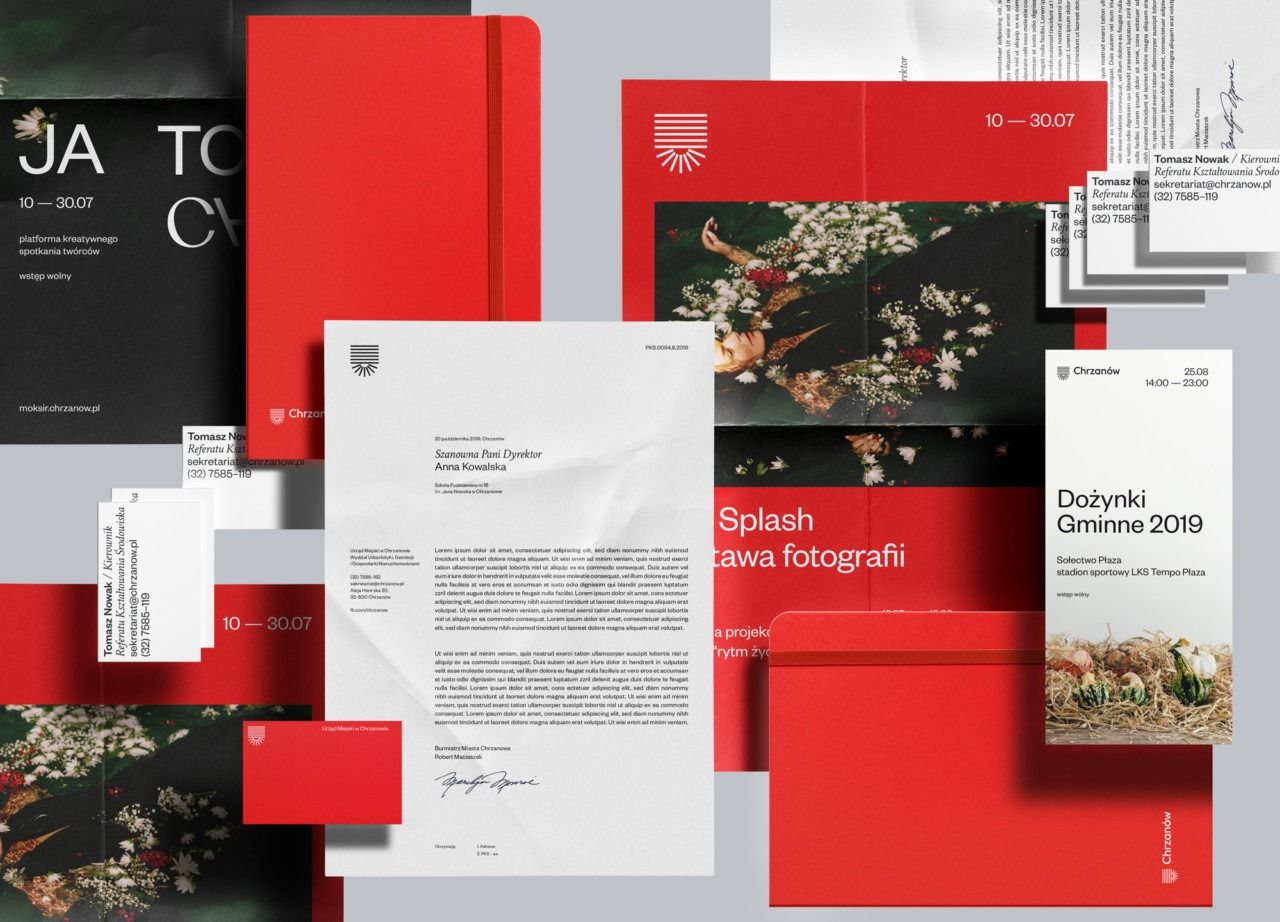
The colors defining the coat of arms of the city (black, red, white) are echoed in the new image, but other shades of the color palette also emerge (blues, purples, yellows). Redkroft., however, did not stop here: in the spirit of consistency and a uniform visual communication, they also created different documents, presentation and letter templates for officers so that they can use them in their daily work.
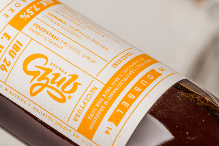
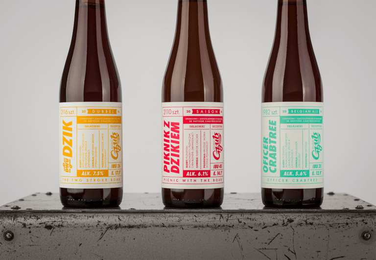
A family artisan brewery, Gzub also belongs to the clients of Redkroft.: the design team designed a logo and label for them, and although they have designed illustrative images for many breweries before, for example for the brand Inne Beczki, which is also worth taking a look), they chose a much more minimalist design for the beers of Gzub, where they put the emphasis on the characteristics of traditional Polish typography. The emphatic display of the essential information related to the beverage (such as alcohol content, level of bitterness) was an important factor, and also that customers should not be distracted by other illustrative elements. The labels tuned to light Pantone colors were made with screen printing – this further enhances the artisan nature of the beer.

Mamsam
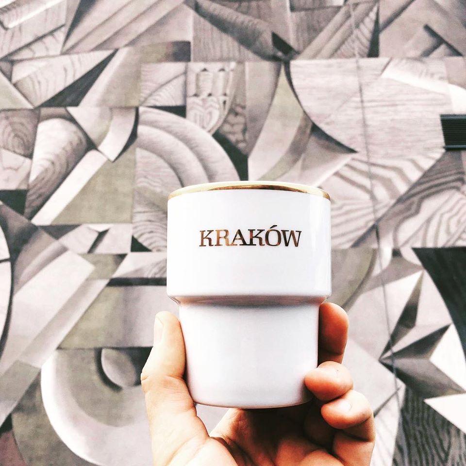
Our hearts immediately skipped a beat when we saw the Mamsam ceramic mugs. We took our first glance at the pretty mugs in the selection of the much-talked about Autor Rooms, and then we met the cups of simple design and working with different signs on the shelves of more and more Polish design stores.
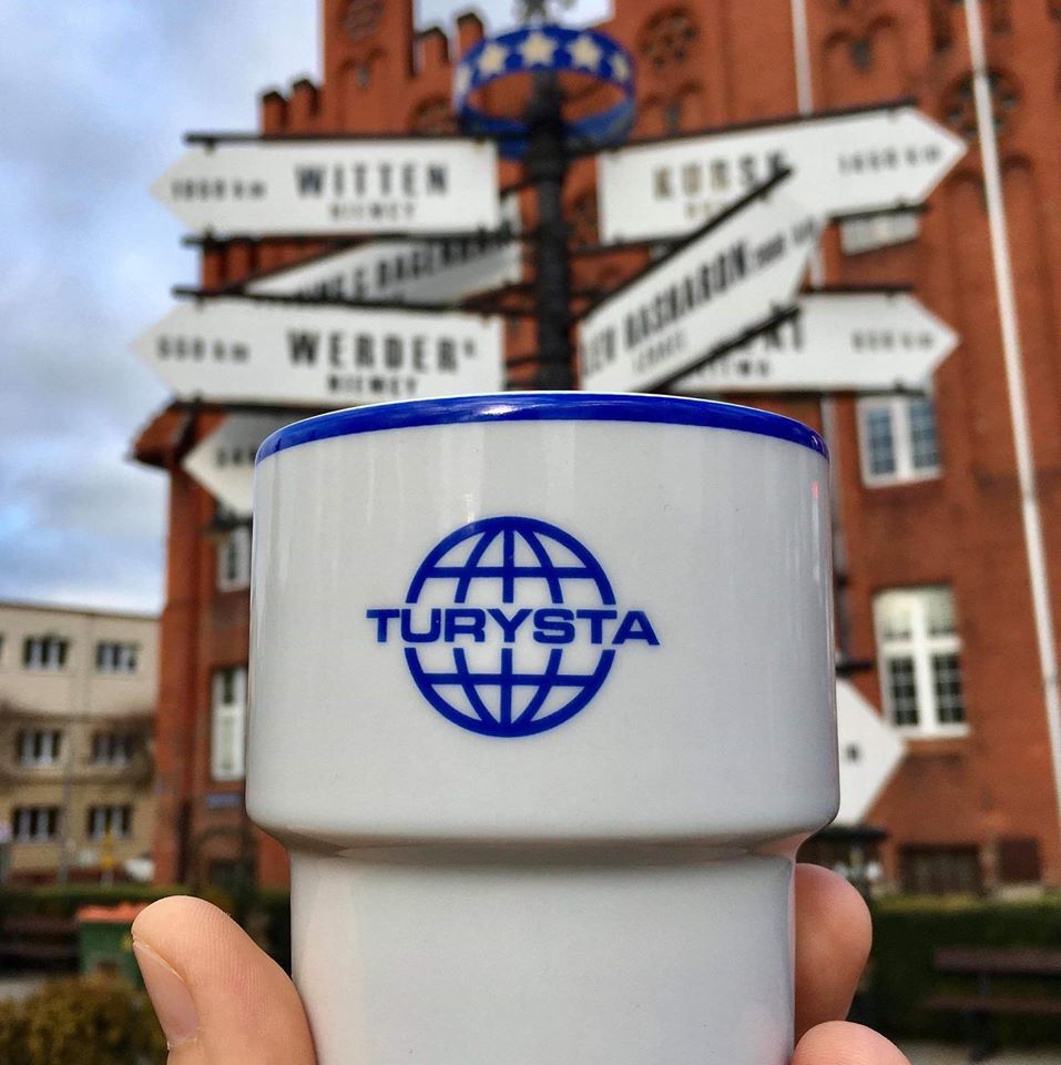
What happened in the case of the brand Mamsam is that they brought back a ceramic mug with classic design into public awareness, and then printed various signs on them with different cool typographies. We didn’t receive a clear answer as to the origin of the mug: we can read on the website of Mamsam that these cups were first used during the era of the Polish People’s Republic, but we must look for its roots in German design from the ‘60s. Whatever the truth may be, one thing is for sure: they are true “must have” pieces, and we would very much like to grab our own.
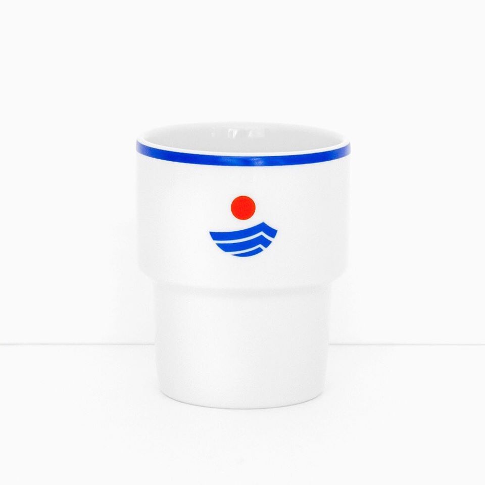
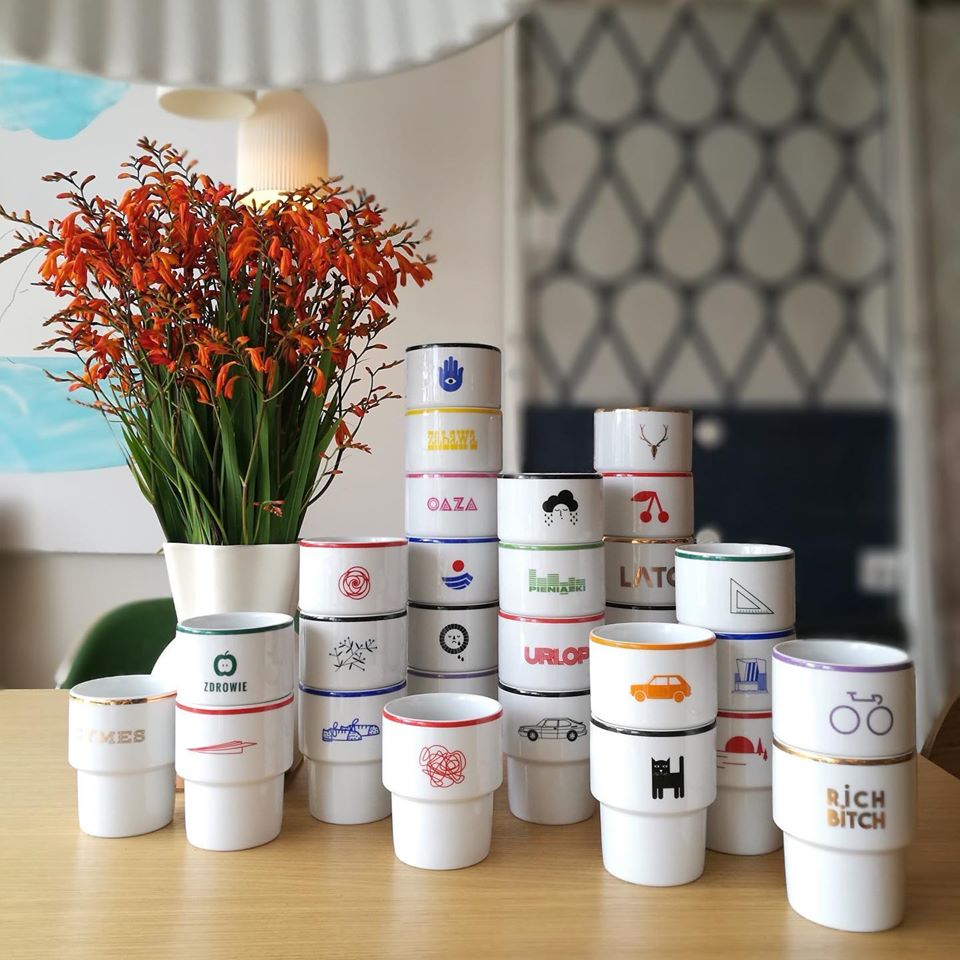
The different signs and graphics on the mugs are designed by different Polish designers, and you can also order your unique version of the mugs with logos, if you fancy. The ceramics are made in limited collections in every case, 100 pieces of a given graphic at top, and these can also be pieces with a golden brim. We already found our favorites while browsing through their online store! The trolley bus mug from Olek Modzelewski, the robot version from Kasia Mihalak or the one with the Turysta sign, designed by the founders of Mamsam. Which one do you like the most?
Nurt
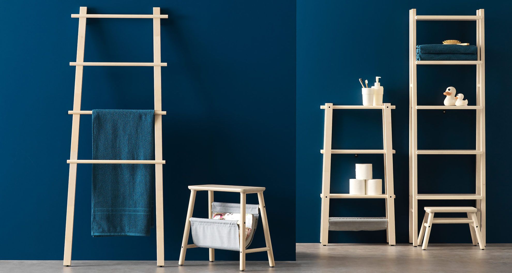
We noticed the brand of Maja Ganszyniec when looking through the pages of the Warsawa Warsaw publication, already mentioned before. The Polish designer has worked for companies like IKEA or Comforty, which is a pioneer in manufacturing upholstered furniture, for whom, for example, she designed the pull-out couch named „Boo” and the UME armchair. At IKEA, objects like the VILTO bathroom storage unit or the fluffy VINDUM RUG can be associated with Maja’s name.
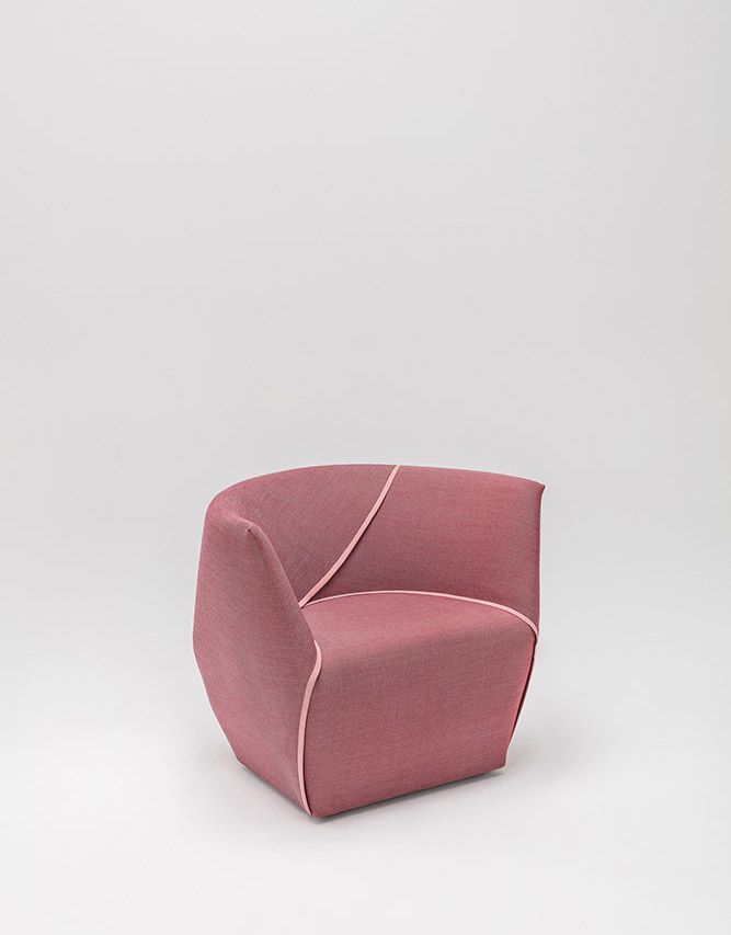
Maja graduated at Royal College of Art in London as a designer in 2008, and her works have been featured in magazines like DOMUS, Wallpaper, Abitare or Icon. She lived in Milan for a short time, where she worked in the team of Atelier Mendini, amongst others.
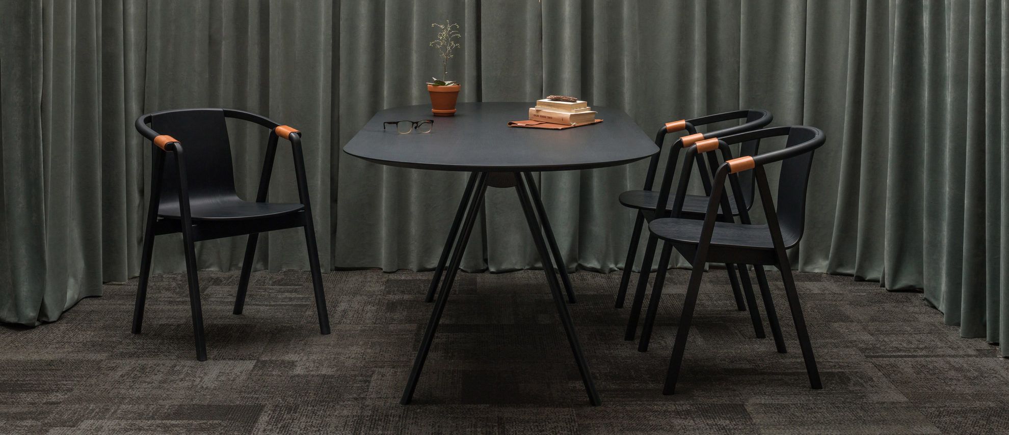
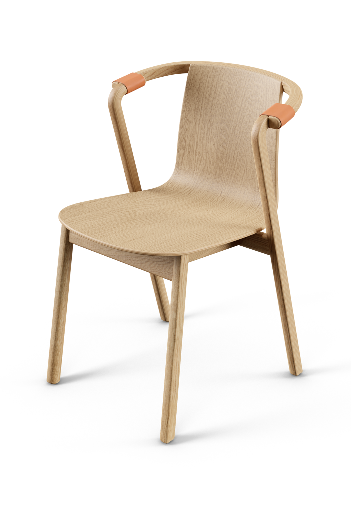
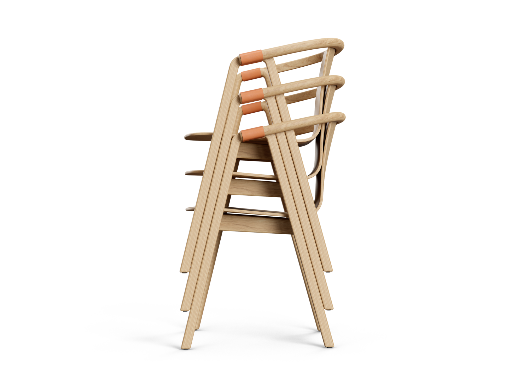
One can find the textbook examples of minimalist design in the selection of the Nurt furniture brand: the Kompas table is lightweight and airy, and there is also a version of it decorated with oak marquetry. What’s more, we can also pick seating that matches the table in the form of Sarna Chair, which offers both short and long versions with armrests. The peculiarity of the stackable chairs made of plywood lies in the leather accessories serving greater comfort (and also aesthetic purposes).
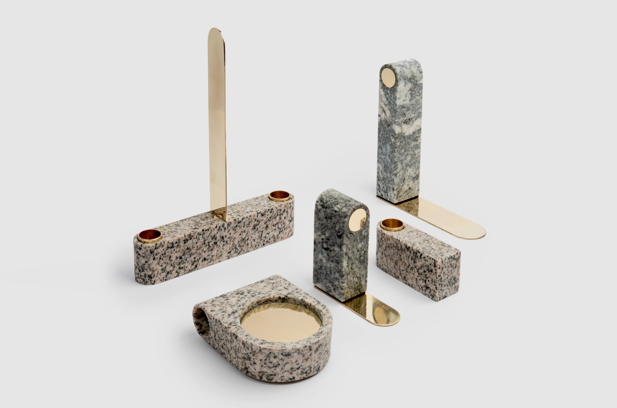
What we like the most is the OTOKI home decoration tool: a match made in heaven of stone and yellow brass.
In our biweekly series, we present the Czech, Slovakian and Polish brands and design spots that we consider worthy of being placed on our mental design map. It is a guide for those looking for something other than usual tourist sights.
HYPE | Weekly program guide
SQUARE-ANGLE – Péter Kuczka
