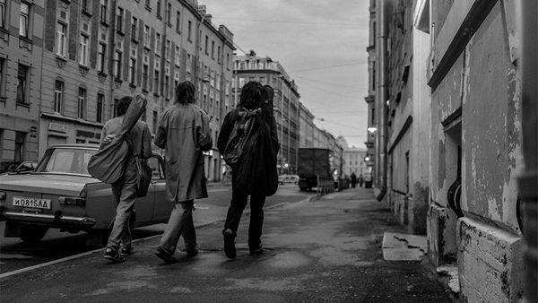
We won’t forget about our Slovakian neighbors even during the quarantine. So much so that if we could, we would teleport ourselves to the “Jurányi house of Bratislavan youth” right in this moment. Until then, we try out a set of games designed for kids living in panel housing estates (in our imagination) and show you a clothing collection intended for fashion-sensitive bookworms. Relax, we brought you some graphic design, too.
Nová Cvernovka
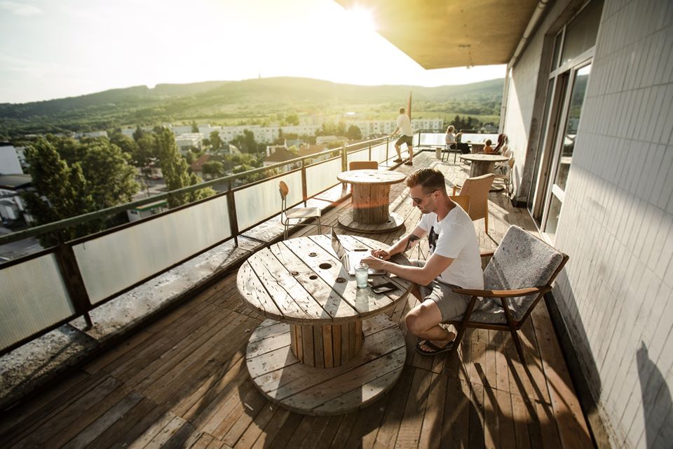
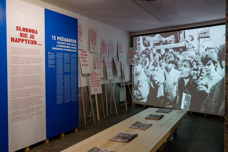
Although Nová Cvernovka is currently closed, we cannot walk past it without saying a word. The building gave home to a chemistry school earlier, and today it functions as a cultural spot, where one can also find several creative workshops of different profile.
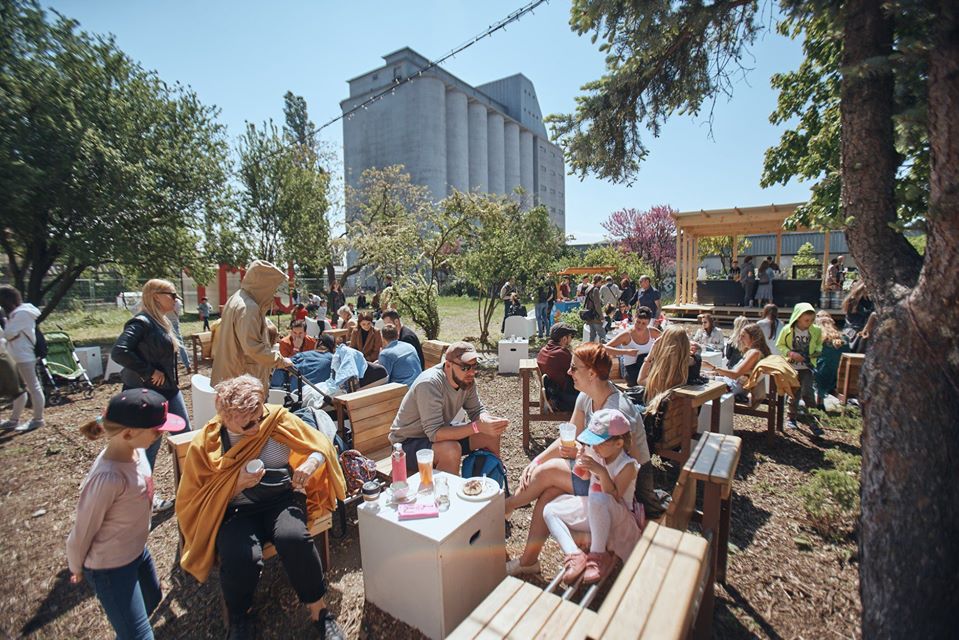
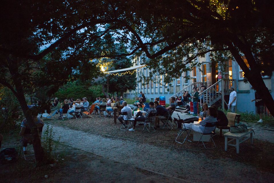
The “Jurányi house of Bratislavan youth” (because that’s what we thought of immediately) gives home to visual artists, designers, photographers and architects: there is a press in the basement, a library and an auditorium awaits those interested on the ground floor, but there is also a design store, which we wouldn’t leave empty handed for sure: in addition to the cool prints, visual art and photography publications, we would jump on the Czechoslovakia earring and the flask made in the spirit of the place, as a souvenir.
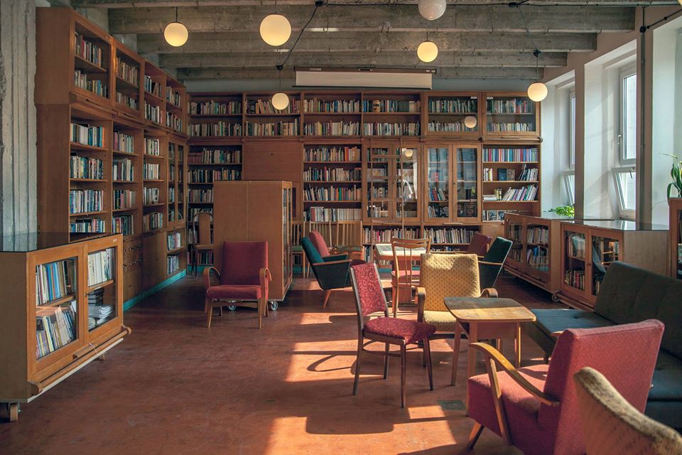
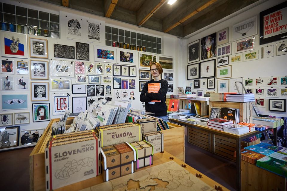
And what else does Nová Cvernovka offer? The fifth floor, for example, gives home to a coworking office(complemented with a daycare club), the ground floor offers a zero waste bakery and package free store, a risograph press, and our favorite Slovakian association, Čierne diery engaged in preserving and promoting industrial buildings also has its headquarters here. They hold an open day on May 1st every year: on this day, those interested can have peek into the design processes taking place in the workshops, can get to know the residents of Cvernovka and of course it wouldn’t be the same without a party at the end of the day. Corona, it’s time for you to go, because we need to go, too!
Barbora Kubi
The Budapest audience also had the chance to meet the name and collection of the young Slovakian textile designer back in 2016. Barbora Kubi debuted her collection titled “King-size” on the runway of the Mercedes-Benz Fashion Week Central Europe. We ourselves remember it quite well, because in addition to the clothing pieces “grown” gigantic, the collection also contained essential accessories such as colorful hats and the sizeable “gum balloons”.
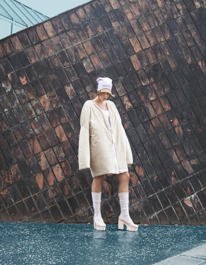
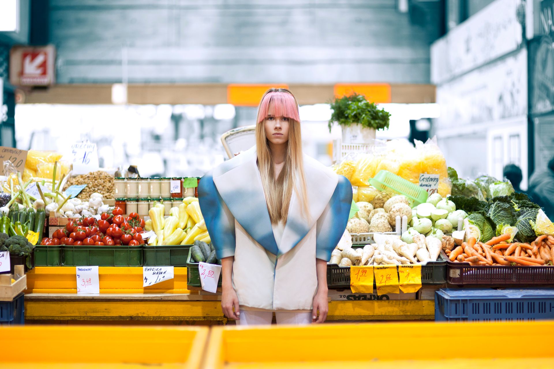
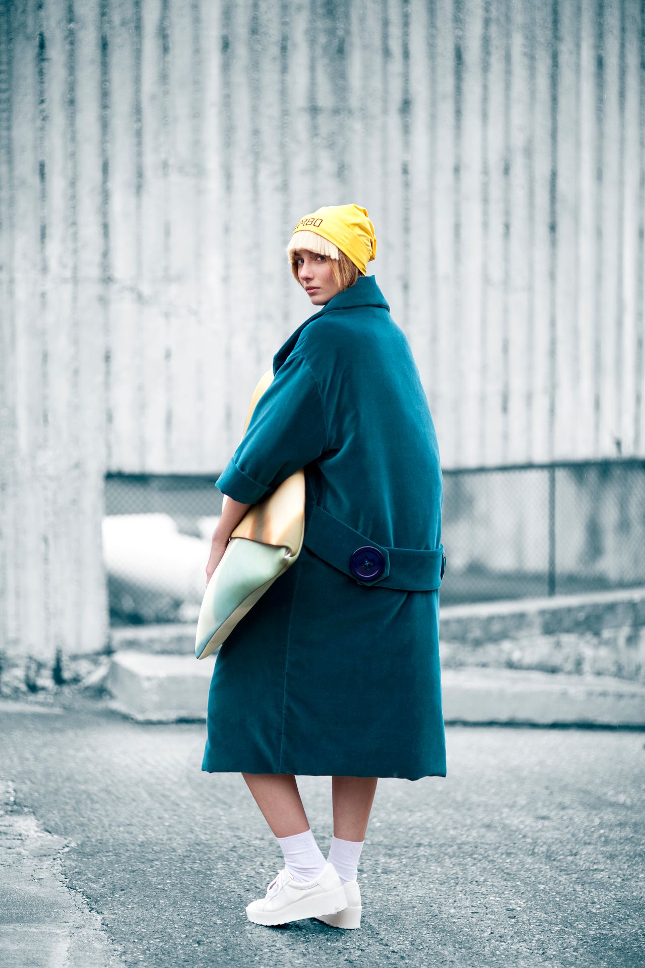
Barbora Kubi has a knack for creating a unified and visually exciting atmosphere – in her case, perhaps it’s not only the pieces of clothing that are fascinating, but the way she presents them. According to the designer, she creates formal looks that are comfortable and creative at the same time, and are primarily intended for women who would like to stand out from the crowd.
The designer has been invited to Fashion LIVE, the fashion event in Bratislava since 2016: she presented the „KUBIK” and the „Knihomoľ” („Bookworm”) collections here. The former was inspired by a painting created by Kubi’s visual artist mother in the ‘90s, displaying playful pastel colors and geometric black and white compositions.
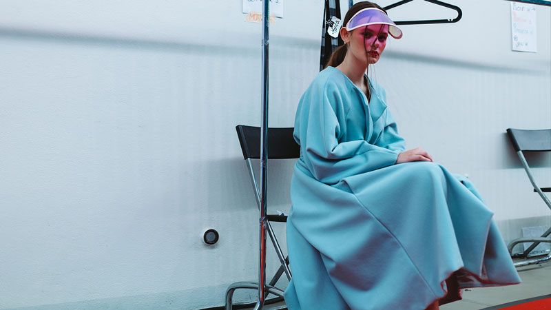
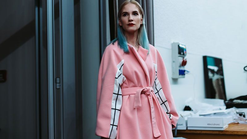
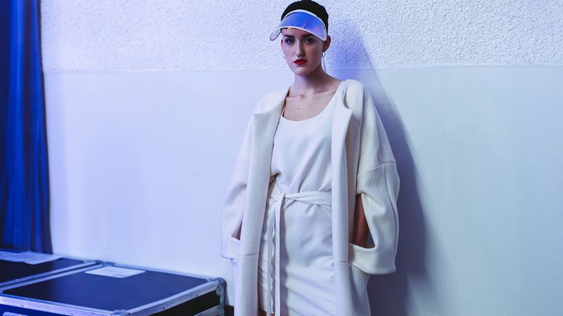
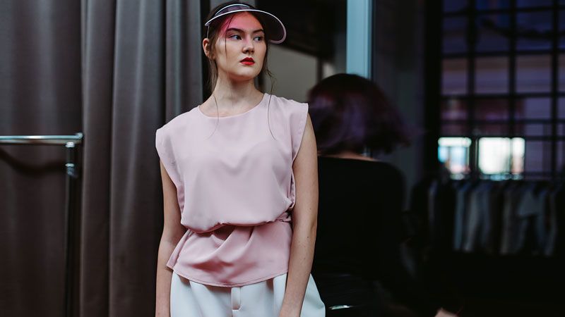
And in the case of the latter, the comfortable pieces of clothing designed in earth colors and ochre manifest Kubi’s love for reading books.
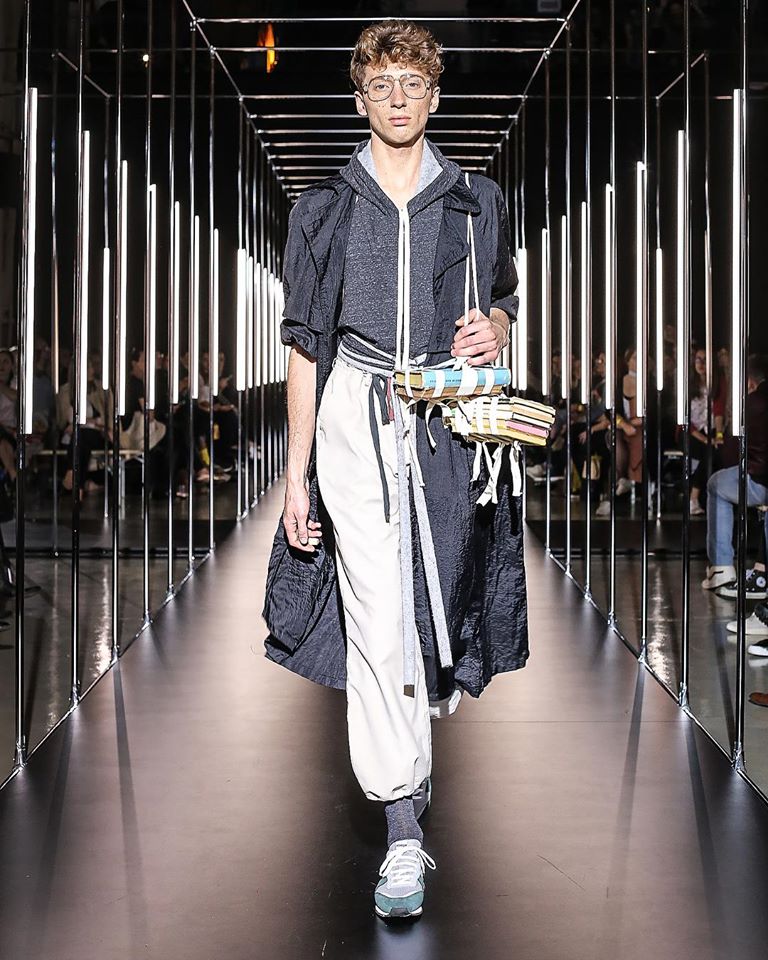
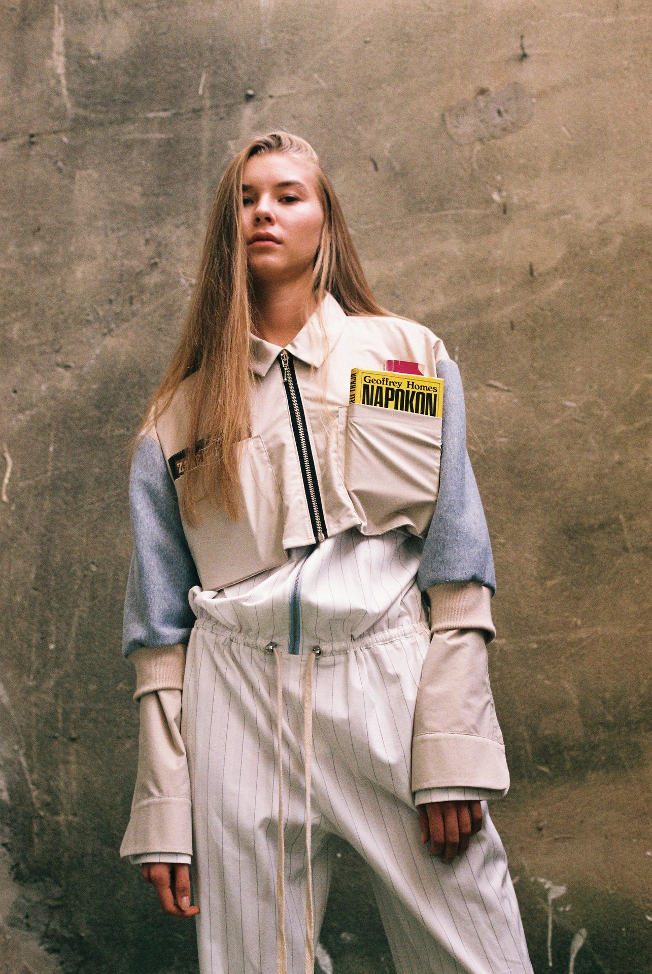
The former student of the School of Visual Arts in Bratislava does not only define herself as a fashion designer: most of the time she also functions as art director and stylist, and building her own brand only gives approx. 40% of her life. She prefers to work in a team, with other artists: one of her permanent partners is Slovakian-born Mária Švarbová, whose photo series titled “Swimming Pool” has been exhibited almost all throughout the world, from Japan to Mexico. Our personal favorite is the “Generation” photo series with marvelous colors and inspired by Wes Anderson, where Barbora Kubi was in charge of costumes. Even if you don’t think of yourselves as true fashionista, you should still follow the designer’s Instagram for inspiration.
Chmela design studio
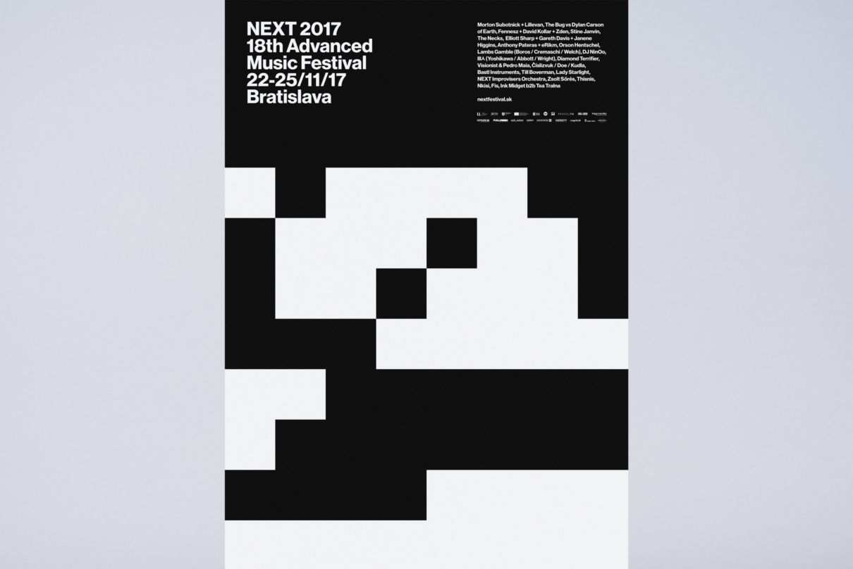
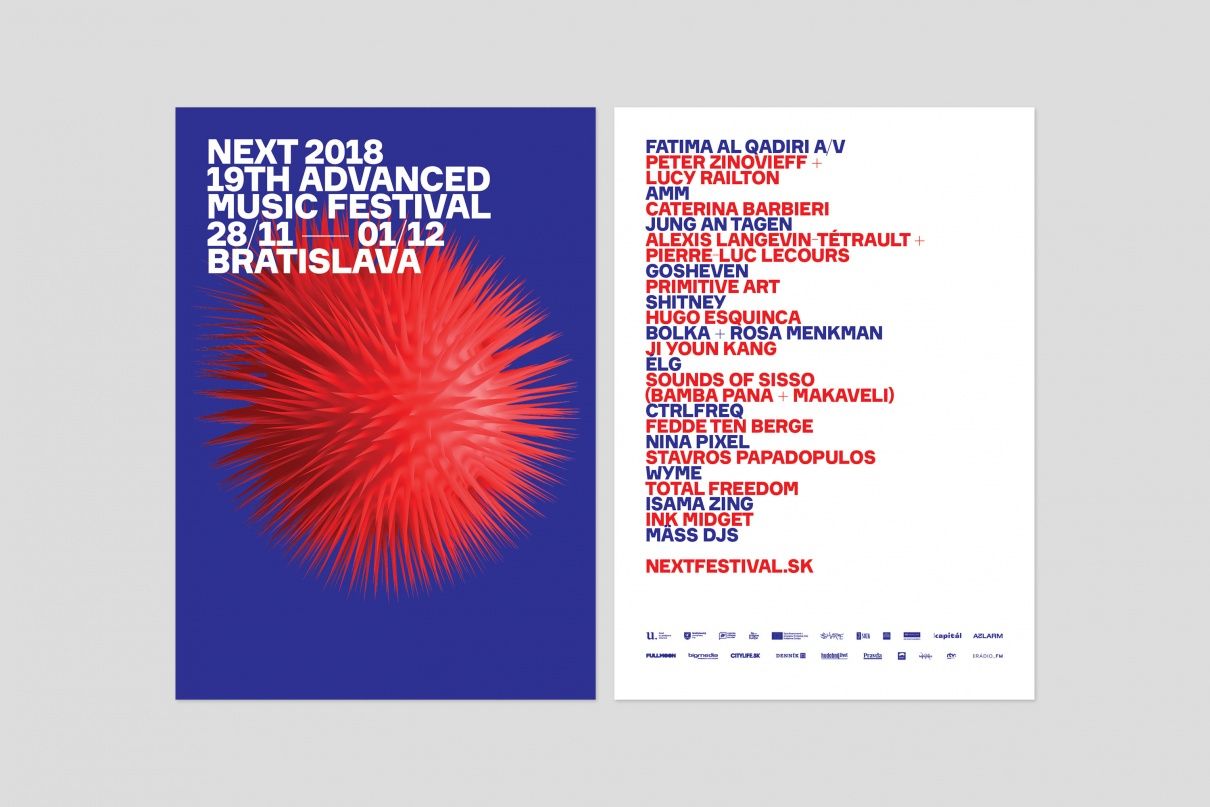
Chmela design studio was founded by two brothers, David and Peter Chmela. To our biggest surprise, the company primarily engaged in branding does not operate in the Slovakian capital, but in Blatná na Ostrove, a little village giving home to 900 persons. The guys have put together a quite outstanding portfolio over the past years. Between 2016 and 2018, they designed the image of NEXT Festival. In 2016 and 2017, they built on the contrast of black and white, while in 2018, the palette became more colorful at the request of the art director of the festival.
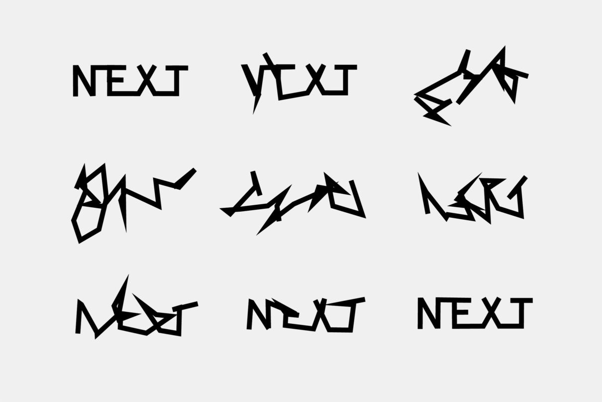
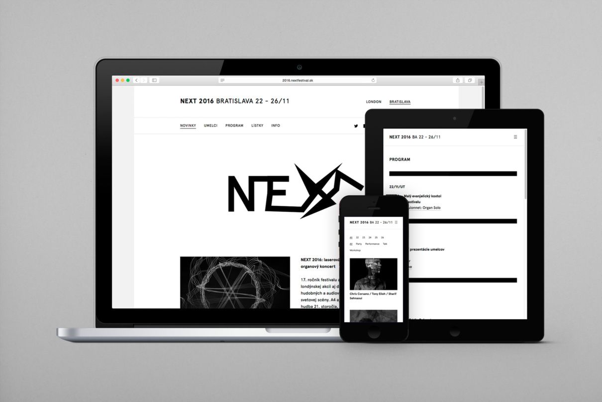
Of course, in line with the spirit of the experimental musical program series, the designers also did their best and created a unique image every year. In the first year, they designed a dynamically changing logo (with interactive typo on the online interfaces) and later on they were inspired by the binary number system.
In 2018, a strange and dangerous-looking fruit object came to life on the different platforms promoting the festival: they collaborated with Bratislava-born visual artist András Cséfalvay in this project.

In addition to the various branding enquiries, they also offer web design services: they created the website of Slovakian fashion photographer Jakub Gulyás and London-based gastro photographer Vladimir Studenic, amongst others. Our personal favorite from the sibling duo is the identity the guys created for the POSVANCZ family venture: and particularly the perforated business card that can be extremely useful in cases when the partner forgot to bring or have run out of business cards.
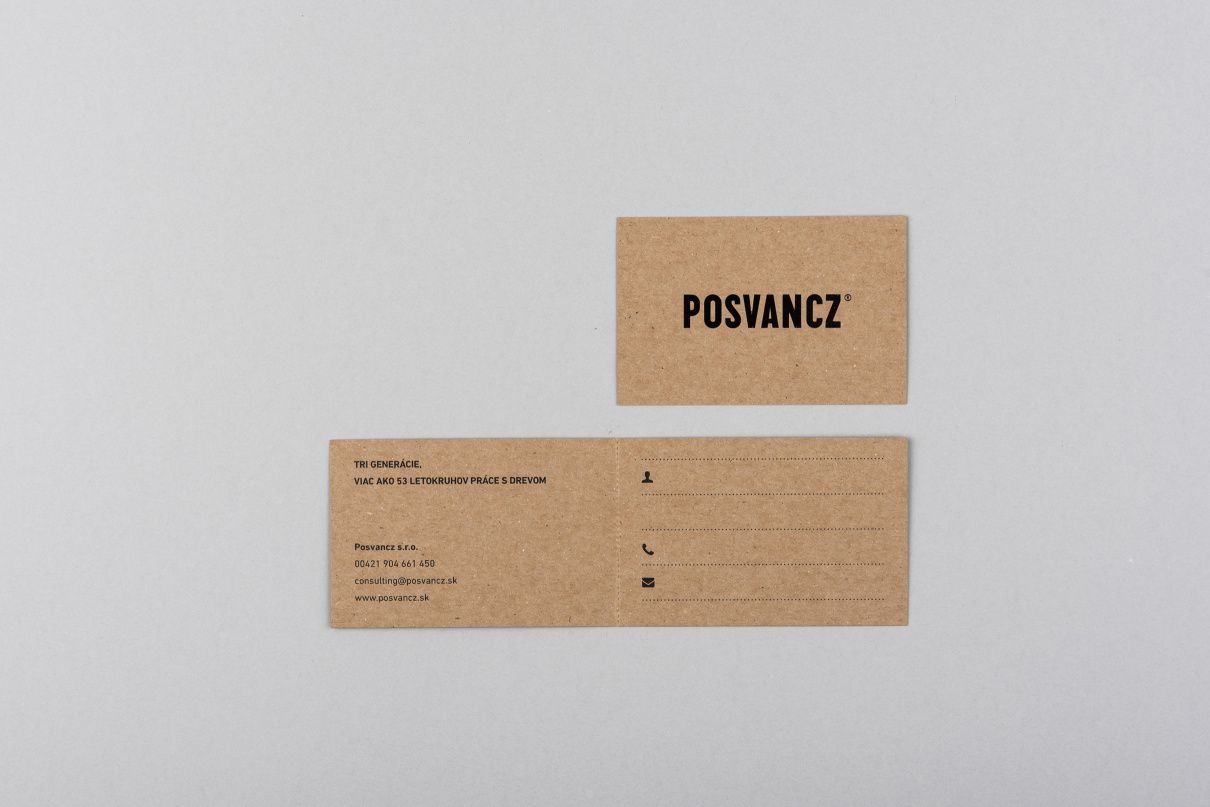

And although the guys highlight “beauty” and “simplicity” as their core values, we think “playfulness” would also deserve a third place on the list.
The Kit for an Urban Kid
The young designer, Mária Fialková was born and raised in a panel housing estate in Prešov. As a kid, she spent most of her free time at the playgrounds in the neighborhood escaping from the confines of the block. This provided the primary source of inspiration for her set The Kit for an Urban Kid.
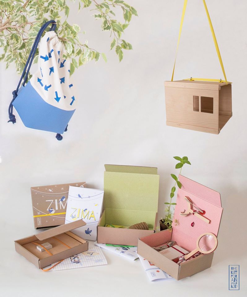
The lovely and minimal set designed for kids over the age of six offers possibilities for creative free time activities for each season. With the help of the package, kids can get a taste of planting during spring, they can play detective games during the summer and explore the tiny treasures of the environment, they can create their herb collection in the fall and assemble a bird feeder in winter time.
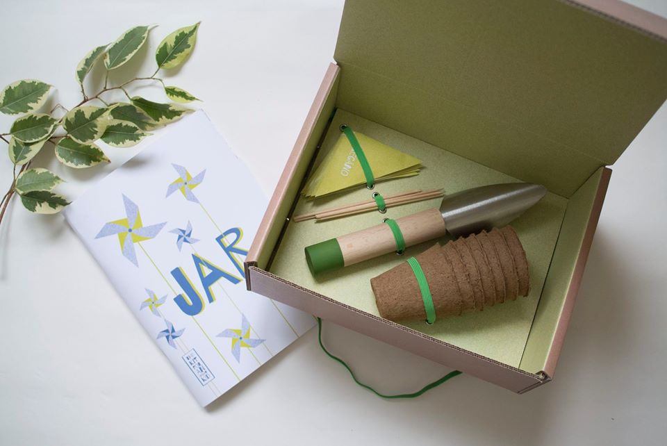

The designer gives the simplest possible tools to the kids: magnifier, skipping rope and colorful crayons. According to Mária, she felt that it was time to create the set as she saw that children spend less and less time outdoors nowadays: The Kit for an Urban Kid can help them find the beauty without playing with extra or overthought toys. In 2019, the designer won the Slovakian design award (“Národná cena za dizajn”) in the student category with this project.
Matej Vojtuš
Matej Vojtuš, born in 1991, is a student of UMPRUM in Prague (Academy of Arts, Architecture and Design – the Ed.), but he has proved his talents on many areas already, at least when it comes to image and font design. In 2017, he designed the image of the book festival in Bratislava (BRaK – Bratislavský knižný festival – the Ed.), which brought him the second place a year later on the Slovakian design award competition, in the category of visual communication. We love this image very much: fresh, illustrative and avoids all clichés that we usually see in relation to cultural programs of the like. Even though it would have been an obvious choice, the image not display a book, and he doesn’t even make any references to it, or does he? This mosaic-like colorful world built on various amorphous and geometric elements pays tribute to a publication published in 1920, showcasing Art Deco decorative elements.
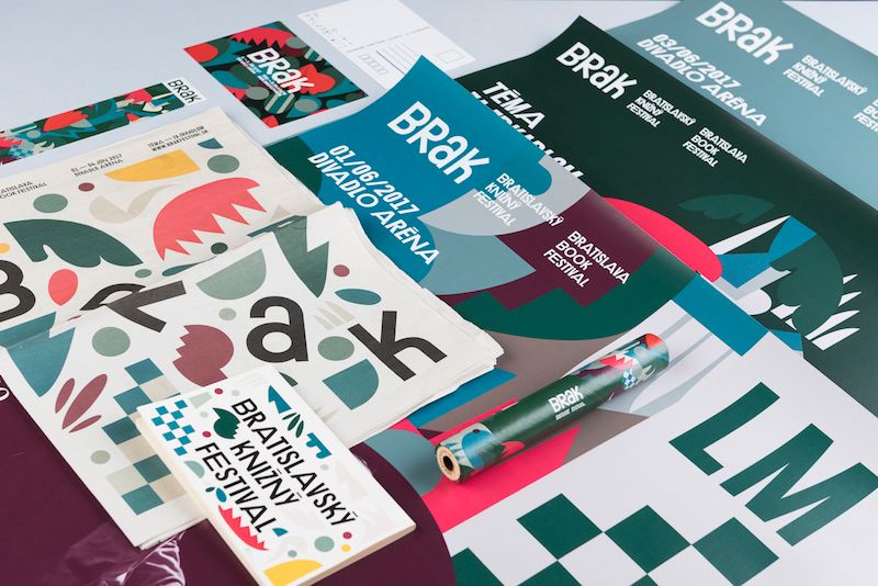
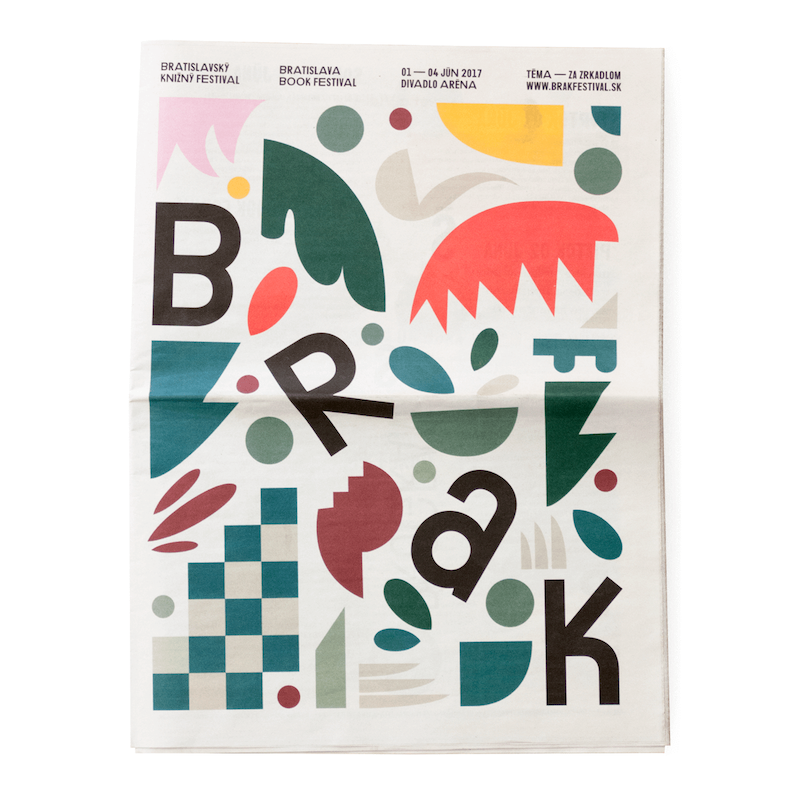
Matej Vojtuš has created several fonts: he designed the fonts „Zaum”, a „Kultivar” and „Deto Grotesk”, and he is also responsible for the typos under the name “Regular Lines” together with his graphic designer partner, Jozef Ondrík. What else the young graphic designer has up his sleeve is displayed by his Tumblr page.
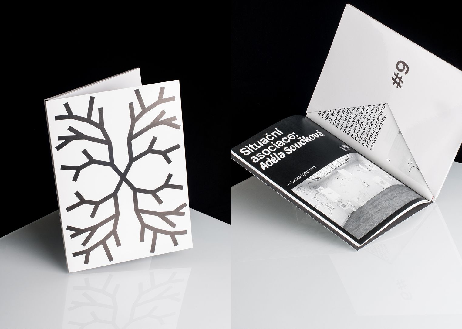
In our biweekly series, we present the Czech, Slovakian and Polish brands and design spots that we consider worthy of being placed on our mental design map. It is a guide for those looking for something other than usual tourist sights.

HYPE | Weekly online program guide
SQUARE-ANGLE – István Örkény
