This time we travel all the way to India, where a Slovakian designer experiments with biocomposite raw materials, and we analyze the rye palinka of our Northern neighbors, too. We will let you know who are responsible for designing the image of Pohoda music festival and we will tell you about the Eastern-Slovakian workshop where each and every bag has its own story. Last, but not the least, we will also take a peak between the walls of a super cool kindergarten.
Malai biomaterials
Zuzana Gombošová started her journey from a small village in Eastern Slovakia, Vinna, and she did not stop until Southwestern India, where she has been experimenting with biocomposite raw materials for more than two years now. First she studied in the Czech Republic, then graduated from the London University of Arts in 2014 with her project titled “The Invisible Resources”: she experimented with diverse micro organisms at the university and her own laboratory at home.
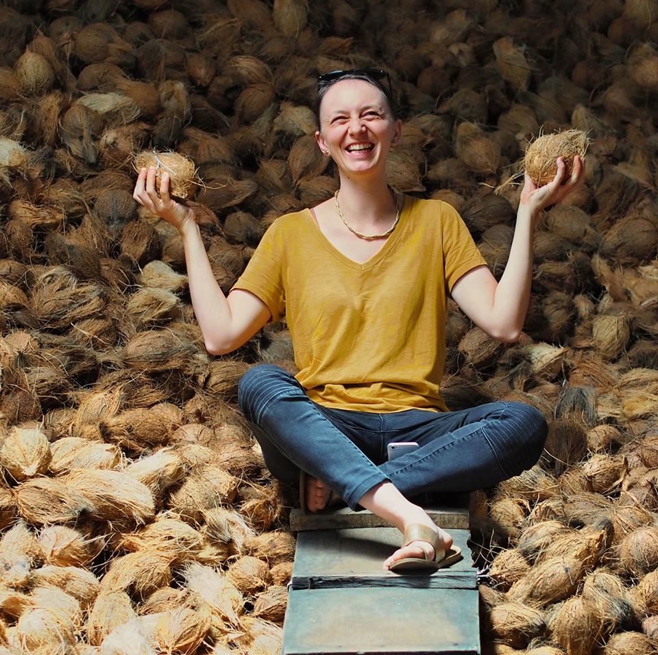
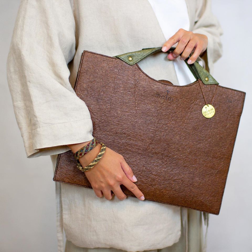
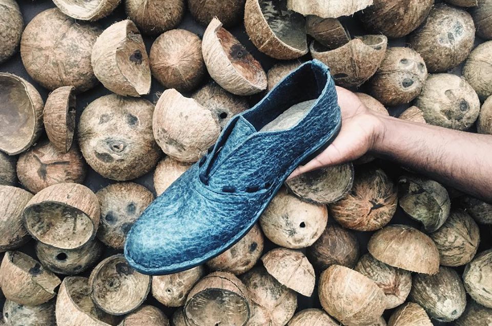
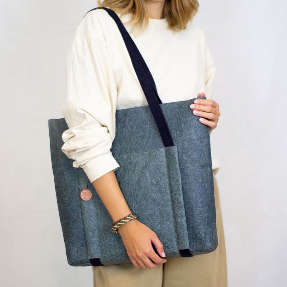
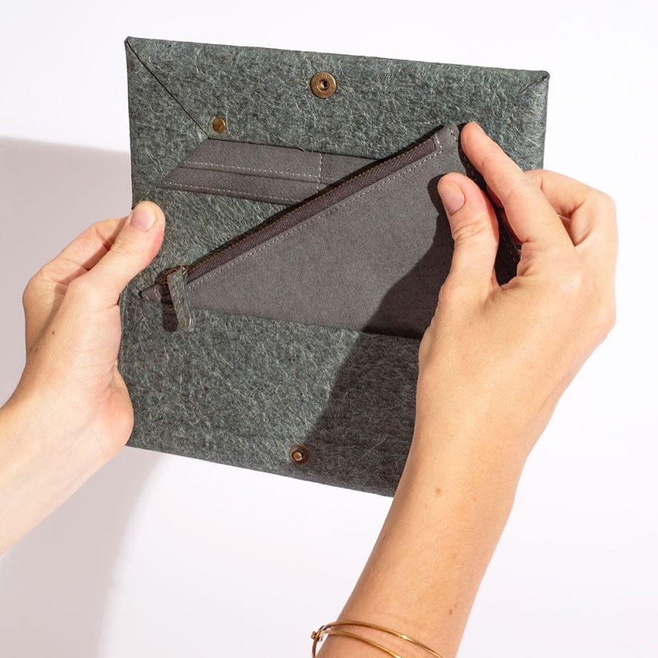
She founded the Malai brand together with an Indian mechanical engineer: she wanted to manufacture a plant-based material that can serve a viable alternative of the leathers used in the textile industry. They found their solution in Kerala state of India: they collect the coconuts destined to be thrown away from local farmers, then release some bacterial cellulose onto the coconut water that has become unnecessary, and the bacteria do their job within approximately 12 to 14 days. Then they enrich the gel-like material with vegetable fiber, so that the durable and flexible material will be easily malleable later on.

Last fall, they raised almost EUR 20.000 in the framework of a successful crowdfunding campaign for the further development of the brand. Zuzana Gombošová talked about the project at the TEDxBratislava and the Eastern Design Conference events, amongst others.
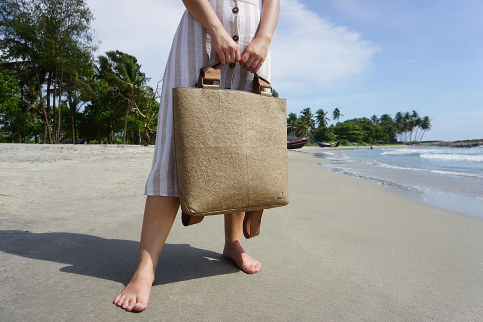
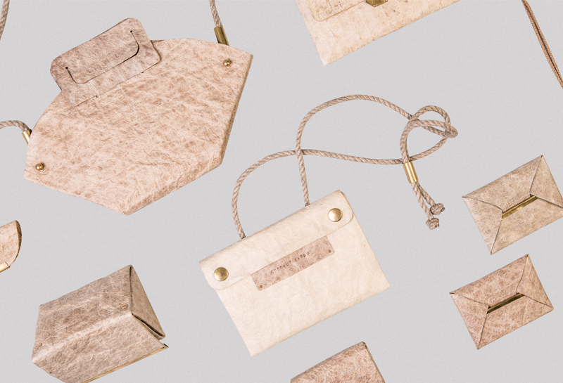
The team of Malai primarily focuses on material experiments, but a few fashion accessories also emerged in their selection (bracelets, wallets, backpacks, tote bags, fanny packs), and one or two prototypes already saw the light, for example Czech designers Lucie Trejtnarová and Eva Klabalova designed a sandal using the Malai material. In terms of its properties, Malai proved to be a high quality and durable material, which is also hypoallergenic and waterproof. On top of it all, vegans can enjoy it, too!
Milk Design Directors
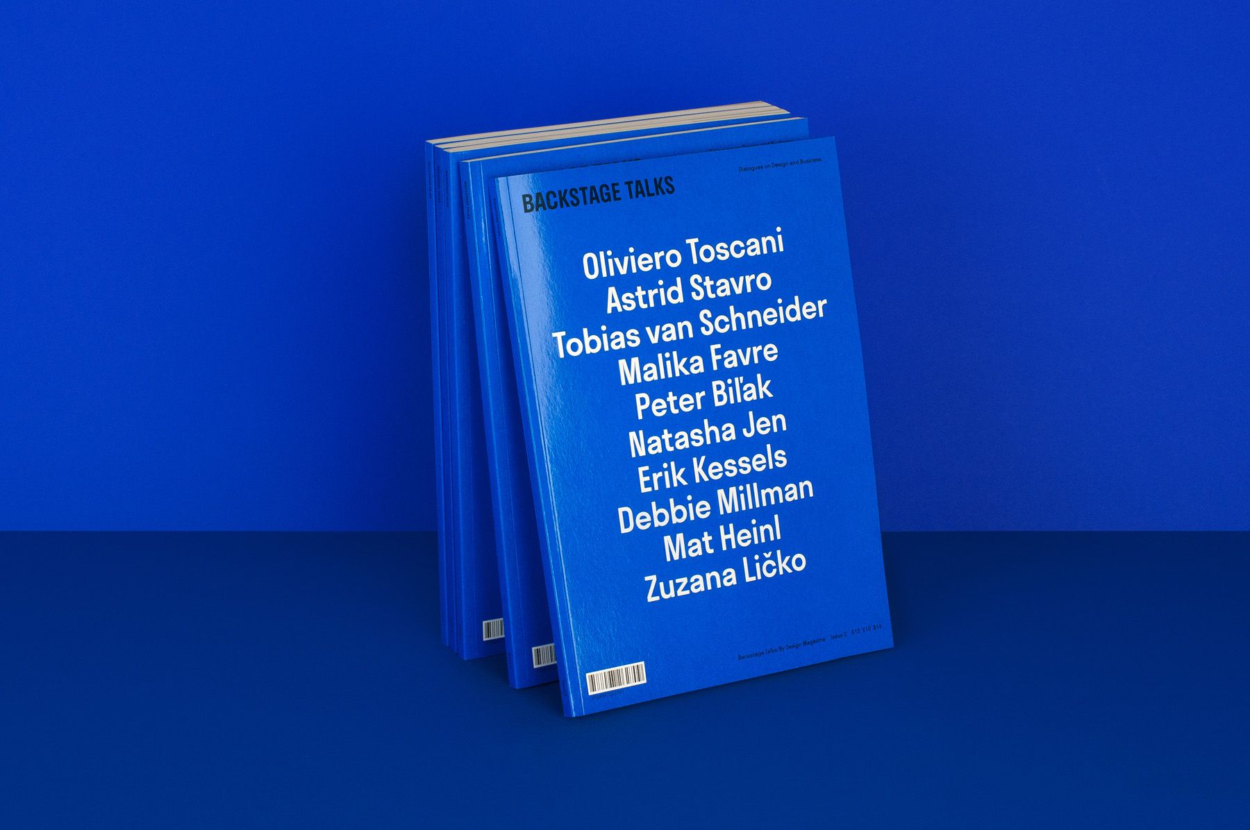
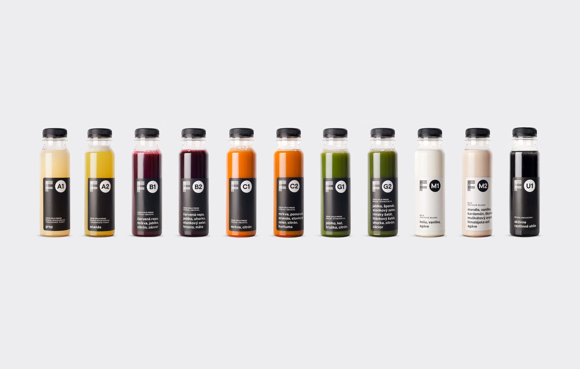
We have already talked about the IASAI food bar in Bratislava in one of our previous articles: then and there we focused on the interior design of the restaurant, and only mentioned the team responsible for branding, Milk Design Directors, yet, as it turned out, they have quite plenty to offer. Let’s begin with the fact, for example, that in addition to their countless projects, they also have their own design magazine, the Backstage Talks (we would also be happy to grab a copy) and they are co-founders of the By Design Conference event in Bratislava, where such hotshots will hold talks in 2020 as the art director of MUJI, Kenya Hara, or Fabian Hermann from IDEO. Wow!
The choice of name is not a coincidence for sure, either: the Design Directors name suggests a team work where the designer does not only offer solutions for the visual demands of the client, but approaches from branding and business, and calls the toolbox of design and visuality for help. Approximately 20 young people work at Milk, not only designers, but experts of business development, business strategy and copywriting, too.
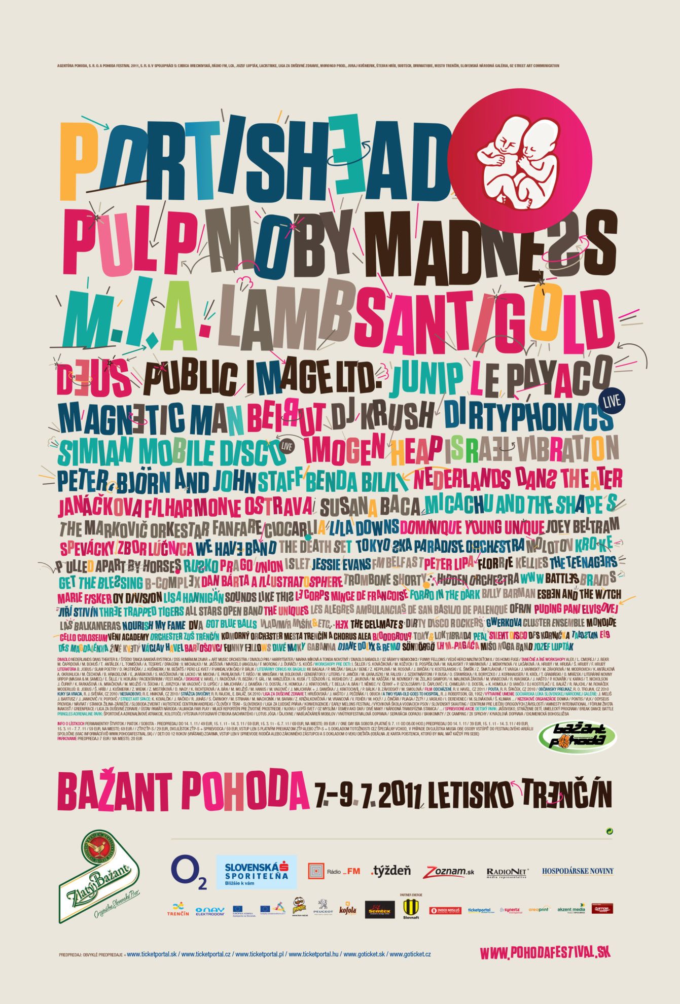
May it be branding, visual identity, art direction or concept creation, the small team will have no problem tackling it, for sure. The largest and most popular music festival in Slovakia, Pohoda also became visually exciting owing to them.
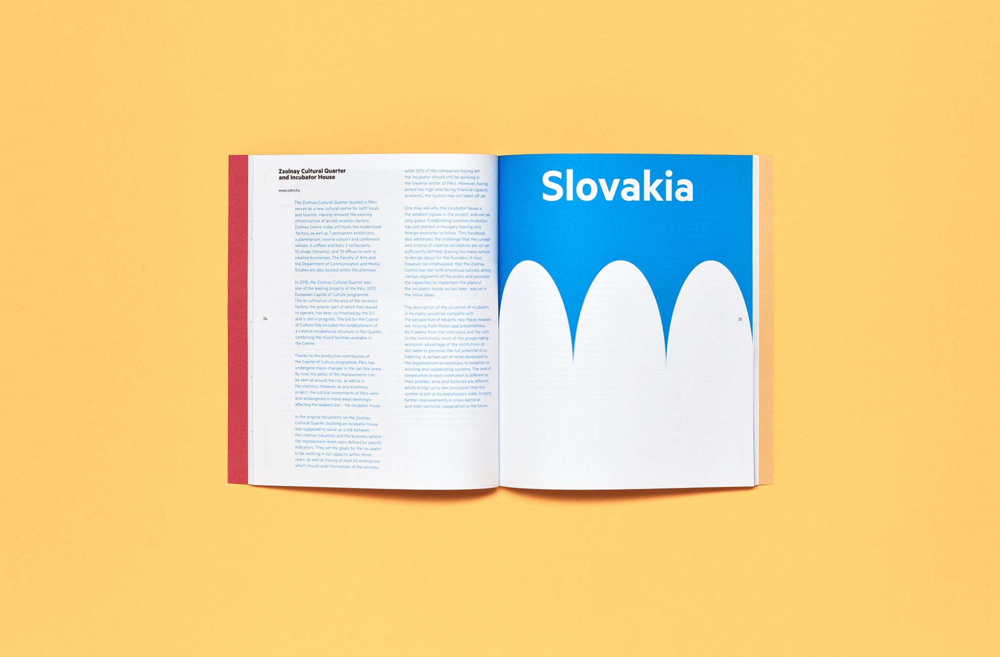
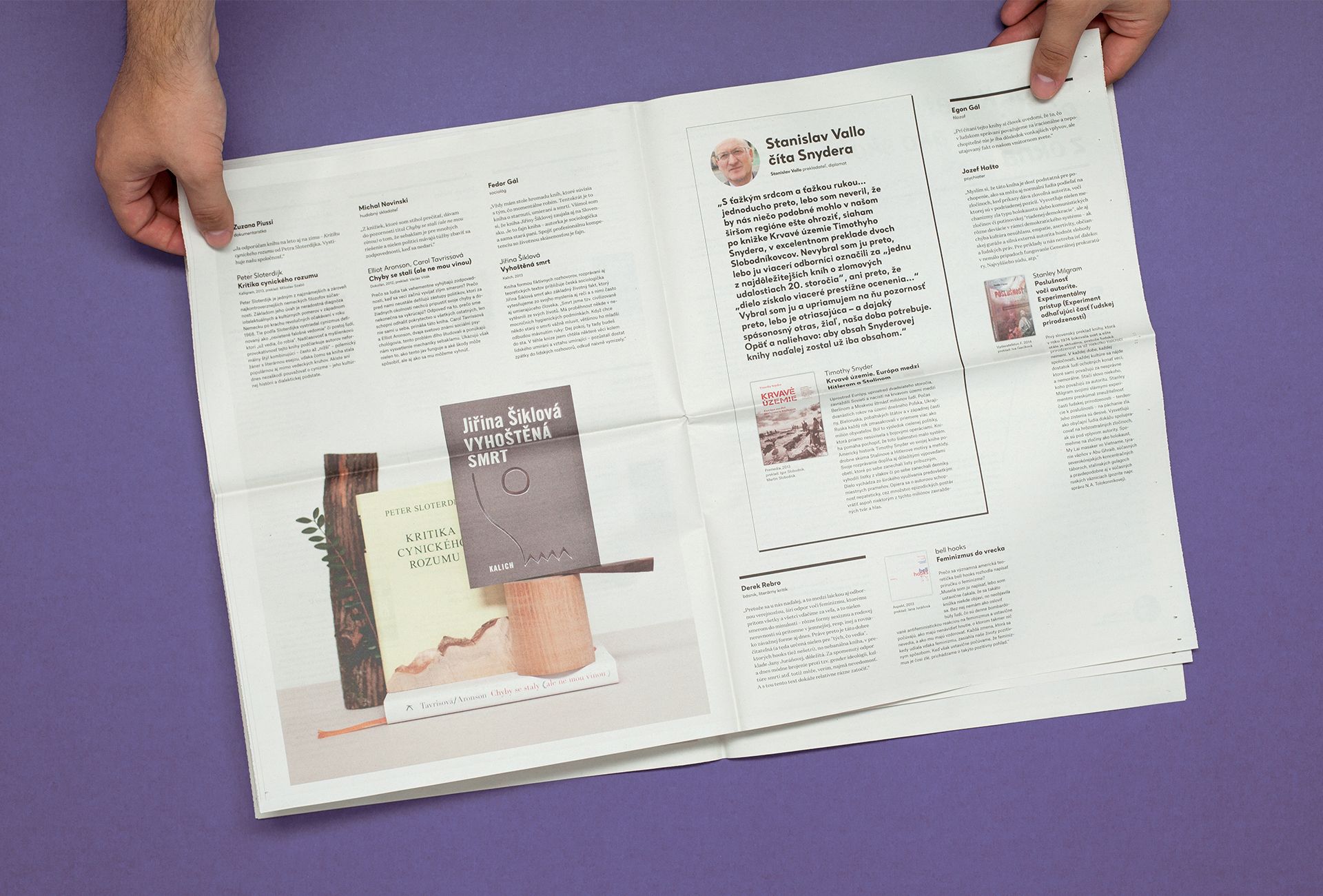
Speaking of Milk’s own magazine, we must say that they are pretty good at desktop publishing, too: they designed the self-published papers of Artforum book stores, and the publications of the Nová Dráma festival, too. We also found a special issue of Creative Incubators introducing the institutions operating in the V4 countries. Take a peak!
uniformarchitects
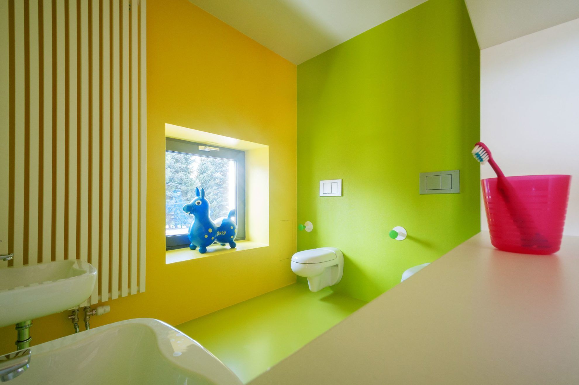
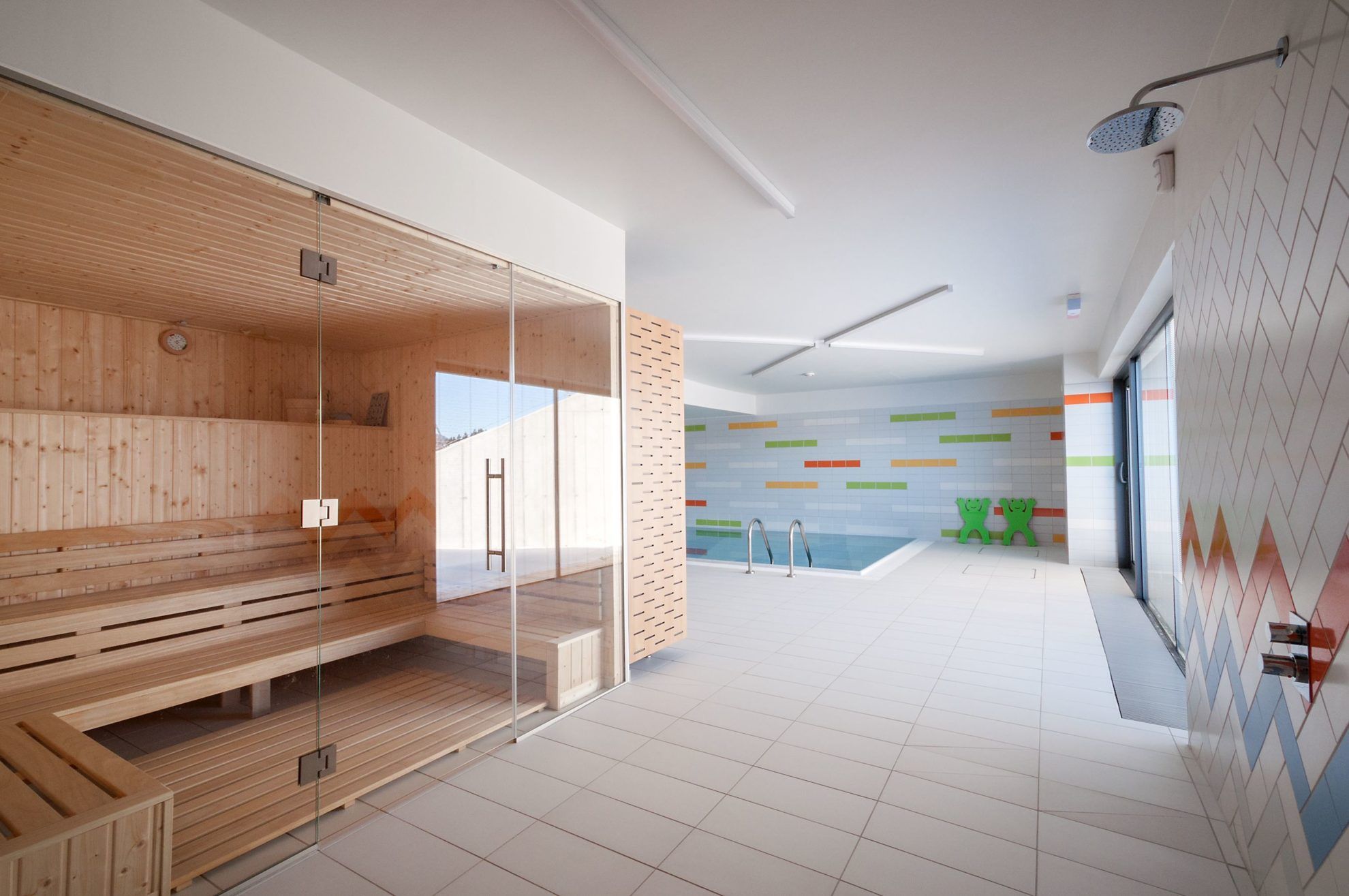
There might be something in the air in the Czech and Slovakian areas in terms of kindergartens. We already showed youthe Nová Ruda kindergarten built in the city of Liberec in the Czech Republic, and now we found another gem, this time in Slovakia. When we saw the kindergarten designed by the architects of uniformarchitects for the first time, we were left speechless. A pool, a spa, a climbing wall – no, these are not the extra services offered by a newly-built residential park, but the accessories of Guliver kindergarten in Banská Štiavnica.
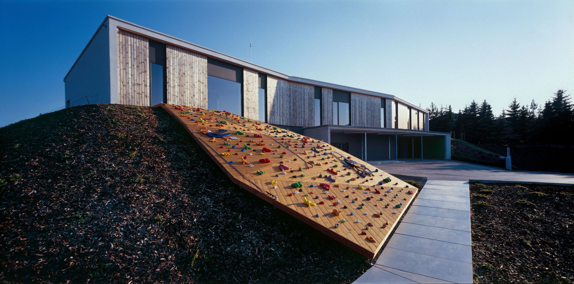
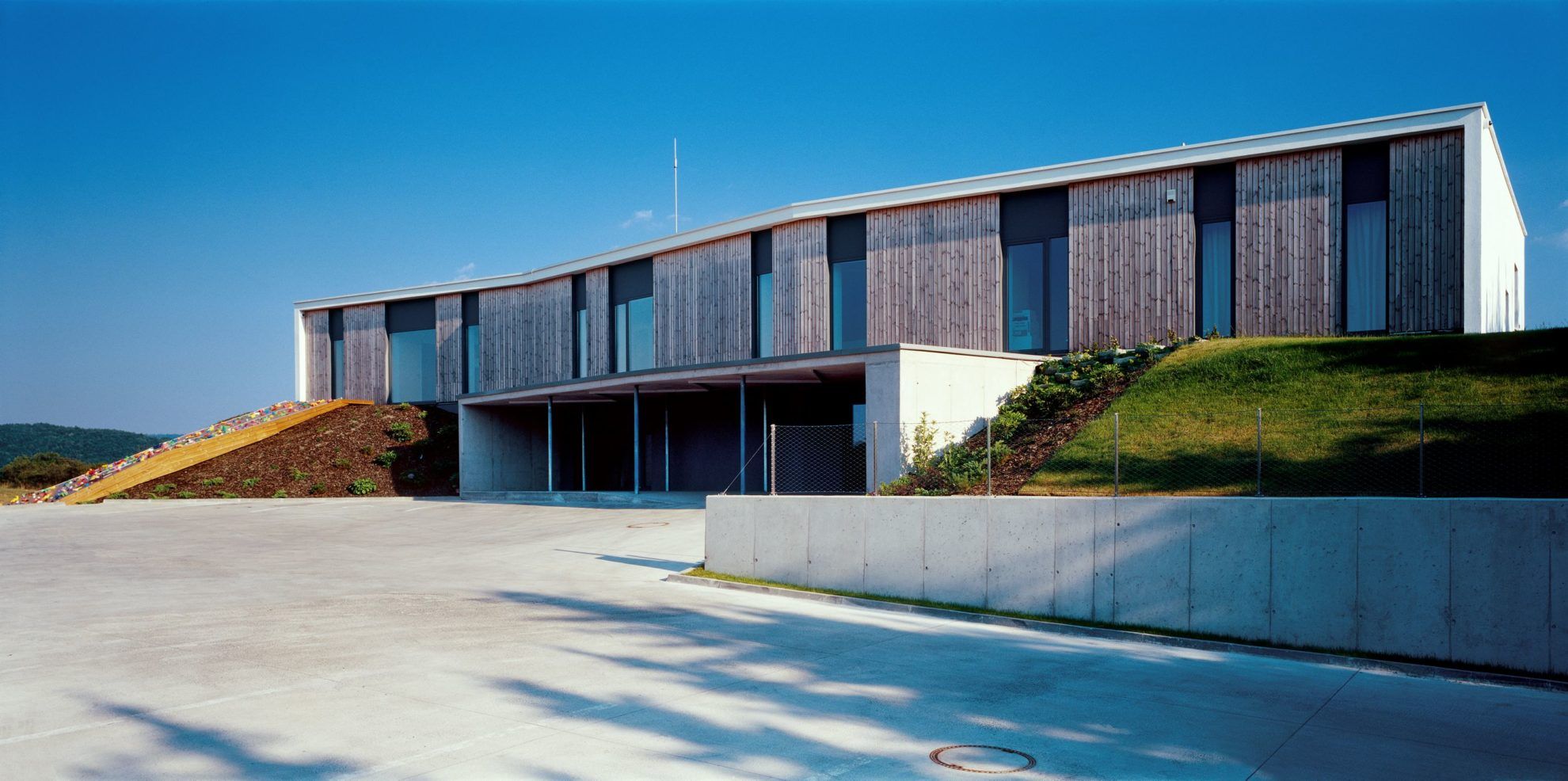
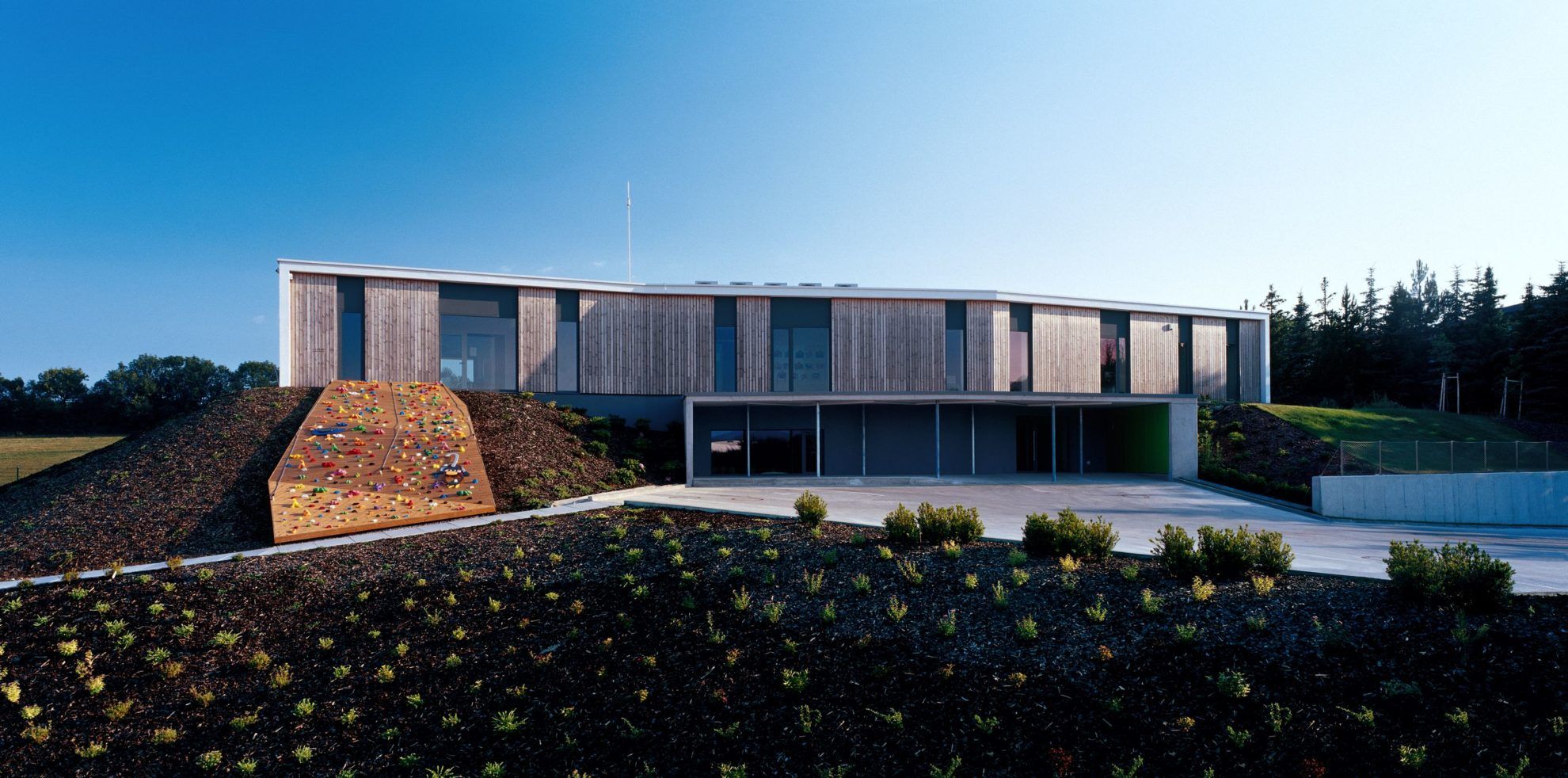
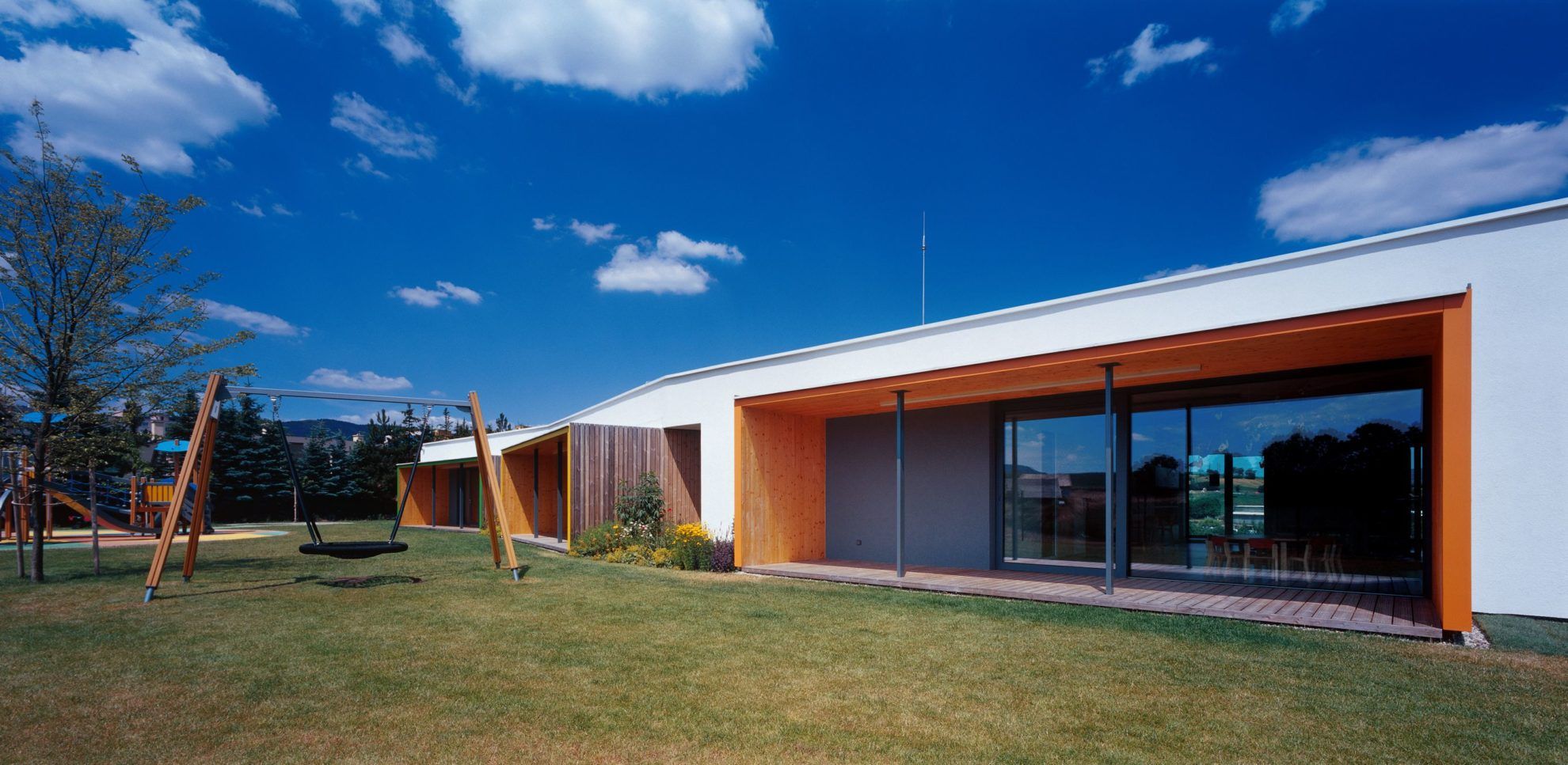
The two-story building built within 9 months altogether is embedded into a hillside. At the first sight, we would not think that it is, indeed, a kindergarten: the large parking area established in front of the building and the spacious loggia is elegant and generous.
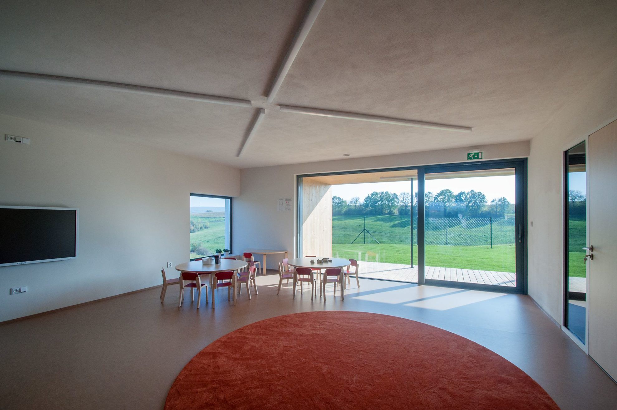
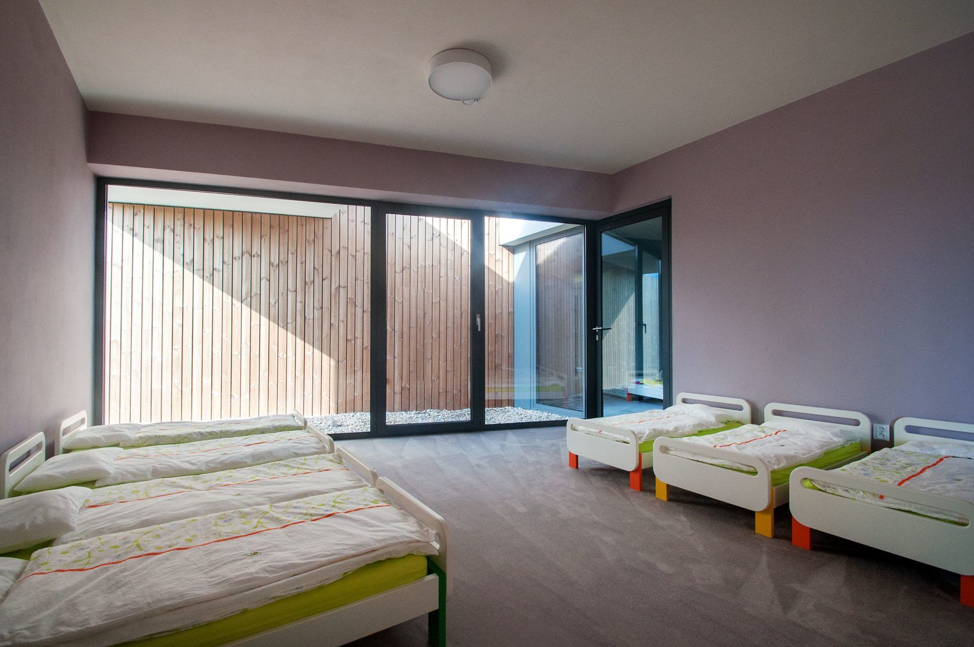
This forefront does not reveal the actual function of the building to those arriving – the safe and protective space of the kindergarten becomes clear to us on the southern part of the building (the group rooms open to the large backyard). Ground level gives home to the changing room, the diner, the gym and the spa with a pool, while the bedrooms, the group rooms and the play rooms are situated on the top floor. We would basically define the building as minimalistic and plain, but by no means boring – let’s just take a look at the colorful loggias opening to the backyard. We would be happy to move into this one, too!
Michal Slovák
If we had to list Slovakian spirits, we are almost certain that Tatranský čaj would be on the top of the list. Now we show you just another that is worth remembering: as, surprising as this may sound, there is life beyond the herbal liquor, too. The premium rye palinka of the Morho brand not only interests us because of its alcohol content, but also because of its packaging (the brand name, by the way, is a reference to the poem of one of the most popular Romantic Slovakian poets, Samo Chalupka, with the same title).
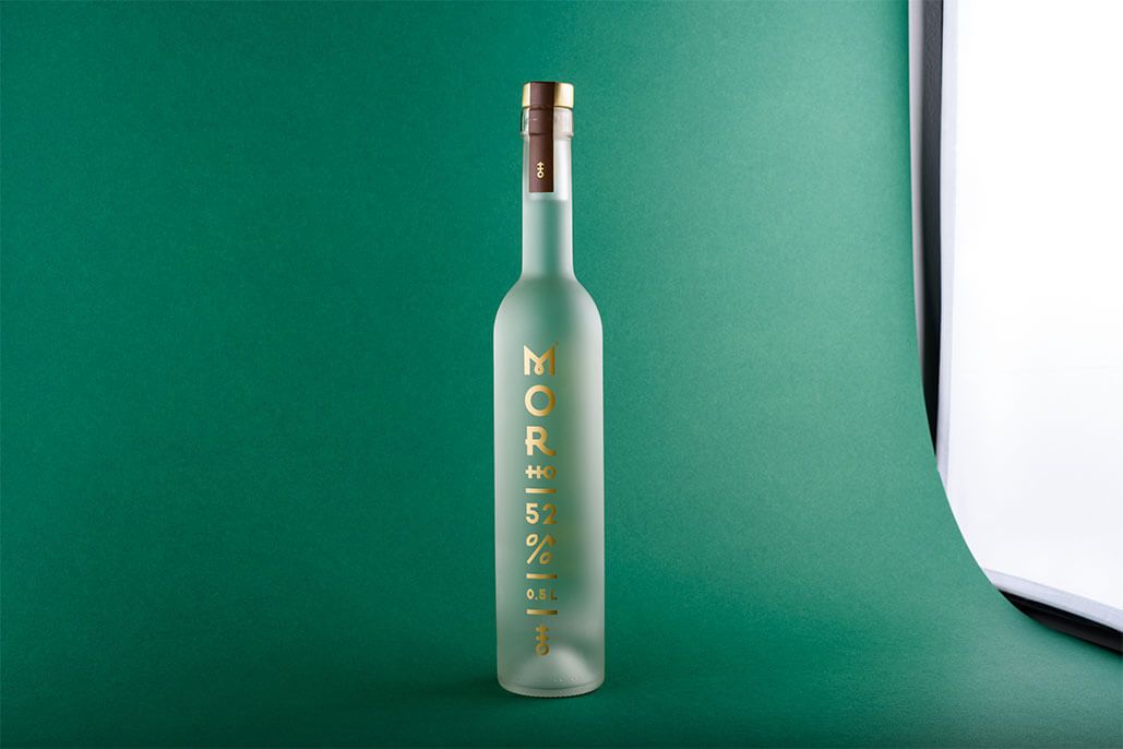
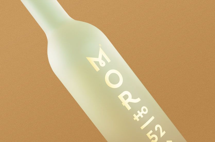
The company invited graphic designer Michal Slovák to design their image and the packaging, who achieved the elegant and minimalist look by finetuning and reducing traditional Slovakian folk motifs. The vertical layout of the signs gives just another boost to the long-shaped form of the bottle, and the “HO” hidden under the “MOR” almost transforms into a visual sign: it could make us think of a flask or a Slovakian coat of arms (this also recurs a bit lower, in the bottom part of the bottle, as a way of closing the design). Something quite similar happens with the % sign indicating the alcohol content – here the axe motif taken from Slovakian folklore is complemented with two rye grains.
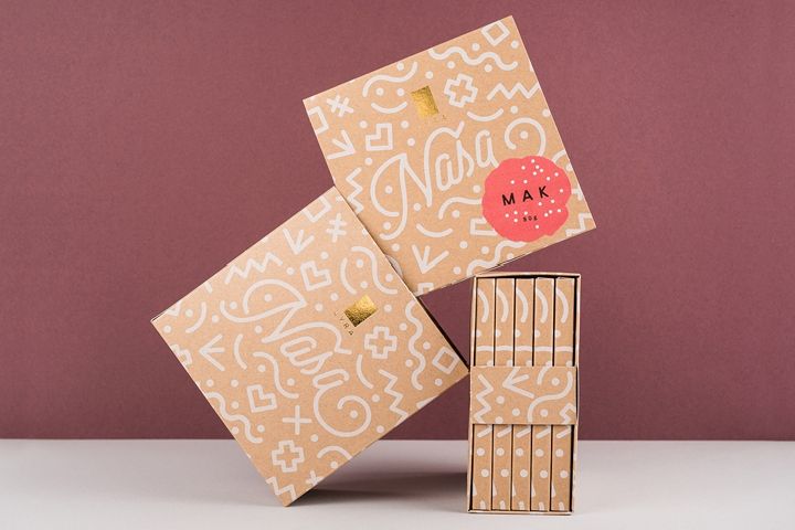
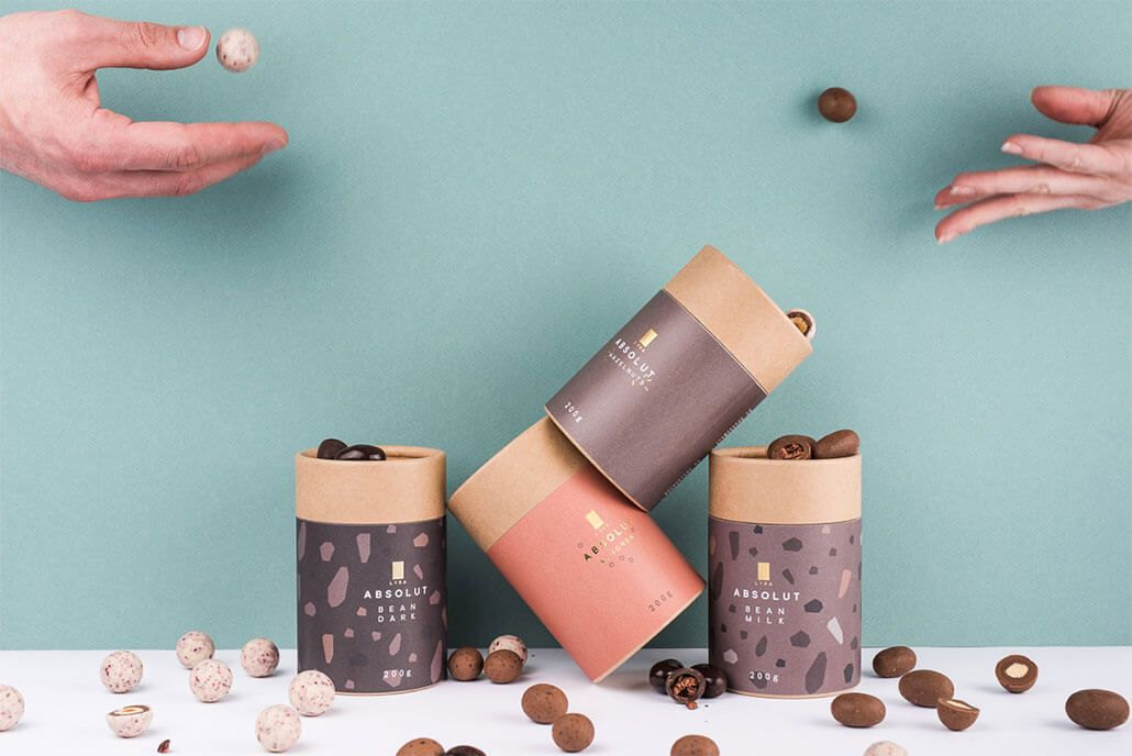
Michal Slovák has been working as a graphic designer for almost 10 years, and has already worked in New York, Melbourne and Honduras, too. As illustrated above, he specializes in branding and packaging design. He won several international awards for the packaging of the artisan LYRA chocolates, including for example the Packaging of the Year award in 2017 and the WorldStar Packaging Award, too.
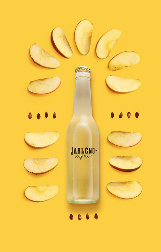
In 2013, he and his friends decided to launch Slovakia’s first cider. This was Jablčnô, the image of which, of course, was designed by Michal. They purchase the base materials from a little settlement in Slovakia, Karva, and they don’t use any artificial flavor enhancers or coloring. Therefore, the Jablčnô brand has nothing to hide, which is also reflected by the transparent label on the bottle.
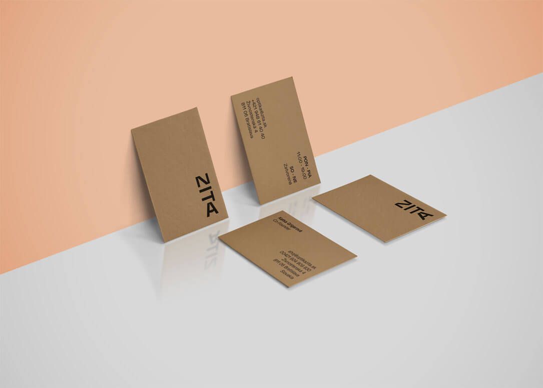
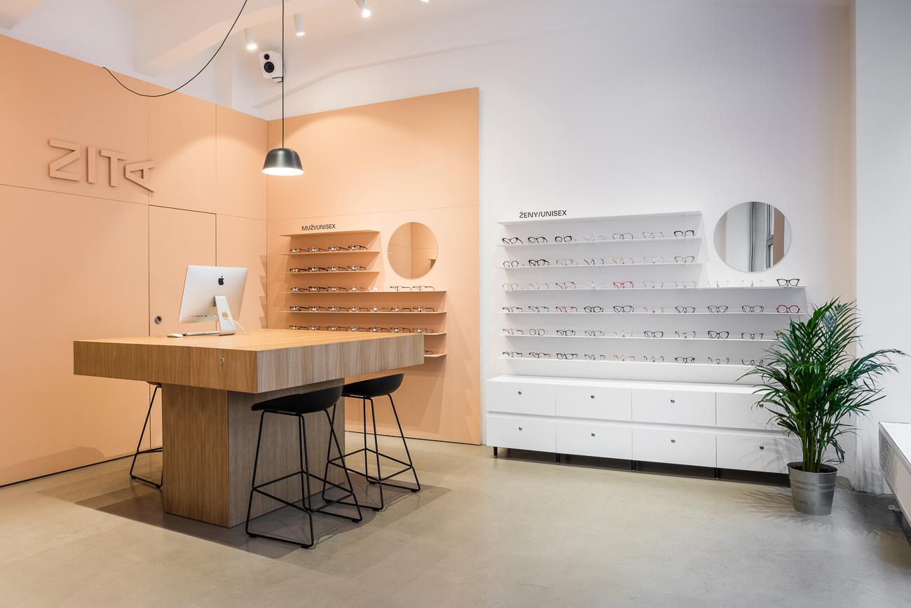
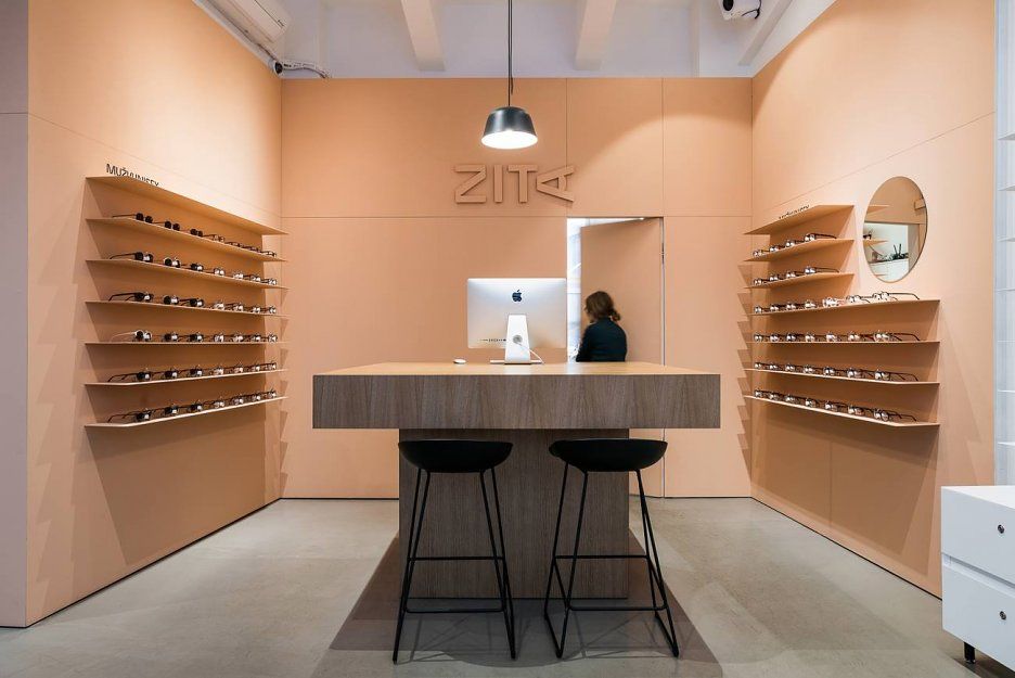
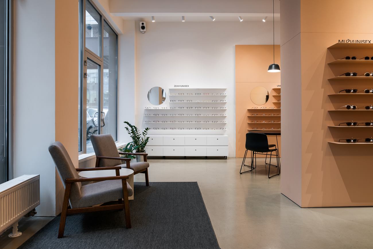
Another work of Michal that we are quite fond of is the image of an optics store in Bratislava, ZITA once again dominated by minimalist style, with a slight visual twist.

DORKA BAGS
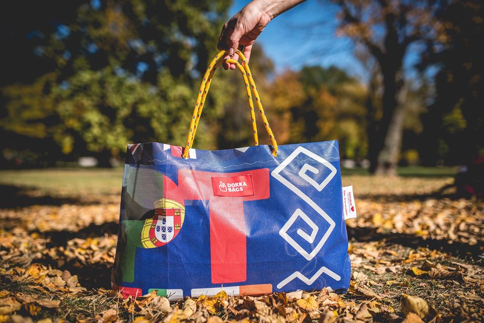
While we were checking out the Facebook page of one of our favorite Slovakian design events, the Eastern Design Conference, we noticed some really fine-looking bags. It turned out that the organizers offered the banners used in last year’s festival to the DORKA BAGS brand, who gave new life to the advertising sheets in the form of bags. One could say there is nothing new under the sun, as our Hungarian favorite, Medence Group also built their design company on this concept.
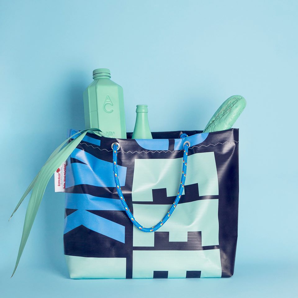
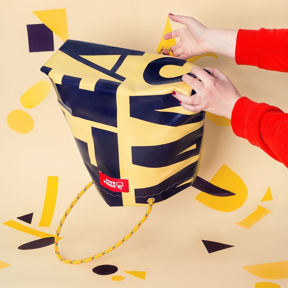
However, in the case of DORKA BAGS, they do something more than the usual recycling: these bags are created in a women’s shelter, Dorka Center in Košice, by battered women and mothers. It is a good example of how a design brand can be socially sensitive and useful for the society: here not only the banners of different color and size, but also the women working next to the sewing machines get a second chance for a new life. This is how each and every recycled bag has its own story (also being the motto of the brand: „Taška, ktorá má príbeh” that is “Bag with a story”).
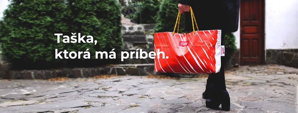
There are several Dorka Centers in the big cities of Slovakia, including Prešov, Zvolen and Ružomberok, too, but so far the bags with the label DORKA BAGS are only created in the center in Košice.
By purchasing the bags, buyers can also support the women, mothers and children living in the homes. They don’t have a separate online store, but you can purchase on the Etsy of the Slovak, if you would like to support the work of the organization.
In our weekly series, we present the Czech, Slovakian and Polish brands and design spots that we consider worthy of being placed on our mental design map. It is a guide for those looking for something other than usual tourist sights.

BIO 26 | Design Biennial in Ljubljana
HYPE | Weekly program guide
