“There’s only one room left!” Familiar, right? Especially now. We fall for tricks like this, voluntarily or unintentionally. But what exactly are these and how can a promotional message be ethical? Experts from Frontira tell us.
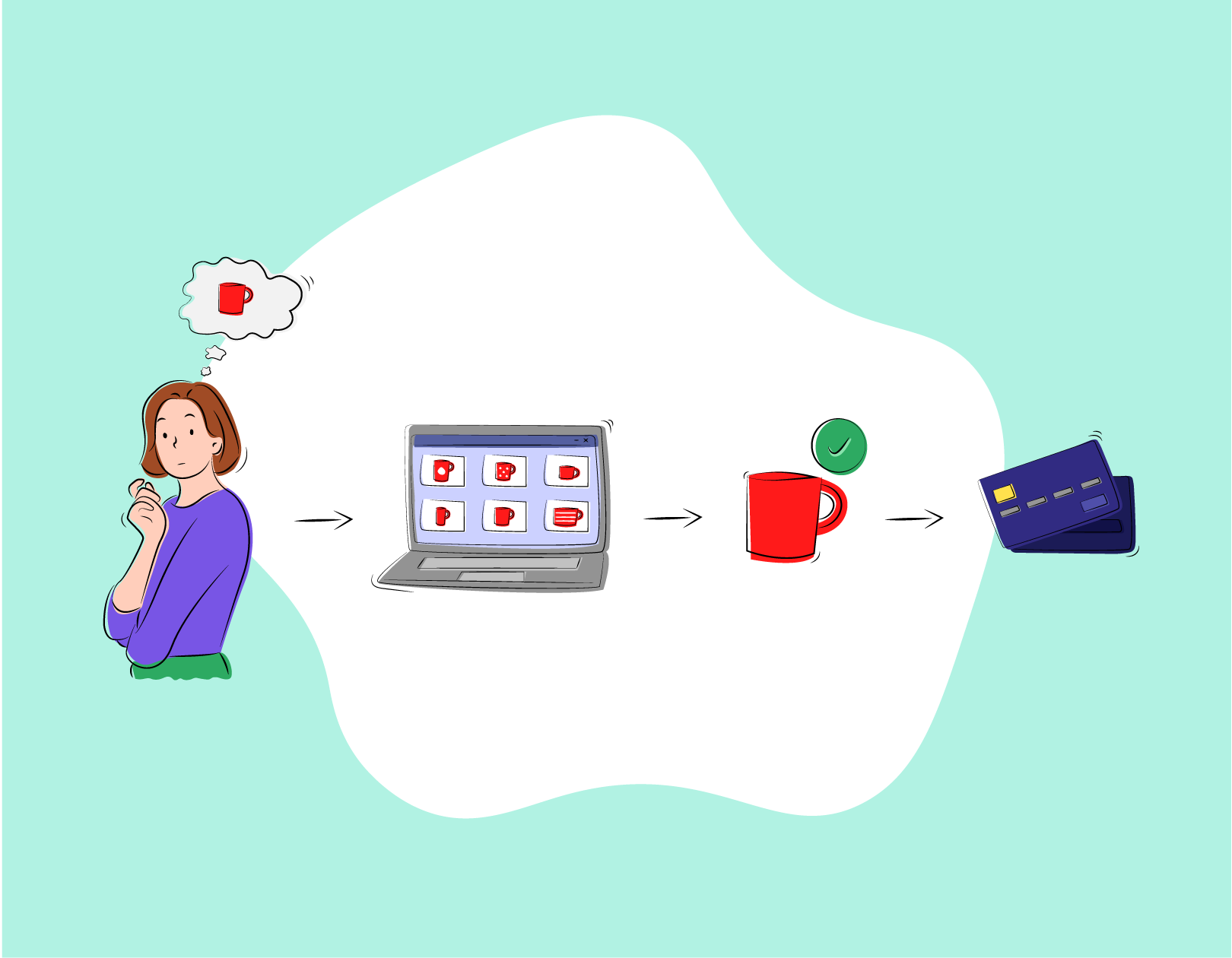
After a long time we are looking for the tickets again, we are just getting ready to fly to Porto at the end of the summer. During the coronavirus epidemic, I almost forgot how annoyed I could be in this process: extra offers waiting to be rejected one by one, hard-to-find free chair allocation, random administrative costs getting into the cart. Everyone is annoyed by them, but this dark side of airfare doesn’t want to go away. Therefore, in the course of our joint work with Szallas.hu, we developed the CROC framework, which helps websites to get rid of their dark patterns.
What is that dark pattern?
Dark patterns are digital messages and user interfaces that unobtrusively persuade people to make unwanted decisions. The term was coined a few years ago by UX designer Harry Brignull, who recognized that some websites combined tools of design and psychology to mislead users.
Brignull originally identified 12 types of dark patterns, such as the appearance of hidden costs at a service, products that pop into the cart, or harmful default settings for which the user does not actively decide, for example, to subscribe to a newsletter or purchase a service, but is set by default.
It is not easy to recognize dark patterns
However, it is not easy to determine what makes a surface harmful, that is, becomes a dark pattern. This is because these tools build on psychological phenomena that often make our daily lives easier in other situations. Let’s take a look at an example!
If we go to the market and have to choose where to buy the apricots, we are not comparing the apricots of every vendor as this would be mentally very tiring. Instead, we might rely on some simple rule of thumb unnoticed for ourselves, such as going to the same place as last time or looking at where the biggest line is. These simplifications help us not to waste too much brain capacity to make these decisions. Because of the same mental rules of thumb, we may tend to fall for the dark patterns.
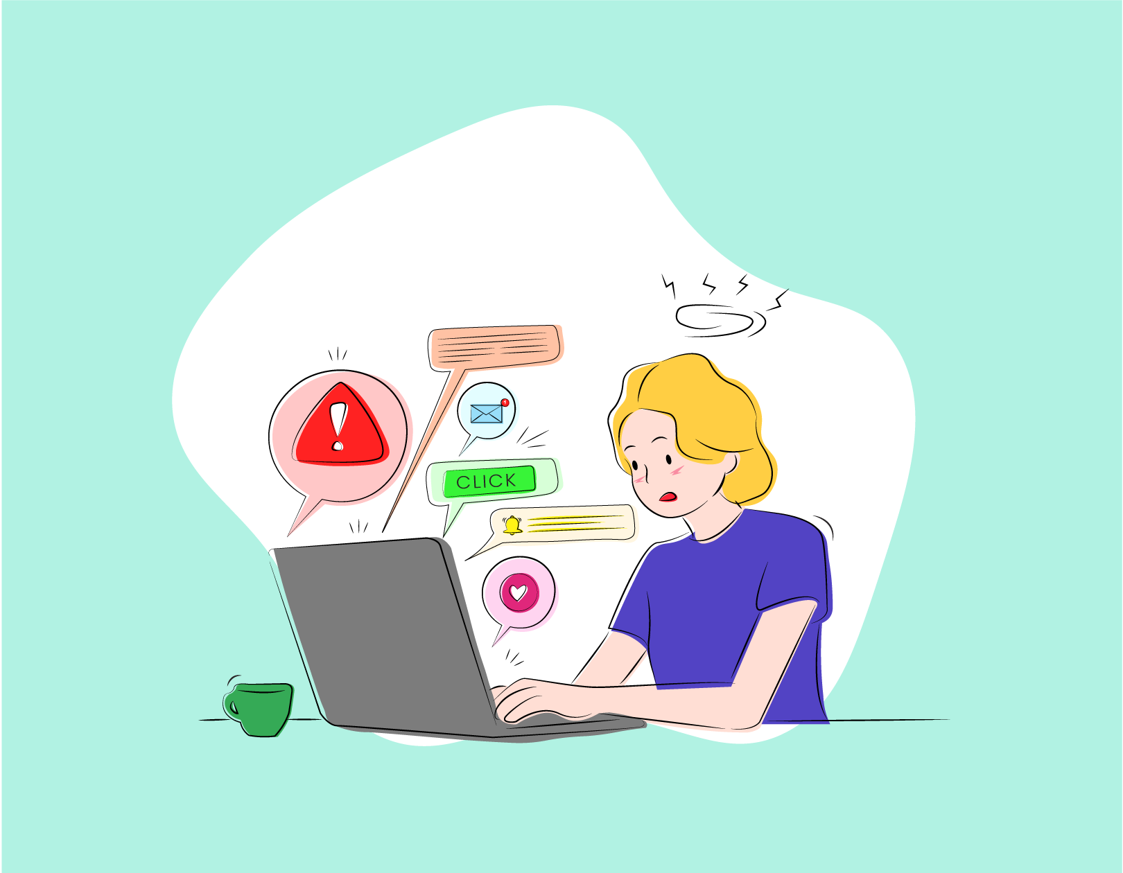
For Szallas.hu, we specifically examined what promotional messages used on online interfaces can become unethical—if you like, a dark pattern. If you’ve already booked accommodation on any of the major accommodation aggregator sites, you’ve probably come across plenty of such promotional messages already. “There is only 1 room left” based on the so-called scarcity effect, evoking from our brains the rule of thumb that we should seize hard-to-reach things; while the message “10 bookings in the last 1 day” draws our attention to what is a good decision by others with the help of social proof.
These messages can sometimes move the user over the deadlock, but in some situations they can put unethical psychological pressure on them, causing him to make a purchase or booking decision in a way that he may regret afterwards. But how do you decide if a promotional message is ethical or not?
The CROC-framework
Under the CROC-framework, promotional messages appearing on websites or in communication must meet four interdependent aspects in order to be ethical.
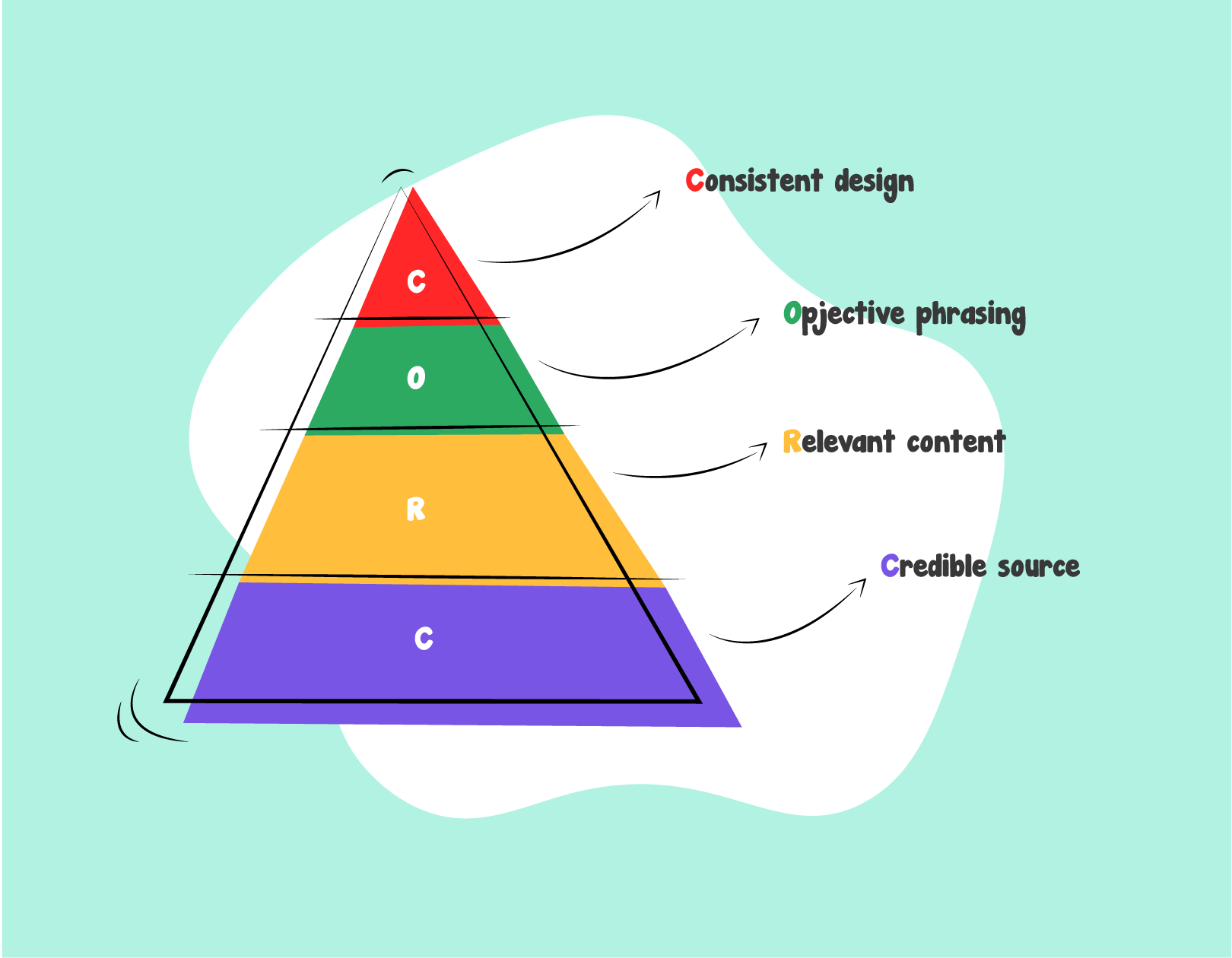
1. Credible Source
The first and most basic aspect is not to lie to the user. Not only does it matter to display authentic data, but also to make the information credible. For example, just how many people are planning to book a hotel room doesn’t seem authentic because what made the page infer what visitors wanted? In contrast, if we show how many accommodations have been booked in the last month, we can tell clearly, and this figure shows the popularity of the accommodation in the same way.
For example, instead of “A person plans to book here” it could be “5 views in the last 1 day”
2. Relevant content
The purchase or use of any service is part of a process (user journey) that the user goes through. For example, buying involves creating a need, being inspired, choosing the right product, and paying.
At some point in the road, it doesn’t matter what information or message we show the user. We can even confuse, for example, if we show a sold-out product in the results.
For example, instead of “Unfortunately you missed this” it could be “Out of stock—Show availability”
3. Objective phrasing
It does not matter if a message contains true and even relevant information if its wording in some way discredits it. This is why the message should avoid subjective, value-judging wording and strive for as factual wording as possible.
For example, instead of “Very popular!” it could be “5 reservations in the last 2 days”
4. Consistent design
Last but not least, it also matters how we display the messages. For example, if a promotional message is just as red as the error information, it can be misleading to the user. Compared to our previous experiences, the more surprising a form or unexpected place we encounter it, the more likely it is to cause stress.
Why should a designer know this?
Imagine a three-legged chair with the first leg of the design, that is, how user-friendly a site is, how easy it is to find, subscribe, buy something. The second is the economic leg, as a service provider has to make a living from something. Finally, the third is the ethical leg, that is, how much it manipulates the purchase of the user in terms of design and economic interest.
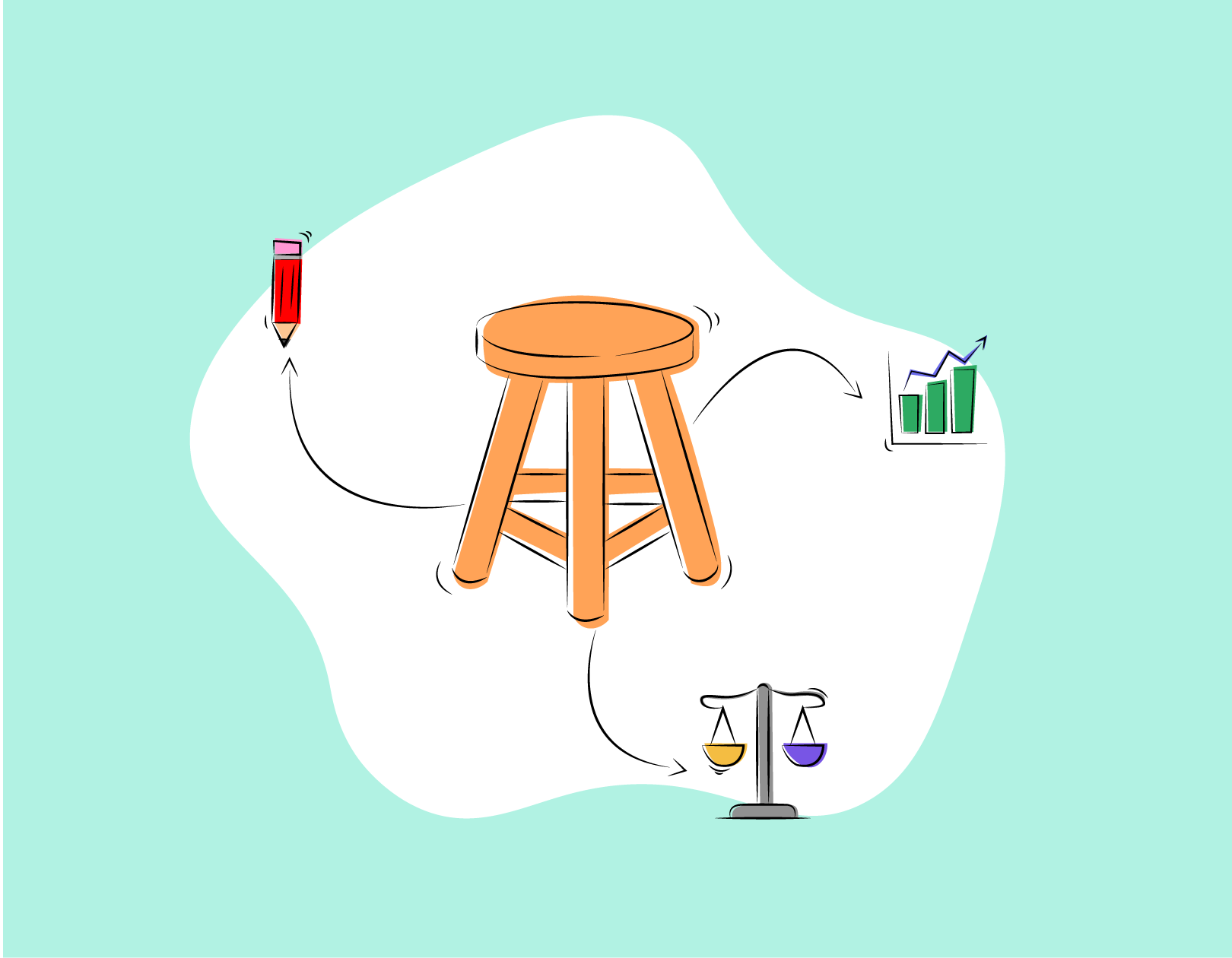
If one of the legs is too short or possibly too long, our chair will already start to sway and if we are not careful, it may tip over. It is not advisable to shorten or cut the ethical foot in the long or short term, as it can ruin the brand experience if the customer leaves a page with bad feelings or regrets the purchase after. Our goal is to build a long-term good relationship, but by manipulating it, we are undermining loyalty. And the quality of the site plays a big role in building trust and consumer loyalty.
The article was written by: Gyöngyi Fekete Product Designer | Krisztián Komándi Consultant & Behavioural Designer | Frontira
Frontira | Web | Facebook | Instagram
In our monthly series, we explore the various fields of design with the help of Frontira to understand the role of design beyond industrial design. What role does design play in building up human behavioral patterns? How can a service be a good experience and what digital product design toolset do we need for it? Calling itself the “company of strange problems,” Frontira answers questions like this, in an exciting manner and comprehensible form.

Stunning buildings of star architects in Eastern Europe | TOP 5

HSUP startup training at MOME was a resounding success