IBM has unveiled a brand new visual identity, showing off that the company is able to renew itself time and time again.
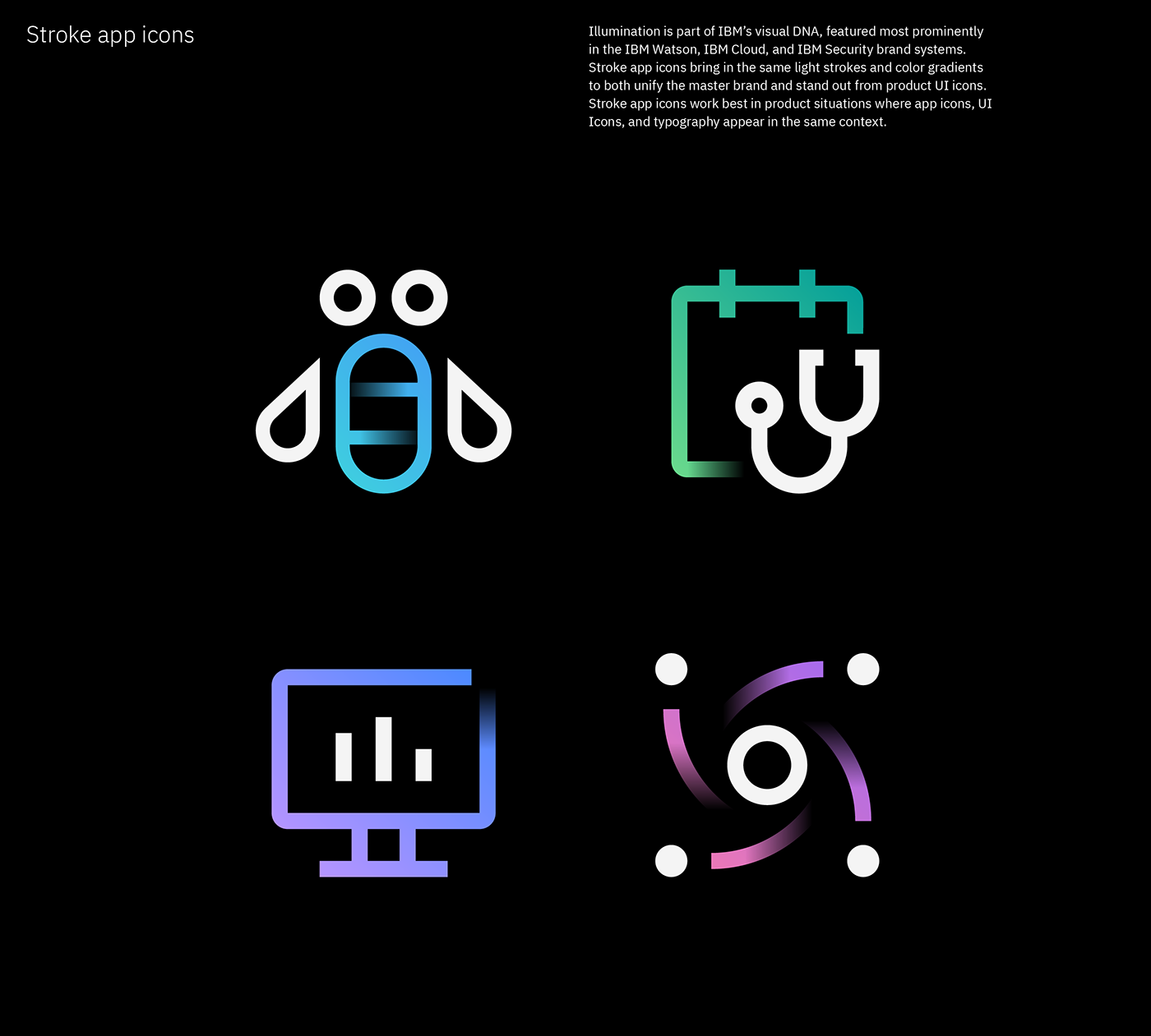
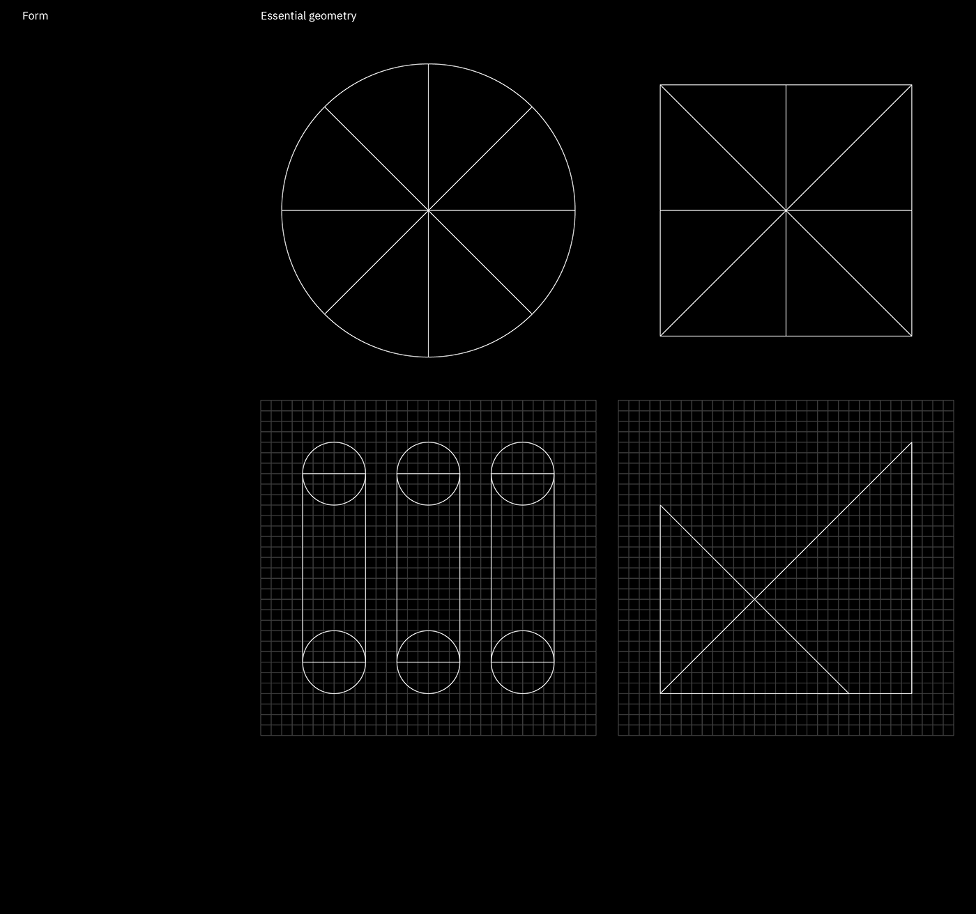
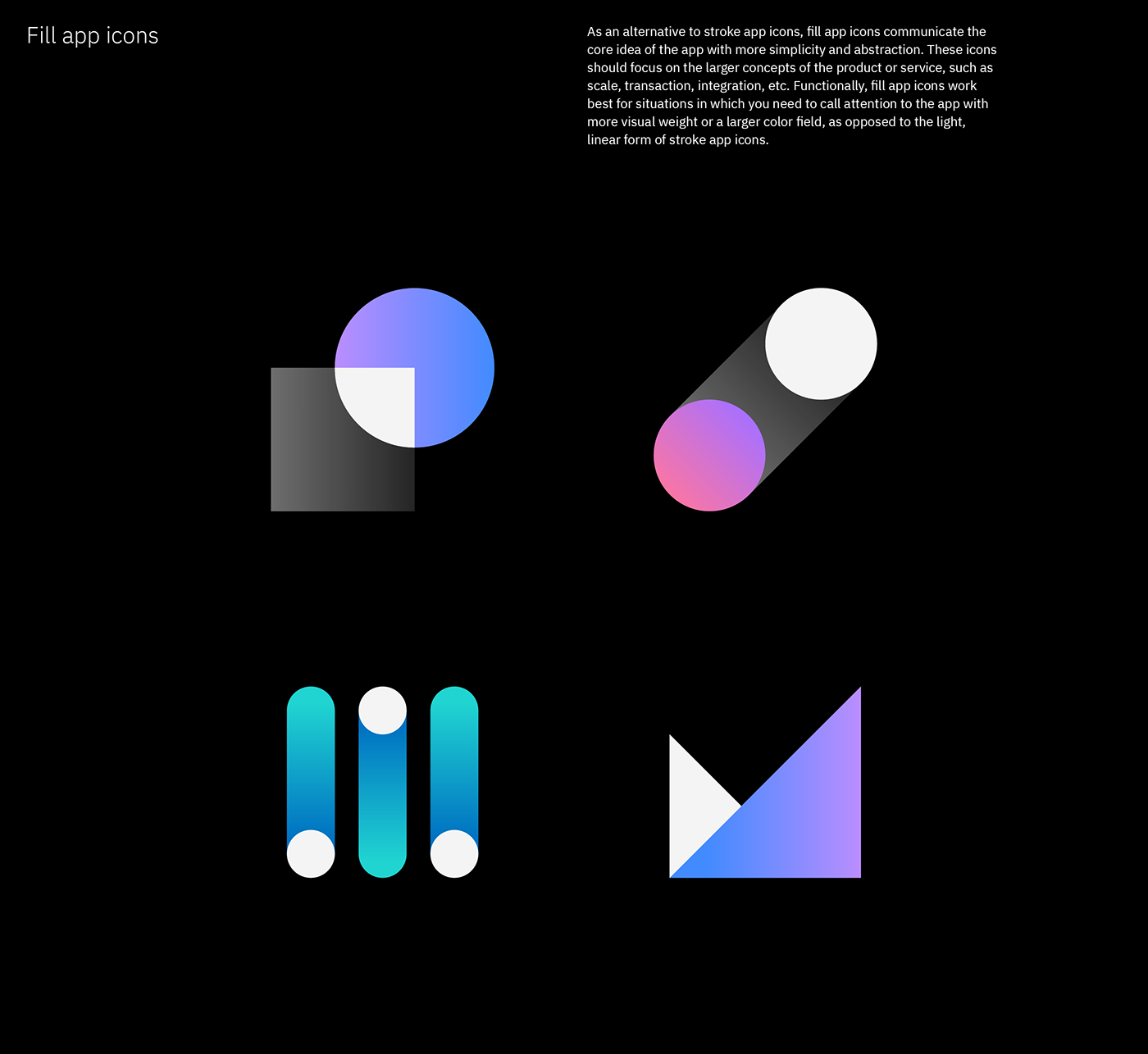
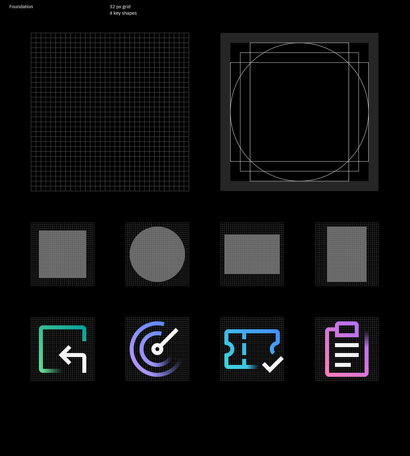
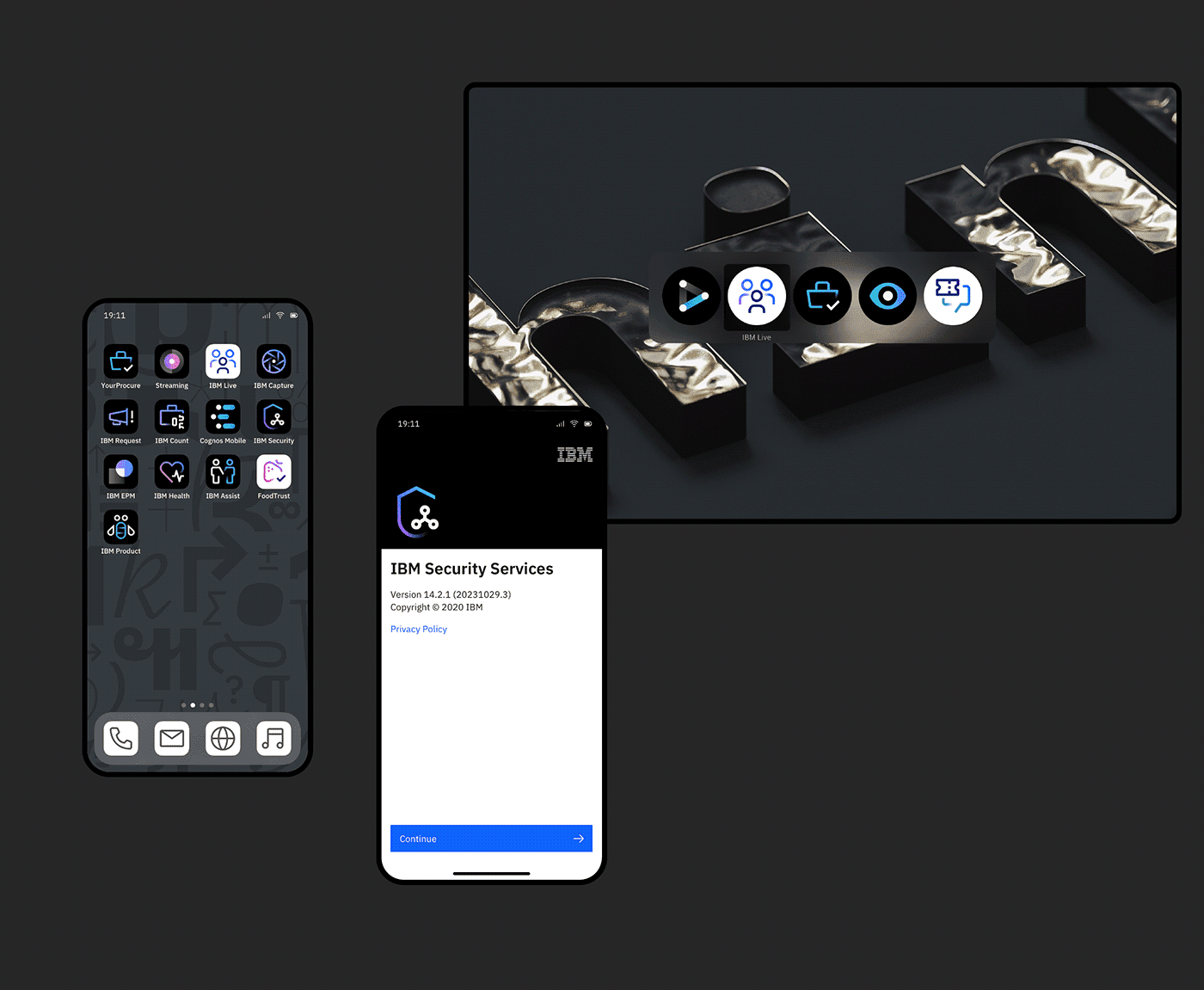
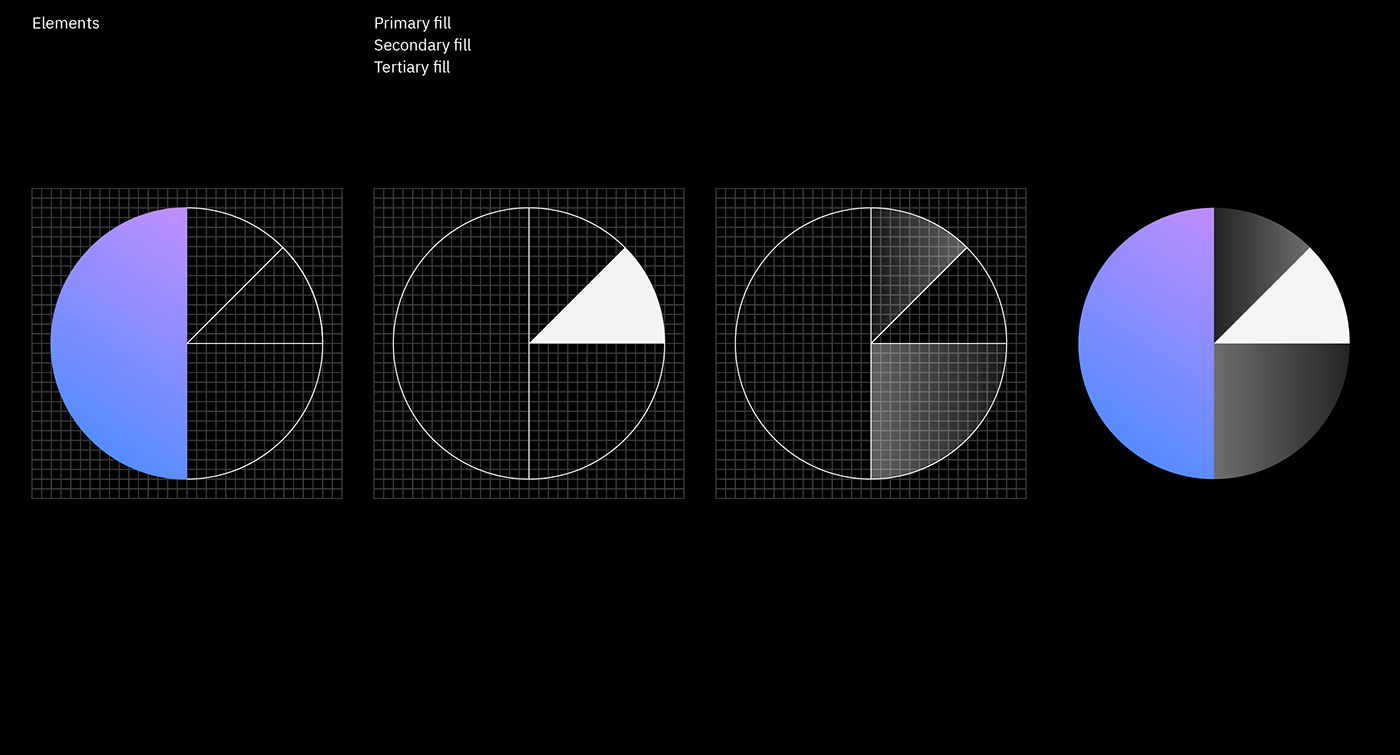
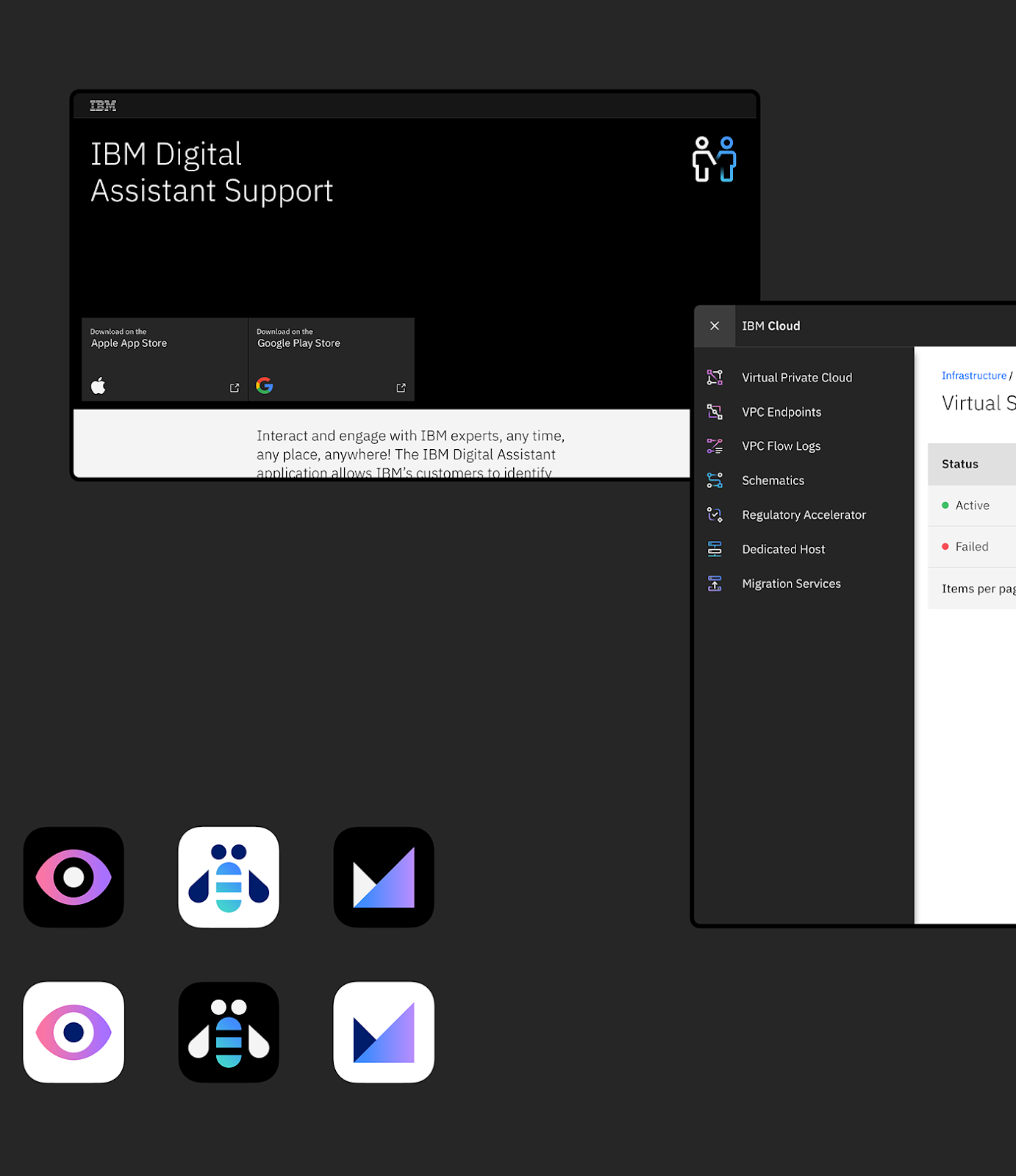
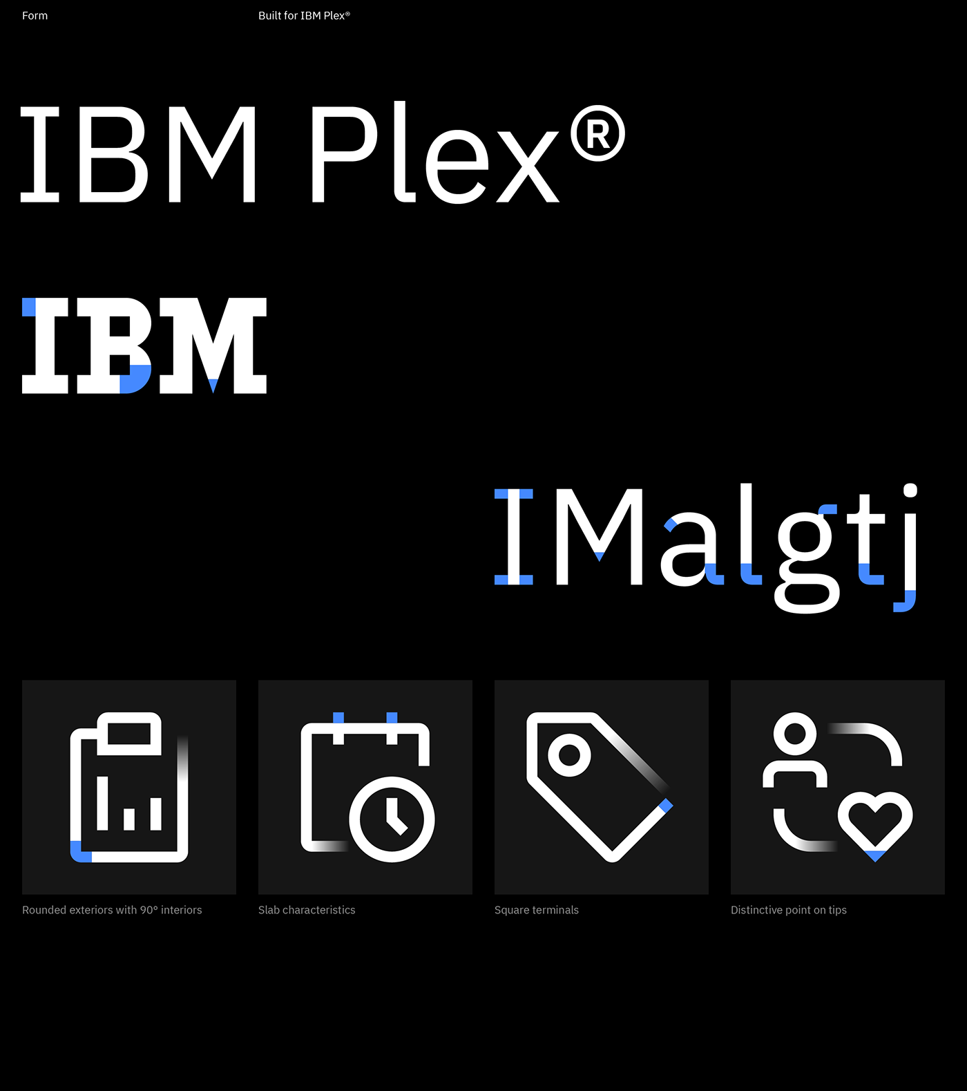
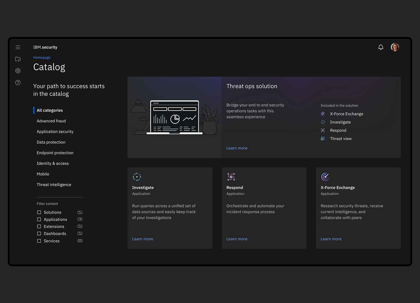
The visual identity of IBM has always been able to show novelty since Paul Rand’s design. This made the firm a reference point not only in terms of technology but also regarding visual communication, similarly to other tech giants. Now Peter Garvin, a member of the firm’s team responsible for brand experience and design, has published stylish icon sets from their IBM Design Language that follow the latest trends. The line drawings and filled icons associated with the IBM Plex app and the Hero brand wear color gradients and shadows, contradicting the belief that the design of good icons should be limited to just a single color.







Further interesting visuals can be found at this link.
Source: Abduzeedo

„This is a revolution” | VAJ

An old warehouse gives impetus to the industrial district in Brno | DADA Distrikt


