We’ve become used to vitamin packaging being anything but creative: there is too much text and it is easy to get lost in all the information. But nowadays, more and more companies are realizing that a spectacular identity can bring any brand, including vitamins, into the spotlight. Among our regional examples, you’ll find some unconventional solutions—and not just in terms of visual identity!
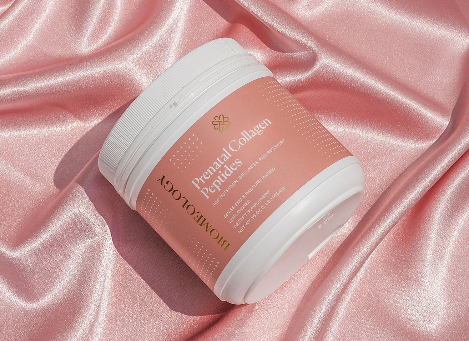
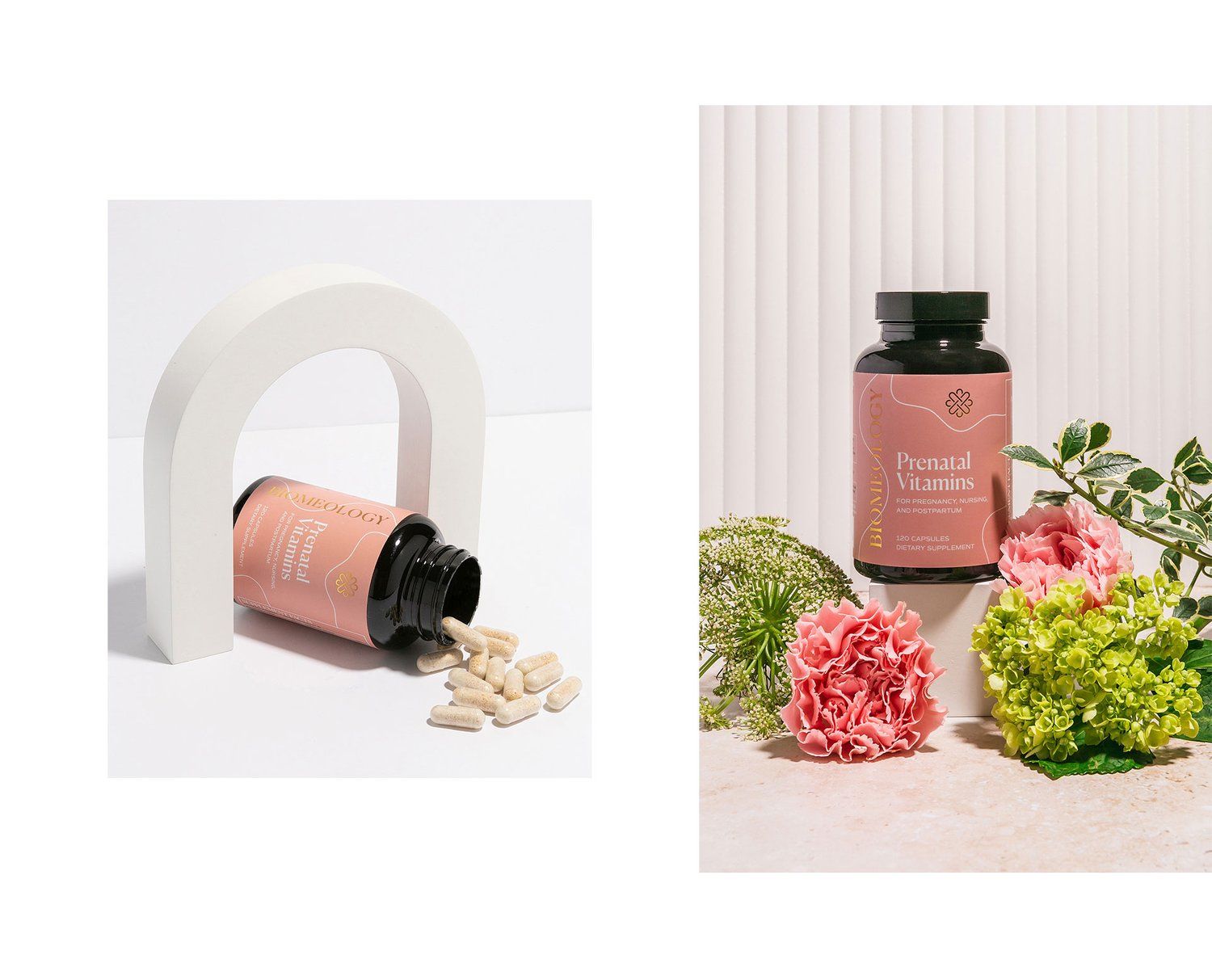
Biomeology | Romania
To redesign its identity, Biomeology asked the Alexandra Necula design studio, which kept the logo, but added a sophisticated, feminine and warm color palette—so the gold-foiled logo system on the packaging is most seen with the typical coral pink. Various samples have been designed for maternity vitamins, thus marking products with different properties.
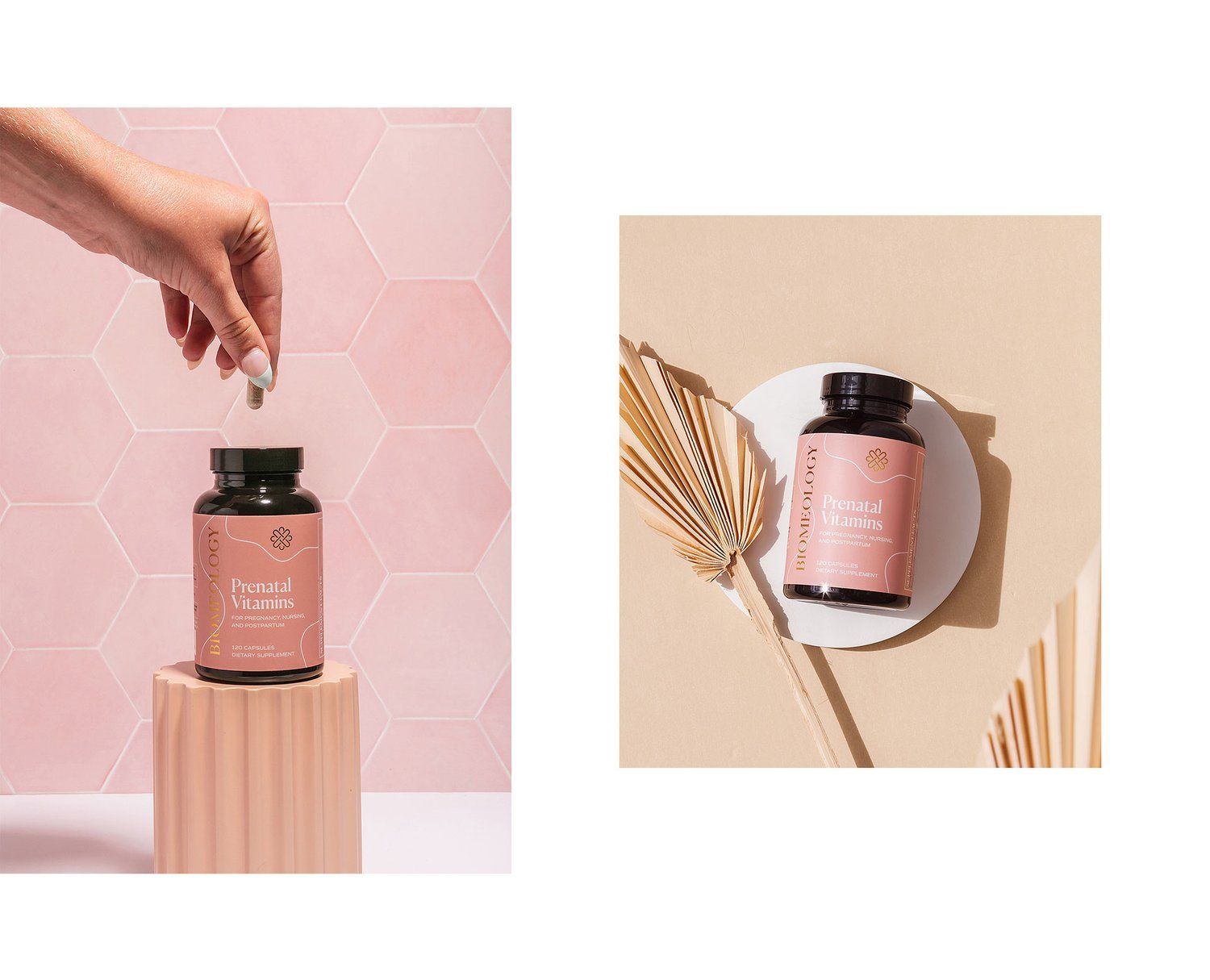

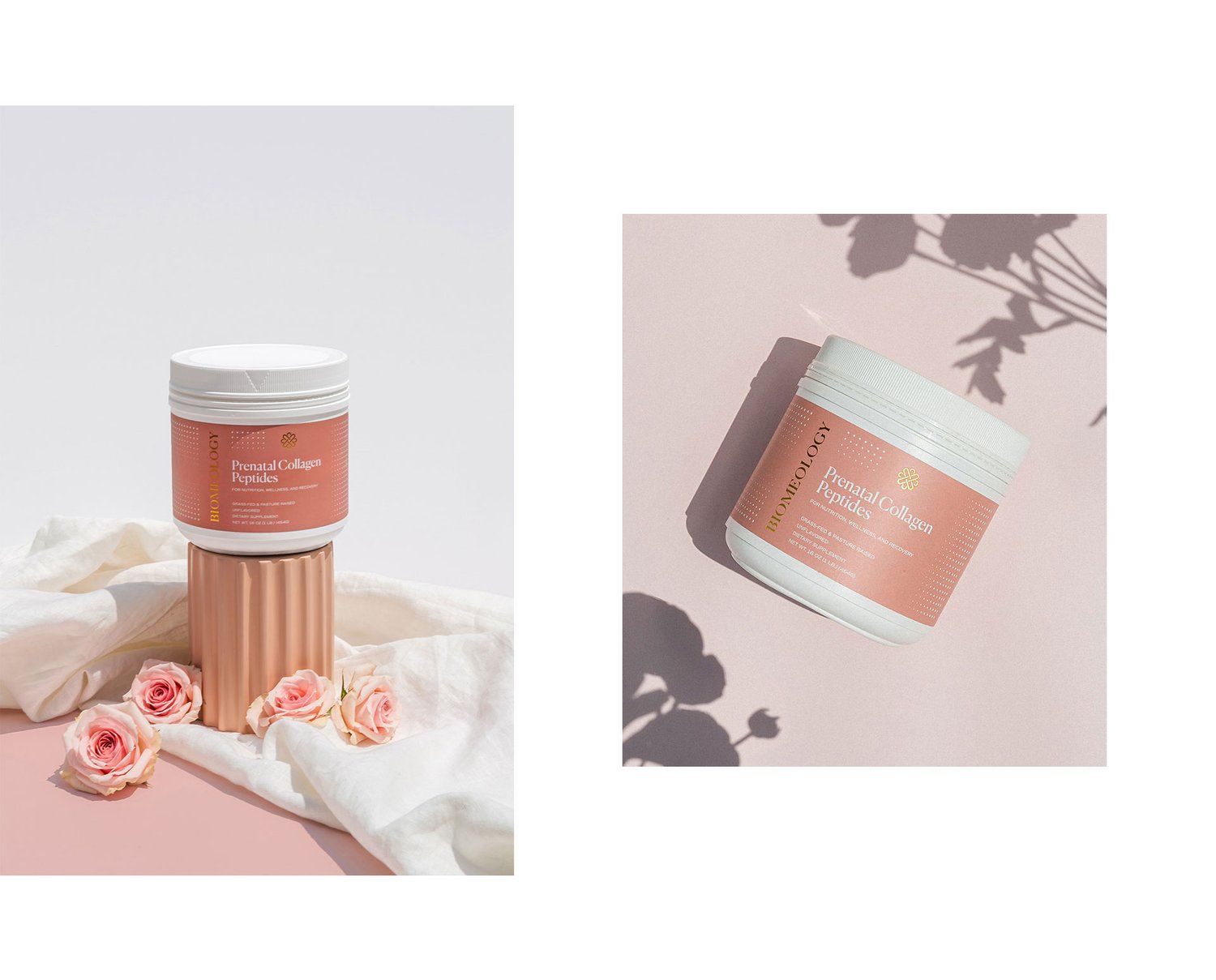
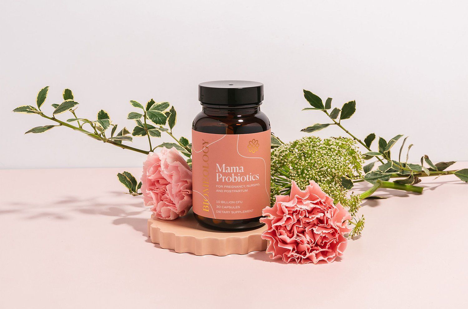
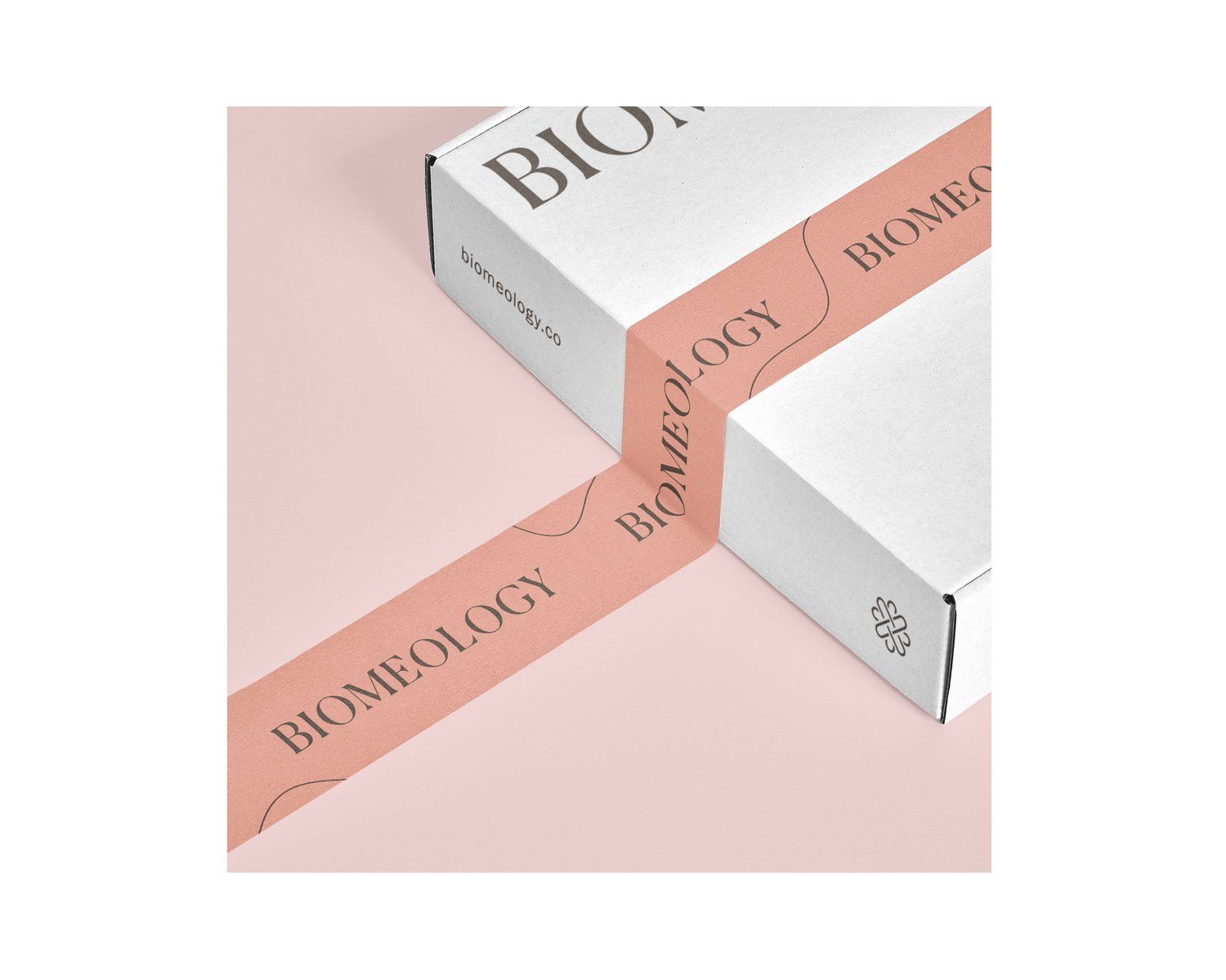
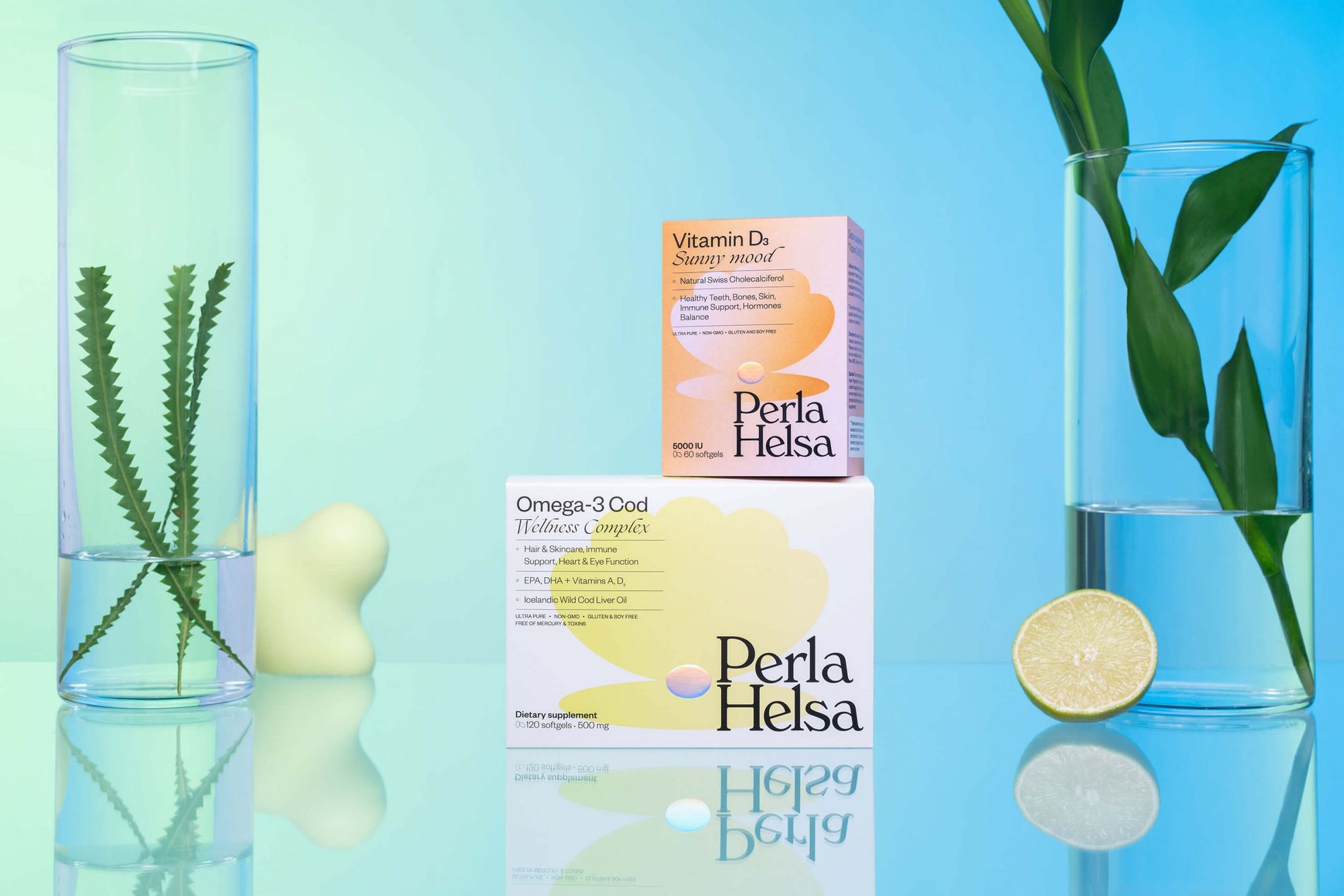
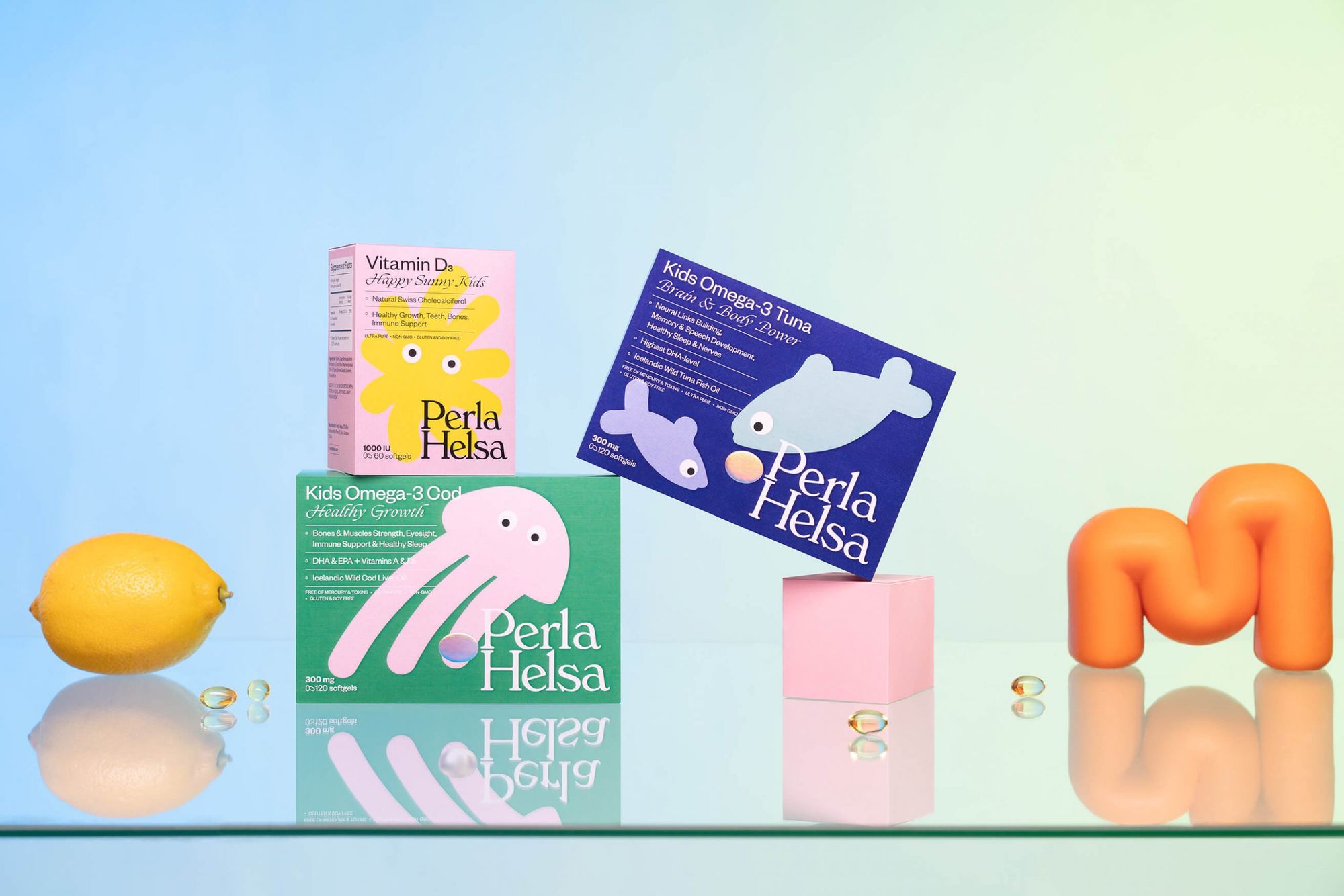
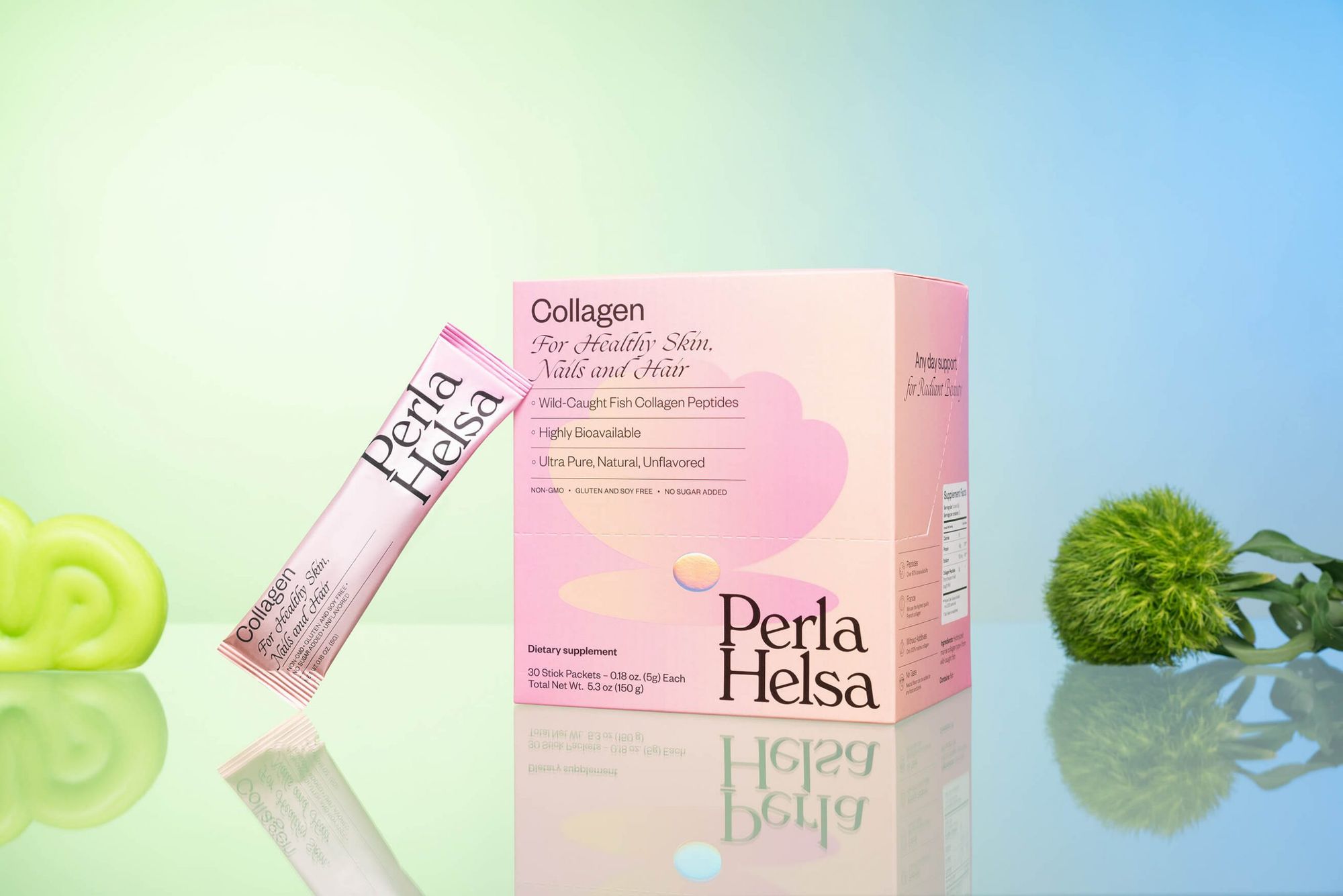
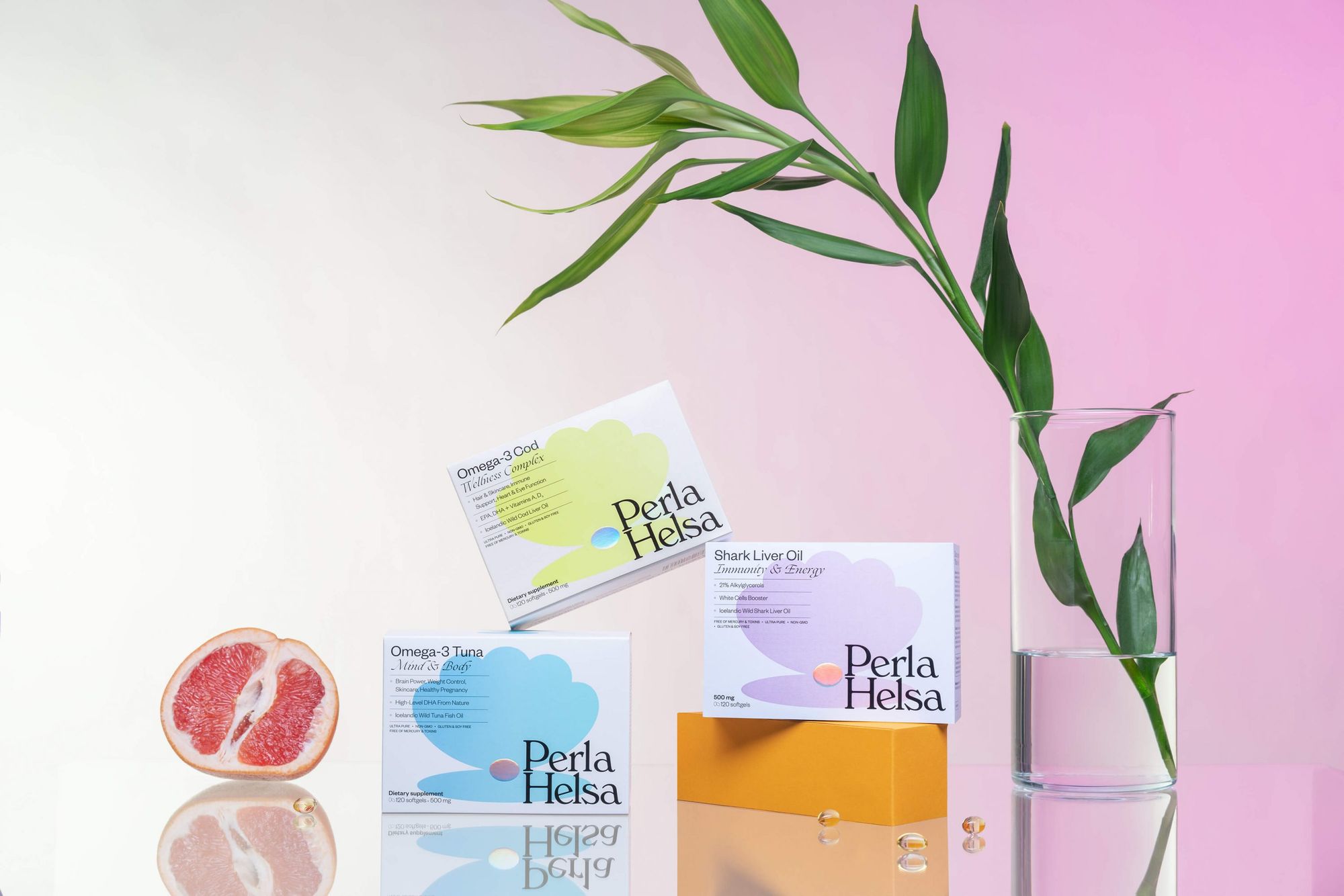
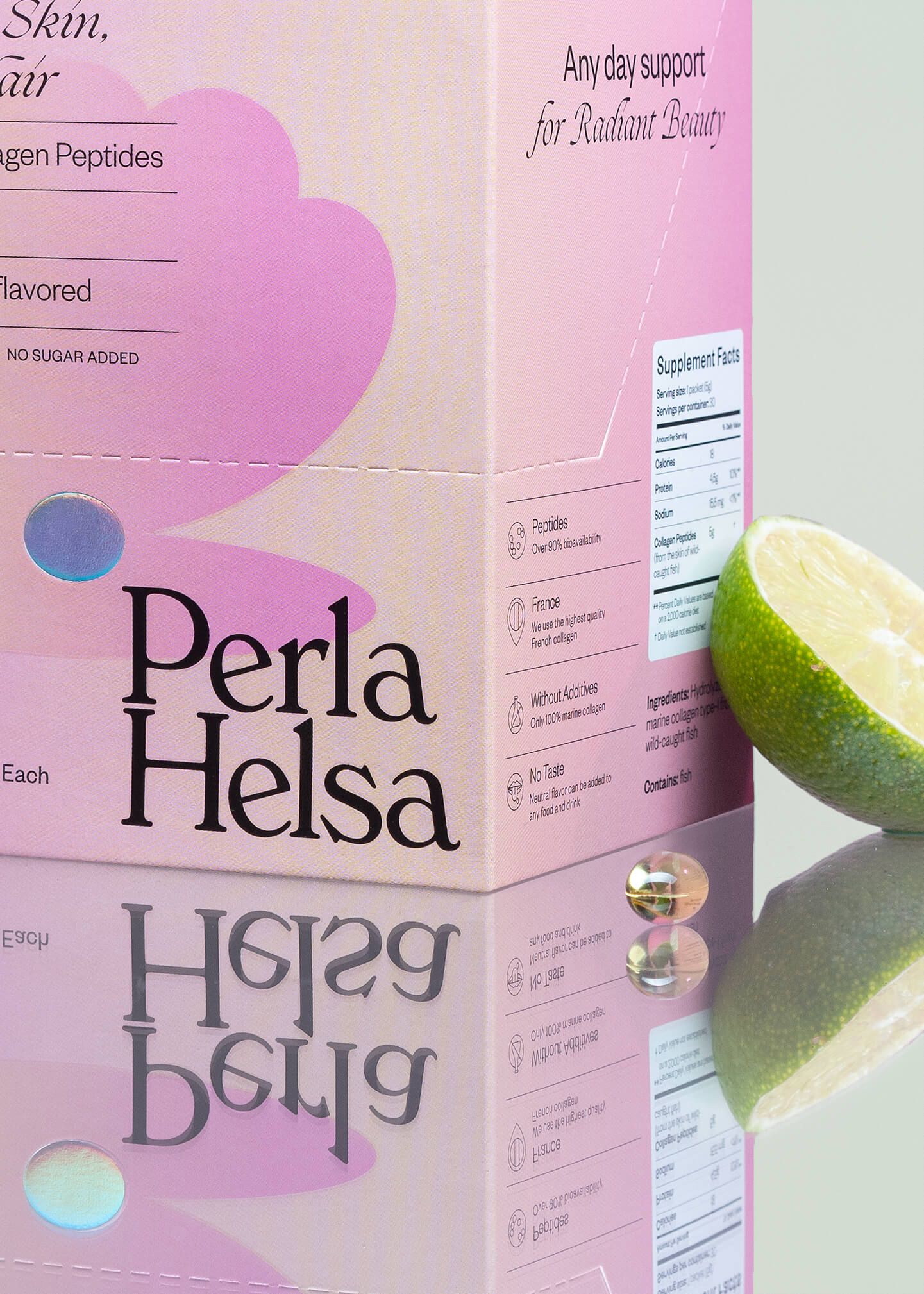
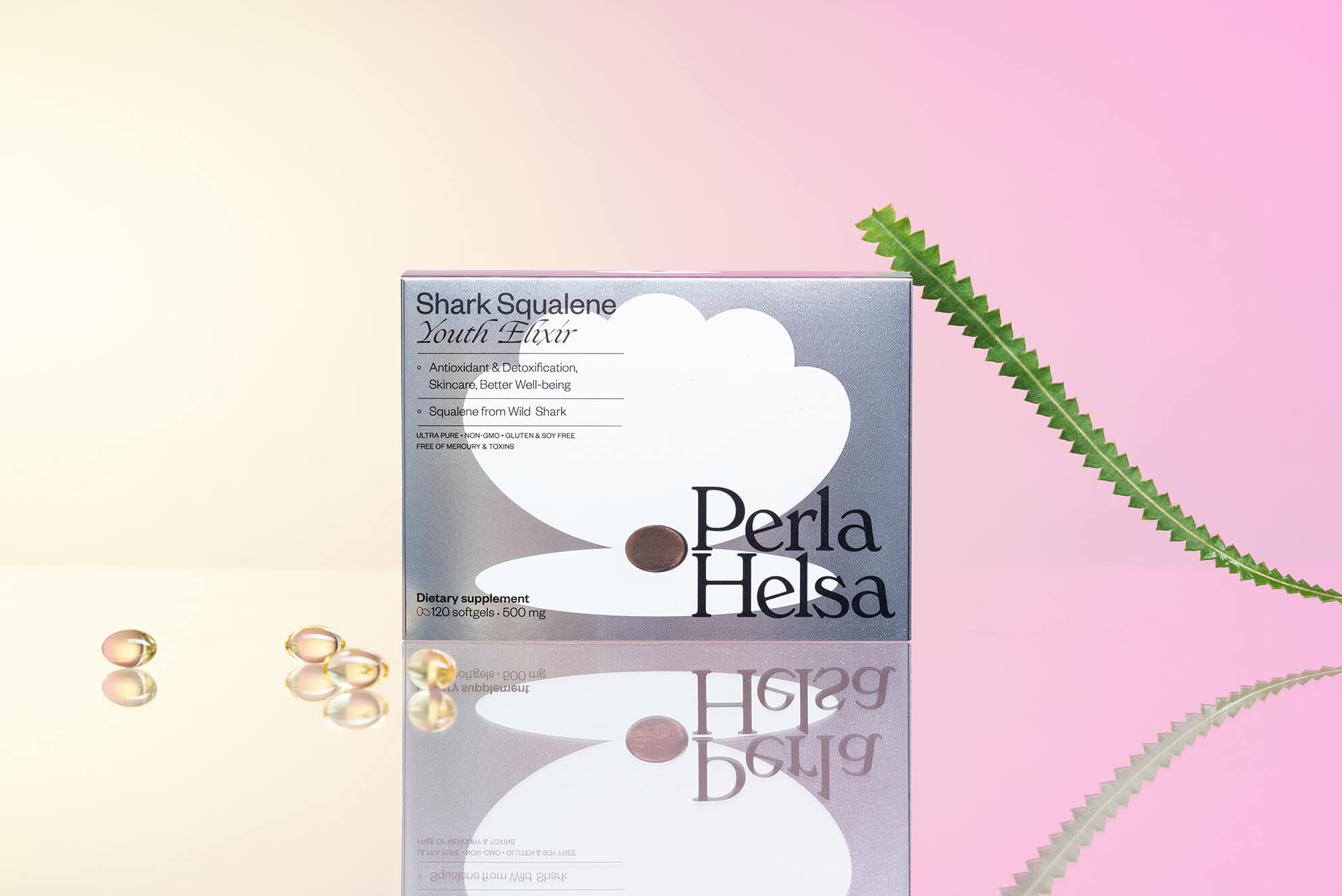
Perla Helsa | Ukraine
The dietary supplement Perla Helsa consumers are almost exclusively women, but they come from different age groups, so the Orchidea Agency came up with a versatile identity. In all cases, the pastel base is combined with a vibrating shade, but the final result is harmonious. The characteristic of the brand is the shell, with the pearl in it, so the pills appear on the packaging too, the animal version of which is intended for children.
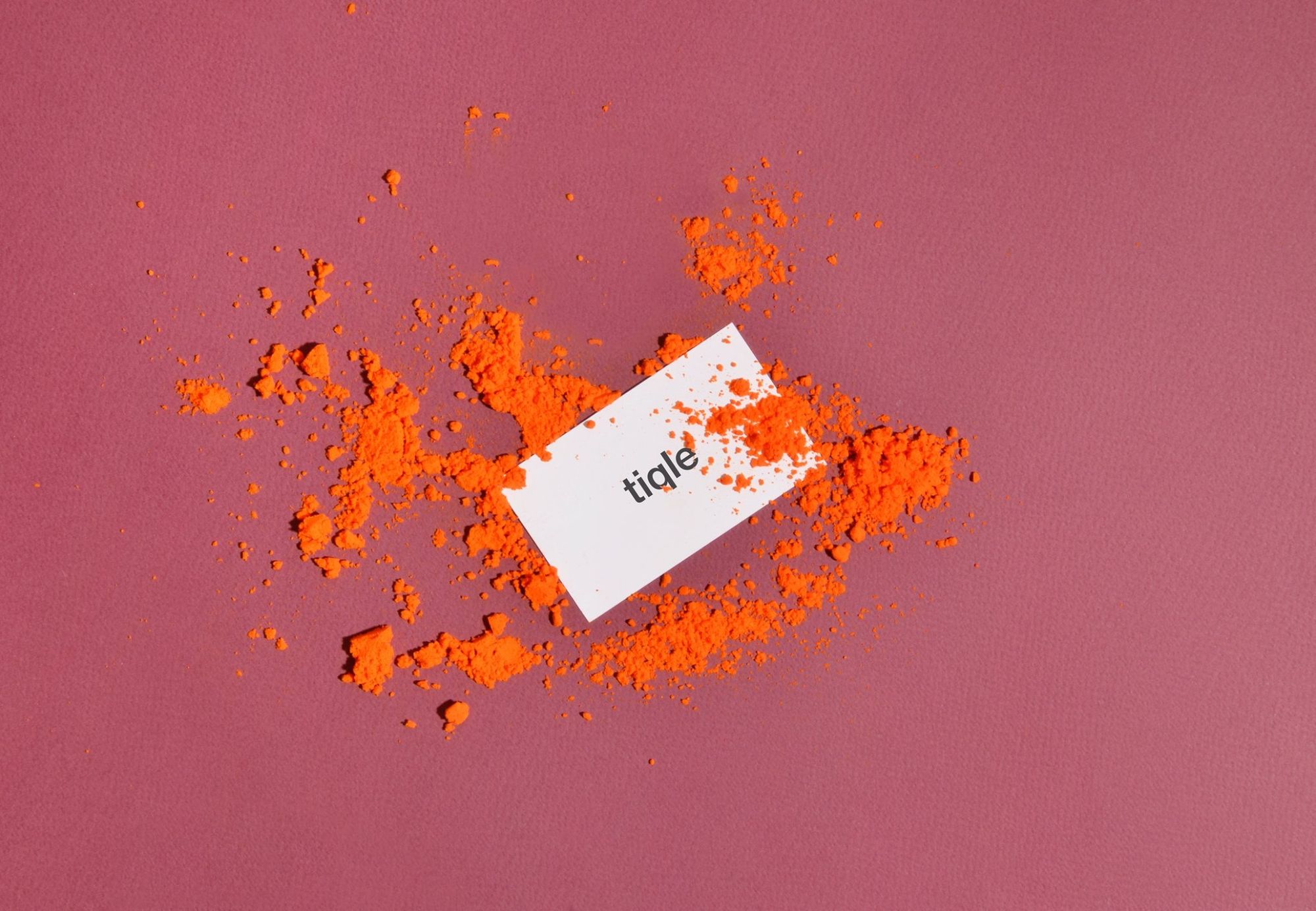
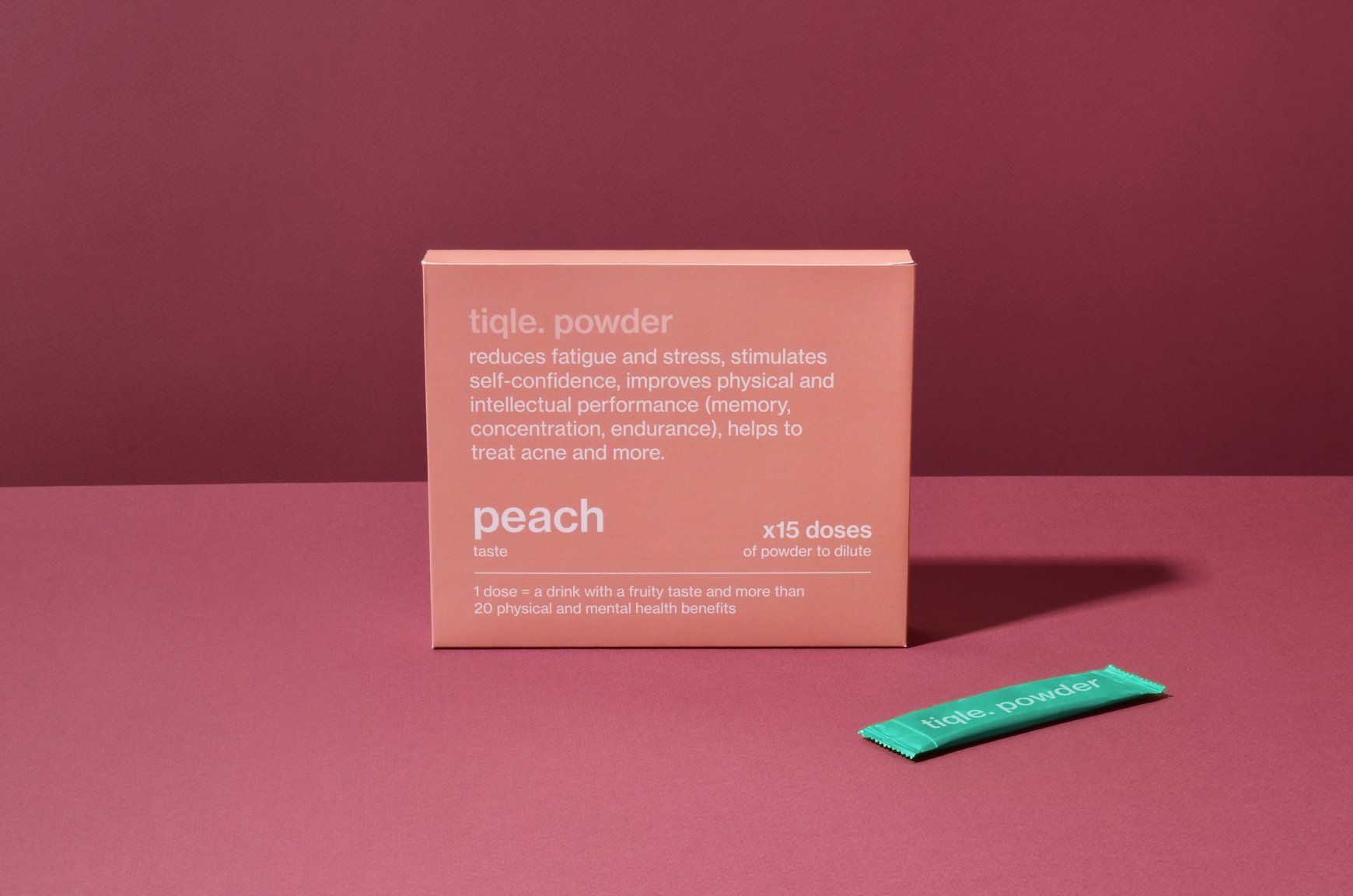
Tiqle drinks | Poland
Vitamin-rich Tiqle drinks reduce fatigue and stress while increasing physical and mental performance. The visual identity of the brand was developed by Owlsome studio in Warsaw, who designed a modern, refined yet dynamic look for the product available in four flavors.
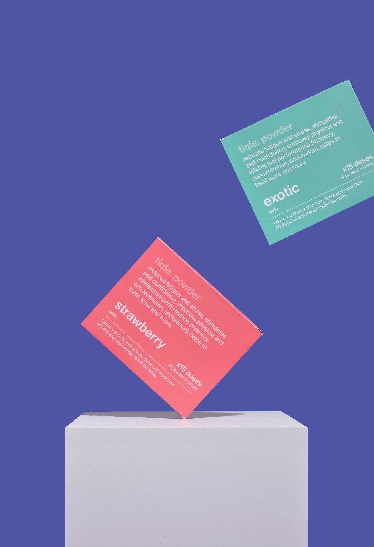
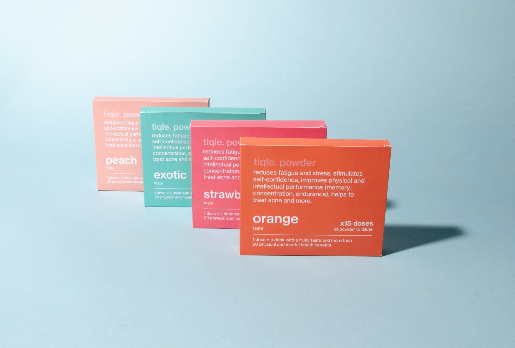
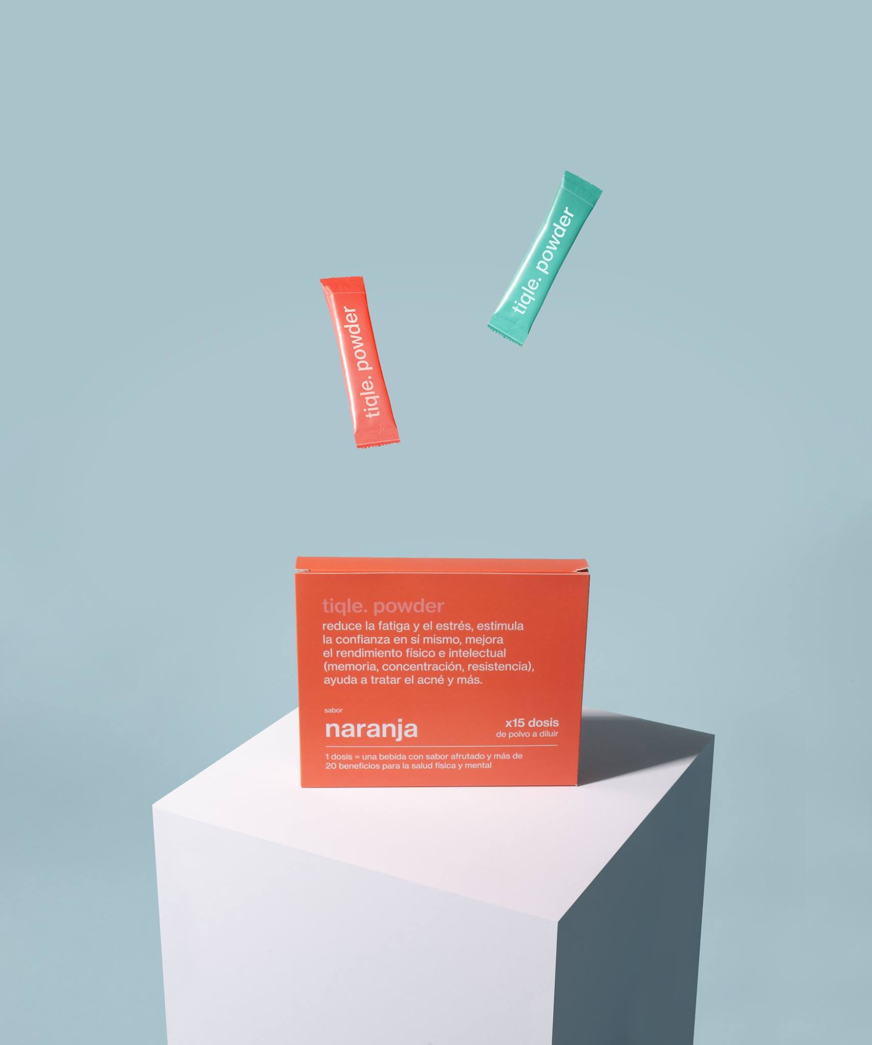
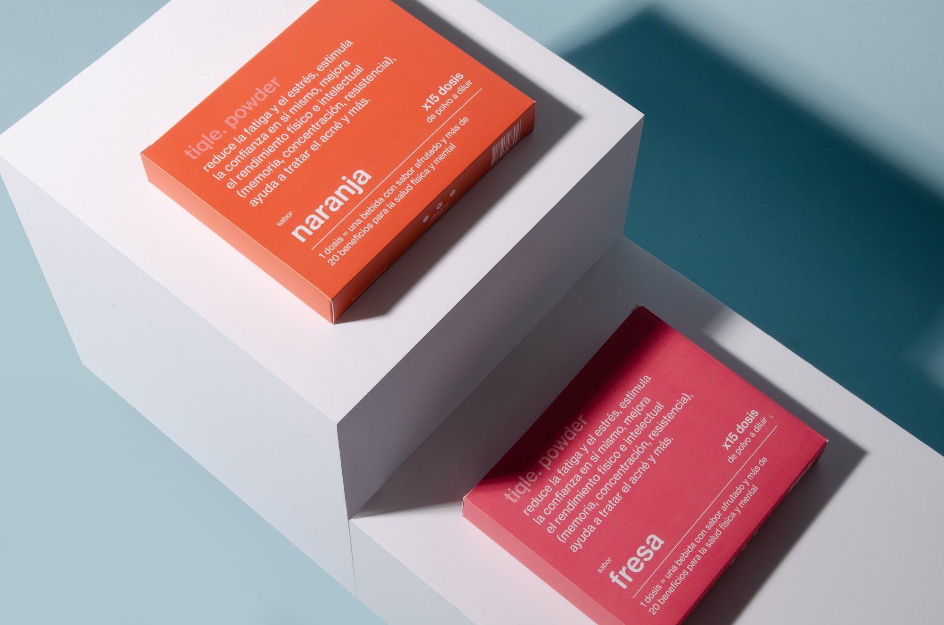

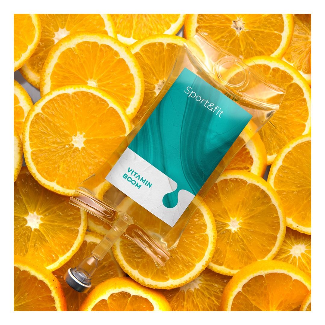
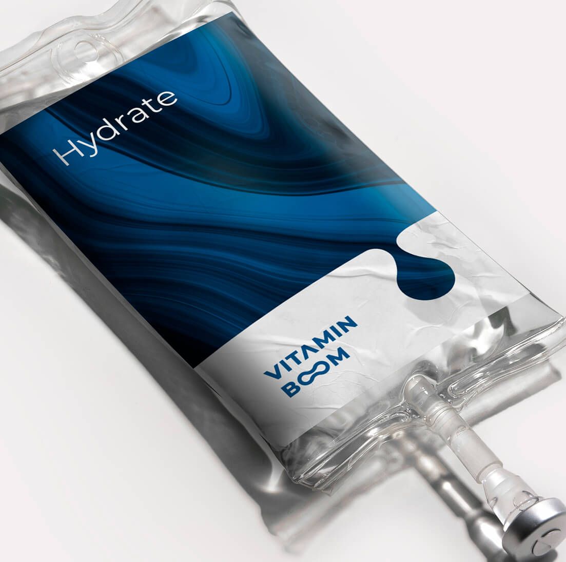
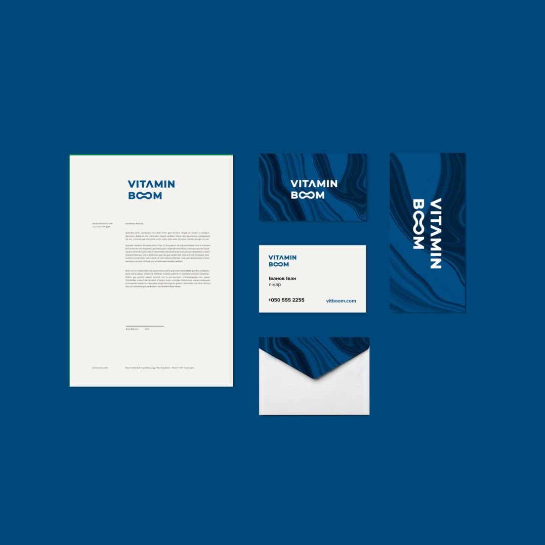
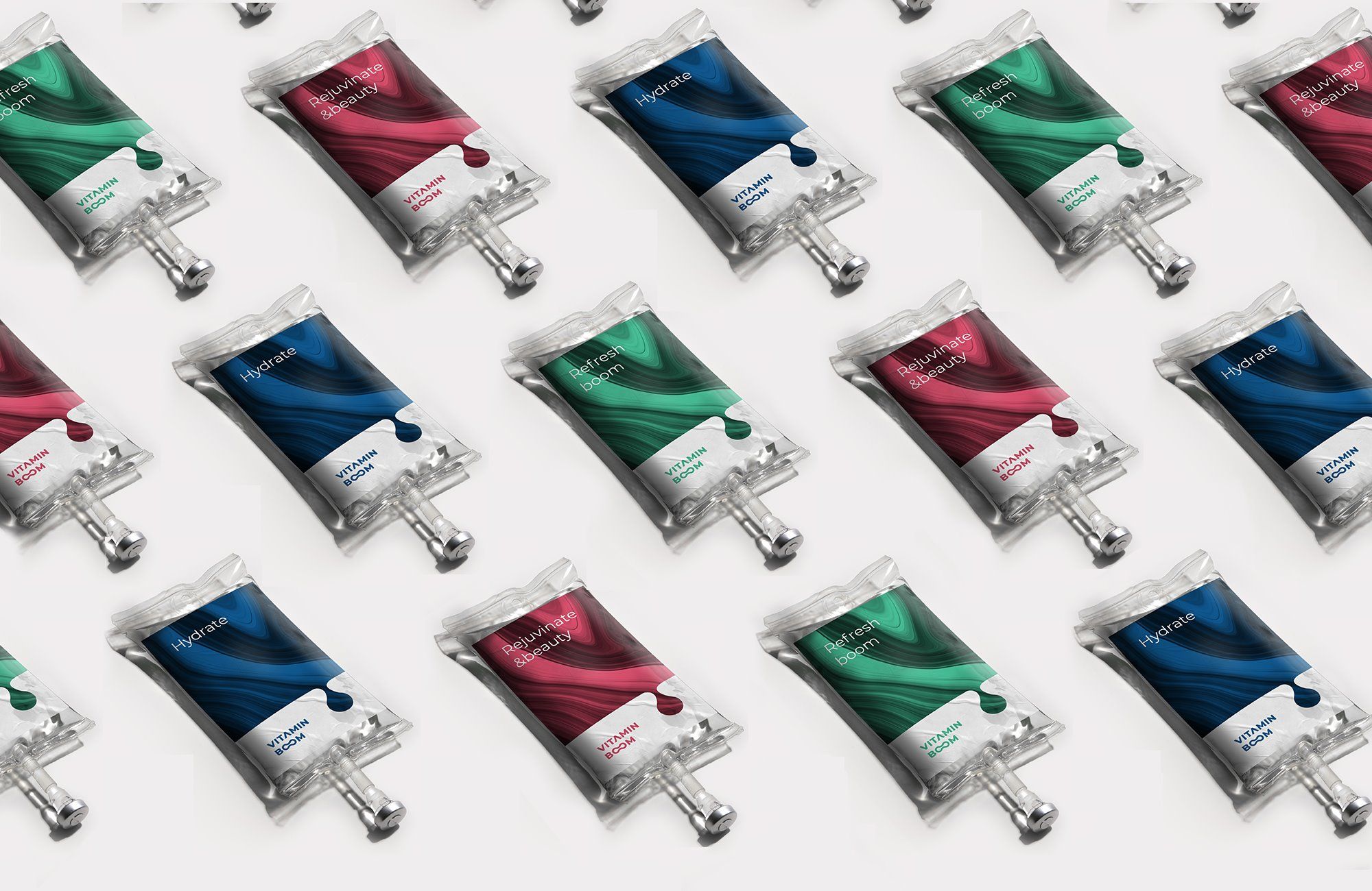
Vitamin Boom | Ukraine
Vitamin BOOM is an intravenous vitamin therapy that allows rapid and 100% absorption of vitamins, minerals, amino acids and antioxidants. It may seem like medical treatment, but it’s actually a kind of vitamin cocktail that’ll get you back on your feet. Dynamics and energy are also symbolized by the design of Levan Space, with an easily memorable logo.


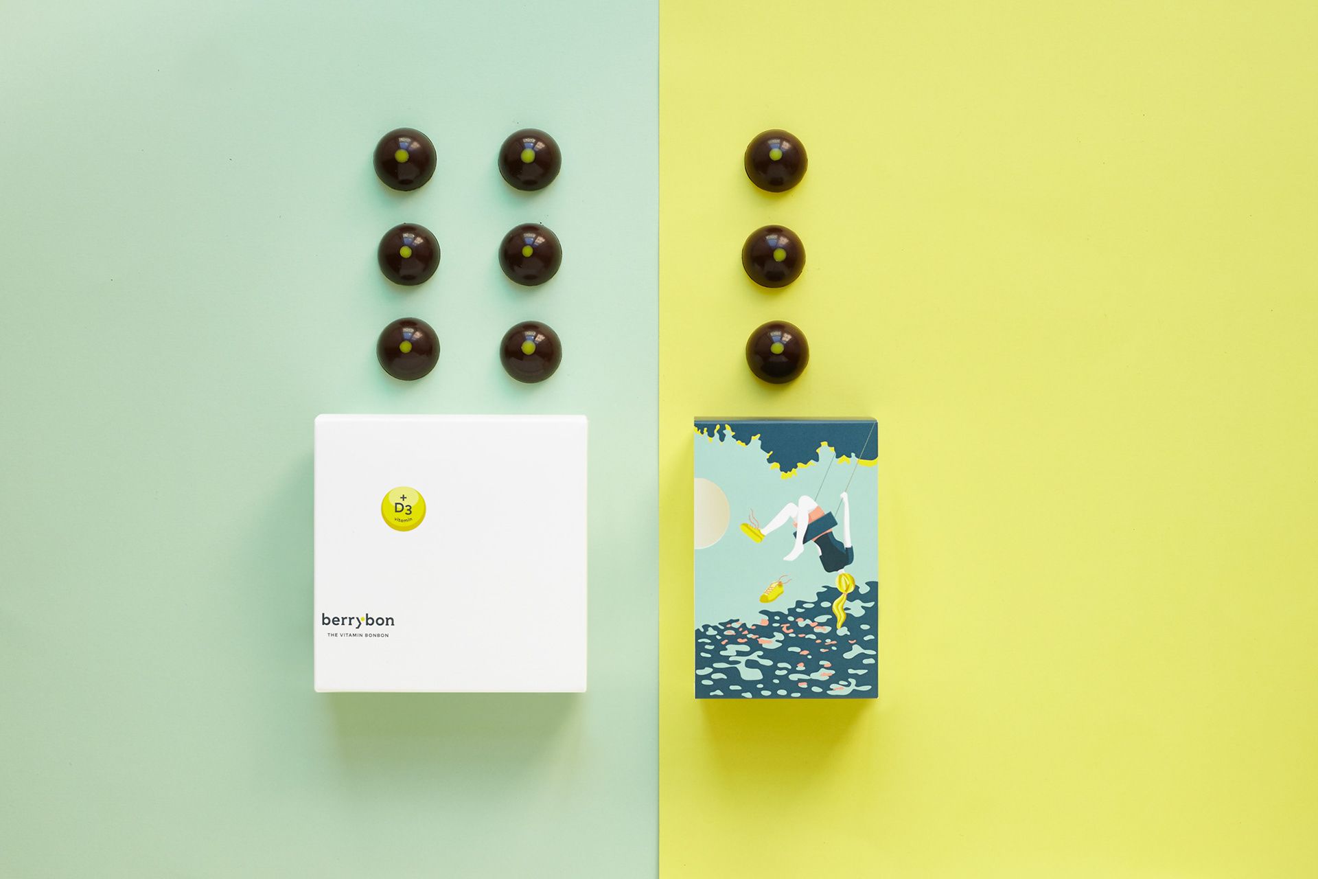
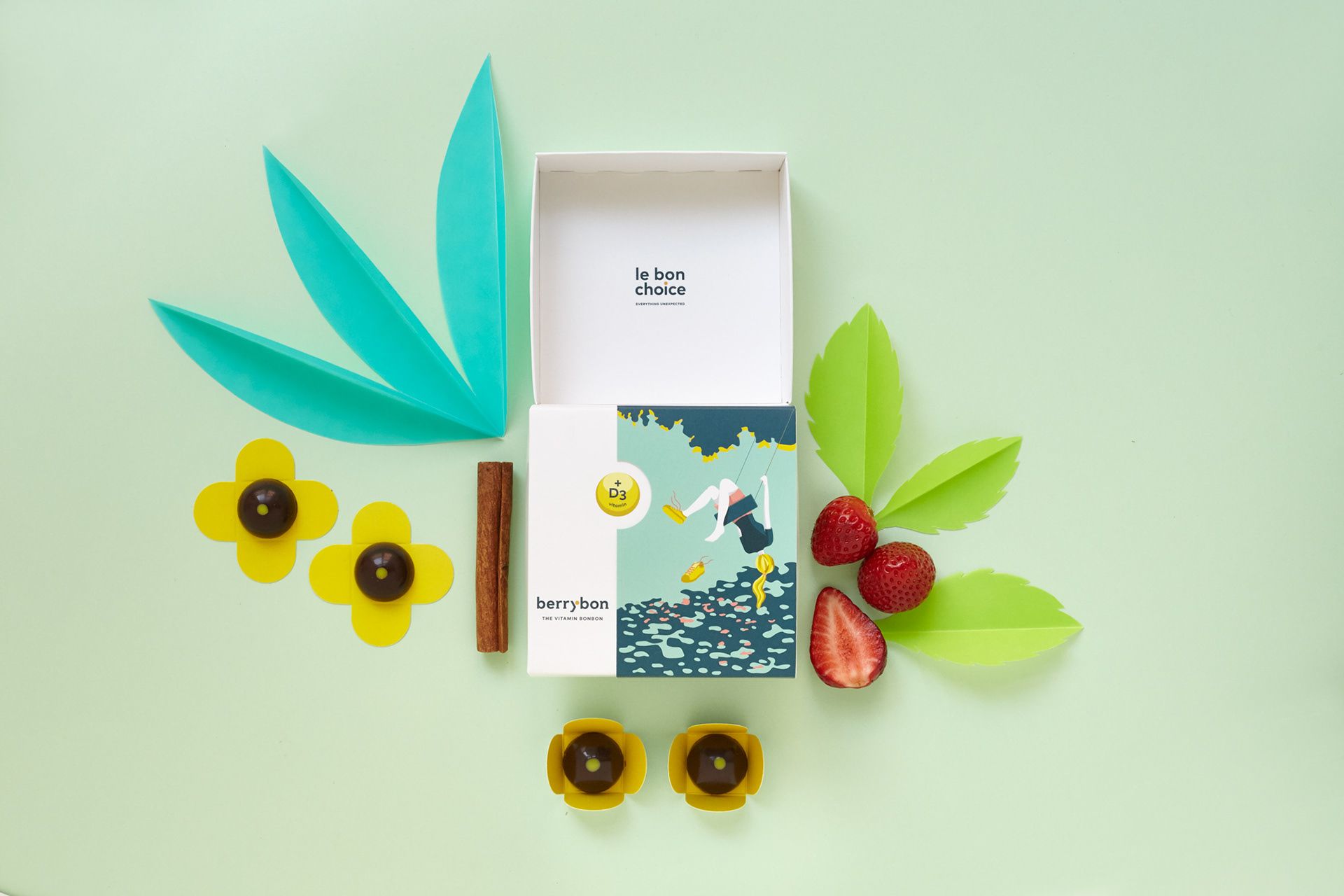
BerryBon—The vitamin bonbons | Hungary
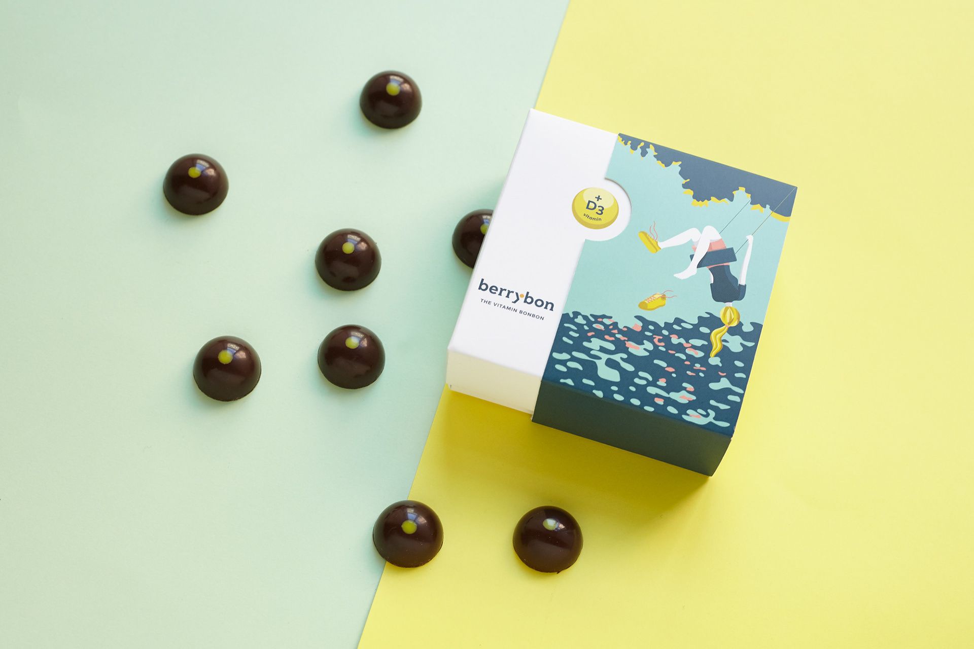
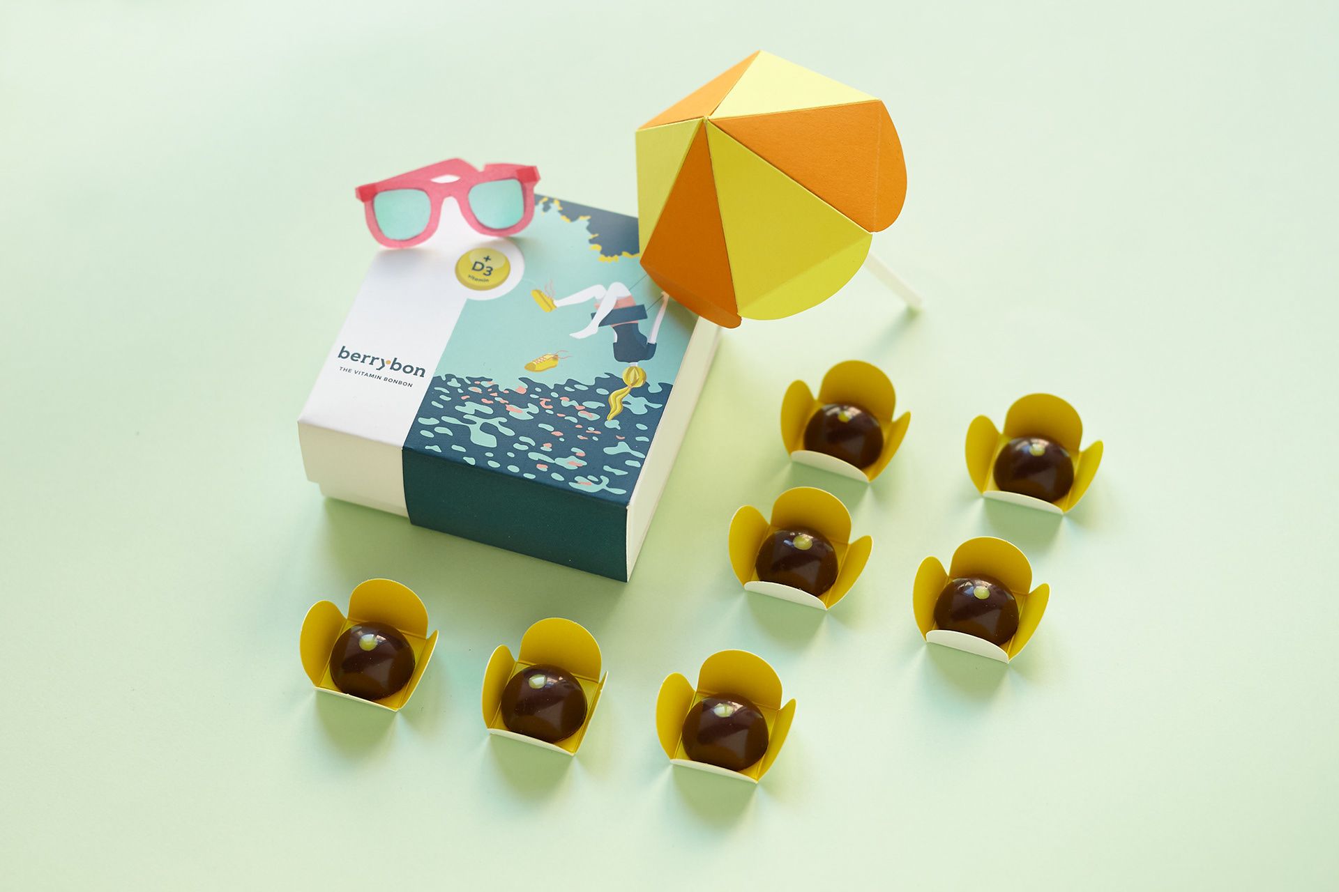
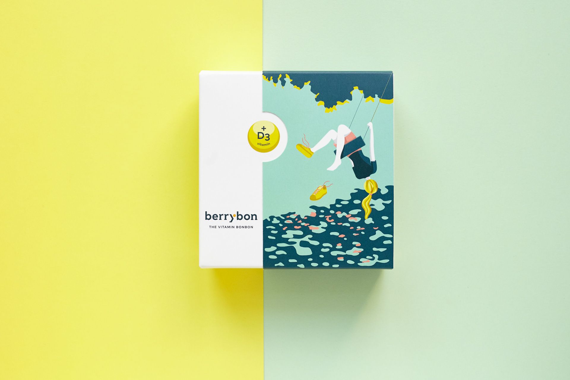
Berrybon is a healthy dessert with the special feature that every candy contains so much vitamin D that it almost covers the daily needs of an adult. Ant Works was responsible for the visual appearance of the unusual brand, and designed a tricky and complex identity—the cheerful packaging creates a pleasant summer atmosphere.
Alexandra Necula | Web | Facebook | Instagram | Behance
Orchidea Agency | Web | Facebook | Instagram | Behance
Owlsome studio | Web | Facebook | Instagram | Behance
Levan Space | Web | Facebook | Instagram | Behance
Ant Works | Web | Facebook | Instagram | Behance
This map highlights how residents of Prague feel in different parts of the city

Spanish photographer presents Europe from an unusual perspective in his latest exhibition


