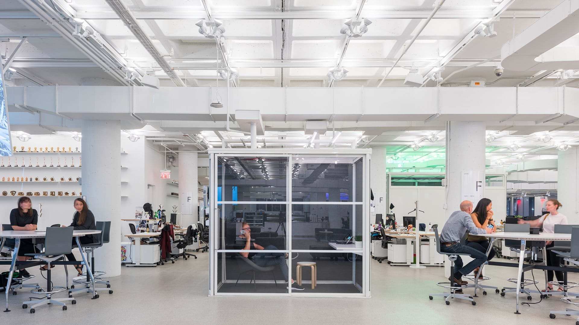
Each week since the health emergency has been declared, director Gary Hustwit has made one of his design documentaries made in the past years available for those interested. Although originally each film is supposed to be streamed for a week, sometimes they get extended, this is how it’s possible that Workplace (2016) is still available for free. In the documentary, the viewers can take a peek into the work of Foster+Partners, a design studio experimenting with coordinating digital and physical work spaces, on the occasion of which you can follow the evolution of the office work environment, from Taylorist offices to the home office setup.
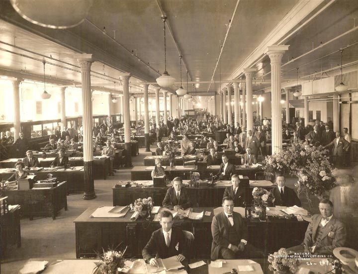
With the advent of the lockdown and impromptu home office solutions, the majority of us left open offices behind. As Nikil Saval puts it in Hustwit’s movie: “we tend to believe that the open office is a new trend”, however, in reality, we have been working in open offices since the very beginning. The resemblance between open offices at the beginning of the 20th century and the setup of assembly line production appearing along Fordism is uncanny. The parallel lines of tables crowded with employees working like robots and piles of paper were interrupted by narrow corridors.
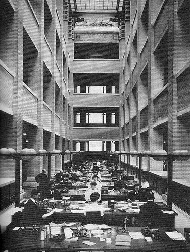
Although the iconic figure of 20th century architecture, Frank Lloyd Wright also applied the Taylorist office approach, his plans showed holistic thinking and progressive ideas, that proved to be forward-thinking from several aspects. In the case of the office building designed for Larkin company, it can be observed that the architect thought of the employees as a big family, who can work in the same space intently, as they have the same goal. The building reveals the designer’s religious mindset and faith in the power of community with several of its features: he placed the windows above eye position to promote turning inwards and concentration, and the following sign conveying a moral message welcomed workers near the entrance: “Honest labour needs no master, simple justice needs no slaves.”
However, usually it isn’t the Larkin building that people tend to refer to as the predecessor of today’s open office, but Johnson Wax Center designed once again by Frank Lloyd Wright almost thirty years later. The two buildings had many common features: light came from the ceiling in both of them – in the case of Johnson Wax, sunlight came in from within the columns growing upwards, thus forming a close relationship with the outside world. The furniture of the office work stations were custom-designed for the building, and their positioning didn’t resemble the depressingly narrow spaces of assembly lines: they were arranged in an airy and comfortable manner, so that employees wouldn’t disturb each other.
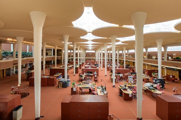
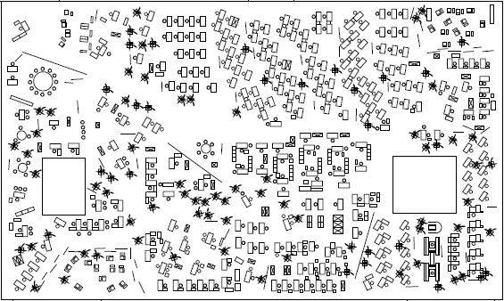
However, the open offices of the following years wrongly integrated Frank Lloyd Wright’s ideas, and these spaces simply lacked the basics of systems thinking. In 1950s Germany, with the introduction of the concept of Bürolandschaft (“office landscape”), the idea emerged that instead of the closed walls, the managers should be positioned together with the employees into a space that is suitable for comfortable and flexible working; promoting the flow of ideas and giving impetus to work. The designers wanted to implement this new layout by object systems that align with the movement needs of workers more organically, and that can improve the crowded open office setup causing discomfort to everyone. This way, the era of cubicle work stations has arrived (and soon became subject to common discontent).
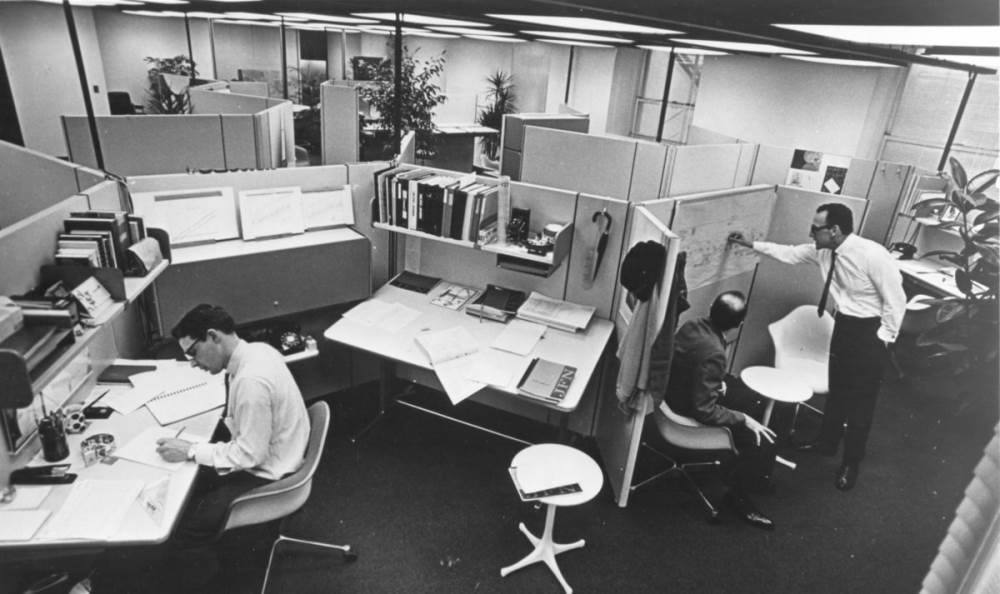
When Hermann Miller introduced the first version of the Action Office System in the beginning of the ‘60s, it was seen as the example of the office of the future – the revolutionary work stations proved to be comfortable, spacious and elegant at the same time. The designers (Robert Propst and George Nelson) set the goal of making open offices flexible and more humane, and for this, they examined the “nature” of offices for a long time. In their drawings, they placed the focus on the multifunctionality and transformability of the work station. The resulting variable furniture systems ensured some private space, too. The problem was caused by the fact that the Action Office System substantiated by thorough research was copied by prosperity wrongly, by preserving one thing only: the walls. Propst and Nelson left out one thing from their concept: economic factors, and so instead of it becoming a huge hit, the simplified, stripped-down copies of Action Office System were put into mass production. This is how the elegant solution turned into a dehumanizing phenomenon hated by everyone, the cubicle, which soon became a synonym for restlessness and being threatened.
Dilbert, the satirical comics series published since 1989 does not only give an authentic representation of this work environment and the accompanying lifestyle in terms of content, but in terms of appearance, too. The dull colors of the story cubes sliced into panels are as if they reflected the lifeless atmosphere of the office space divided into cubicles and the grey everydays of corporate life consciously. Over time, employees got fed up with this environment, and by the end of the 1990s, discontent reached its peak, especially amongst the members of the younger generation pursuing creative work.

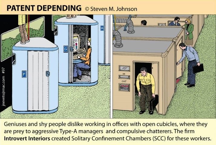
Slowly we started throwing away the walls dividing the tables, forgetting about the fact that they did help creating the feeling of private space to some extent. We were stuck with the conversations we don’t want to hear, the noises startling us out from concentration and the frustration of being “under surveillance.” It turned out that the open office does not suit every work process and especially not every personality type, as it was well illustrated by one of the drawings of Steve M. Johnson, introducing alternative inventions. “Geniuses and shy people dislike working in offices with open cubicles, where they are prey to aggressive Type-A managers and compulsive chatters” – says one of his illustrations, displaying the ever desired private space in the form of lockable cabins, connected to ventilators.
History has proven that closed doors, open offices and cubicle work stations aren’t good solutions in themselves, as different types of people require different environments in order to do effective work, and the types of tasks also require different conditions. In Gary Hustwit’s movie, the architects designing the new office of R/GA company consciously strived to create opportunities to satisfy all needs starting from ensuring private spaces to spaces facilitating collaboration, and not only in the physical, but in the digital space, as well. Owing to technological innovations, today we can work from anywhere, and many people believe that the forced home office caused by the coronavirus outbreak can bring the revolution of working from home. This can radically influence the future raison d’être of offices, and we can also expect changes in the temporary structure of the open work spaces in the post-epidemic period.
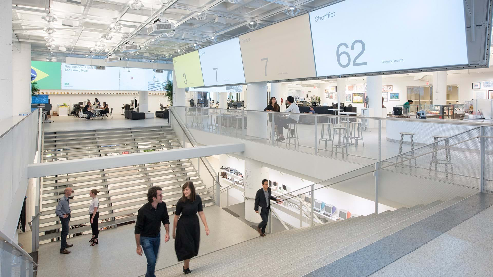
The Workplace (2016) is available on this link.
Further references:
Saval, N (2014) Cubed: a Secret History of the Workplace. Doubleday, New York.
Saval, N (2015) Office Space – In conversation with designer Jonathan Olivares. 26th Chicago Architecture Biennial, Chicago, 7 November 2015. Available at: https://www.youtube.com/watch?v=2DRy5-M8TgU (Accessed: 01 May 2020)

Support Hungarian design! | BAGS & MORE
Europe’s largest green facade has been completed
