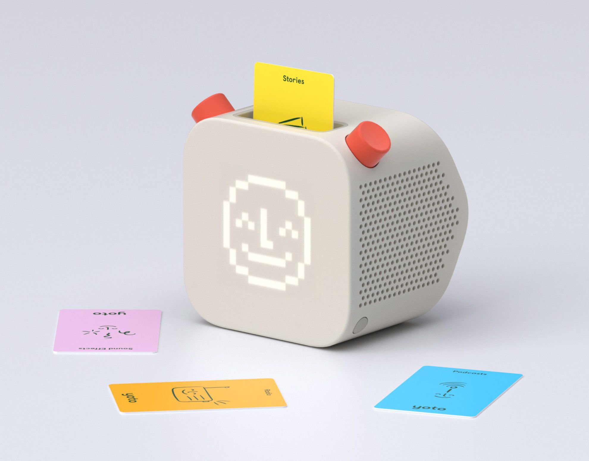
A well-thought-out technical device that is children-friendly in every bit of it. Yoto collaborated with Pentagram and developed an interactive screen-free audio player, with which children can listen to stories, music, radio or even podcasts.
Here it comes.
Using Yoto is extremely easy. Following the analogy of the old music players, instead of CDs or cassettes, here we have to insert a card into the device, and then we can start the music by pressing one of the buttons, and we can control volume with another.
Kids in control
Yoto started developing the device in 2015, with the aim of stimulating children’s creativity with the help of audio content and music. Reducing the screen time of children also played an important role in designing the device, due to its negative effects. They wanted to create a product that provides access to musical and audio contents in the easiest way possible and with the help of which the use of physical tools instead of virtual ones becomes emphatic in the process of learning and playing.
Instead of a screen, a 16×16 pixel colored screen is placed on the front surface of the Yoto device, which brings the currently played audio content to life and projects an interactive image without being to distractive.
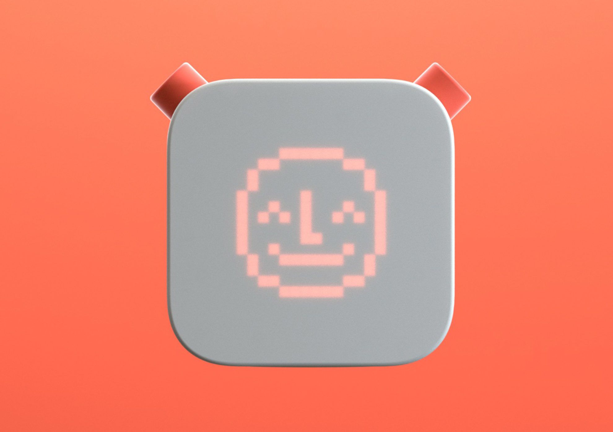
The device has a built-in battery, which makes it possible for us to use it anywhere and it also includes a smart magnetic dock, with which children can also charge it safely if needed. Its shape also facilitates simpler use: its tilted back makes it possible to place it straight on a table or on a shelf, or to lean it backwards so that the screen faces the child.

More than a smart speaker
As we mentioned earlier, we only need to insert a card into the device to play the content. Today, Yoto even has an expanding content library, and we can choose from a total of six content types: stories, music, podcast, activities, audio effects and radio. The users can also choose a “Create your own story card“, which makes it possible for children or the family to create their own home-made content. This is a perfect and creative solution for parents or grandparents to share stories with their children or grandchildren.
Another advantage of the device is that we cannot only play audio content by using the cards, but we can also access daily updated additional content by pushing one of the buttons, without paying anything.
Visual identity for every member of the family
Although the same as in the case of every other game, children are the primary users, we should not forget about parents, either. Yoto adjusts to both target groups well: the design is simple enough for children to use it, but sophisticated enough to make it interesting for parents.
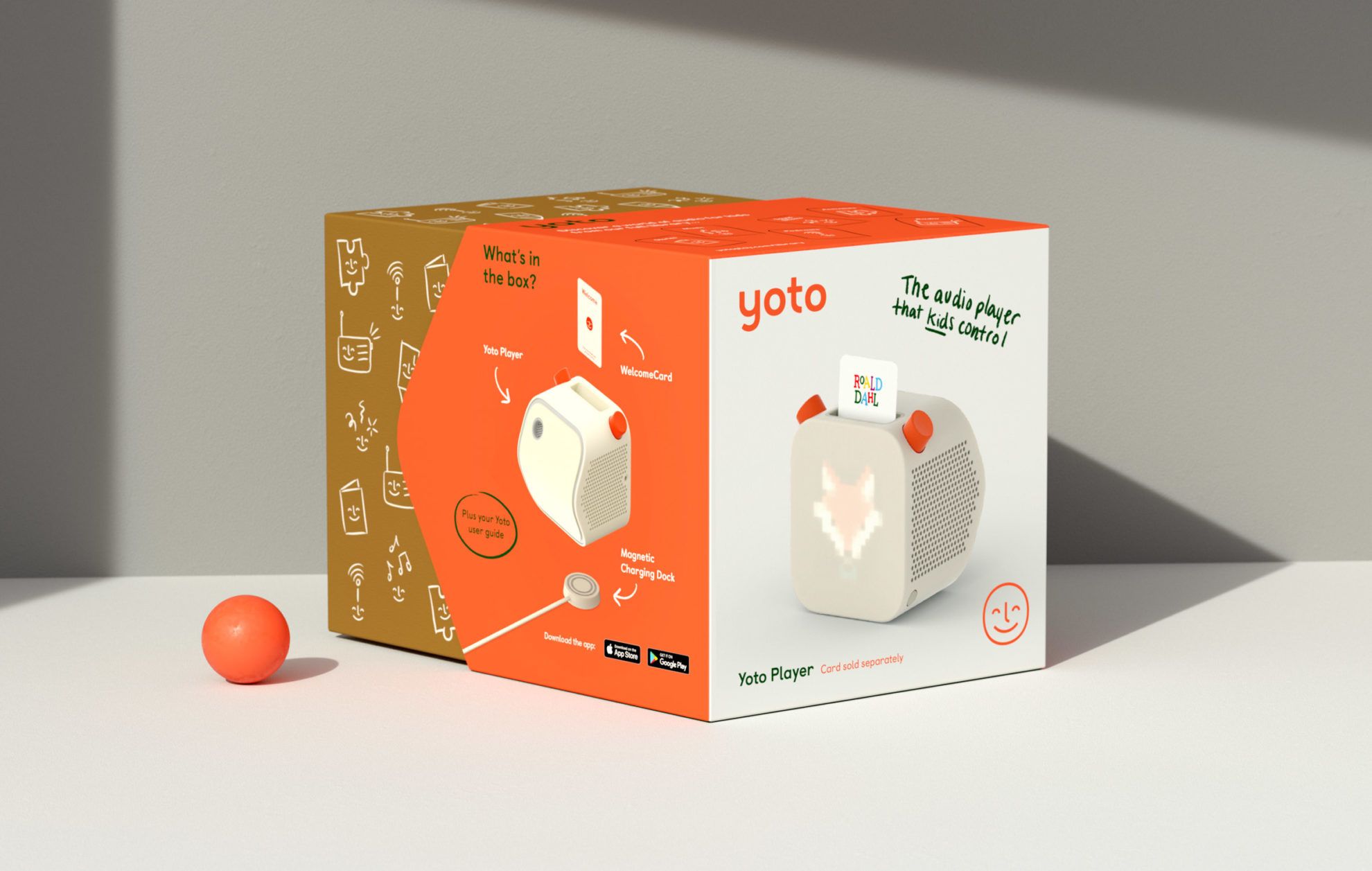
In designing the image elements of the device, a common denominator was in the focus. The designers developed a color palette that is playful and modern at the same time, and, that can be appealing to both children and parents. The game itself is white, with two red buttons on top of it, but the design of the packaging also includes deep green and sand shades.
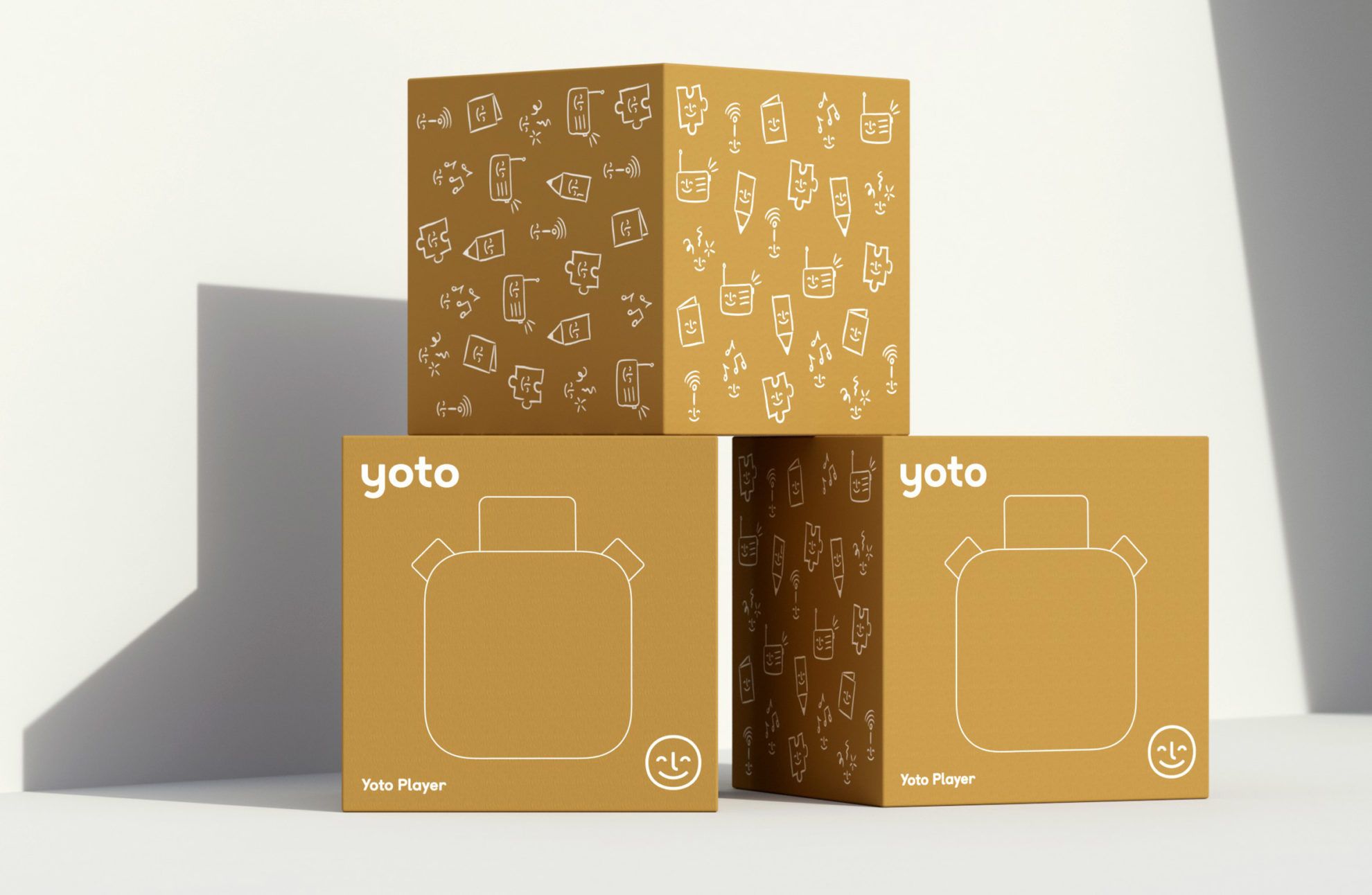
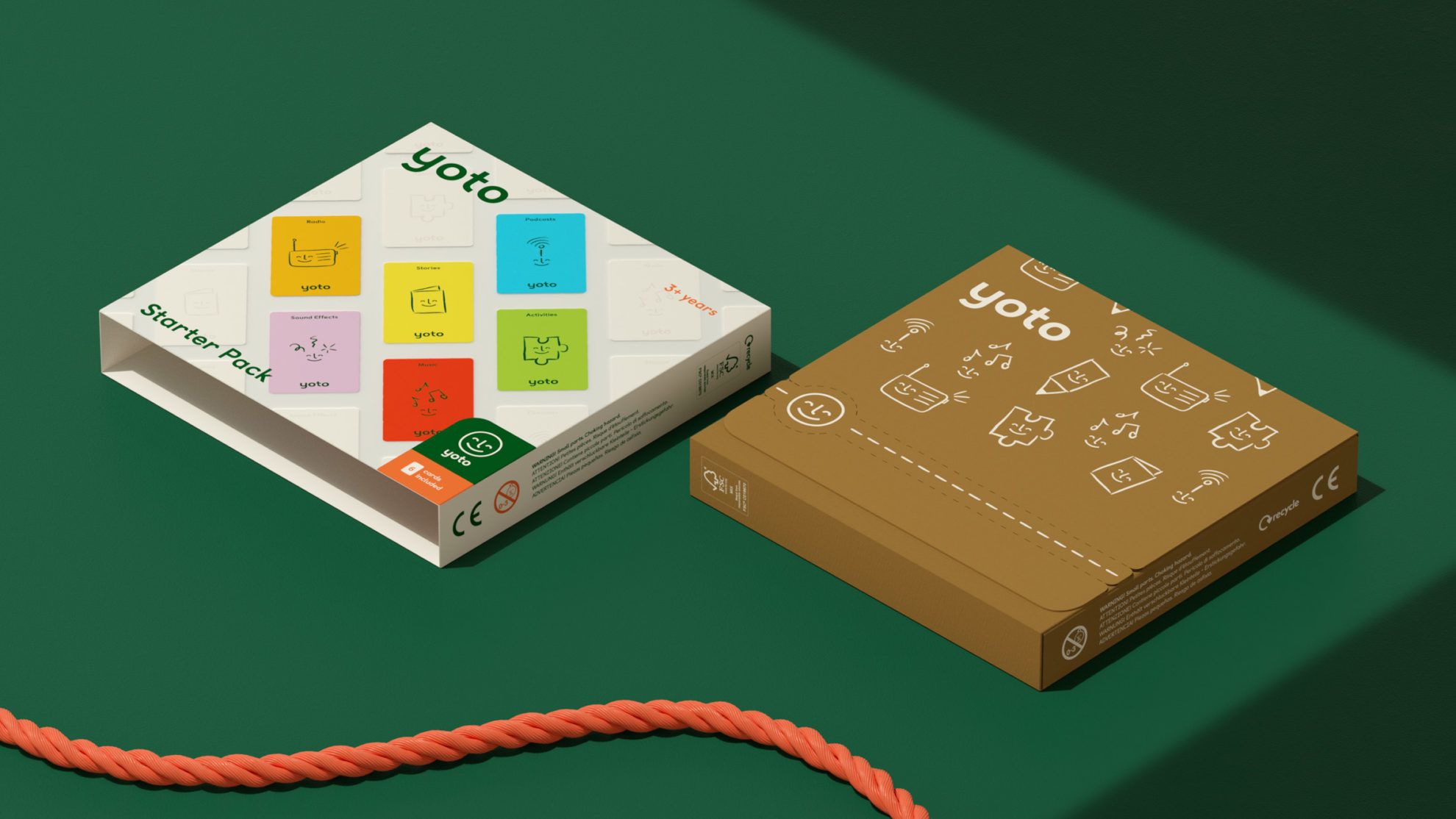
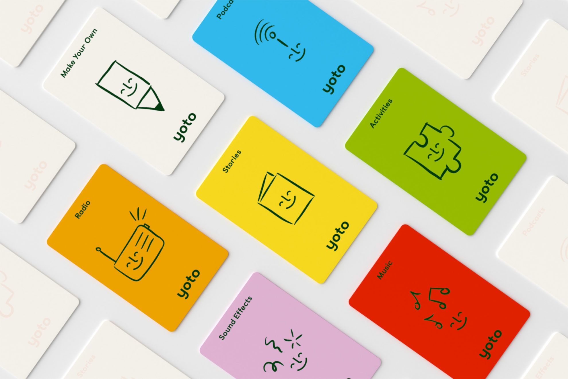
However, in the design of the content cards, they used expressly vivid colors, such as yellow, green, red, blue, pink and orange, complemented by joyful illustrations. To distinguish between card types, Pentagram developed a separate icon system, also displayed on the packaging.

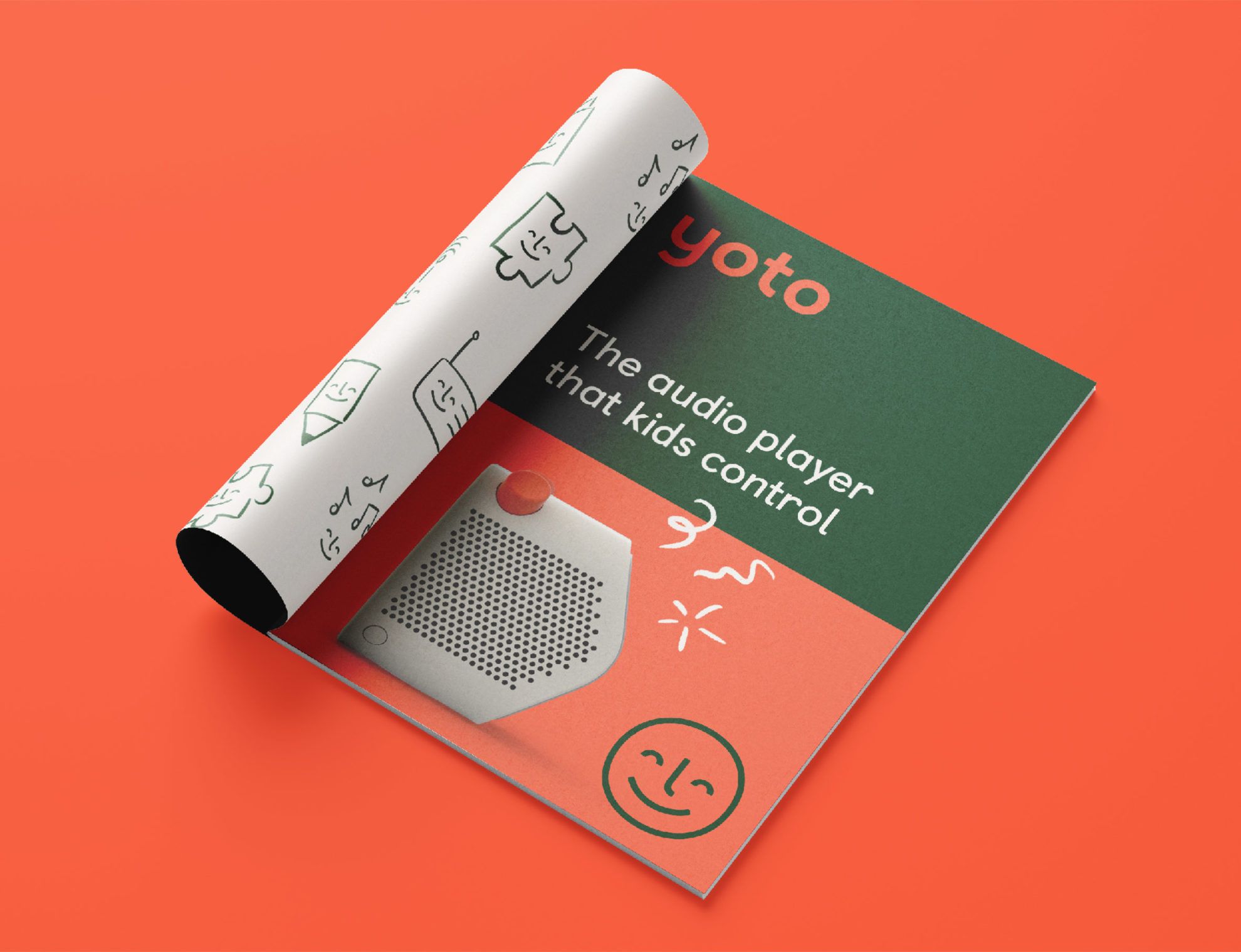
Further typical image elements of Yoto player include the logo displaying a smiling face, and the special logotype (Colophon Foundry Castledown), resembling the shapes of the drawn letters when learning to write.


Yoto can be pre-ordered on the website of the game.
Pentagram is one of the world’s largest independent design studios. Their portfolio includes names like Slack, Mastercard, or Warner Bros. Their latest project was redesigning the logo of Yahoo search portal.
Yoto web | Pentagram web
Source: dezeen.com, yotoplay.com
Budapest by Labrosse | “Dugattyús” house

“Fledglings” | Olympic champions on movie screen
