The superiority of the perfect, glamorous beauty salon is in the past, and a more real, rustic concept is taking hold, showing that beauty can be redefined. This is the philosophy of TEN Salon in Warsaw, and this time it is reflected in the interiors, with the help of interior designer Julia Brimer.
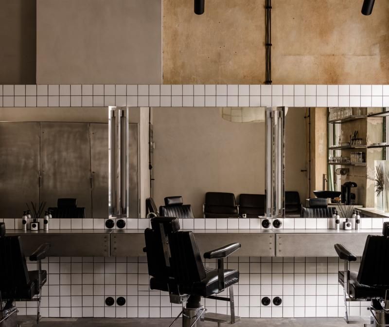
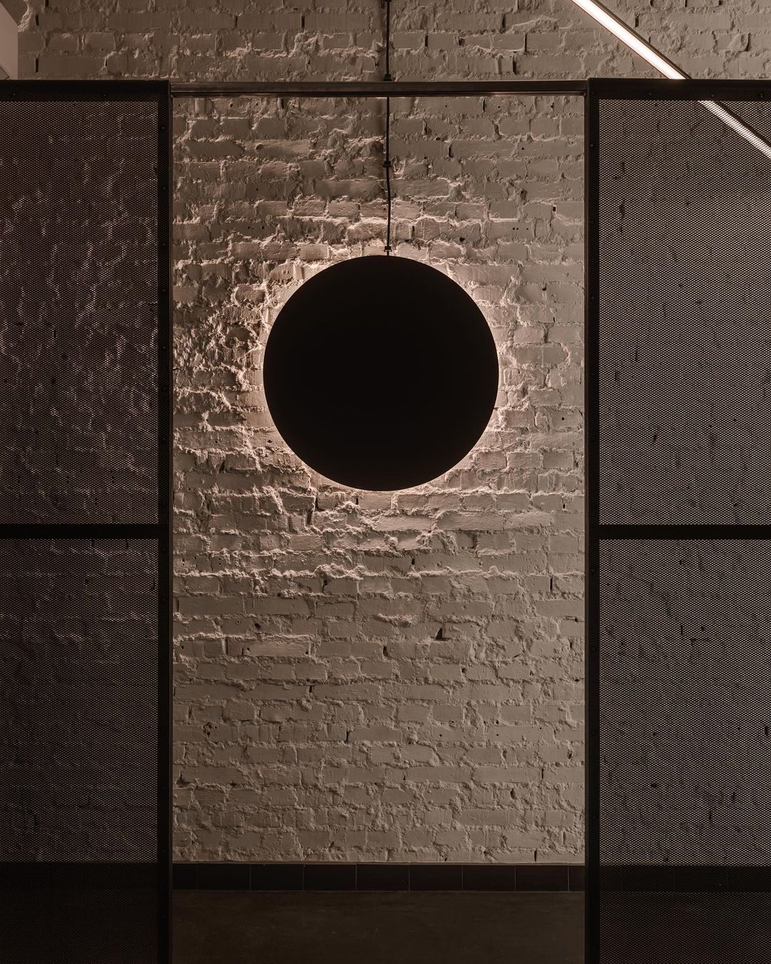
The abandoned factory building at Poznańska 24 was formerly home to the Kosmos club, whose interior retains the rustic character of past decades. With this in mind, Julia Bimer has taken advantage of features that may be unconventional at first glance but are necessary for a hair salon. Thus, the kitchen ventilation system for the club was retained, as were the concrete floor, the white-painted brick walls, and the metal components reminiscent of a classic industrial environment. As previously noted, the space is a true representation of the TEN brand’s philosophy and a focus on sustainability, hence the obvious aspect of minimal space reconfiguration and the inclusion of previous spaces—which is also a cost-saving measure. The Warsaw interior is a perfect example of how to design a retail space in a cost-effective, value-creating, yet stylish way.
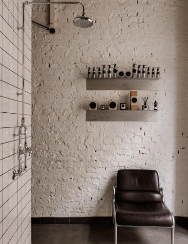
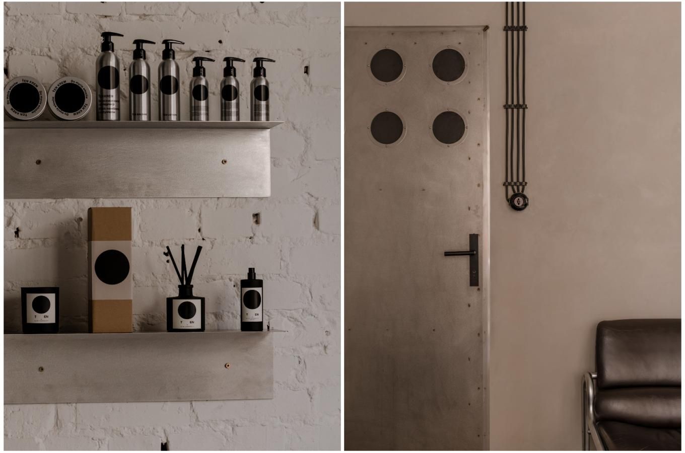
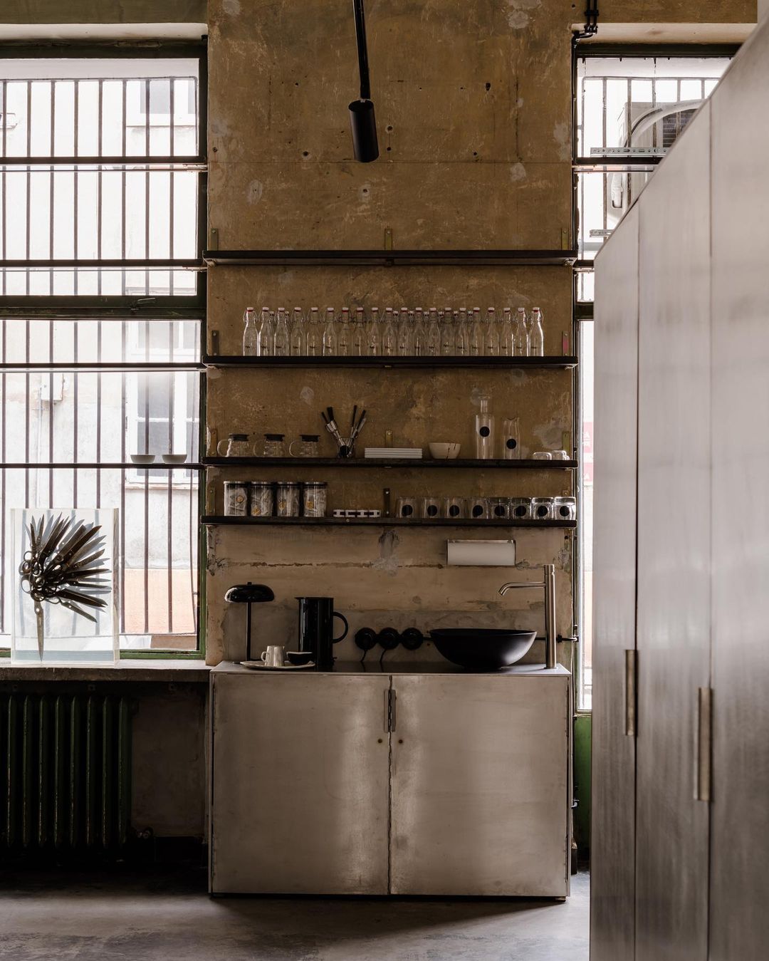
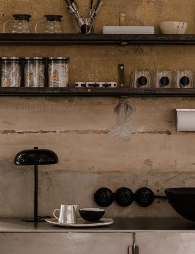
In a hair salon, the packaging of cosmetic products is a major concern, and let’s face it, the adoption of minimalism is aesthetically fortunate. TEN Salon’s products have also influenced the choice of materials in the space, so simple aluminum bottles with a black brand logo provide the starting point. This choice was so radical that Polish lamp manufacturer Lexvala produced aluminum lamps specifically for this interior, rather than steel as usual.
Julia Bimer and TEN Salon manager Łukasz Mazolewski both saw that the art was unconventional, yet important to the space’s character. One of the most striking pieces is Michała Slezkin’s painting Gorgona, which was left in the salon by chance. The painting depicting the mythological Medusa is appropriate both in terms of color and subject matter, not to mention the fact that its placement makes it an integral part of the space. The other significant artwork is the lamp sculpture designed by Marek Bimer, a personal reflection of Julia Bimer’s work, who aims to use her father’s creations in as many of her projects as possible.
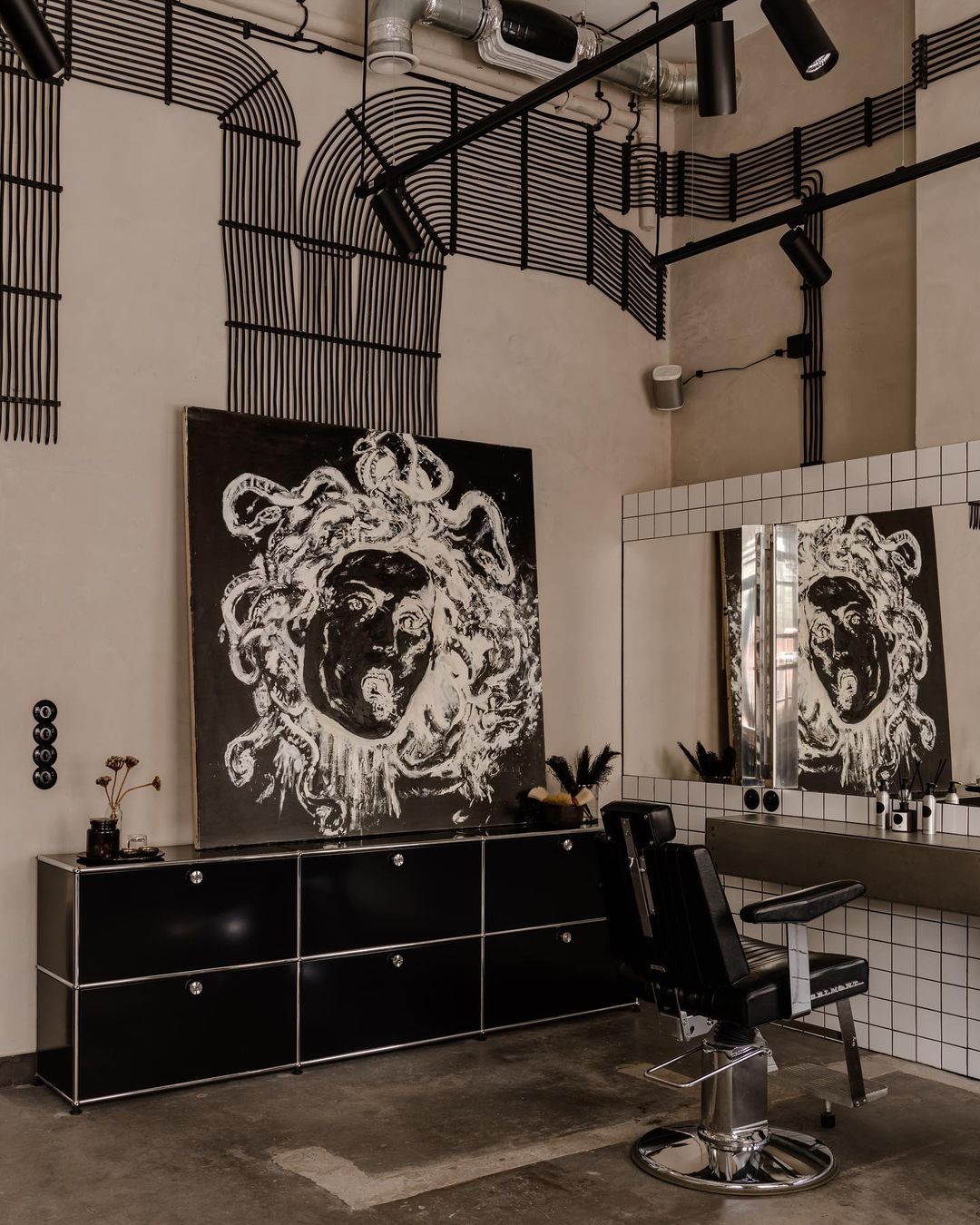
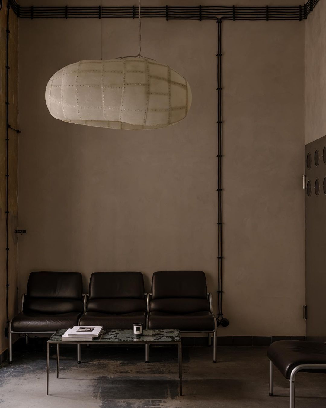
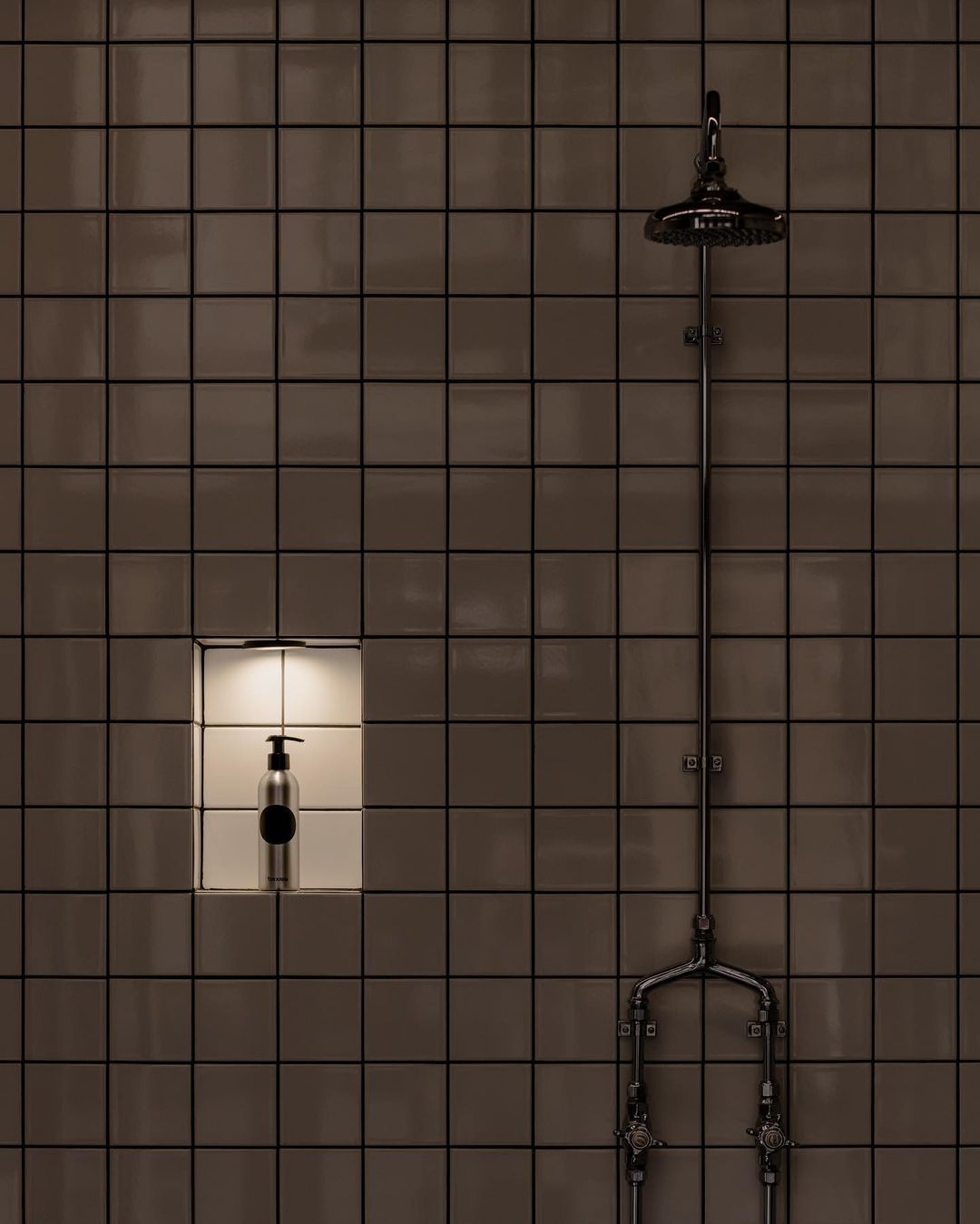
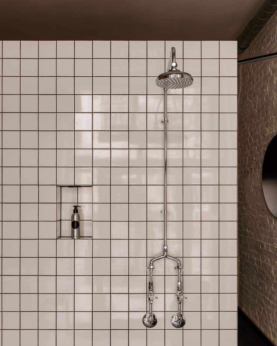
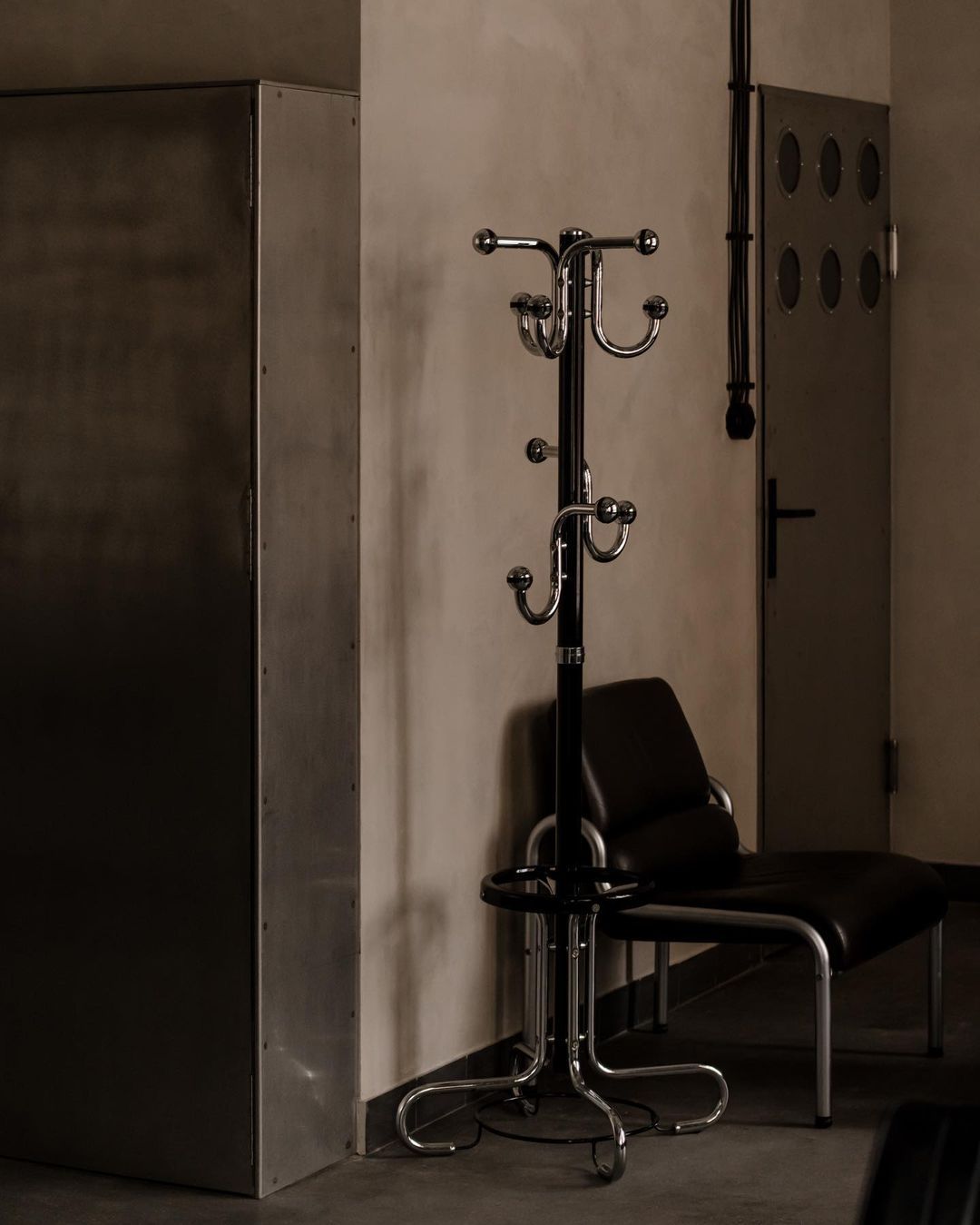
Most of the walls are covered in Italian white 10x10 cm tiles with black grout, providing both a strong rhythm and a break from the huge factory-like surfaces. Sourcing the faucets and shower columns, which were imported from New Zealand, was a major challenge—but apart from these and the USM bookshelf, everything came from second-hand or vintage shops, making this unusual concept even more unique.
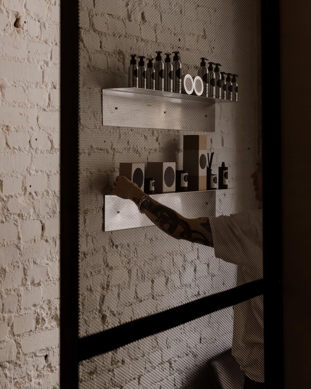
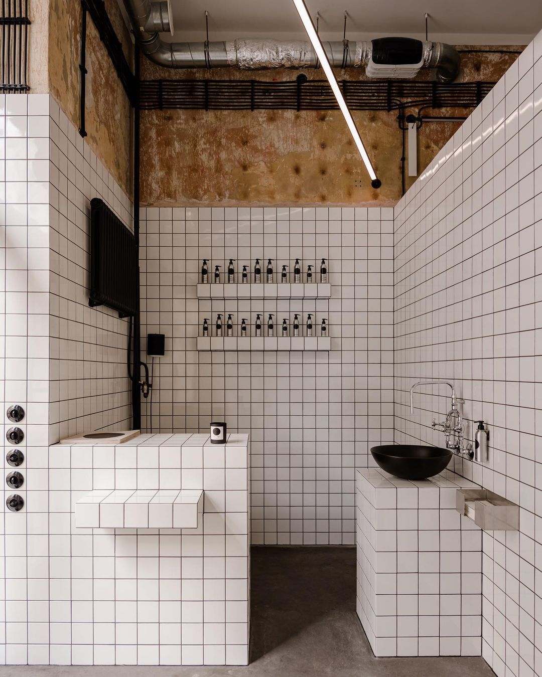
Photos: Oni Studio
TEN Salon | Web | Facebook | Instagram
Julia Bimer Interior Architecture | Facebook | Instagram
Source: Label Magazine
Hidden treasures of Bukovyna | The Babyn Buchok project
