Bold, experimental or sometimes more modest visual world, combined with strong color contrasts and a characteristic logotype.The story of Classmate Studio started not so long ago, yet their portfolio already features prominent projects like the visual identity of Off Biennale or various design and architecture studios, as well as the city image of Debrecen 2023 European Capital of Culture. We interviewed the members of the studio, Attila Ács, József Kiss G., Lili Köves, Eszter Misztarka and Fruzsina Fölföldi about their work together and their exciting projects. Interview!
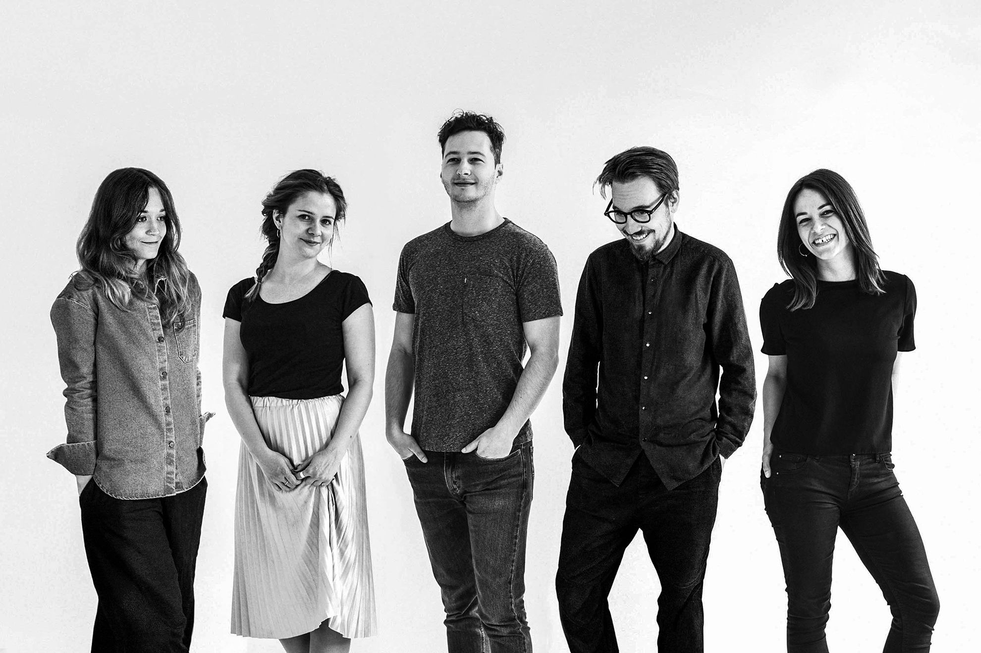
Classmate studio’s team consists of the five of you. There’s a reason behind your choice of name, as all five of you used to be classmates at the Department of Graphic Design of the University of Visual Arts. When did you decide that you wanted to work together and what was your first project?
We had already worked together on smaller projects during our university years, and of course as a result of our friendship, we always asked for each other’s opinion about our own individual jobs, too. Our first large project together, which also marks the launch of Classmate, was our project for the competition announced for the visual refreshment of Metropolitan University. Even though our project made it to the best three works, we weren’t selected to design the new visual identity of the university. This, however, did not break our impetus, and we thought our project was worth showing to others – this is how MET became the first project we published on Behance together, as a group. Finally it caught the attention of several Hungarian and foreign blogs, and it was also featured in multiple foreign publications, which gave us enough momentum to continue.
How are the work processes divided between the members, and what are your strengths?
Our mindset and approach to tasks is essentially similar. Of course we all have our individual strengths, for example some of us are more talented in the field of illustration, and others are more skilled in web design, animation or photography. We usually divide smaller jobs between two-three people depending on capacity, but fundamentally we strive to allow everyone to have an insight on the task and contribute to a project in the case of larger jobs or competitions: just like we did it during university.
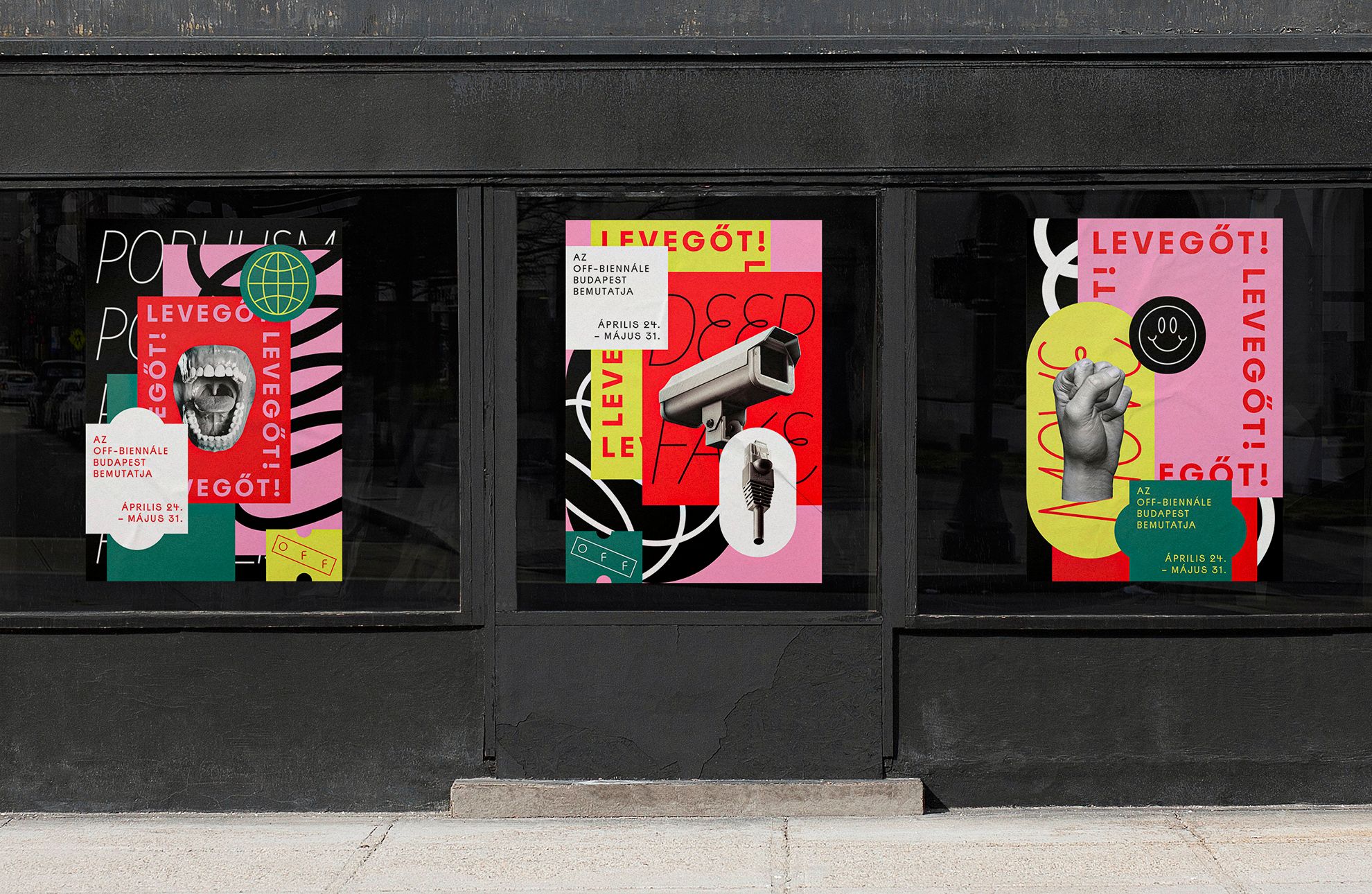
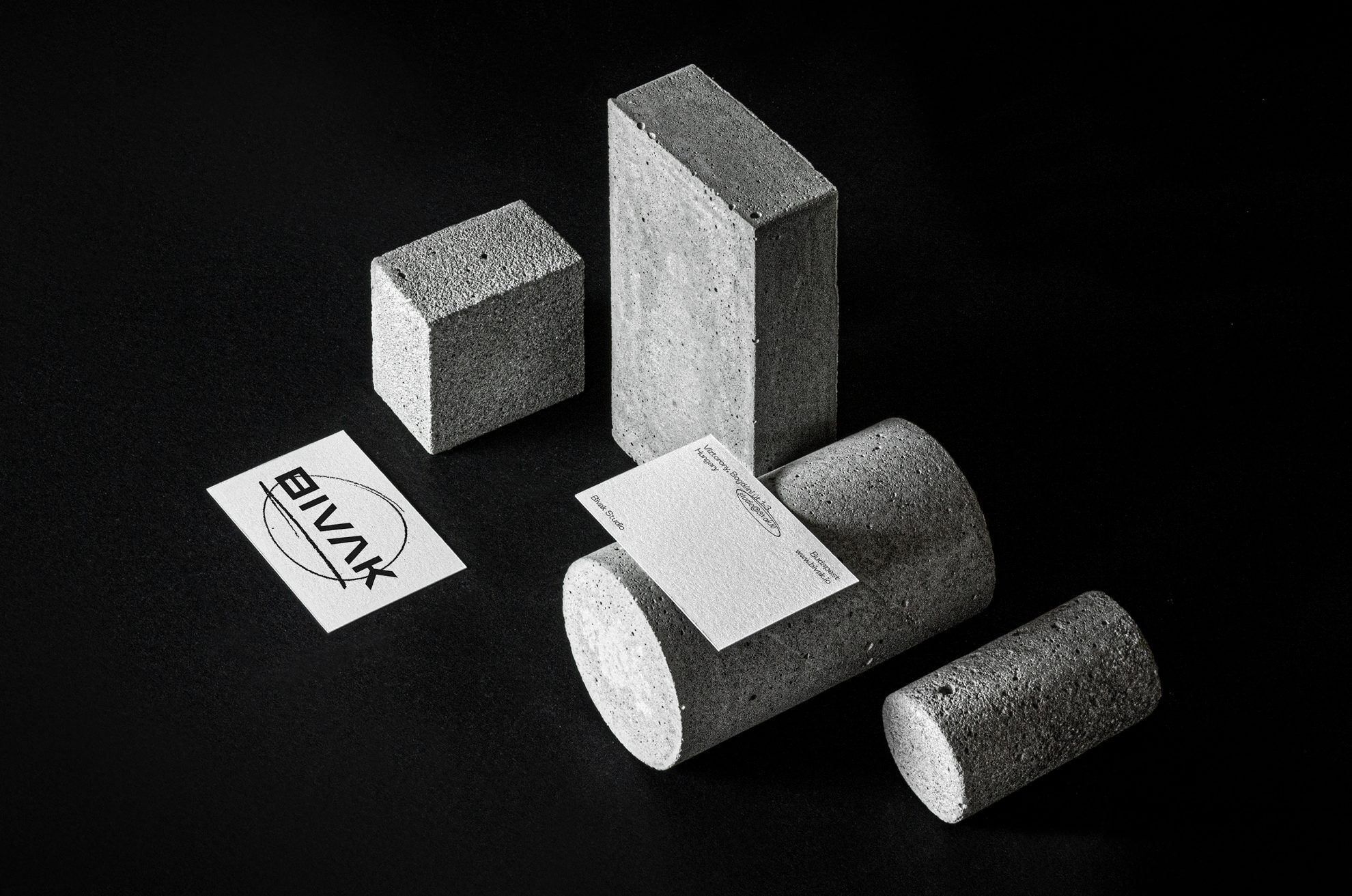
Strong and bold use of colors, characteristic logotype, geometric basic shapes and illustrative elements. Even though the team consists of the five of you, there is still a visual unity that can be observed in all your designs. How would you describe Classmate’s creative perspective and style?
We received the same education, we are subject to similar graphical stimuli in our everyday life, and we also try to find a concept behind each of our works to which everyone can relate and on which we can build the visual appearance also with regard to the close friendship established over the university years.
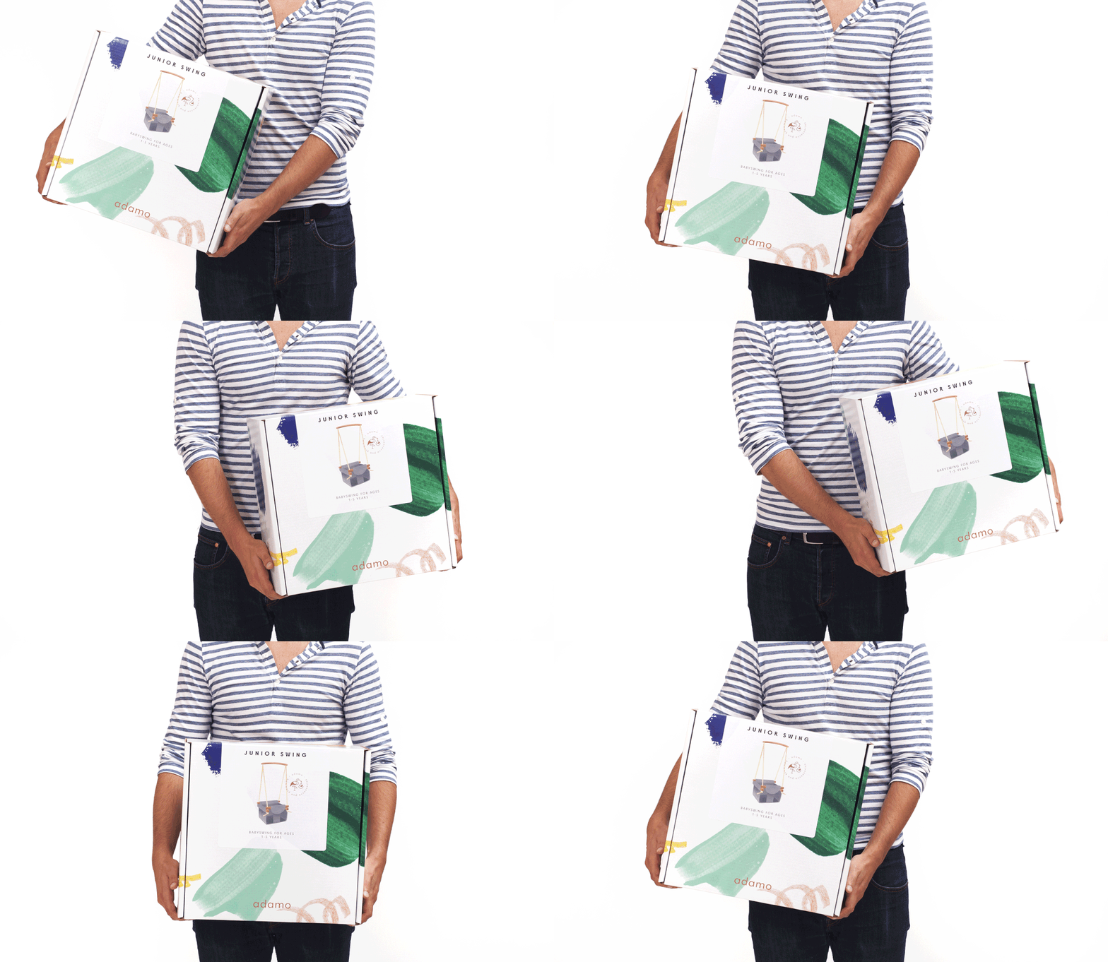
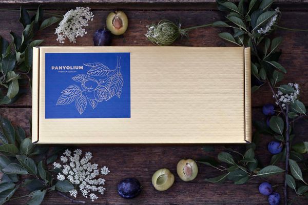
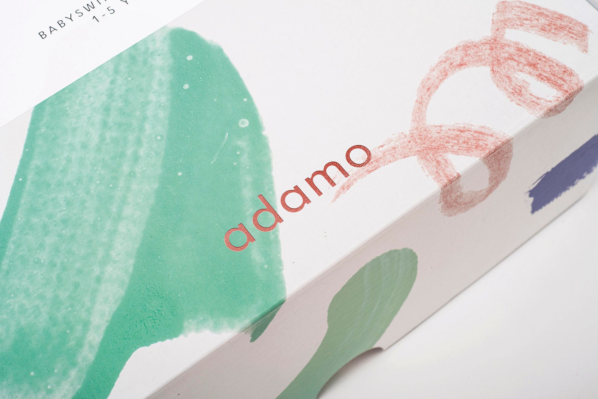
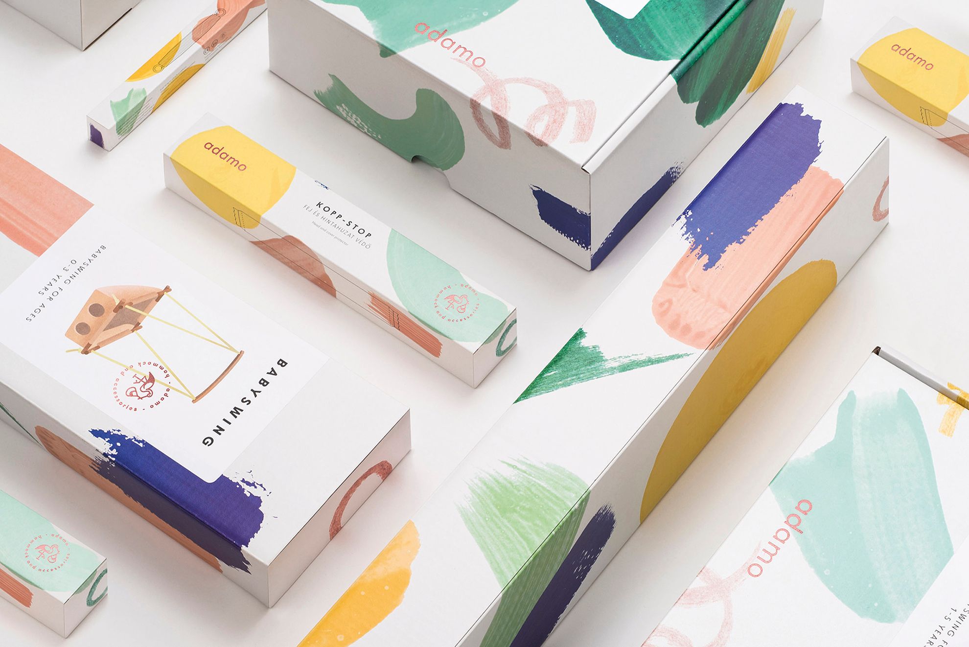
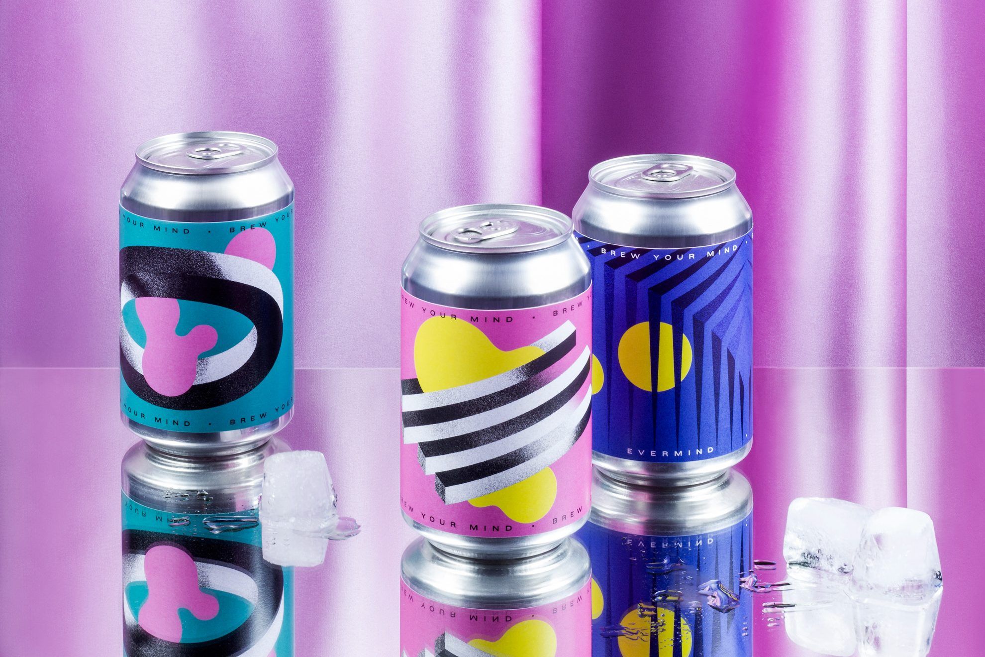
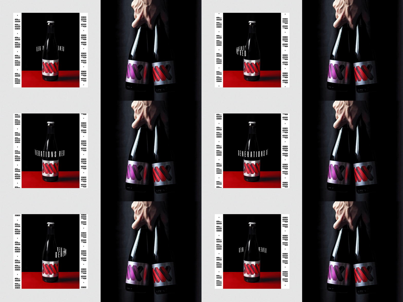
We have several projects that are more modest, but perhaps these are less prominent amongst the cultural and design jobs. For example, in addition to being colorful, the packaging designs made for Adamo, a brand focusing on hammocks for children also represent a lot more organic, elegant and traditional graphical approach than for example the exciting, geometric world of the labels designed for Brew Your Mind brewery spiced up with an optical game.
Our studio works mainly online. Two of our members, Lili and Józsi spend the largest part of the year in Finland, yet this does not influence our primary goal at all: to work on projects we love freely, without any boundaries. Of course we all have our own projects, but in Classmate we can work with multiple types of inspiration and a larger volume, and we also dare to start in more lively and bold directions.
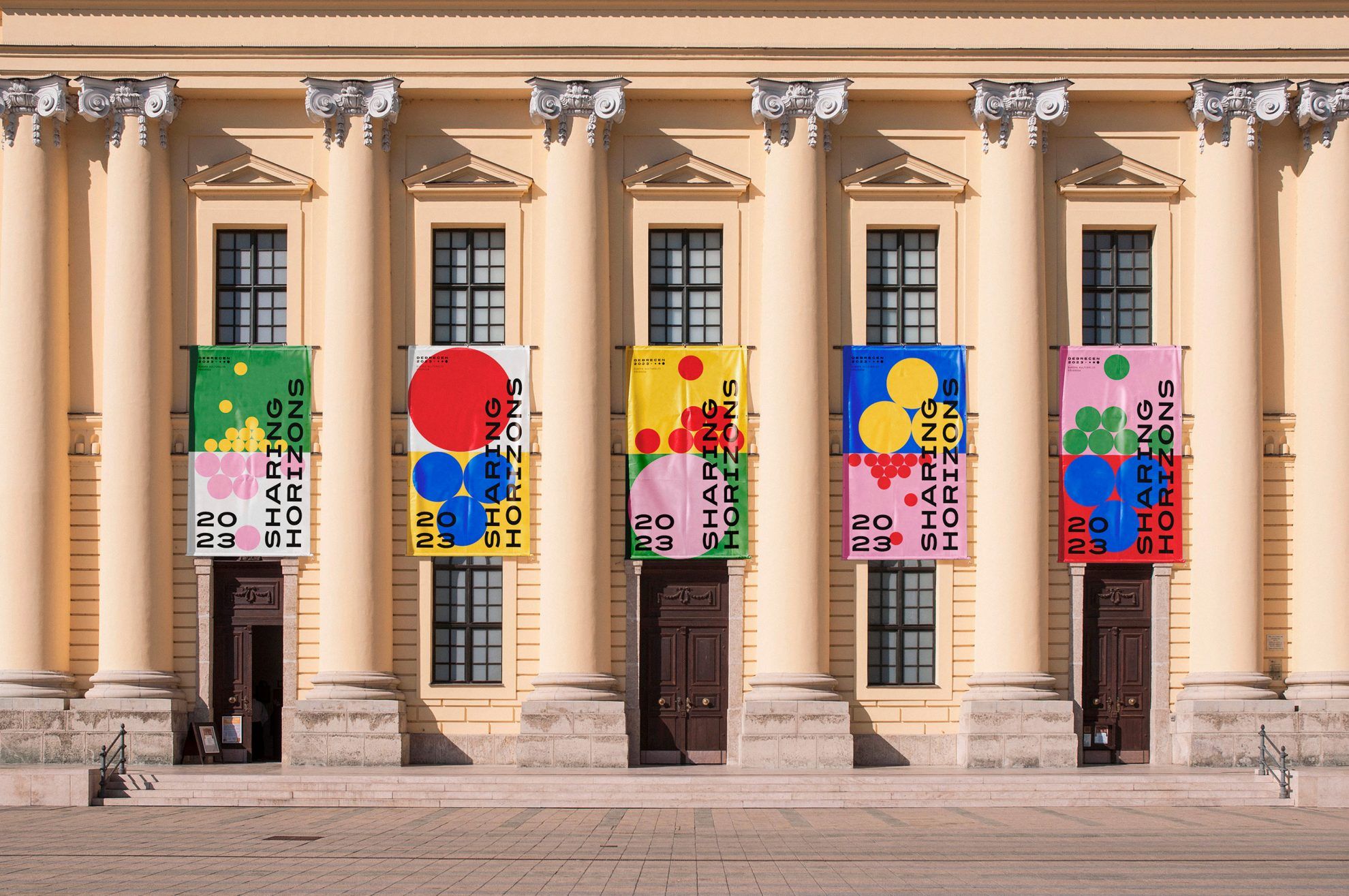
Initially, you looked for competitions: including for example your quite popular visual identity for Debrecen 2023 European Capital of Culture, which has won several awards for you, and you were the third place winner of Highlights of Hungary in 2018. Today, it’s safe to say that your customers find you, and not vice versa. What do you think is the sector or profile that allows you to fulfil your potential the most?
We got enquiries from every sector: fashion, festival, food, packaging, web service, office visual identity and so on. This does not mean that all enquiries make it to our portfolio, or get to the final work phase, but we can find the exciting things and things needing refreshment in everything. The end result depends on the trust we receive from the client greatly, too.
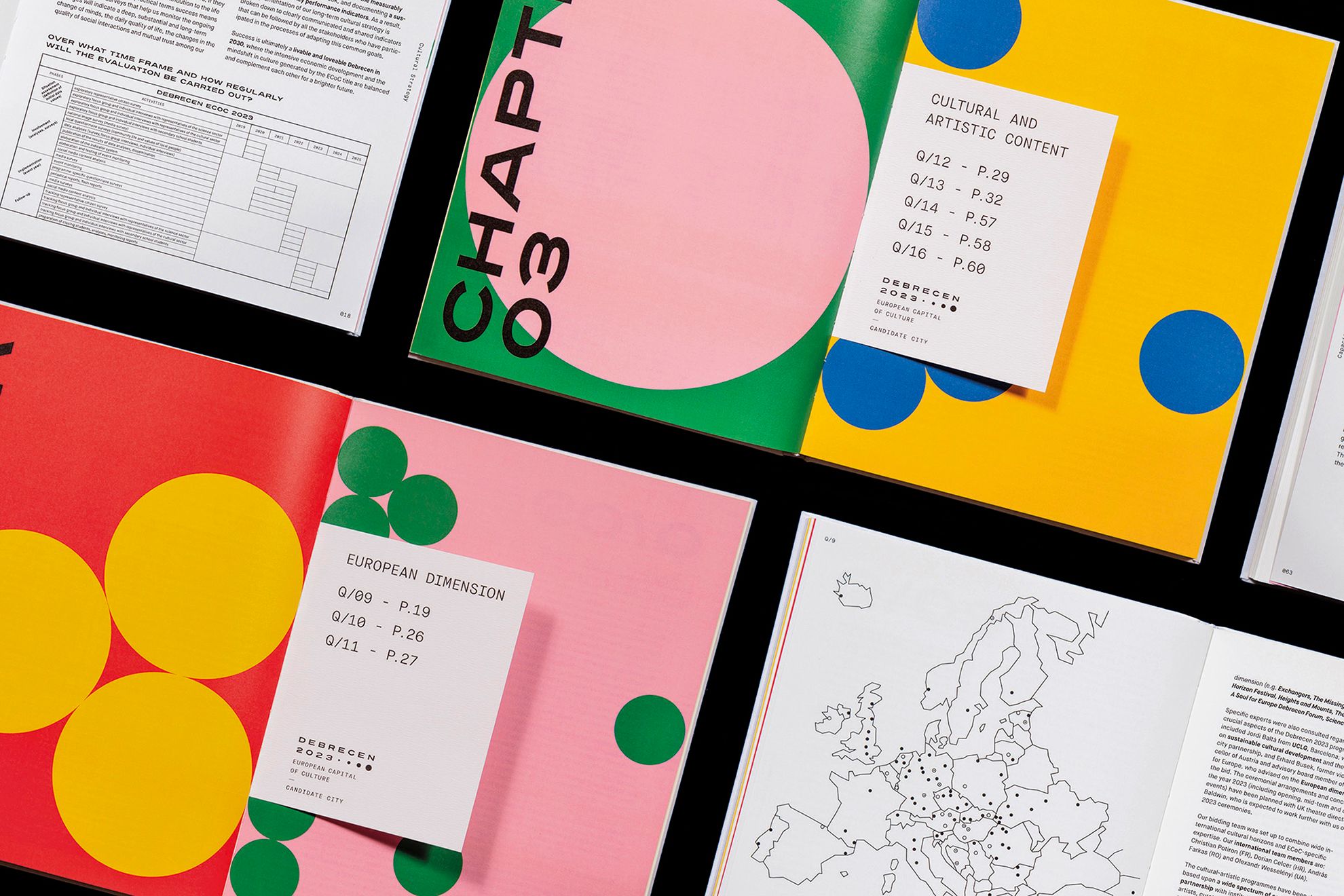
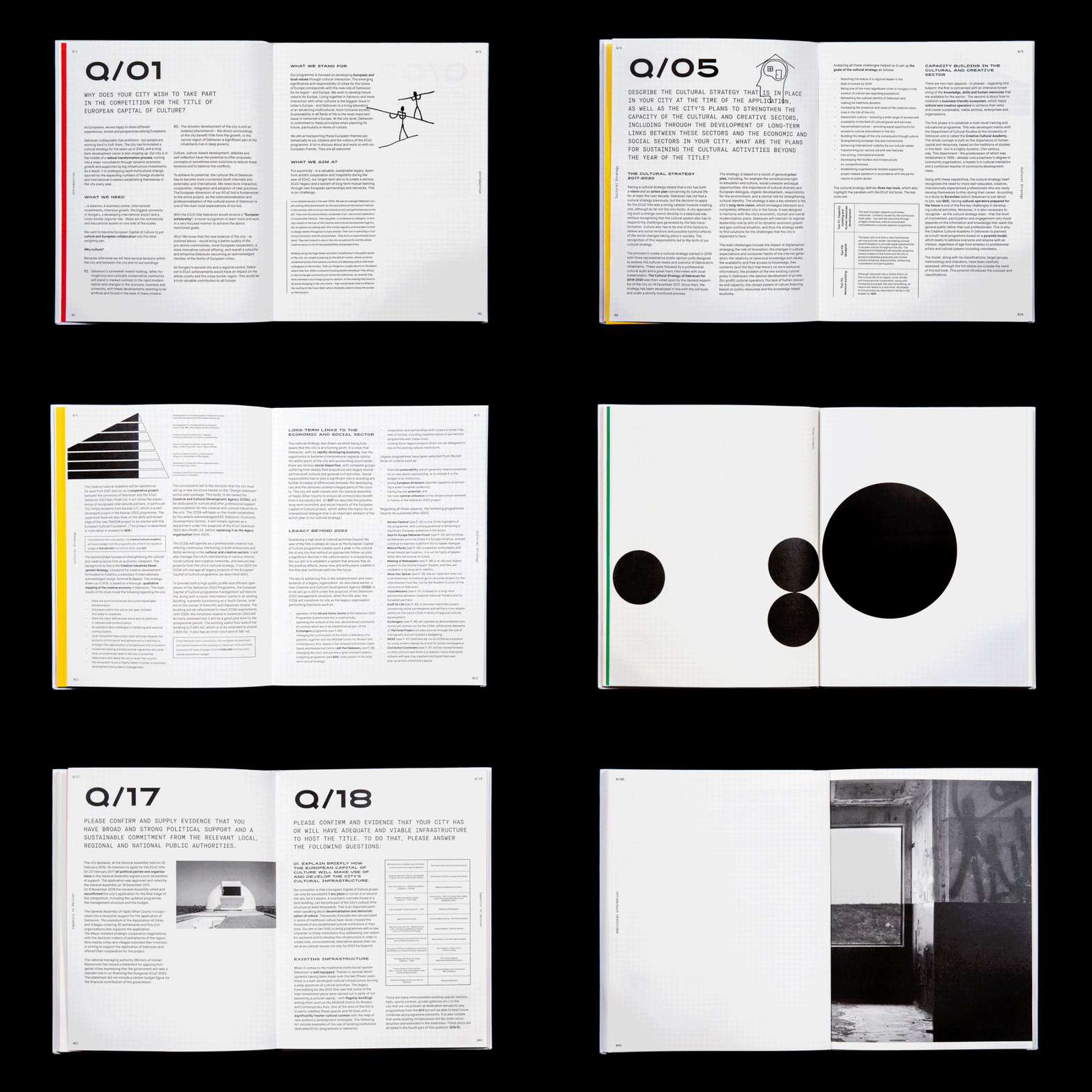
Perhaps the projects that interest us the most are the ones with a tactile and physical end result. Our competition book prepared for EKF Debrecen is a good example for this. In addition to various printing techniques and paper textures which are already exciting by themselves, here the collaboration with the people we got to meet during designing – authors, photographers, artists and illustrators – results in an even more fascinating experience.
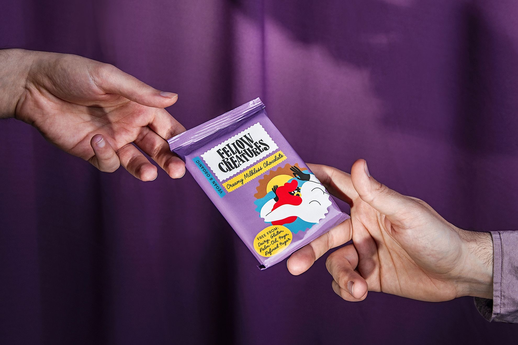
In addition to the Hungarian ones, you also have enquiries from abroad, and on top, two members of the team are living in Finland, as you mentioned. These projects include for example the packaging design created for Scottish vegan chocolate manufactory Fellow Creatures. How did this collaboration start and what was your task exactly?
The founder of the company, Zsolt Stefkovics, who is currently living in Scotland, found us on Instagram back in 2018. He started to build his vegan chocolate brand around this time, and he asked us to help create the visual world of his brand. We knew it from the very beginning of designing that Zsolt wanted to collaborate with UK-based illustrator Egle Zvirblyte. We also supported this idea, as we knew that Egle’s style would be a perfect match for the visual identity in progress.
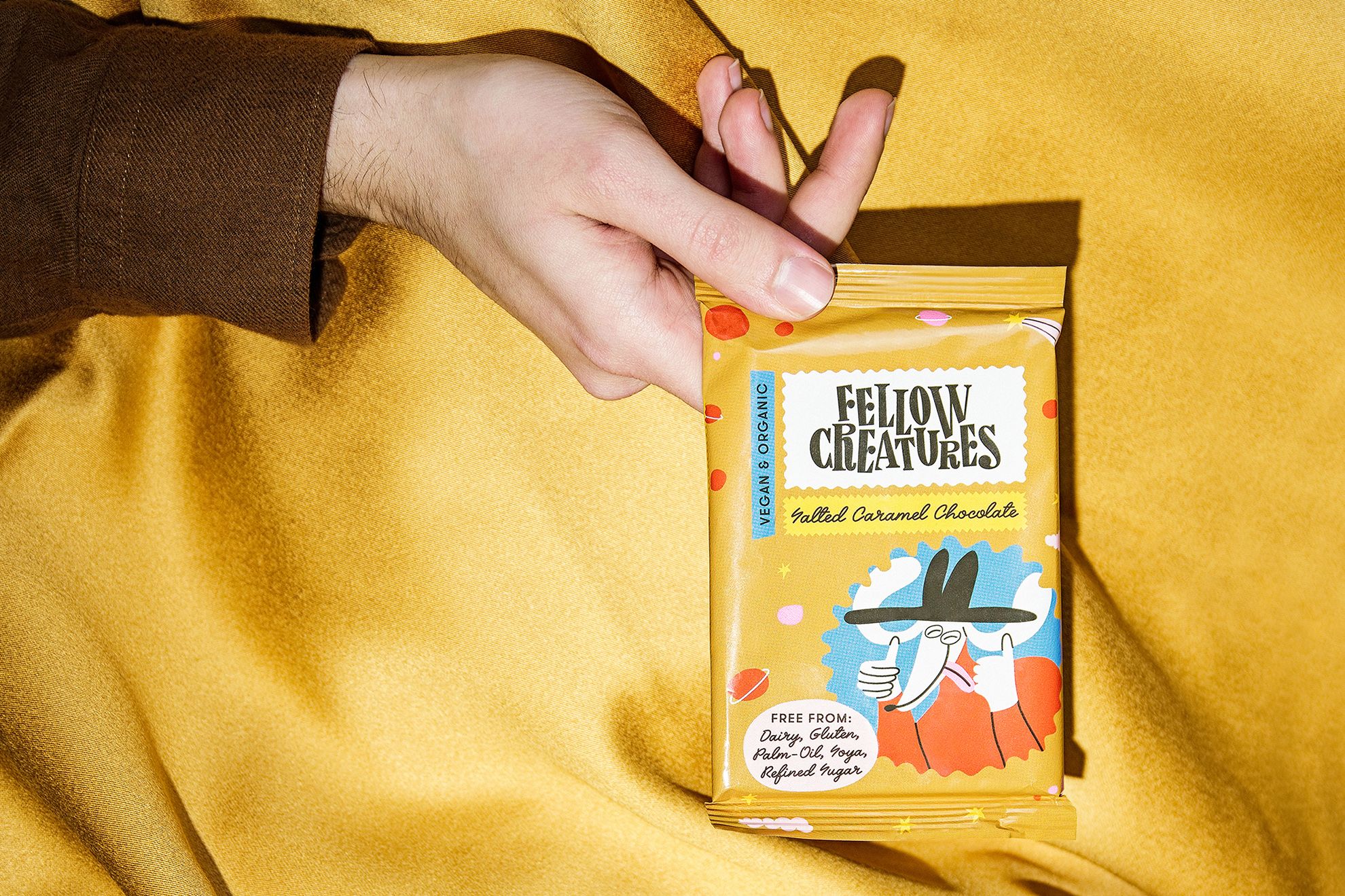
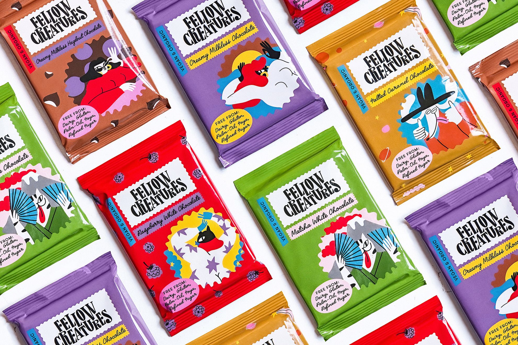
During that time, we made several packaging designs and we also created a display font based on the logotype. Ultimately the final design visible on the packaging now was created, however, our collaboration has not come to an end just yet, as we continue to expand the appearance of the chocolates unto this day.

What new projects are you working on currently?
There are several projects in prep phase, and there are also some on which we have already been working for some time. One of our larger jobs is our series of illustrations created for Liget Budapest. This job also started with a competition, where the jury liked the illustration part of our visual identity design, and so we got an opportunity to continue it along the visual identity project of Graphasel.
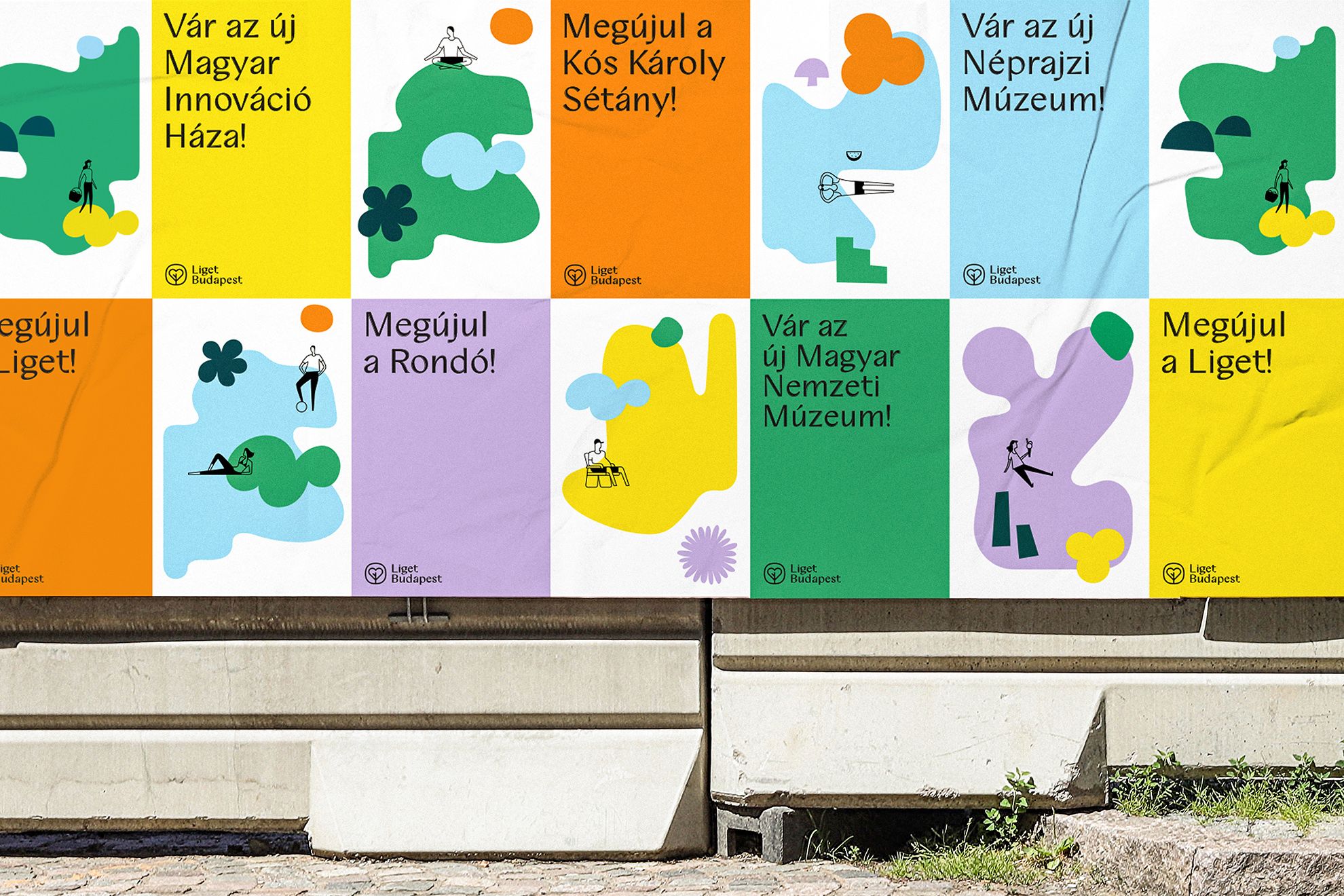
Moreover, we also work on the visual identity of the company Amata Power. They manufacture food supplements for athletes and fans of movement in a completely new approach, but we also work on the visual identity of a picnic place and a small winery, and we recently started to work on a brand reforming the work uniform of healthcare workers.
New house inside a ruin | ORA architects
