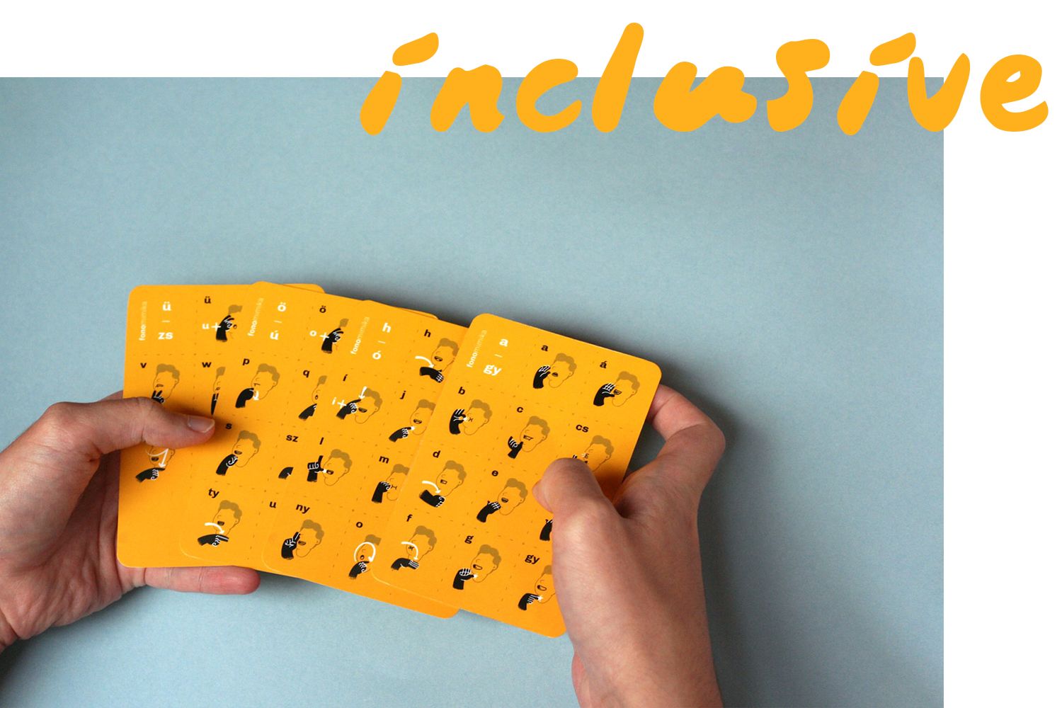
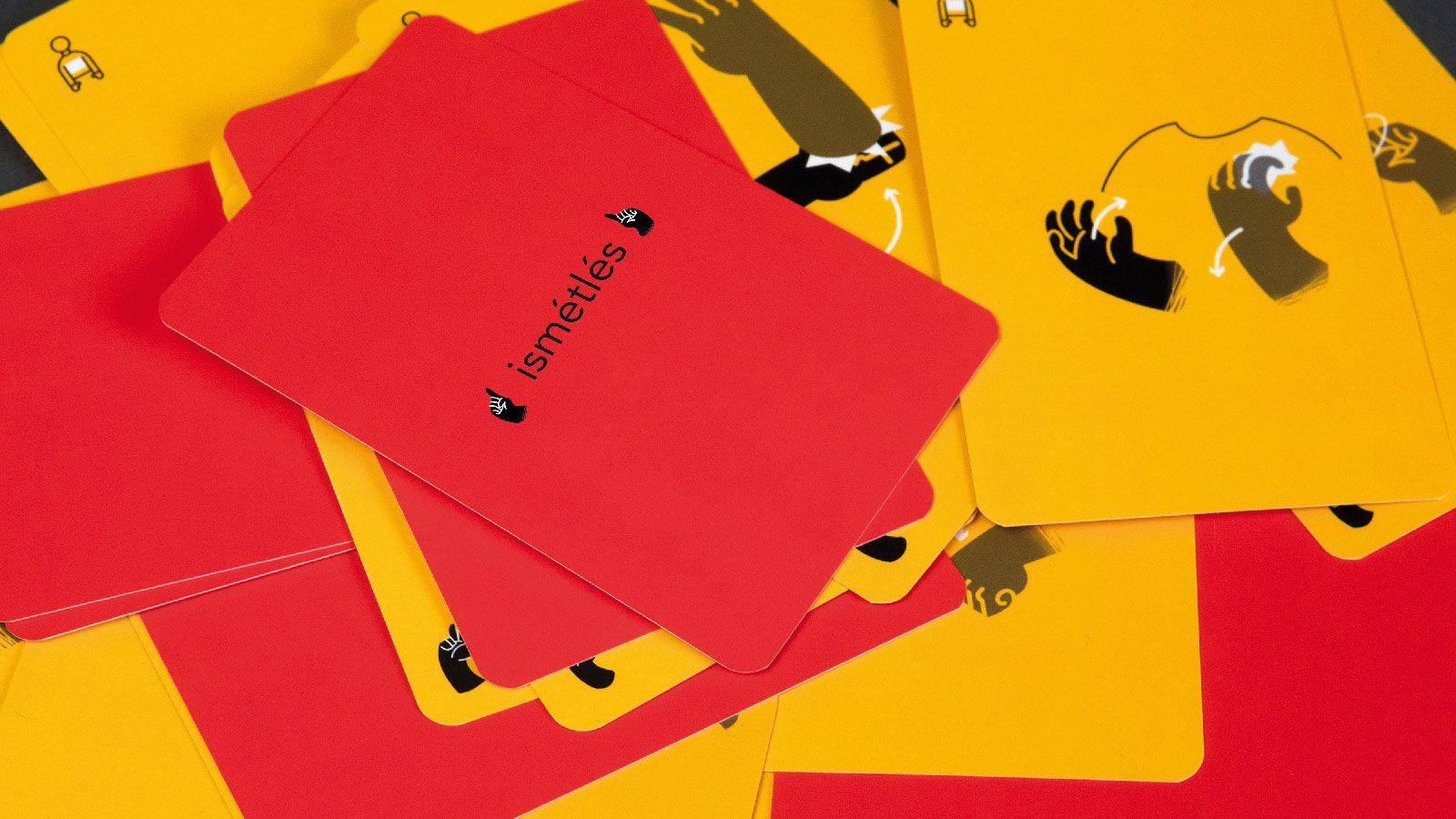
Friendly, lovable and minimalistic: the Szignó card game helps us to learn sing language in a standardized and easily comprehensible manner, not only for the deaf but also for the hearing. In addition to its educative nature, the game also aims to eliminate the barriers established in relation to the use of sign language.
Language is the most general means of human communication and social activity. It is a less known fact that sign language, the form of expression used by hearing impaired is considered a separate language: the same as spoken language, it has its own morphology, syntax and grammar rules. In spite of this, very few means are available that would promote the acquisition of sign language or the development of one’s vocabulary.
We interviewed the creator of Szignó, Bence Kiss.

Designing for groups with special needs is always challenging, and in order to get to know them, we must become part of it to a certain extent. The hearing impaired also have a very unique culture.
Yes, absolutely, this is what made the design process so exciting. I could get to know deafness and the deaf culture: as an audiology assistant, my mother has been helping people with partial or full loss of hearing for more than 30 years, and she herself is quite proficient in sign language. I was inspired by her and a university course focusing on sensation also helped me find my topic. As much as it was possible, I strived to gain an insight into the unique world of the hearing impaired by myself. The sign language course proved to be the most helpful in this, where I was able to acquire a basic knowledge of this completely visual form of communication. If found the sign language course of SINOSZ very exciting and adventurous: not only did they improve our sign language skills, but the course syllabus also included an insight into the culture of the deaf. As a visual designer, I tried to find a point where I could contribute something from myself, from my designer approach to the topic of sensitization related to sign language not in a selfish, but in a more useful way.
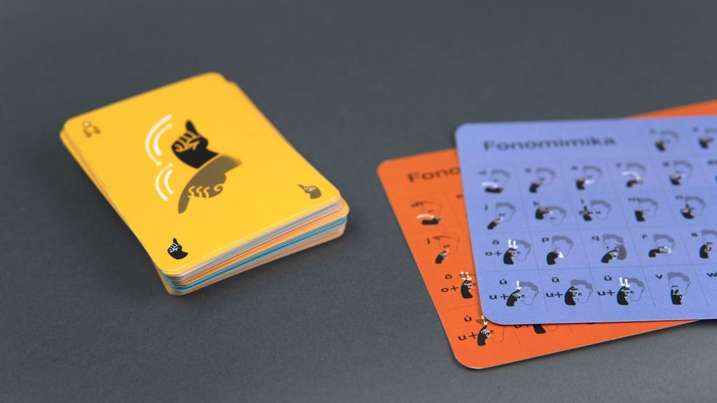
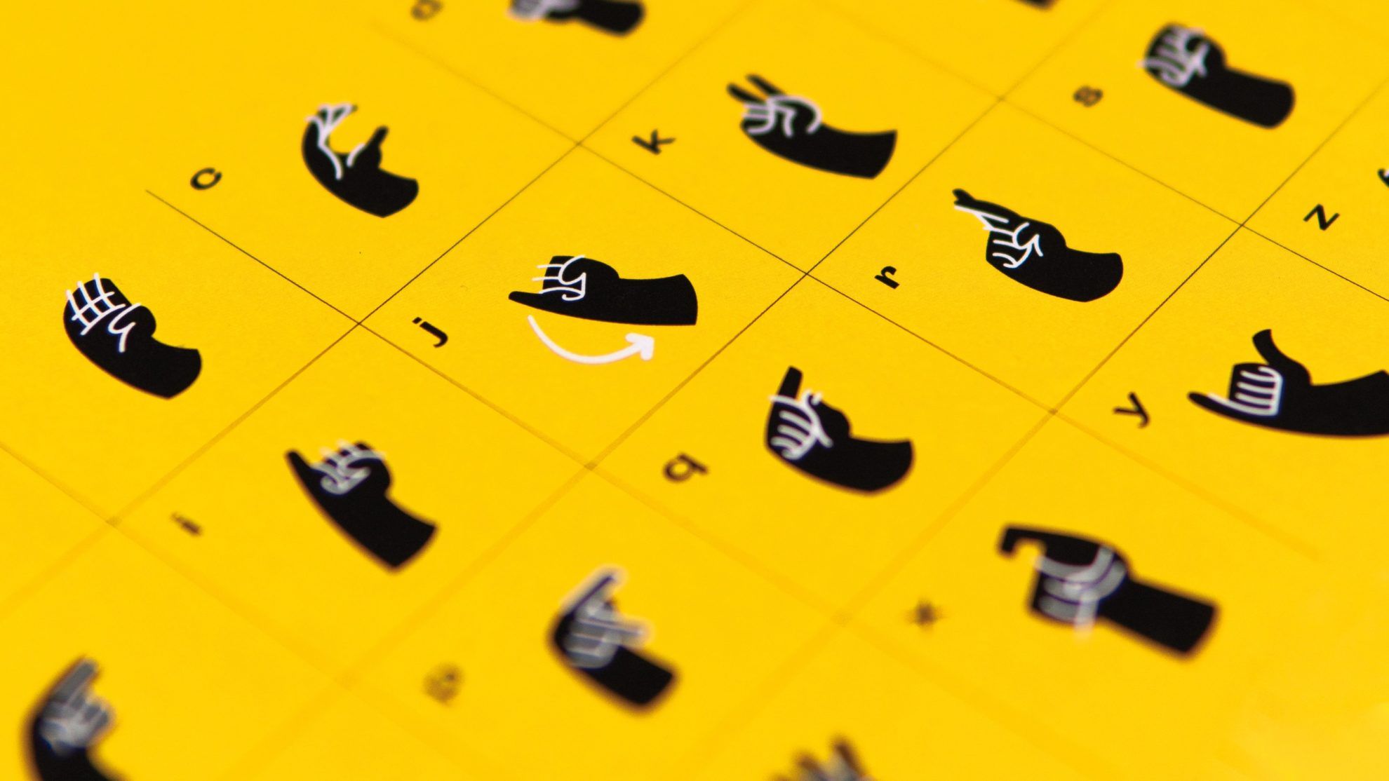
Sign language varies by territory and several sign systems are used: phonomimics, where hand gestures and the expressions of the face form letters jointly, and dactylology (or the so called fingerspelling), where we only express signs with the movement of the fingers and the hand. On the Szignó cards, you developed both letter systems: exactly what logic did you follow when building the system of the cards?
This is true, there are letter systems, such as the Hungarian phonomimics and dactylogy. In addition, there are different unique living sign language expressions that are characteristic of Hungarian sign language communication. It is interesting that these unique signs can vary, especially according to the fields of old deaf schools: I focused on the sign language educated in SINOSZ in Budapest. Based on my research, I am sure that the most obvious connection between deaf and hearing people lies in written communication. This was the core idea of my design, too. It’s also interesting that a large percentage of deaf children are born into hearing families, where communication is a problem. The parents are many times unwilling to acquire sign language, and so I chose children as my target group, who can develop their sign language skills at home together with their families. When clarifying my topic, I had the chance to meet deaf elementary students on several occasions as well as the fantastic pedagogists educating them. I noticed during the conversations held with them and during observation that the letter systems helped them the most in acquiring their basic writing and reading skills. Unfortunately I haven’t seen any exciting graphical solutions for illustrating the sign that would be interesting for and comprehensible by children. I started designing my diploma project, the Szignó in response to this gap.
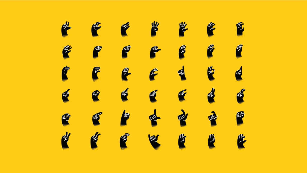
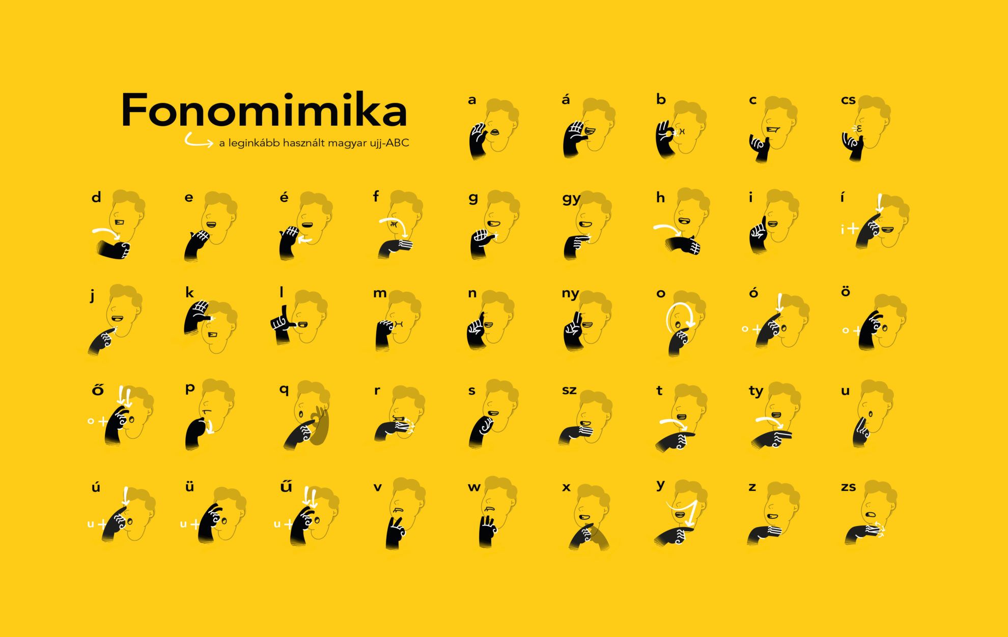
I think the hardest task was to come up with the uniform and comprehensible visualization of language signs, in a system that can be further used later on as a template and with which we can easily expand the pack consisting of 50 sign language expressions. The biggest challenge was to design cards that are plain and minimalist, that use a minimum set of visual means and that can be interpreted as a series also by illustrating the direction of movement, its place compared to our body and the hand.
How does one play with the cards?
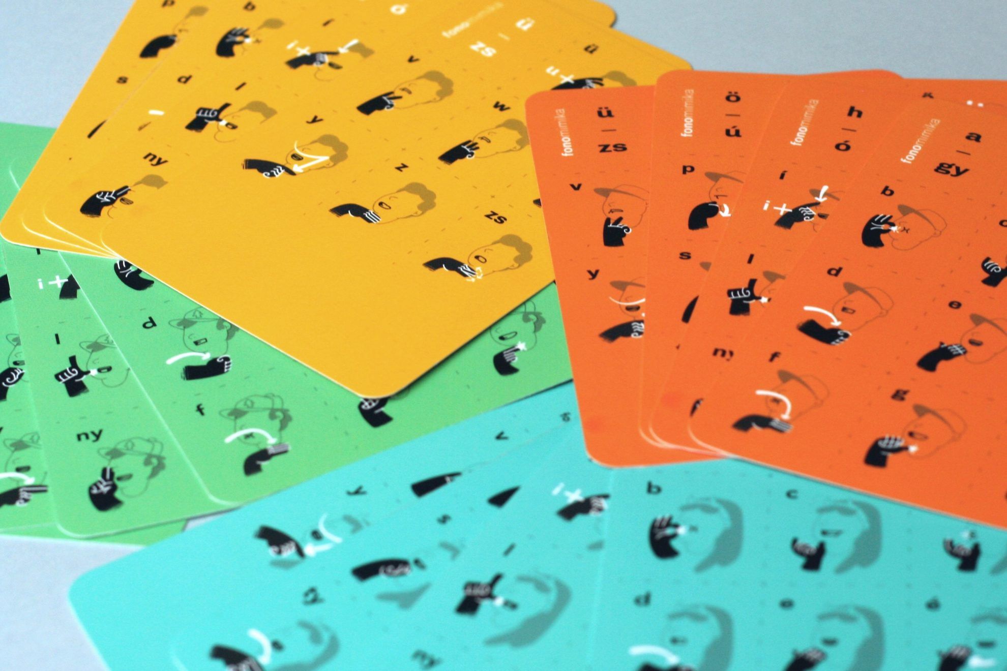
Every player gets character cards that display the letter systems. One side displays the illustration of phonomimic signs and the other one displays dactyl signs. We place these in front of us, and these will serve as a help or cheat sheet during the game in the case if someone is only getting to know sign language or if he or she suddenly has trouble remembering a letter.
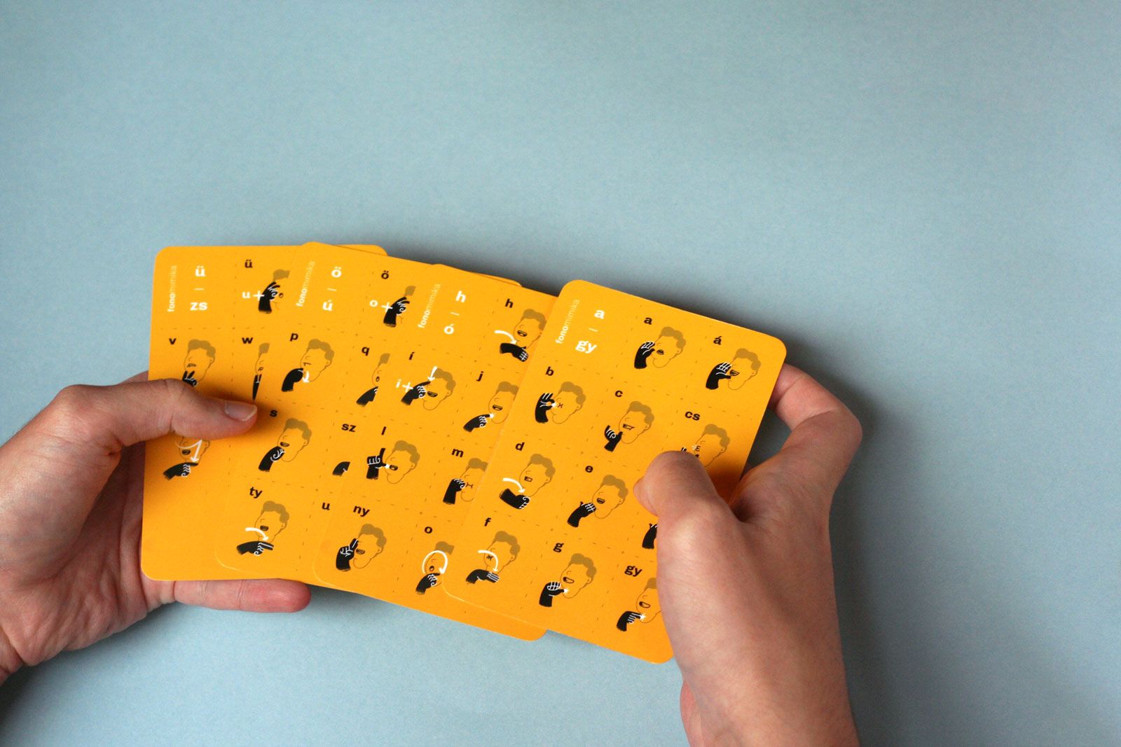
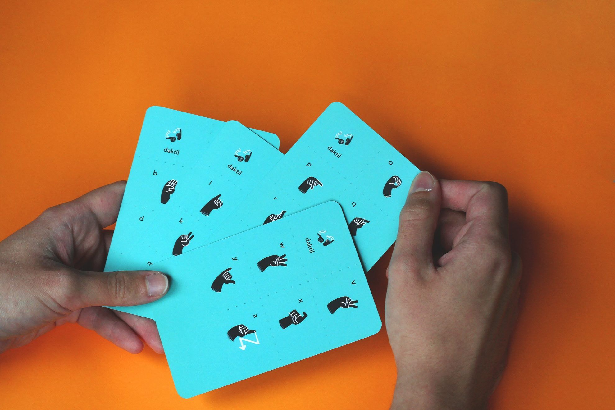
We place the card pack in the middle: we will find written words on one side of the cards and stylized words displayed as a sign language sign on the other side. We have to express these words during the game in sign language.
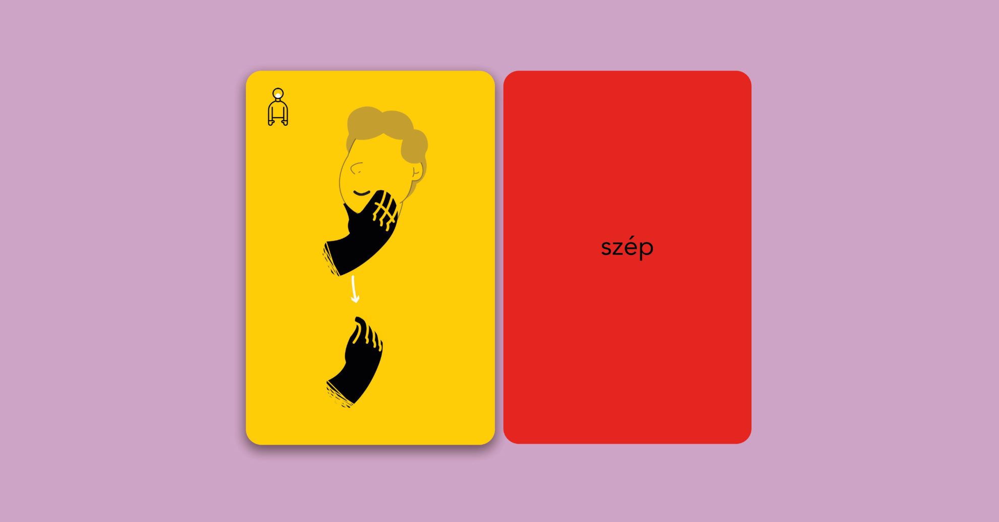
The game allows us to enhance our sign language skills in several ways: if we place the pack with the letters facing upwards, we can check our vocabulary in sign language. In this case, the essence of the game is to see whether you can sign the expression written on the card more quickly than the others, or you can compete and see who could sign the word displayed on the card with the help pf phonomimics or dactylology the quicker. And if you place the pack with the stylized sign illustrations facing upwards, you disrupt the obvious connection between the word written and the letter system, so the game becomes more difficult. In this case, first you have to work out the given expression and then you have to sign it to the others. Of course, you will also need a judge in the case of less fair peers or peers of the similar speed, who will render final judgment as to who was the quickest. The person figuring out the most cards will win the game.
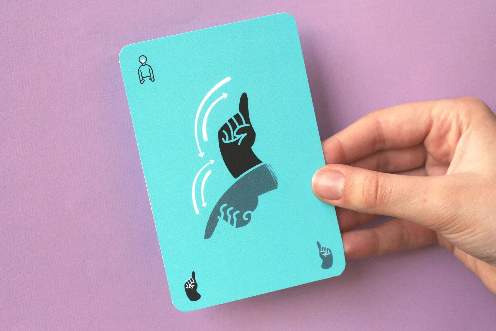
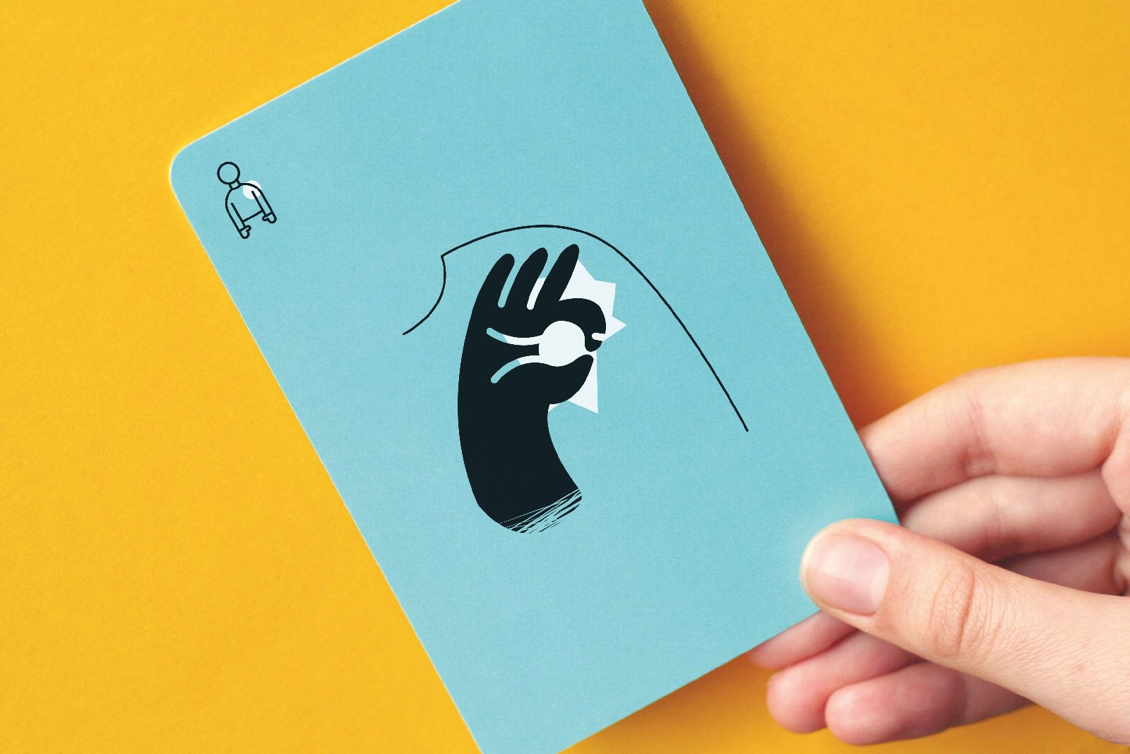
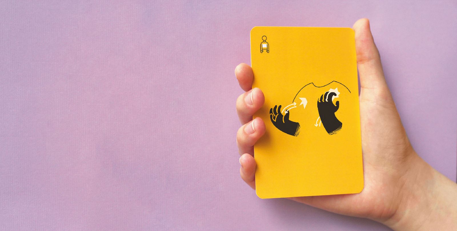
Green, orange, yellow and blue colors are used on the cards: why did you choose these ones exactly and what is the function of your use of colors?
In the course of designing, I aimed to create a color set that can be differentiated easily but that still has a uniform look to it. The character cards have these colors so that the players can differentiate between them easily and so that everyone has a full sign language alphabet in front of them at the beginning of the game. When determining the exact colors, I also asked for the opinions of the children taking part in the test game, so we finetuned it together.
In addition to the character cards, the signs of the game pack also received colors: in the future, these would mark words of different topics (animals, sports, etc.) according to the concept.
What is your long-term goal with Szignó, in what direction would you like to further develop it?
After my diploma defense and my latest interview, I received a surprisingly large number of inquiries: it is clear that there is a demand for the game. In the first place, I would like to develop the cards into a form ready for production, for which a couple of test games, finetuning and the expansion of the sign set of the game pack will be necessary. Then I would expand the base game with additional packs of different themes. I have been thinking about crowdfunding for creating the first pack for some time now.
The INCLUSIVE article series is created in collaboration with MOME Transfer lab., the workshop of Moholy-Nagy University of Art and Design, which aims to call attention to the role of design in shaping our society.
MOME Transfer lab. (2012-2019) is an interdisciplinary research, creative and educational platform. It initiates activities along the passages and links between the different fields that promote the social visibility of people with disabilities and their self-determination through the means of inclusive design. The lab is a significant node of design promoting equal opportunities in Hungary.
HYPE | Weekly program guide
SQUARE-ANGLE – Péter Kuczka
