At times when the events in Belarus are in the center of attention of the global media, we thought we cannot stay silent either – the same as Belarusian artist Rufina Bazlova didn’t stay silent either, who recorded the events in the form of embroidery. The regular, traditional motifs, bird and human figures transform on the red and white images, while idyll is replaced by despair and violence many times. The embroideries became so popular that the artist decided to move them onto T-shirts and to donate the proceeds to charity.
Of course, the current situation is not the sole reason why we should pay attention to Belarus: we now took a bit different approach to examining the Eastern European country. We found talented designers with good taste – the selection includes pastel-toned and characteristic visual identities building on the contrast of black and white, but the traditional folk art already mentioned in relation to Rufina Bazlova also appears. Our favorite is the bathing sponge designed for Amsterdam-based Rijksmuseum, not lacking humor either. Status report from Belarus, from a design angle.
Kitti Mayer
design theorist
On the cover:
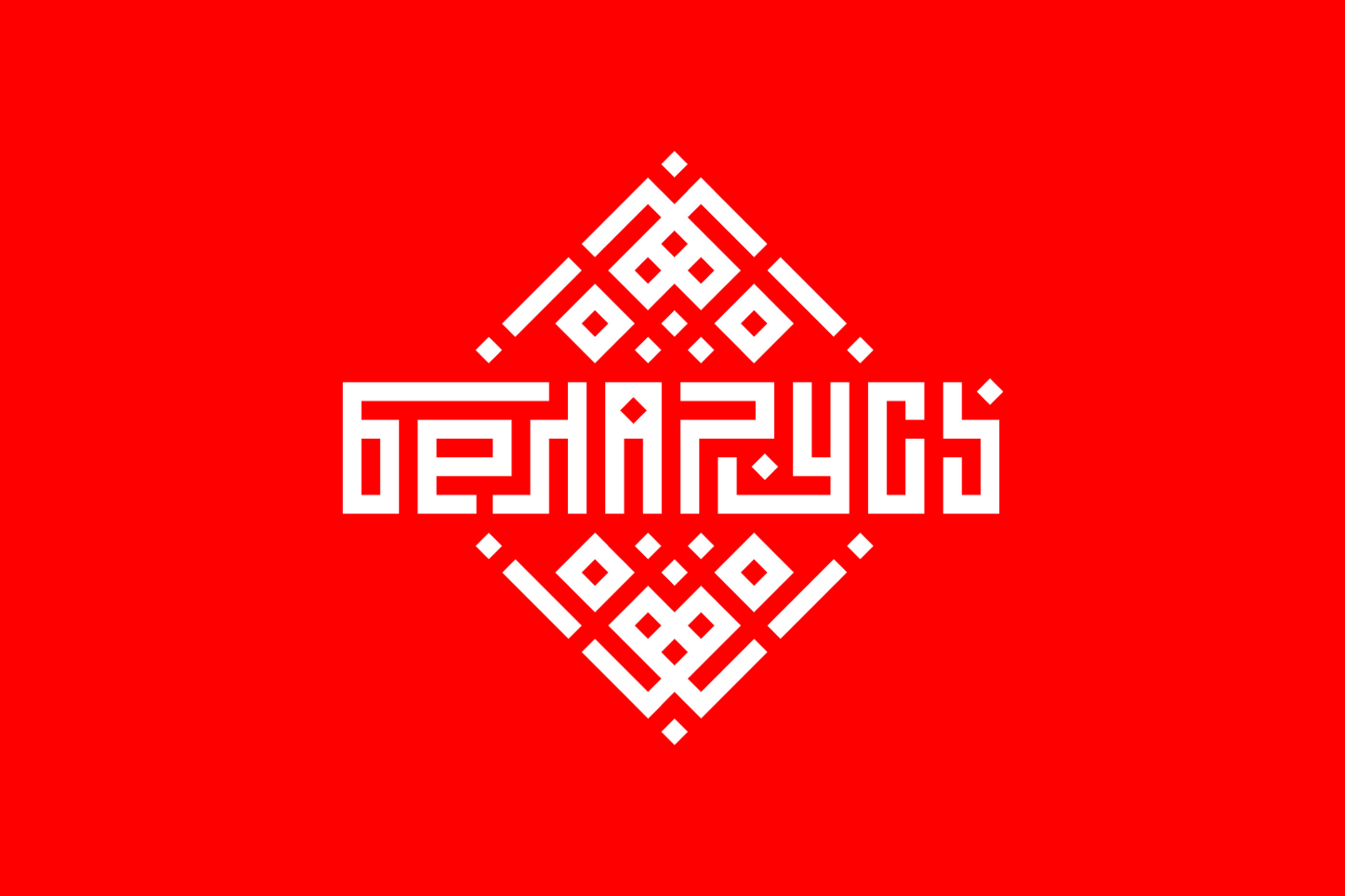
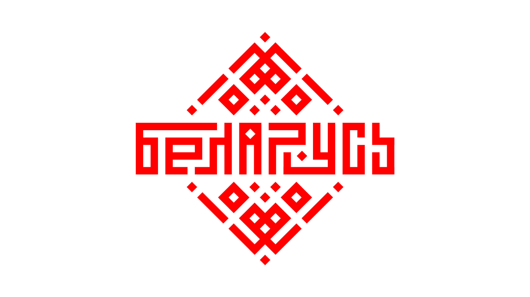
Belarus Branding
Sergei Varkulevich
APPLICATION
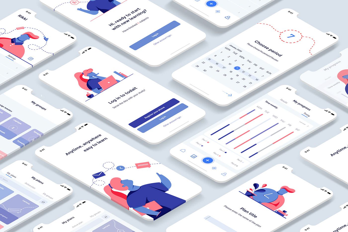
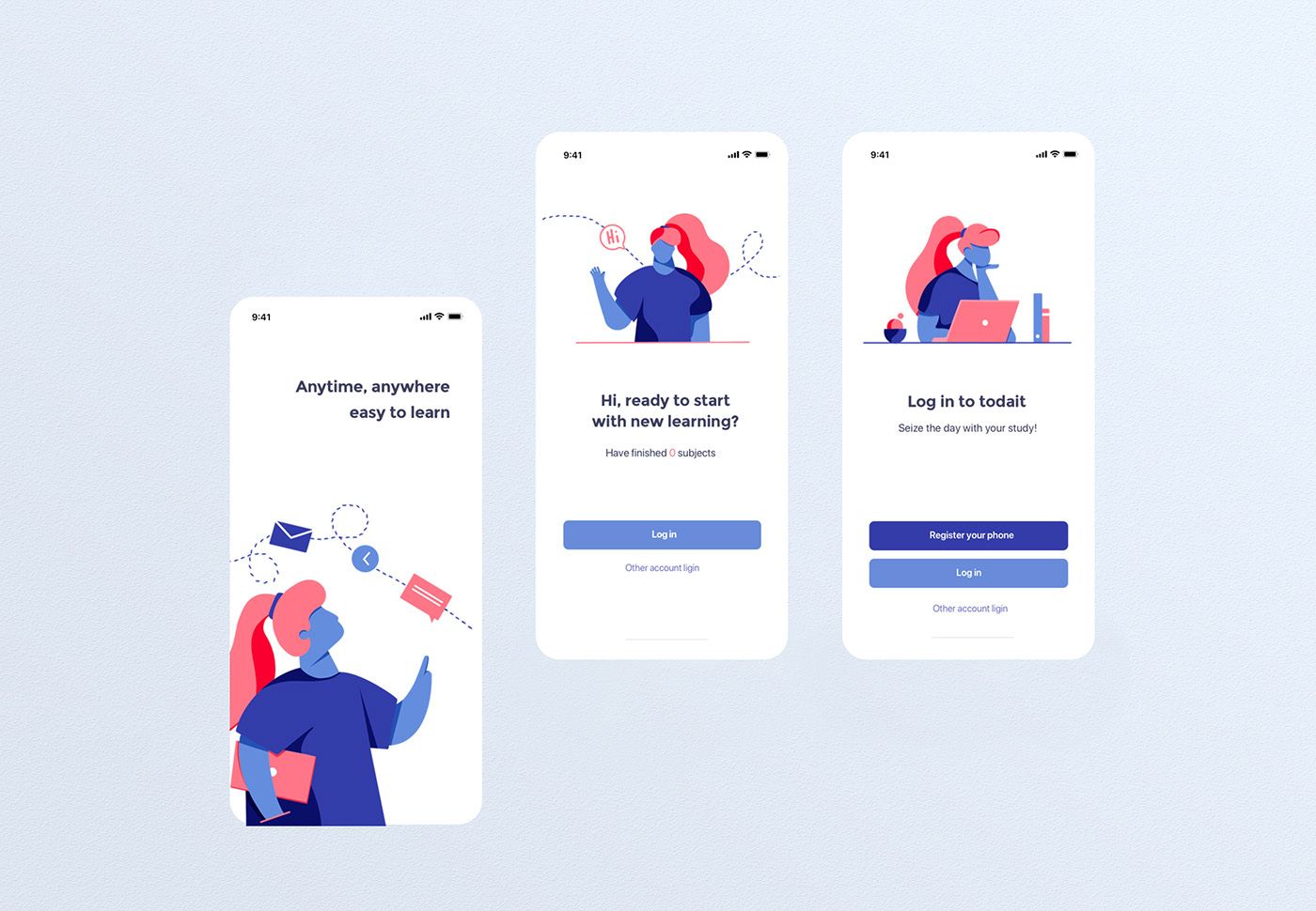
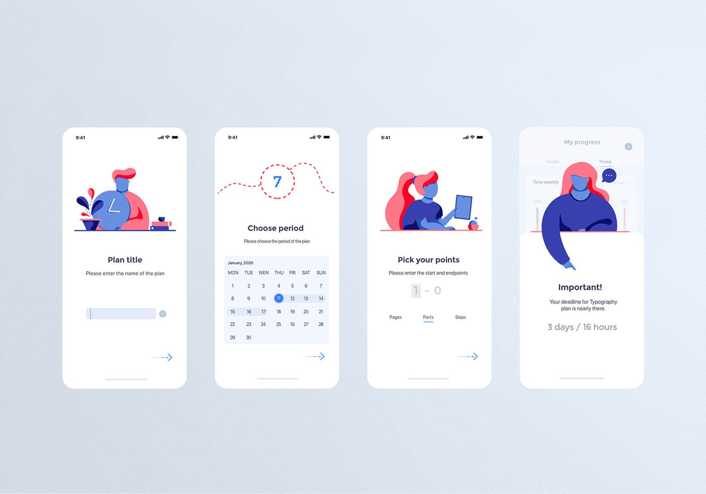
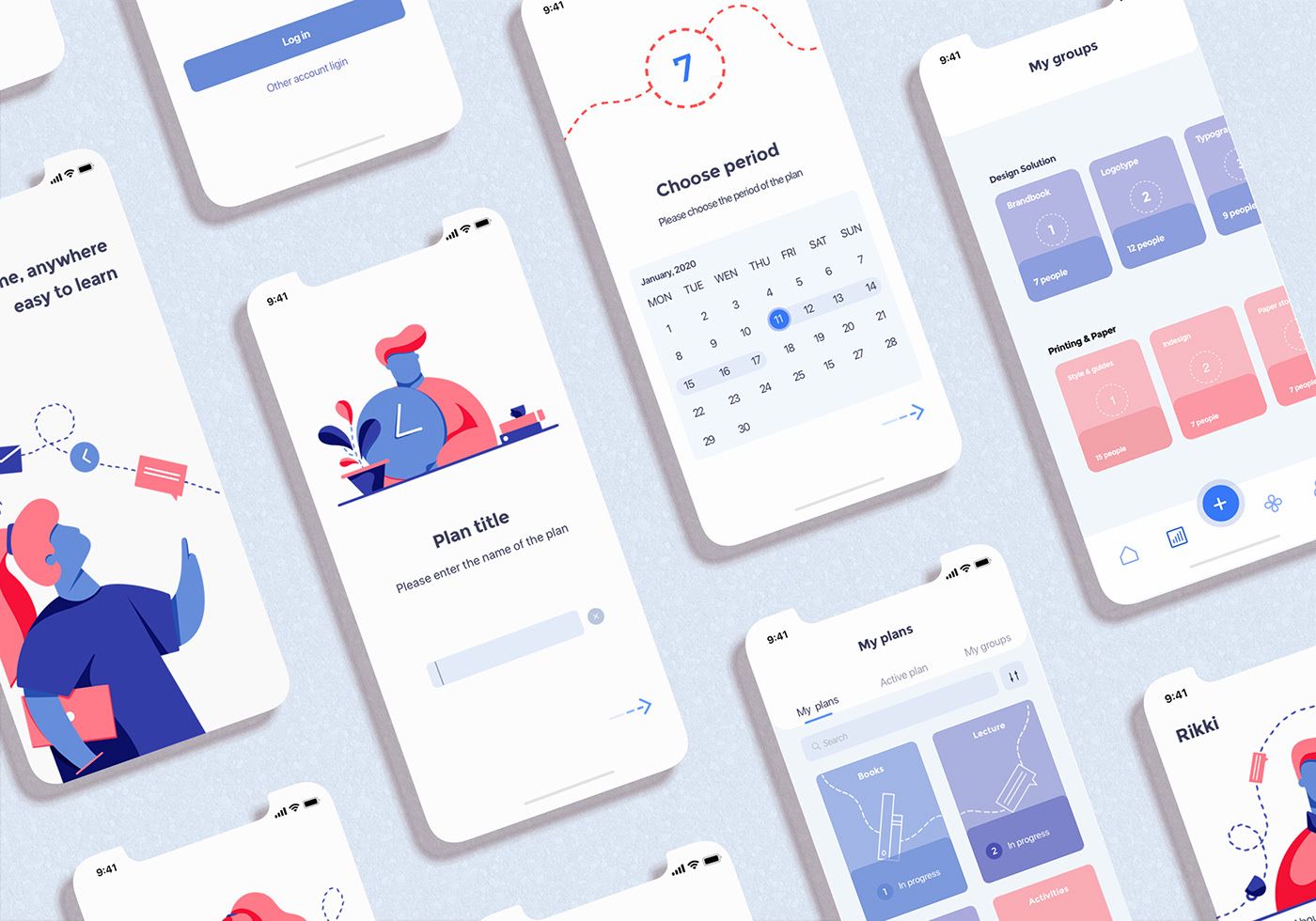
Todait. Time management app. UX/UI
Lizaveta Arhipova
Aksana Rybakova


BRAND IDENTITY
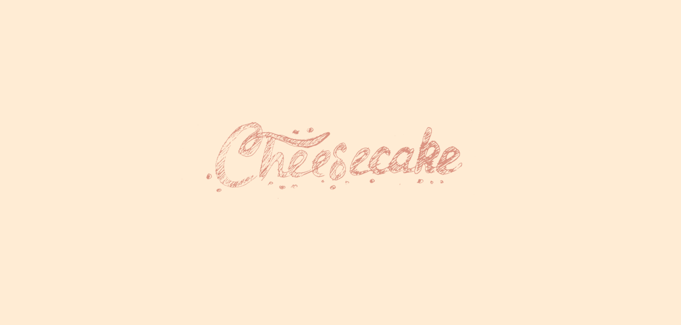
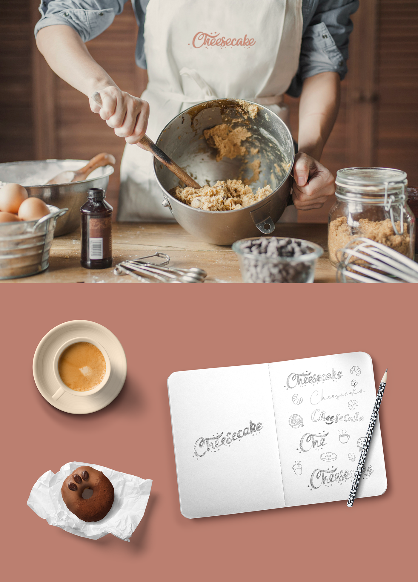
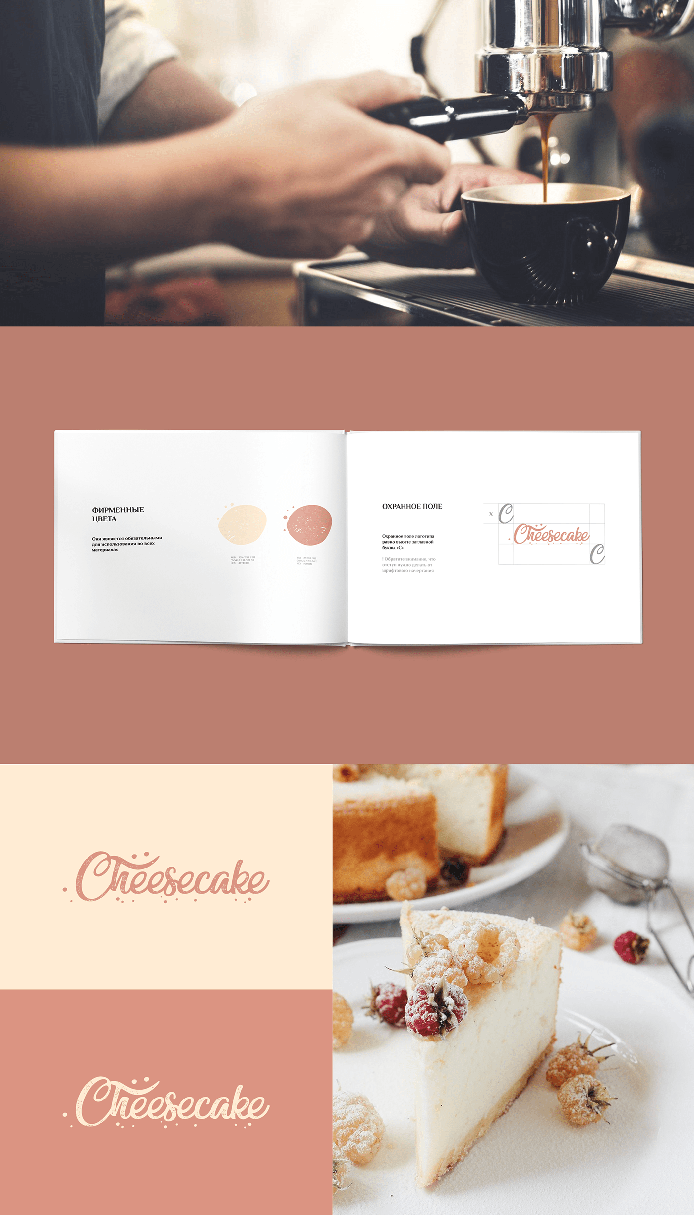
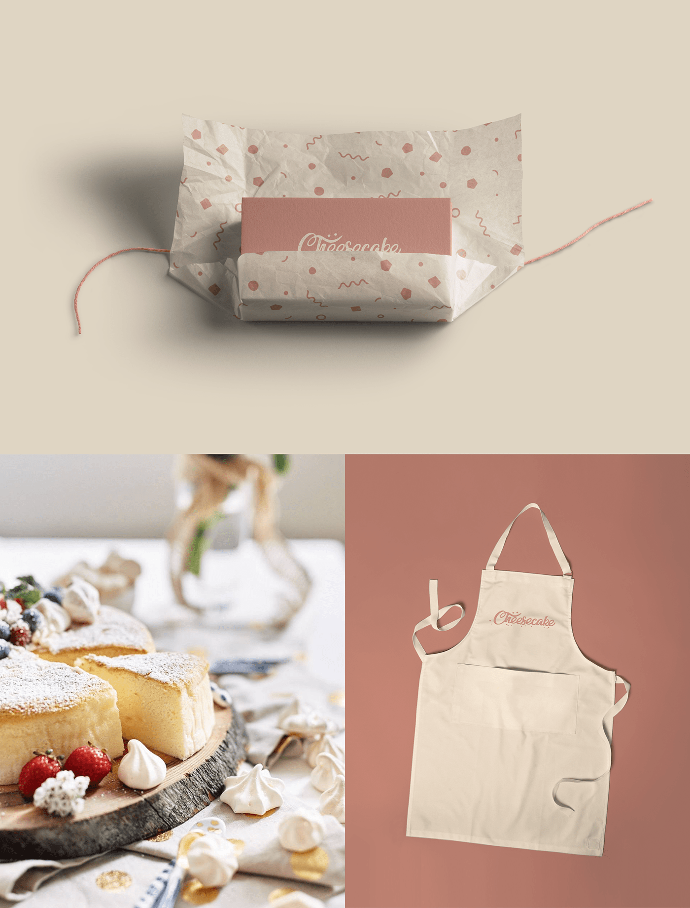
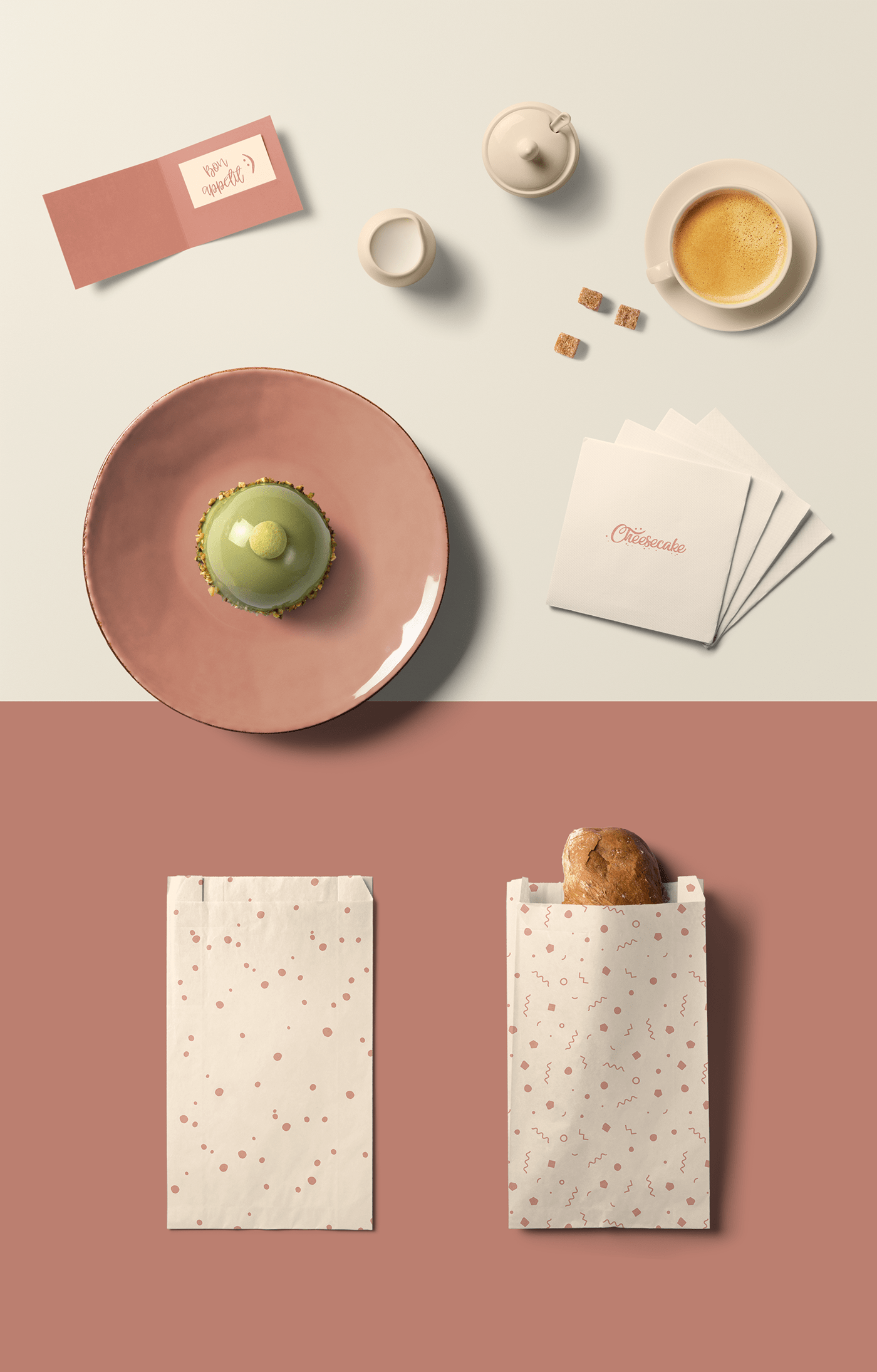
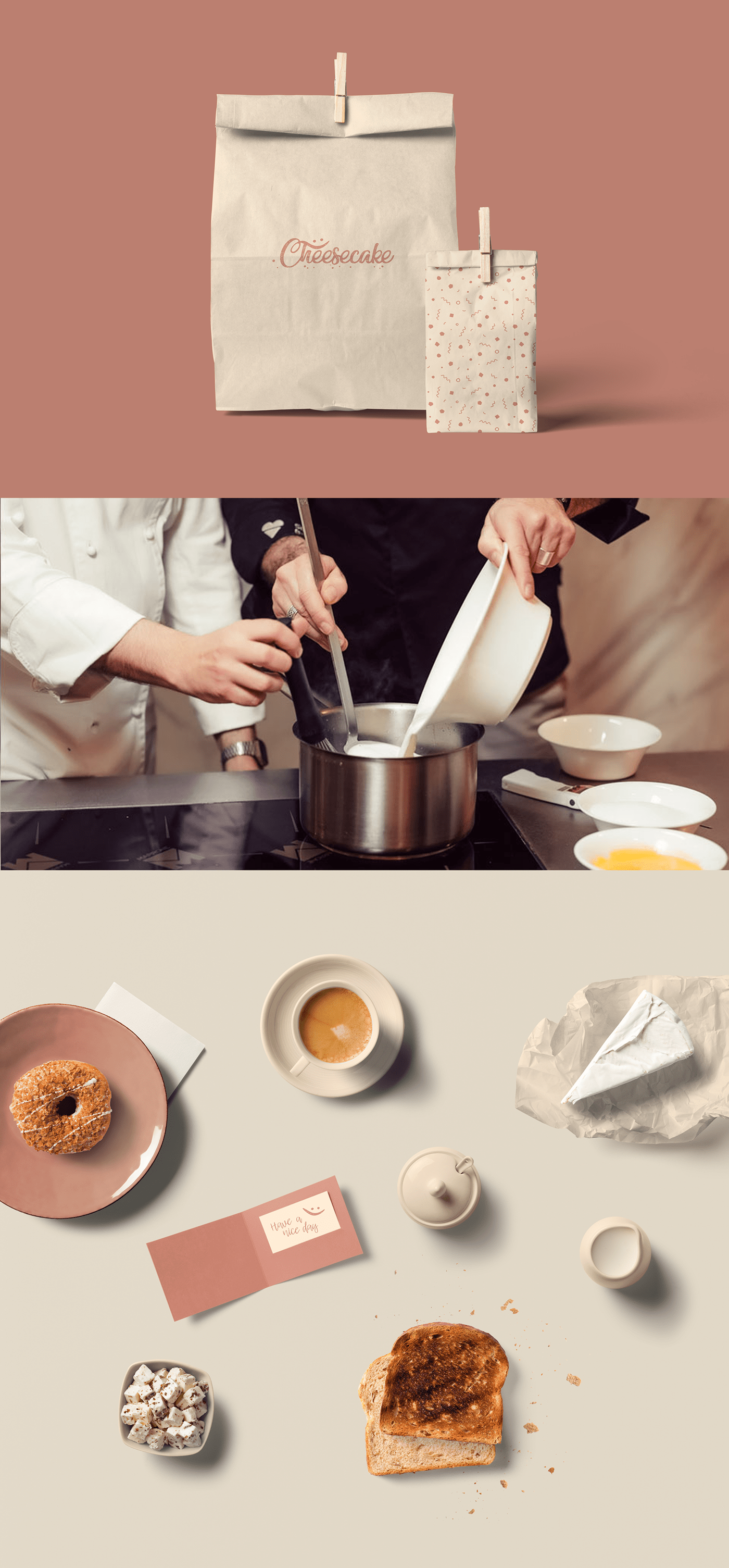
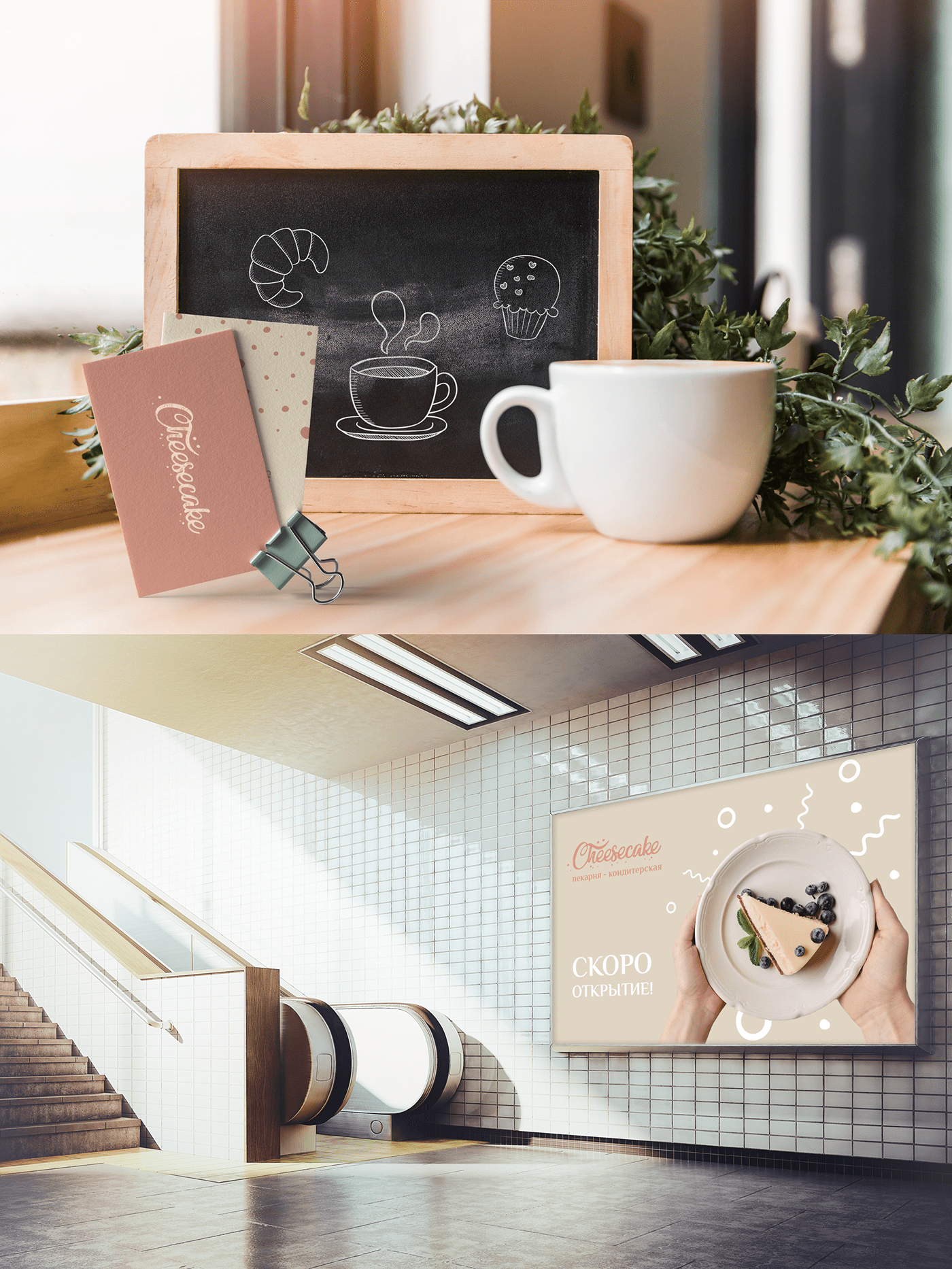
Cheesecake – Brand Identity
Svetlana Novikova
Design Minsk
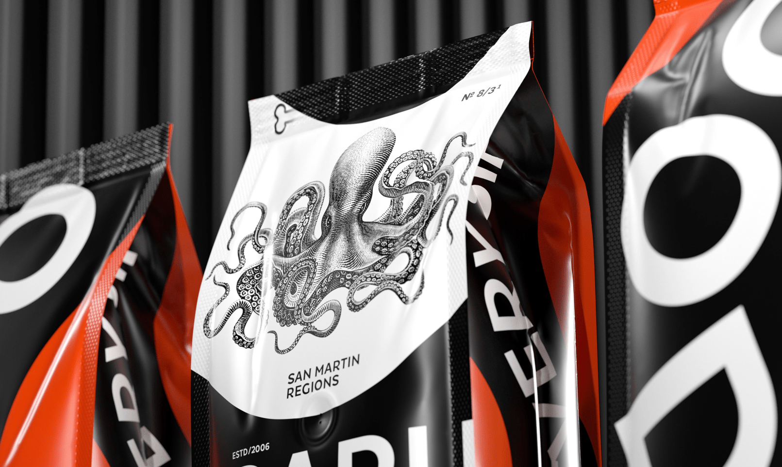
PACKAGING
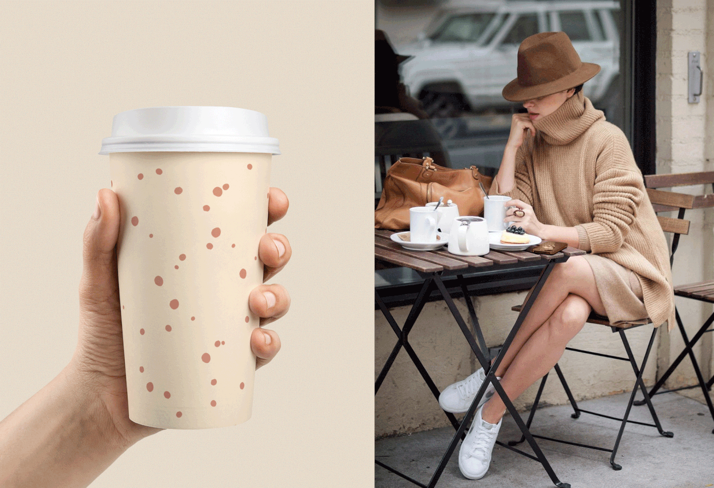
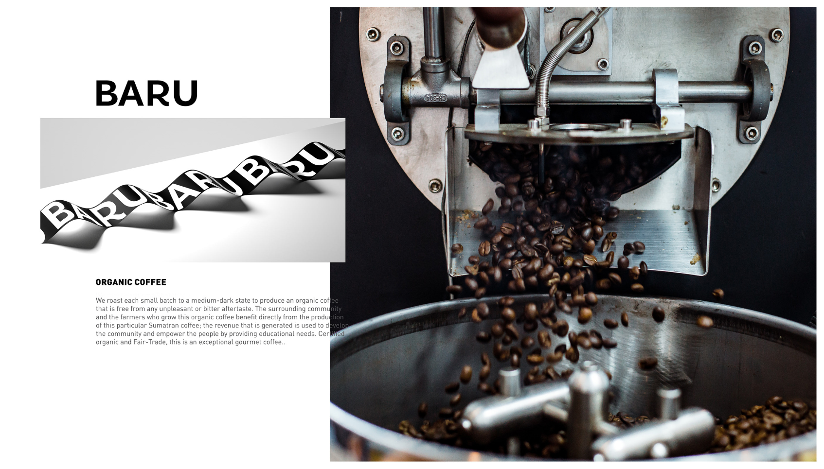
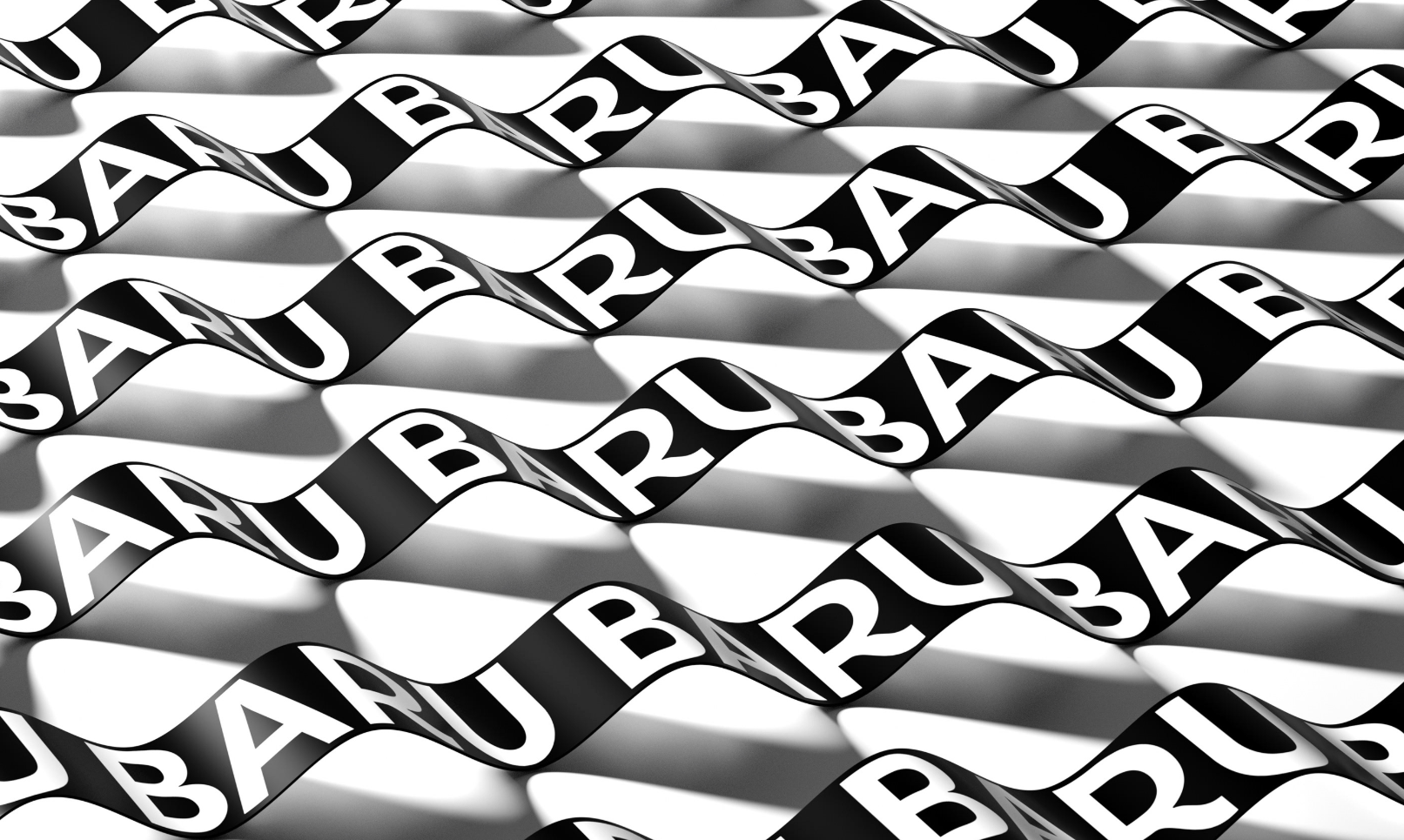
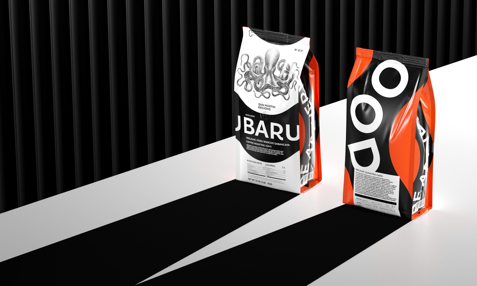
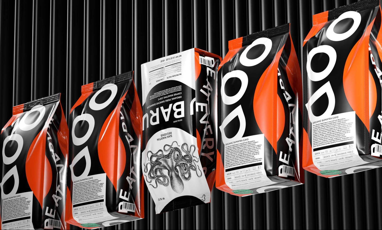
BARU Coffee
Constantin Bolimond
Tamara Vareyko


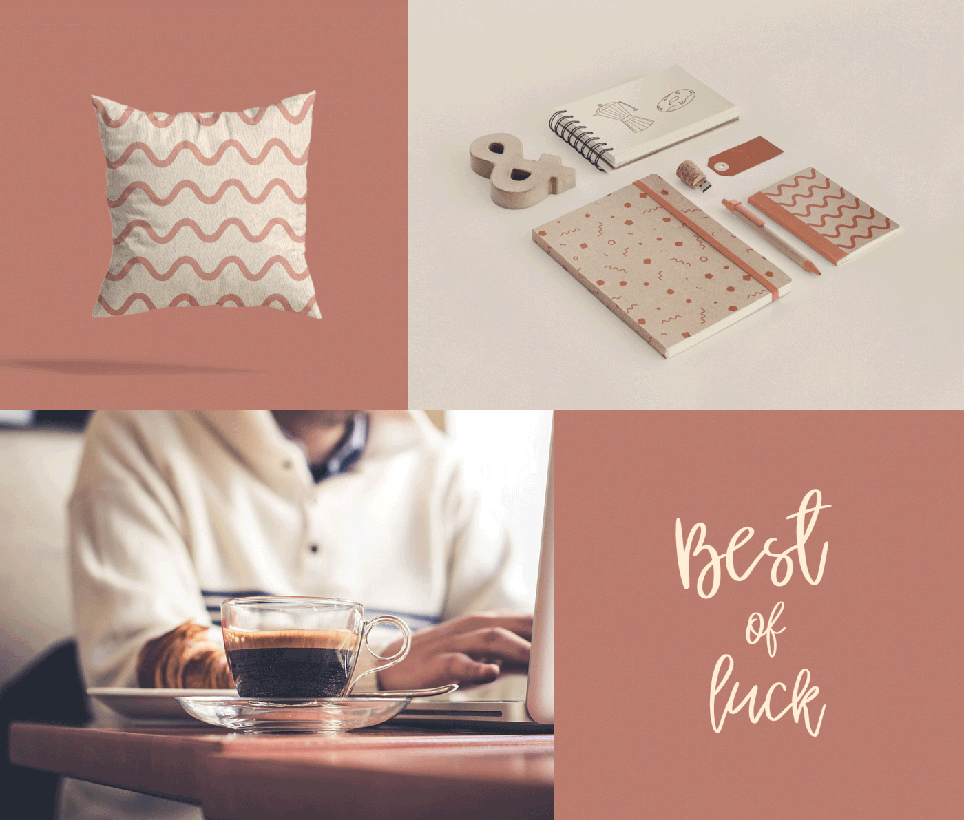
Cudonaja cukernya
Fabula Branding


ILLUSTRATION
Nature inspiration
Liza Rusalskaya


+1
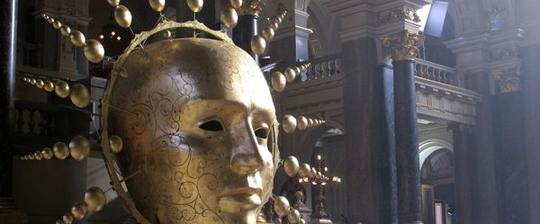
Art Sponge. Rijksstudio Award 2020.
Lesha Limonov


Concept to reality | Epic Creations
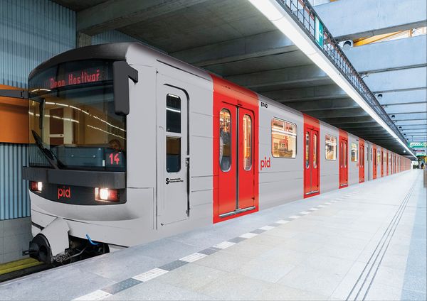
Prague’s public transport receives a new visual identity | superlative.works