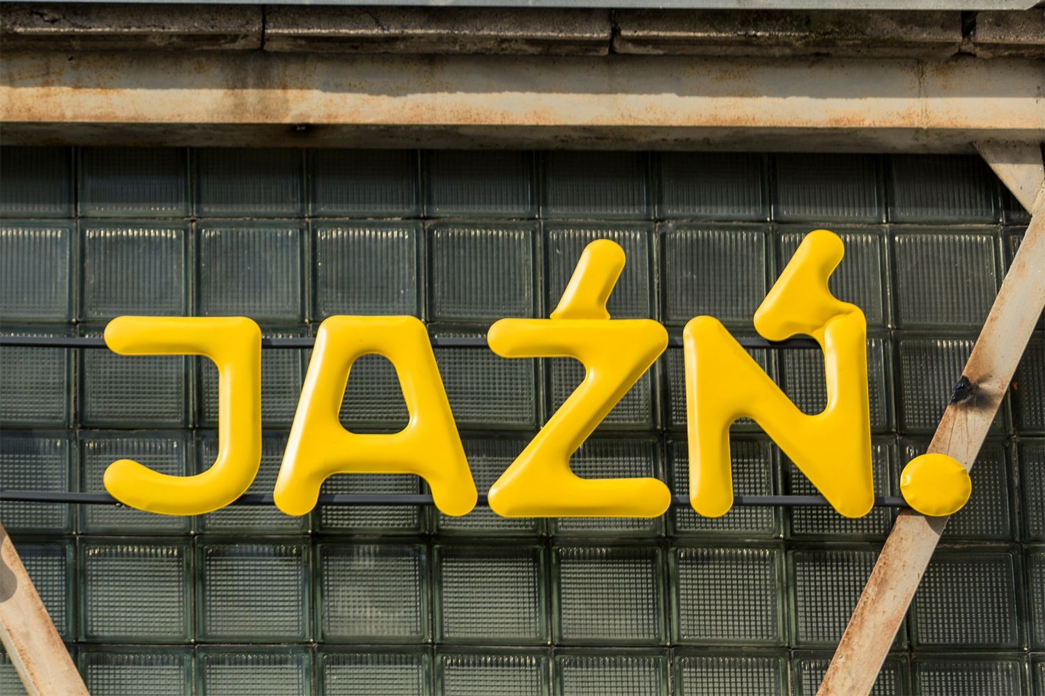
What lies behind a typeface? A platform whose typefaces are the result of careful research: here is Threedotstype, offering fonts with stories!
Polish type designer and researcher Marian Misiak is a true enthusiast of Polish typography. As he says, his love of fonts comes from the streets and public spaces. “As a young person and later designer, this was always for me the biggest inspiration. I know it sounds cliche, but I can’t do anything with it; streets are the primary source of the influence in this matter,” he explains. Marian works mostly for Polish cultural institutions: he is the designer of the new identity of the National Museum in Wrocław and the U-jazdowski Centre for Contemporary Art, and co-designer of the new logo for Warsaw’s public transport system. After years of contributing to the local creative scene as a designer, guest lecturer, and writer, he decided to focus on typeface design and set up his own typefoundry. This is how the platform Threedotstype was launched in 2017.
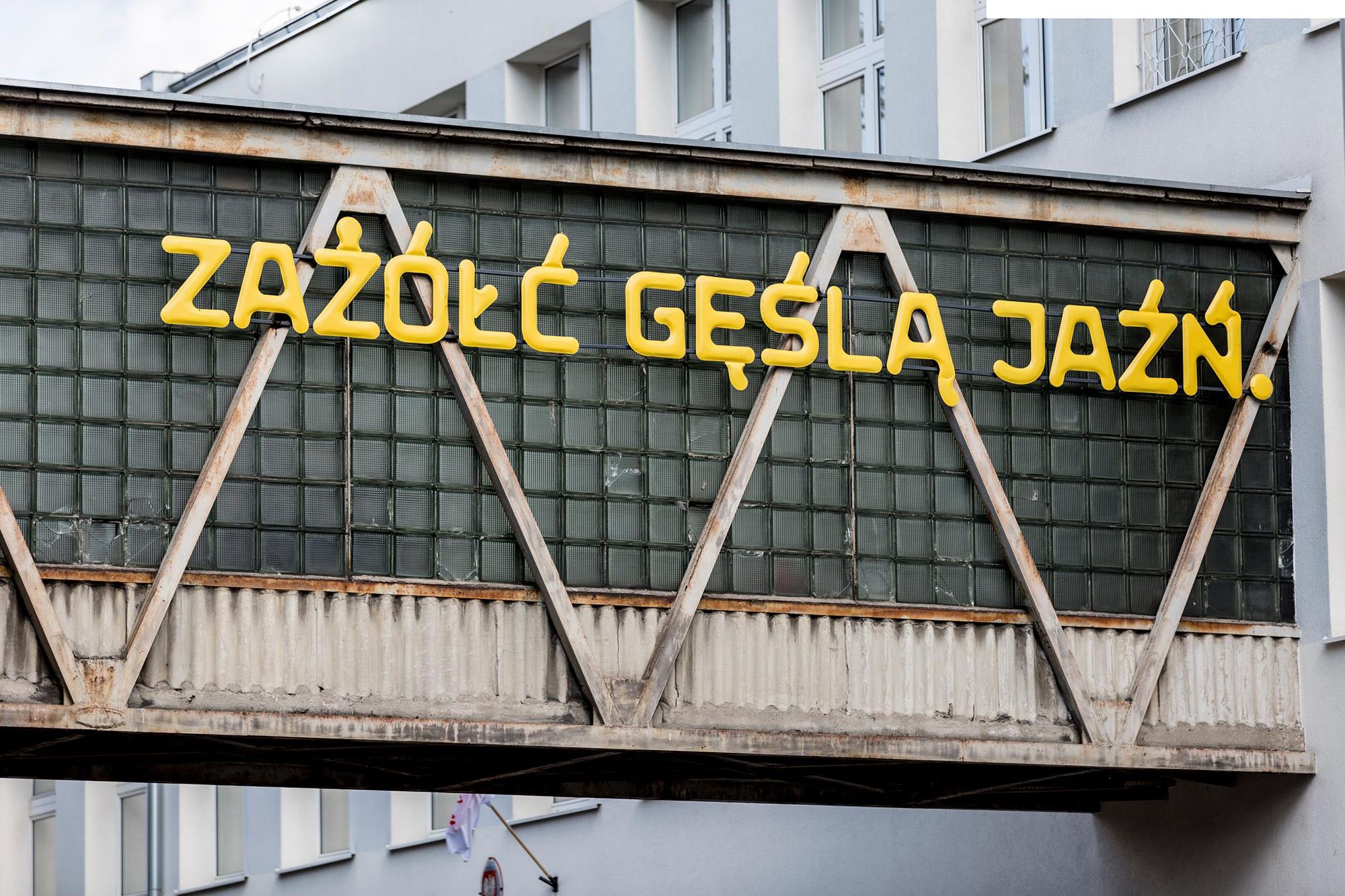
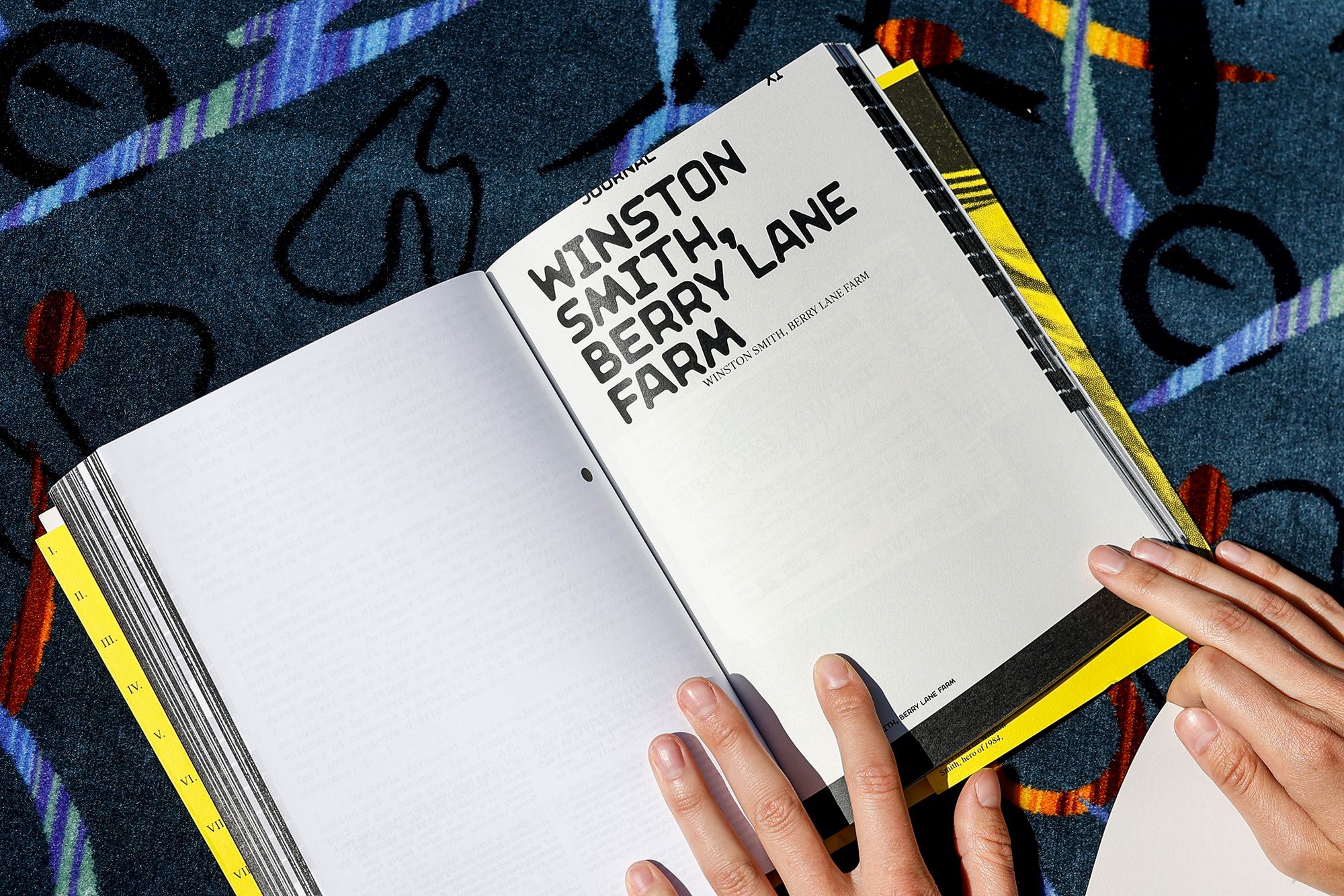
The platform is unique in that it offers both exclusive typefaces that are available for purchase, and different background stories for each font. The name of the project is a reference to this, as “Threedotstype stands for typography where aesthetics, culture, and technology are equally important: typography with three dots”, says Marian. He adds: “We are comfortable with ugly or uncoordinated letters as long as they represent something interesting, solve technical issues, or stimulate discussions. We also want to form a typography culture; hence we publish (usually experimental) content.”
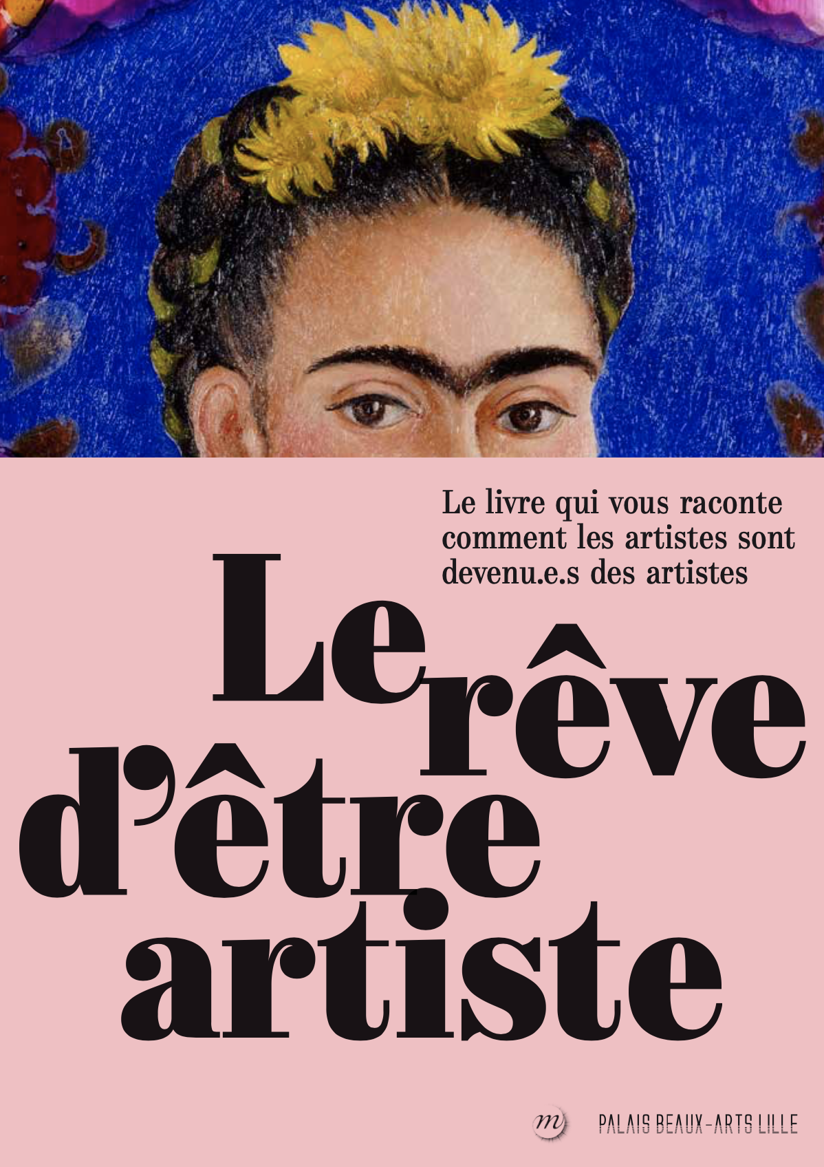
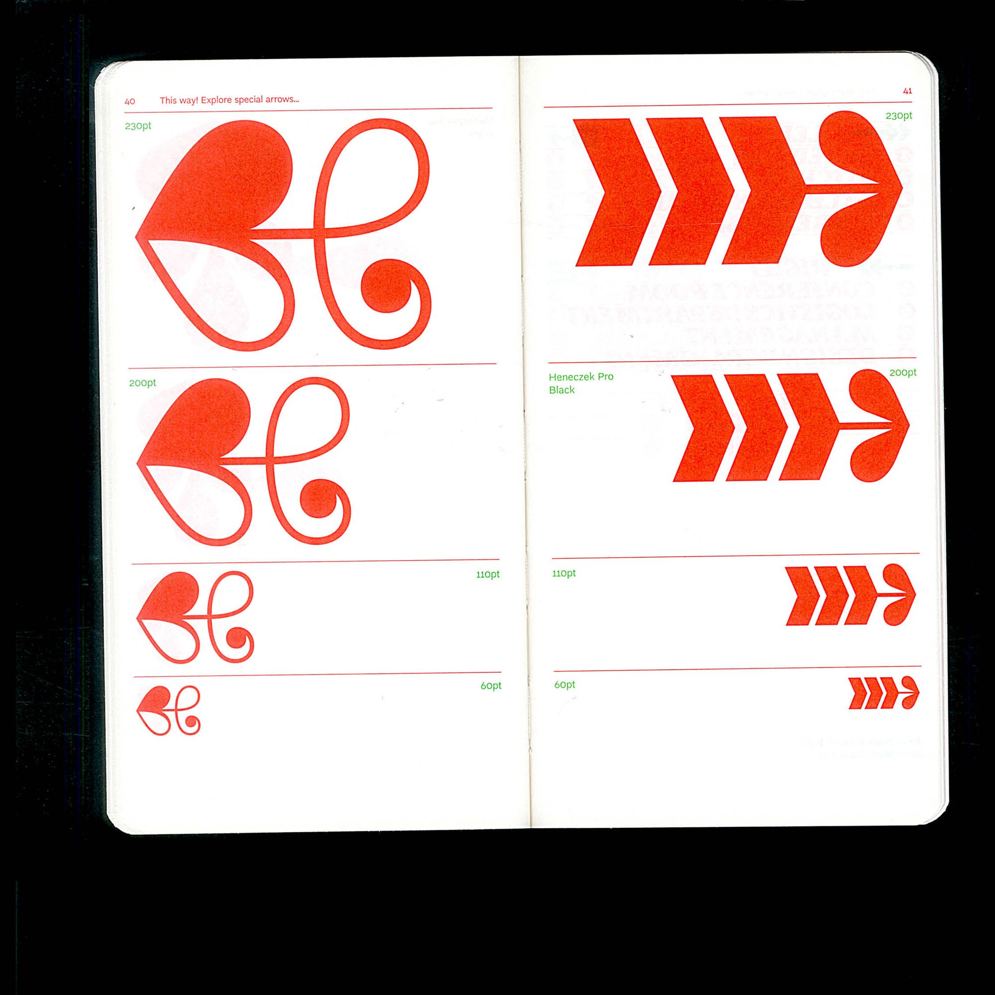
These include the Heneczek Pro typeface designed by Nika Langosz, which pays tribute to Teodor Heneczek, the founder of the first Polish-language printing house; the Sudety typeface by Jan Estrada-Osmycki, inspired by the landscapes of the mountain range of the same name; and Maria Connected and Unconnected, a typeface designed by Marian himself, which is mostly used for wayfinding systems. The latter’s letterforms are reminiscent of FIDU technology, an experimental method patented by the designer Oskar Zięta for creating metal objects formed with air. “It’s not just a typeface, but also physical objects that are available in the Things section of the platform if you are looking for a unique decoration,” Marian points out.
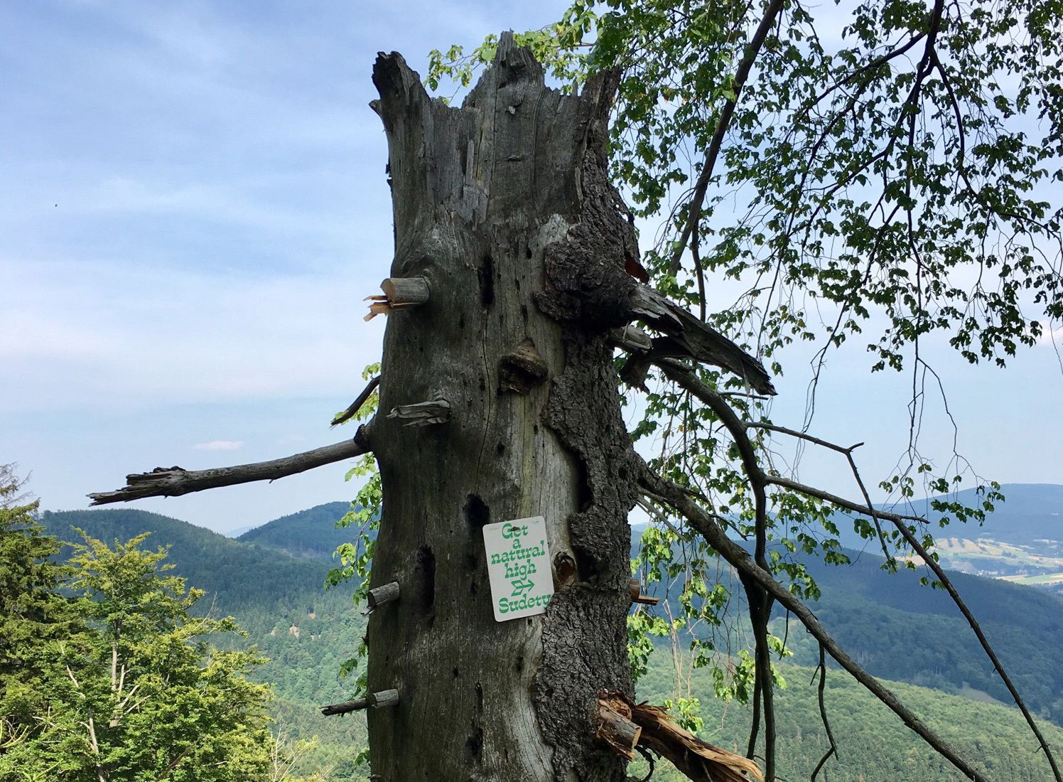
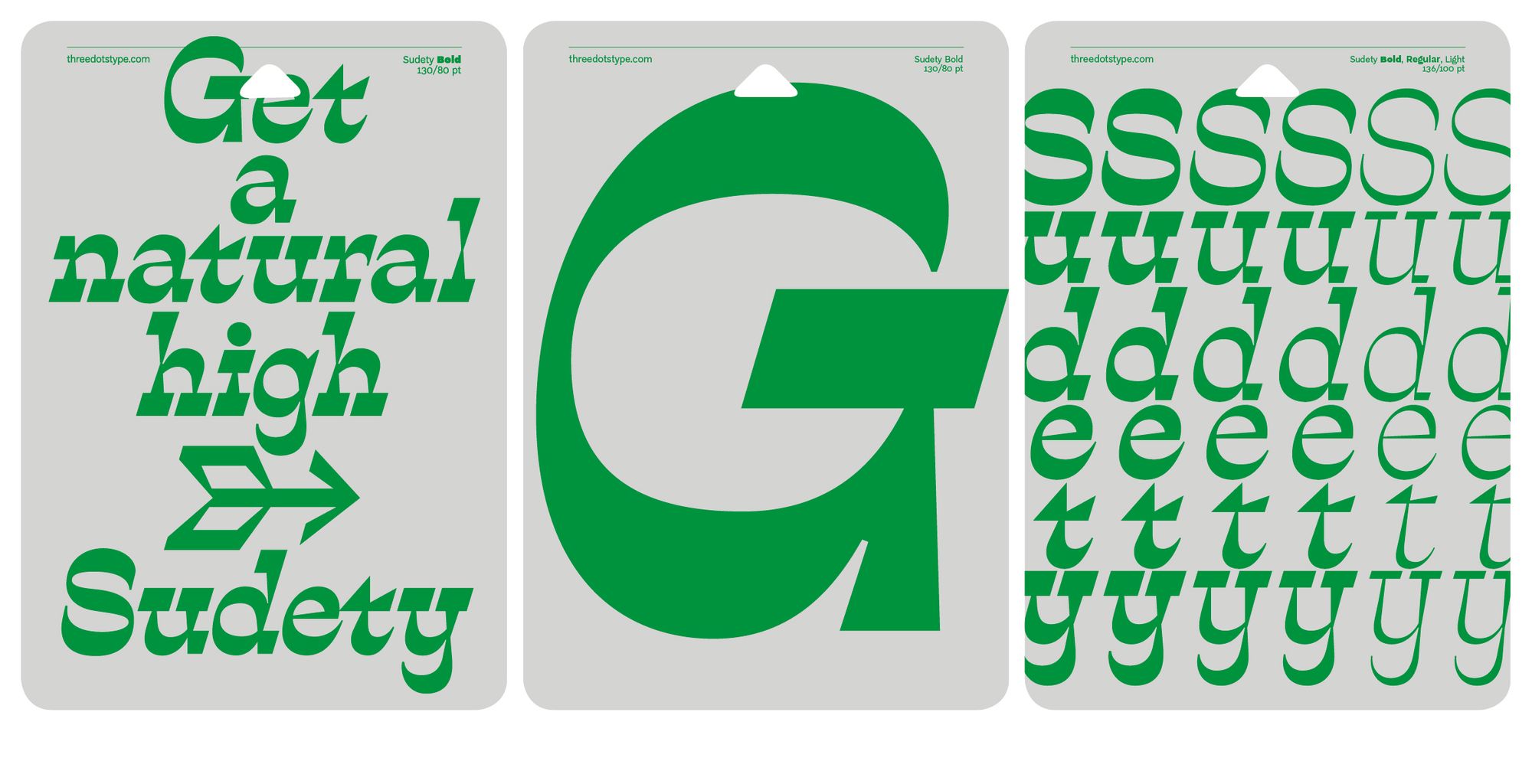
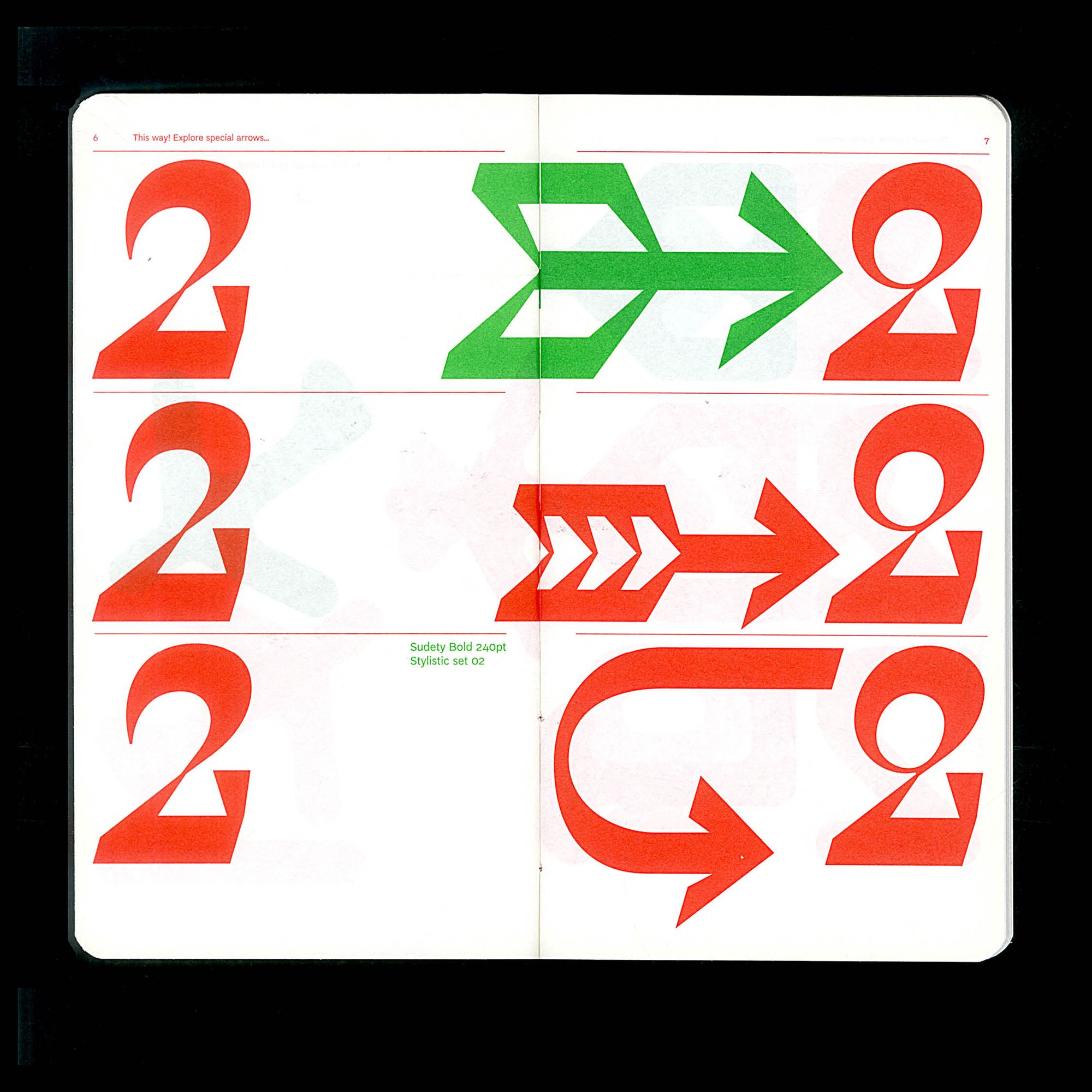
The character of each typeface is not solely determined by the story behind it. Besides including characters specific to different languages, they also feature an accompanying set of arrow symbols. “We collected many impressive examples of navigational tools used in visual communication as an inspiration for the unique character in our typefaces,” Marian notes. This background material has also been presented in the form of an exhibition entitled This Way!, which aims to explore the symbol of the arrow from different perspectives and to present its historical background. As Marian explained, another small but important feature of the Threedotstype typefaces is that each set contains two different versions of the number two: a traditional one and a closed structure. “Maybe it sounds abstract for those who are not typographers, but you have to see it, and it will be easy to imagine.”
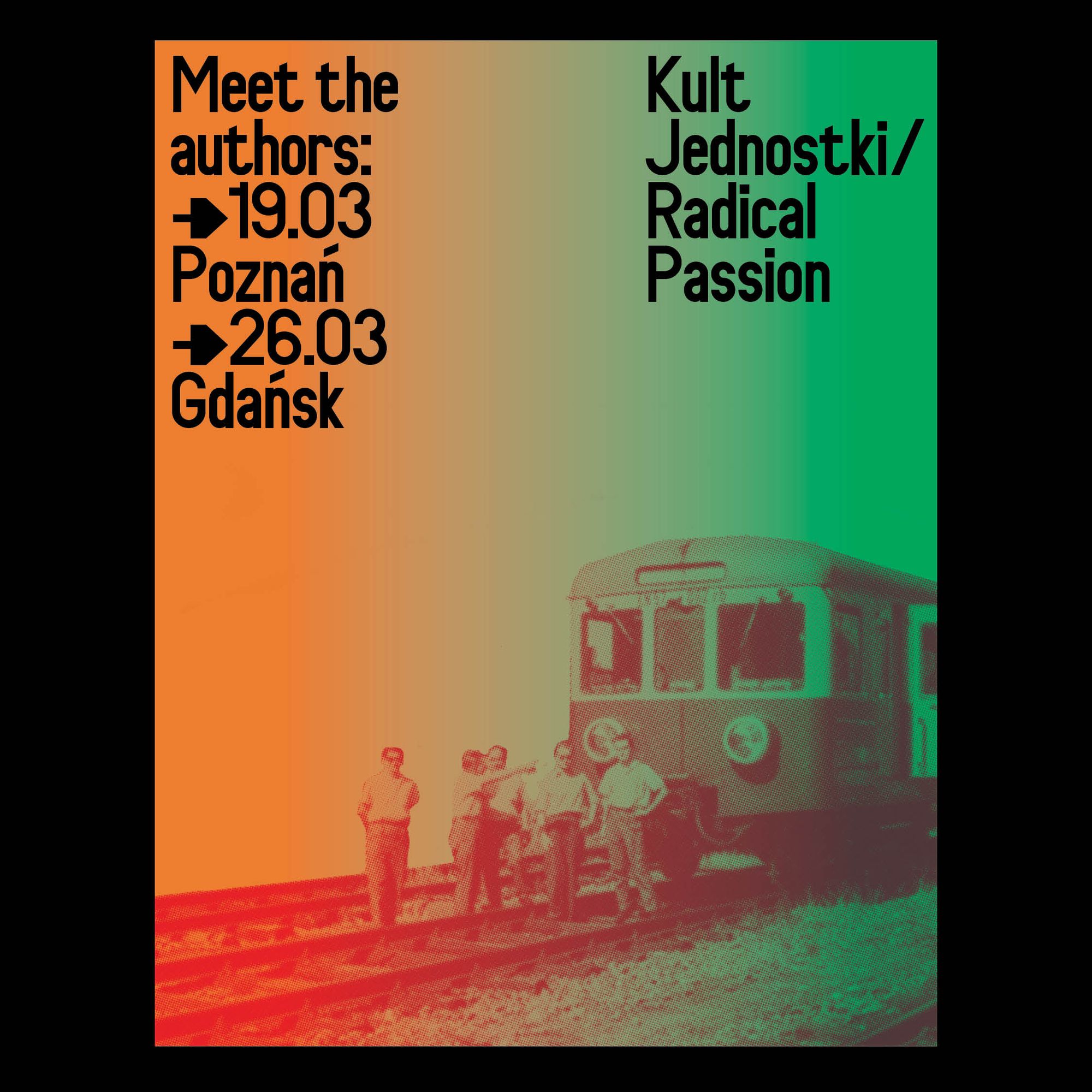
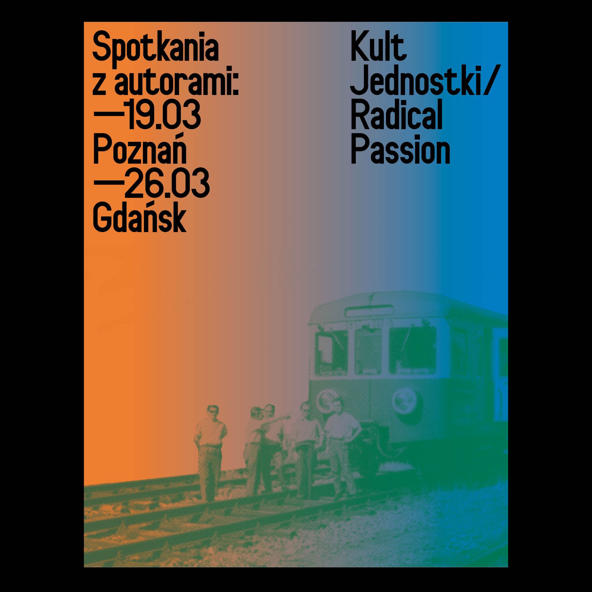
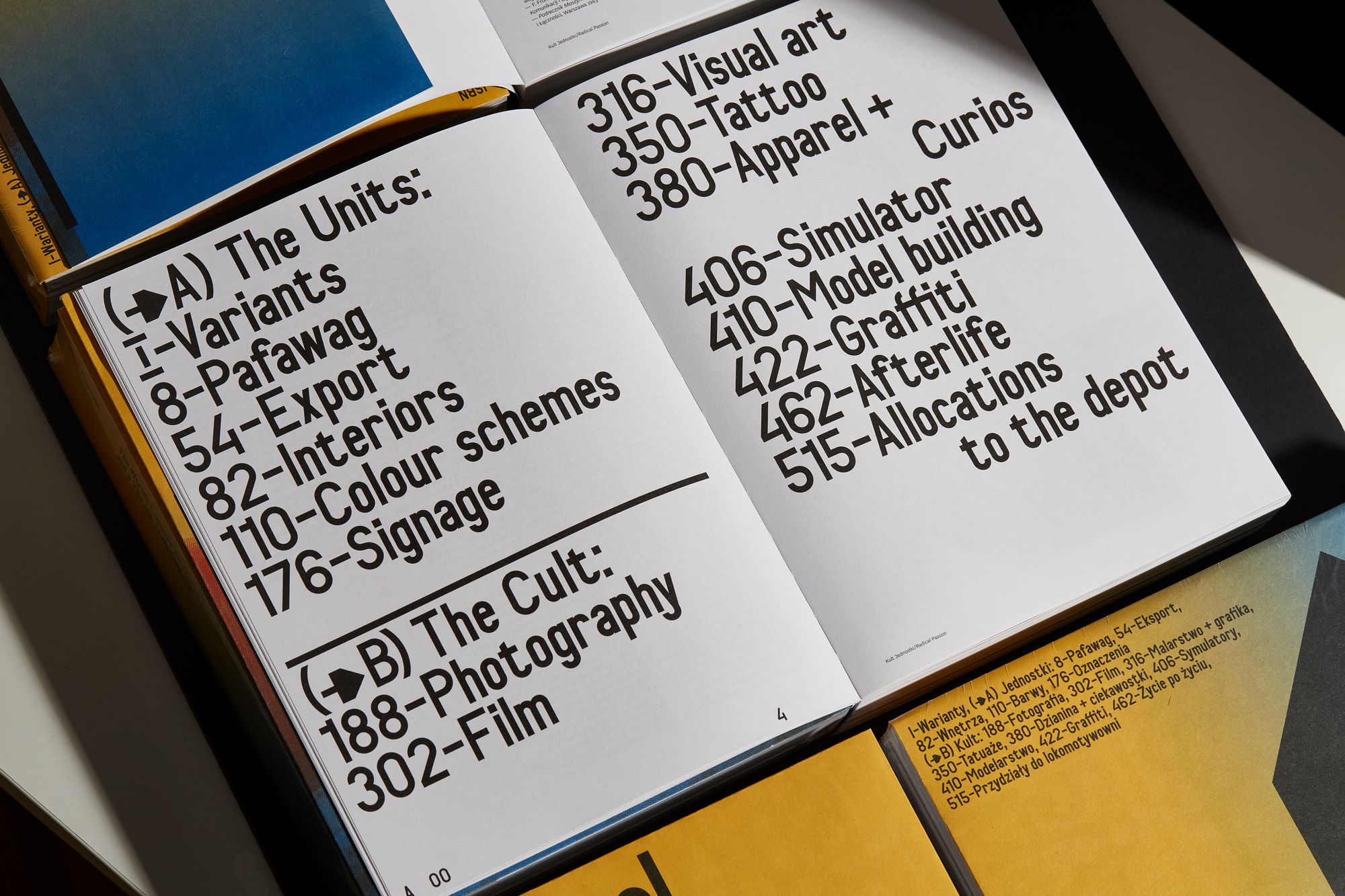
Since the platform’s launch, Threedotstype typefaces have been popping up in various places. One of their latest projects, for example, is a new book called Radical Passion, which explores different layers of train culture. The book explores the history and social impact of the EN57, a Polish electric train that is still in service today and has a huge cult following. “This project is not about the sentimental world of the train culture. It is also about raising awareness about trains as an inspiring model of sustainable public transport with its positive impact on our lifestyle and (as the authors trying to prove) also on human creativity. We are happy our fonts were used in this album, especially Tor Grotesk—a new revival of the lettering used on the trains and signage dating back before World War Two,” Marian explains.
And why do we need new typefaces? “It is precisely like with music. Even the best songs, after time, become somehow dull. It is human nature that we continuously need new music, fonts, and I guess challenges.” With this in mind, Threedotstype’s future plans include creating more exciting typefaces and experimental content, as well as a new website. After all, writing is a communicative bond, or as Marian concluded, “fonts are the future, and fonts are culture itself.”
I always had doubts about the meaning of the European integration—interview with Václav Klaus

Slovenian Days in Dallas


