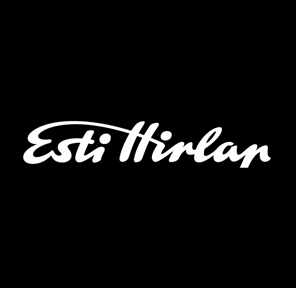
Printed media has a hard time keeping up with the rapid expansion of the internet, but there are some established newspapers whose name still ring some bells today. In addition to the names, we can also recall the characteristic typography thanks to Hungarian Mastheads, an Instagram page collecting the most prominent nameplates of the newspapers of the past century on a digital platform. We asked Ákos Polgárdi about the project.
Graphic designer Ákos Polgárdi launched the Instagram account Hungarian Mastheads this spring, where the nameplates of Hungarian newspapers published in the 19th-20th century form a gap-filling collection. According to the designer, the project’s launch had quite unpoetic reasons and circumstances. After the birth of his son, he stopped working for some time in March, and then a week later the state of danger was declared by the Hungarian government due to the coronavirus epidemic. In light of the latter, Arcanum shared its content with the general public for free, which he liked to browse very much—Hungarian Mastheads was only a step away from here. A subjective selection consisting of 125 nameplates was formed after fishing though hundreds of newspapers, which formed the basis for Ákos’s work.
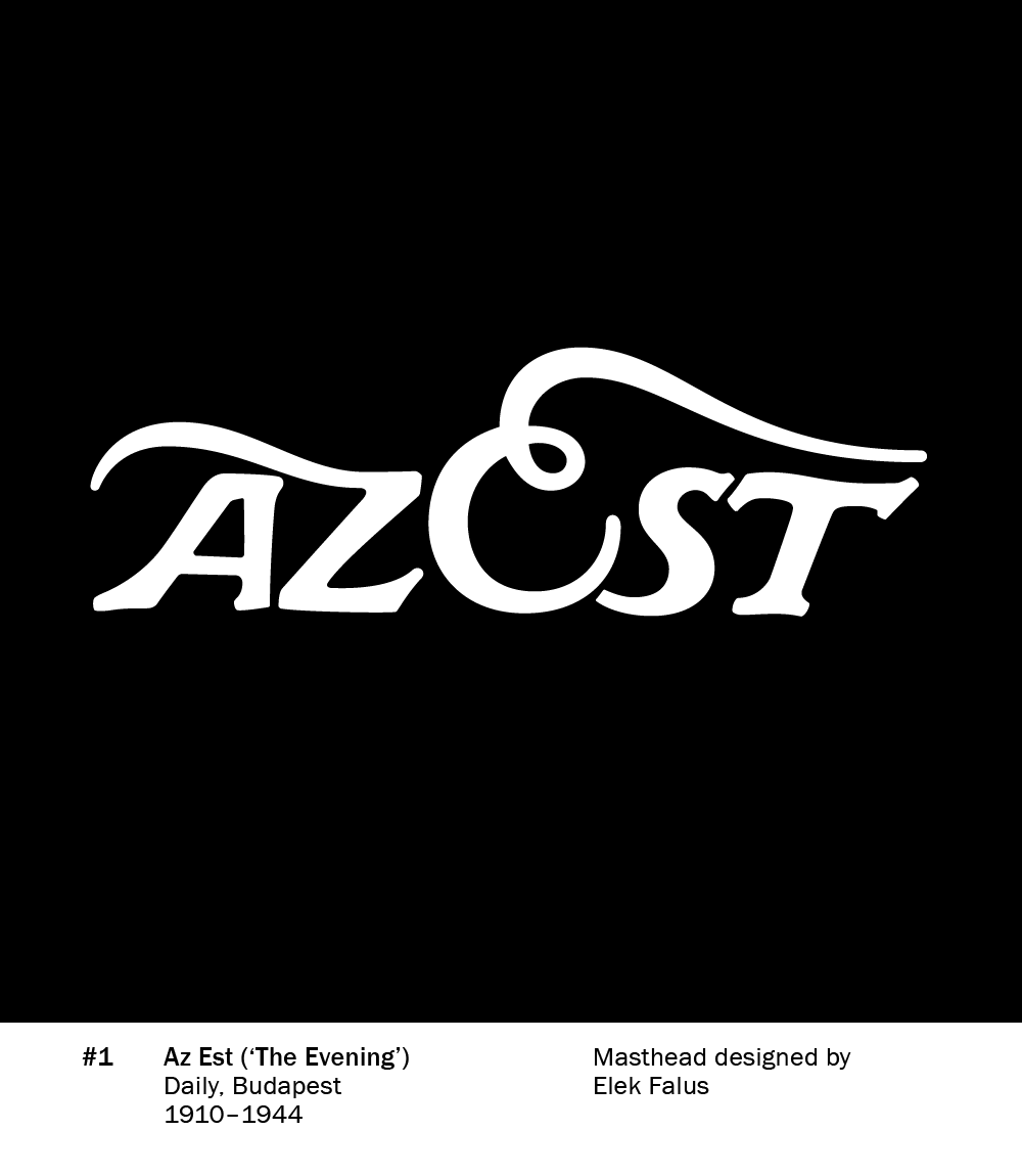
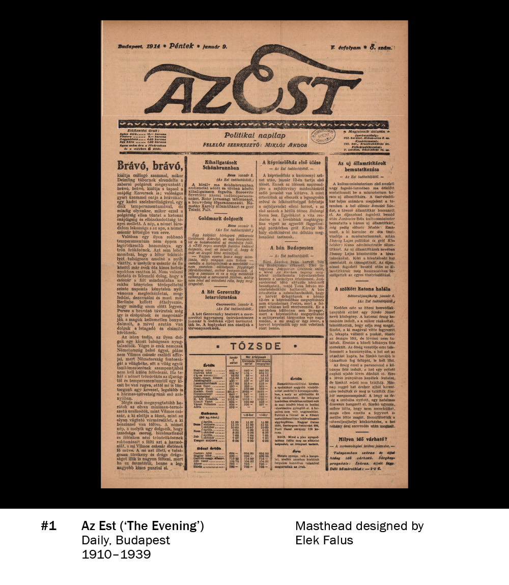
“Masthead… What’s the Hungarian equivalent?” I ask Ákos, who says the genre follows a German terminology in Hungary, and thus they are basically known as kopf. On the pages downloaded from Arcanum, he highlights the mastheads, vectorizes them, then he uploads them to his Instagram page, which preserves the most interesting mastheads of the past century for posterity in a digitalized form, sort of like a miniature museum. The nameplate undergoes slight alterations in the course of the digital vectoring process, and thus the original version is always placed next to it.
“When we are trying to modernize historical examples, we many times face the fact that a print made with lead letters centuries ago looks better in its original version than when we make the same shapes in a digital manner. This is when the peculiarities of the digital format that are not compatible with the attributes of the original reveal themselves and when we find the points where we could perhaps improve the original, because today’s technology allows us to do it,” he says.
During our conversation, I was intrigued as to whether he also researches the designers of the mastheads and their history while he processes them.
“The first masthead I did was the one belonging to Az Est (The Evening)—this is an exceptional nameplate because here we know that it was designed by Elek Falusi, but otherwise the designers in charge of the mastheads are usually unknown. One of the reasons for this is that this area of graphic design history is not processed yet, on the contrary: the entirety of the history of Hungarian graphic design is a white spot, certain fields of which, such as poster art, have been researched, but there are no comprehensive textbooks or monographies that would present the Hungarian graphic design scene in its entirety. Another reason might be the fact that at the turn of the 19th and 20th century, this task was not a »graphic design« job in the modern sense, but a task to be carried out by a press worker in charge of page setting. Of course this job is also design in some sense, but not the type of manual graphic design we have in our minds today, rather a matter of type-setting: a decision as to which font out of the ones the press has in large lead or wooden types is spectacular and eye-catching enough while also matching the publication,” he says and then adds that he also found a few mastheads that were way ahead of their time or had a good grasp of certain tendencies.
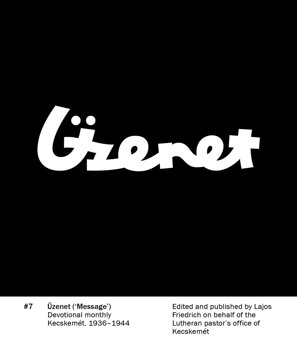
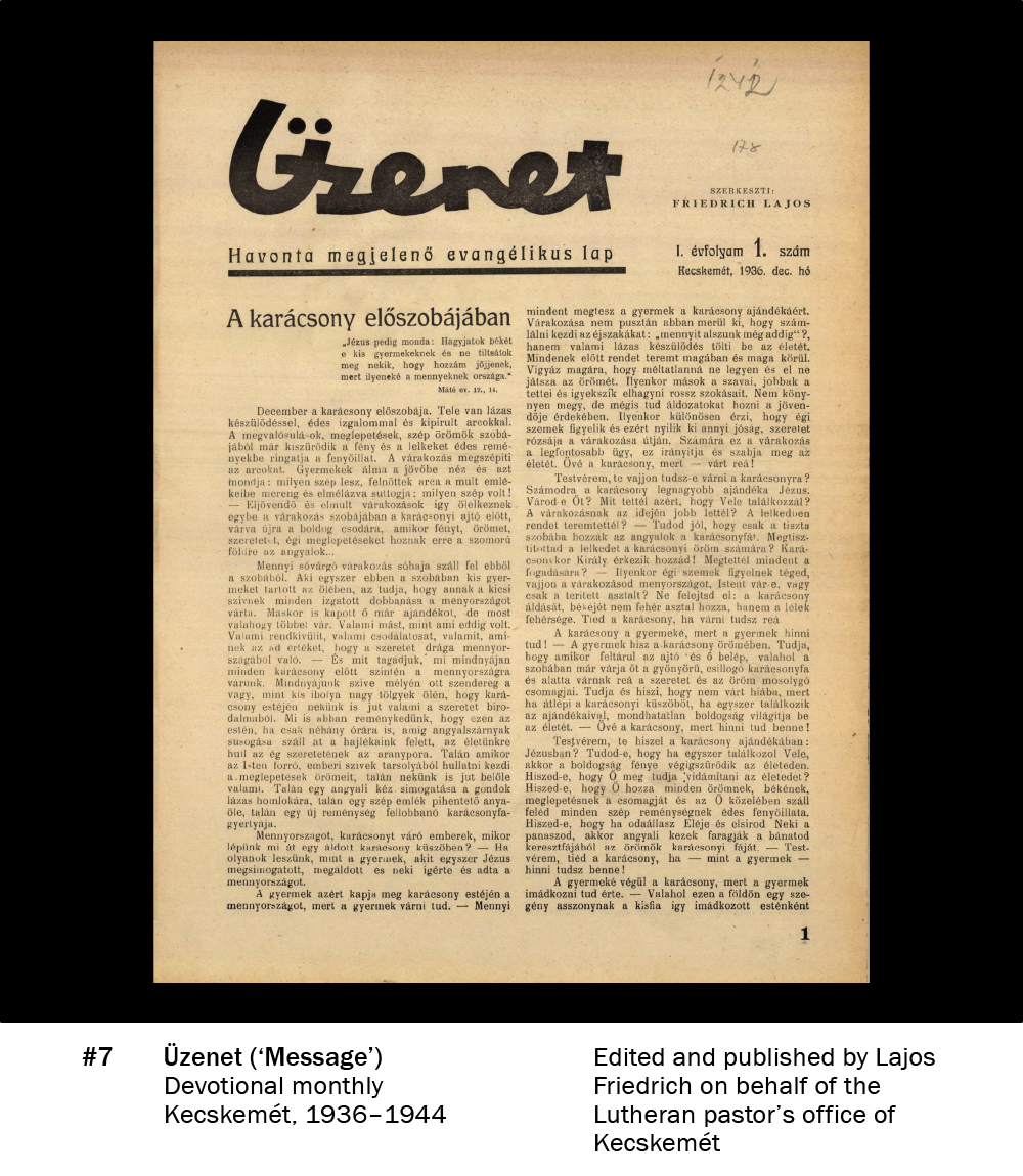
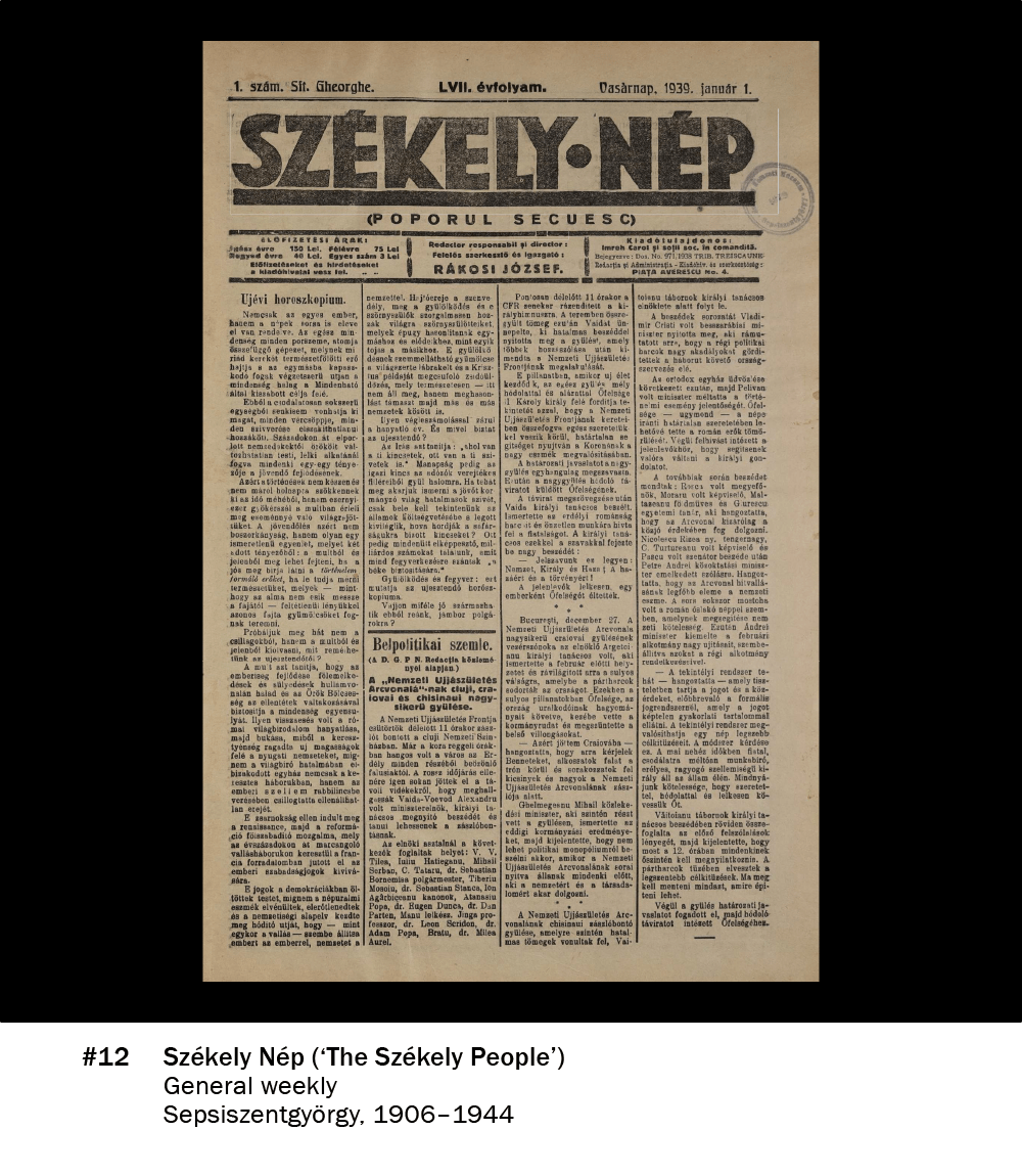
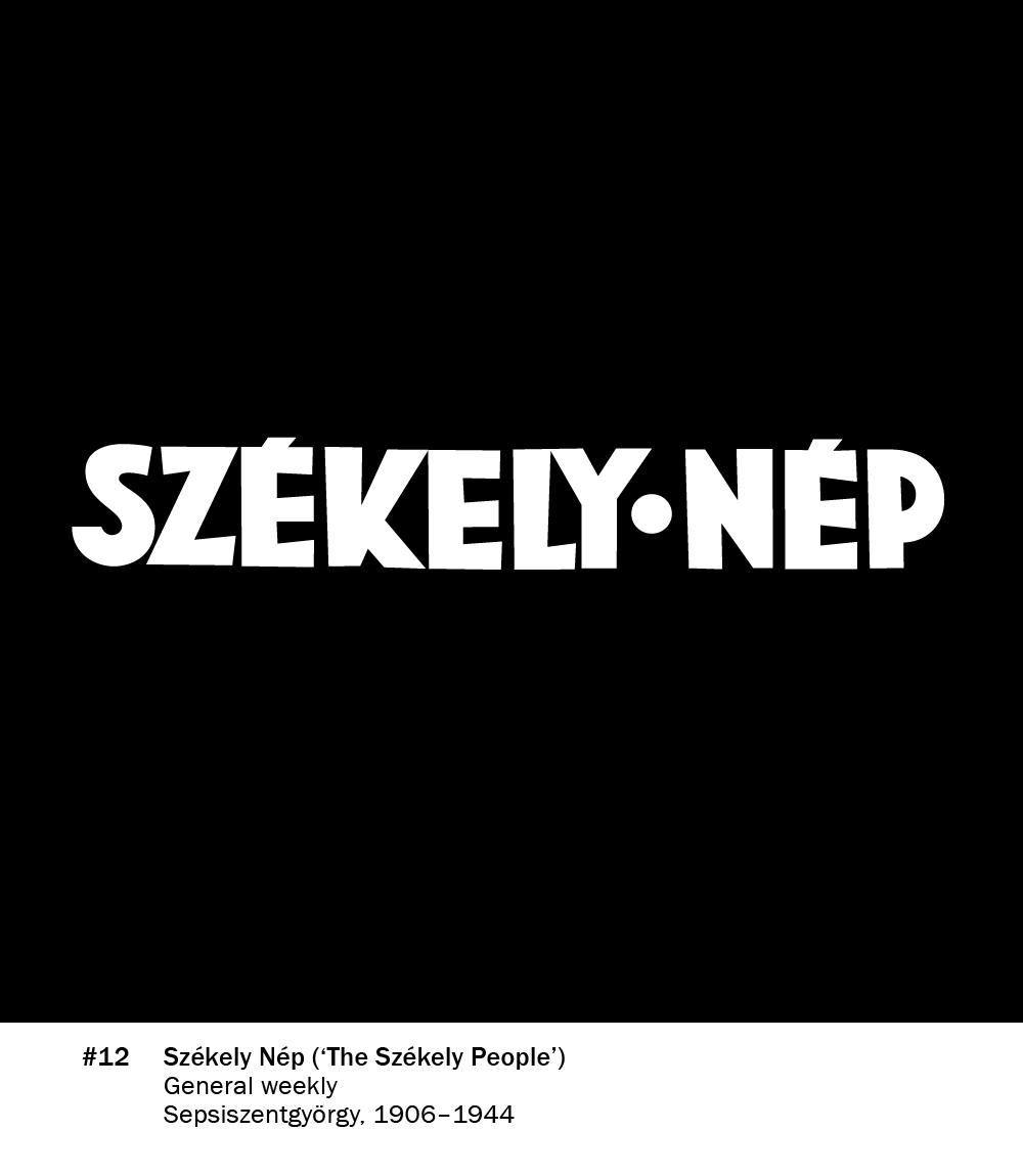
“One of the exciting examples of this is the manual lettering masthead of the first issue of the Lutheran devotional monthly Üzenet (Message) published in 1936, the creation of which would be completely unimaginable today—nowadays, we would use a conservative serif font for a religious periodical like this,” Ákos says. According to him, local peculiarities can also be observed clearly, as illustrated vividly by the masthead of the paper Székely Nép (The Székely People), evoking the visuality of woodcut letters.
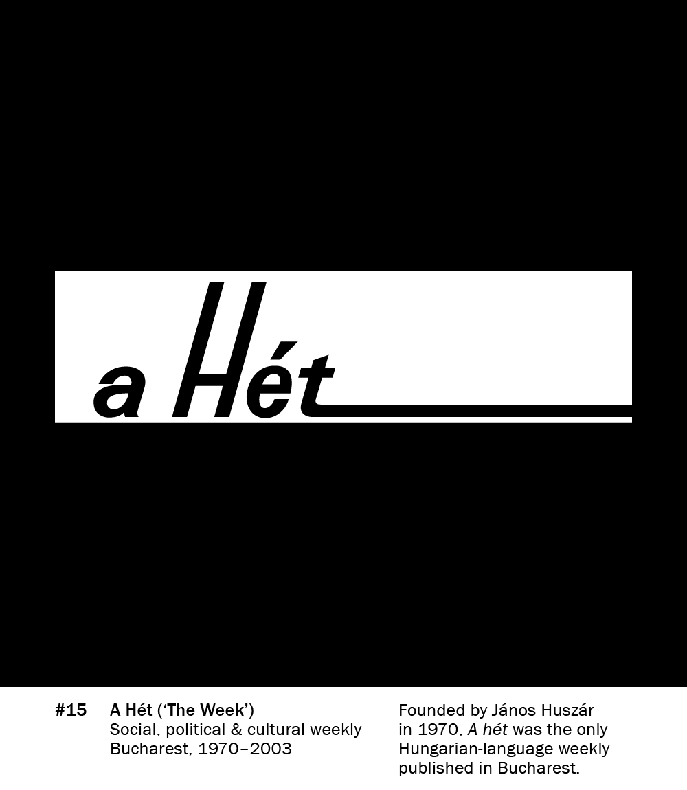
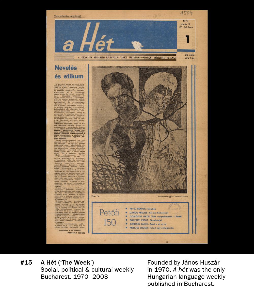
Hungarian Mastheads | Instagram
„A mouthful of goodwill” | BeSweet chocolate manufactory

Good people, good places | Big picture of gastronomy
