Elegant shapes, timeless yet not archaic, and memorable: this is the visual identity created for the world-class racehorse stable, the Scuderia Sonnevend, for which Studio NUR was responsible. Let’s see!
Alexandra Sonnevend and Ágoston Gubicza’s love for horses spans several generations. Because of family traditions, it was important for them to create a breeding and competition stable that would create value for the equestrian society. This is how the Scuderia Sonnevend world-class equestrian center was born, where although they work with the descendants of world-class stallions and mares, the Hungarian equestrian heritage is also extremely important. The basis of the center’s values is to contribute to the success of Hungarian show jumping. Although horse racing in Hungary has a long history, Scuderia Sonnevend focuses more on new technologies and the future. Based on all this, the identity of the equestrian center also pours this idea into a visual form. “We undertook this project at the request of the Son of man brand agency. Our goal was to design an elegant and timeless logo, but not an archaic one,” the designers at Studio NUR highlighted.
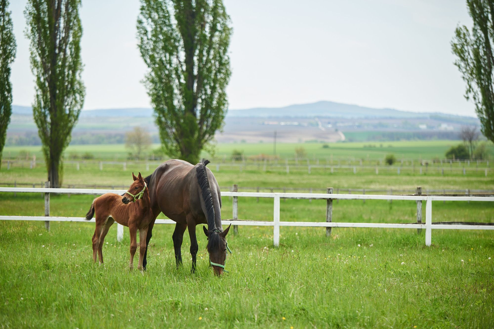
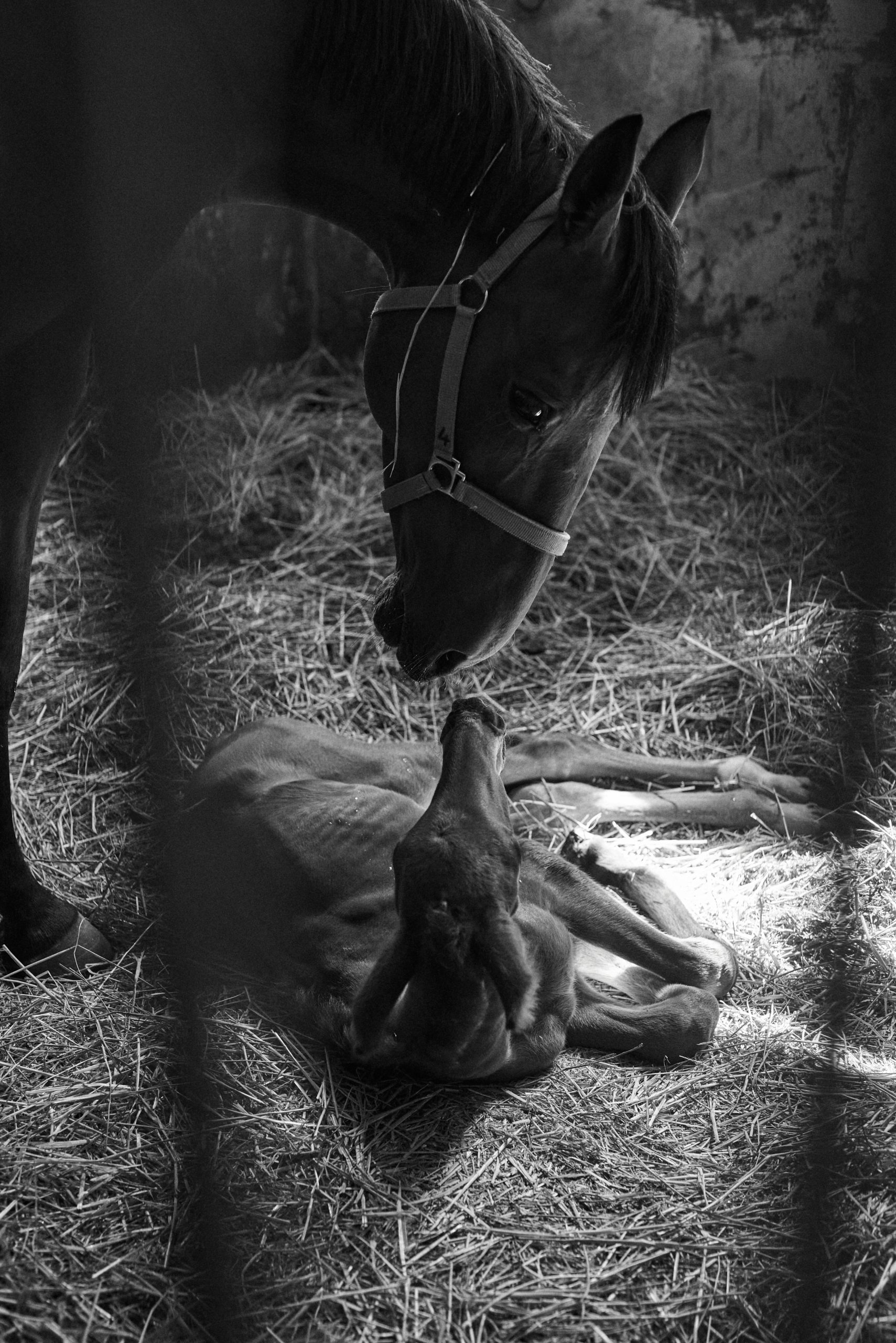
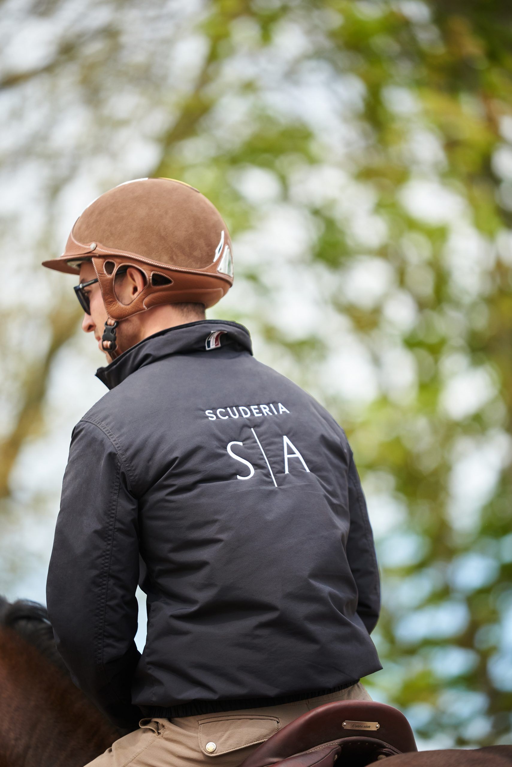
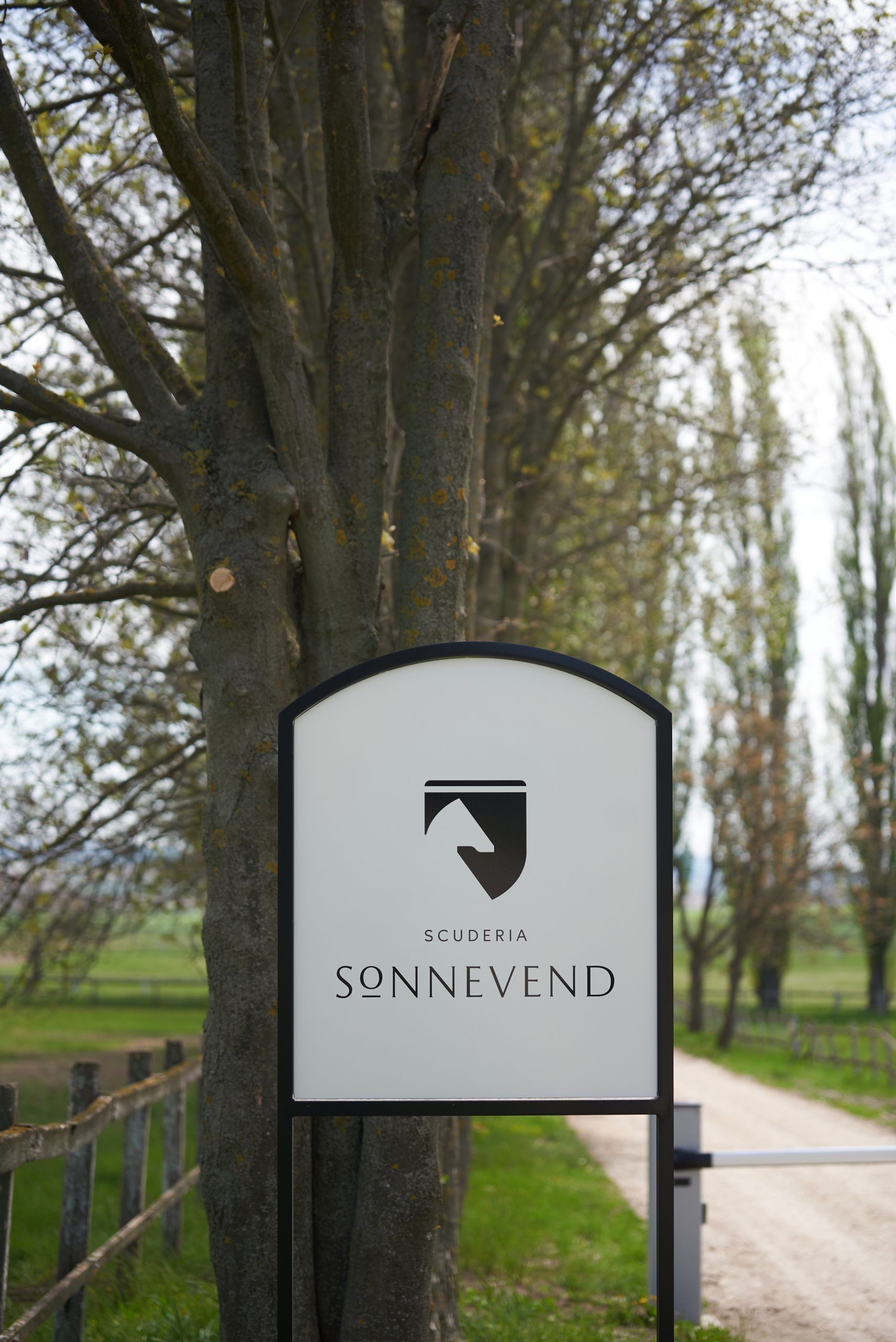
The brand logo features the silhouette of two stylized horse heads: one is white and the other is black. The two figures fit together as a kind of optical illusion, forming a coat of arms together. The logo is complemented by a hidden gesture that refers to the Scuderia Sonnevend’s activity, that is show jumping: the line below the “O” character symbolizes obstacles, the letter jumps over the line just like a horse jumps an obstacle. “The logotype and the logo have refined shapes, but we put in both of them a graphic idea that can make them memorable,” they added.
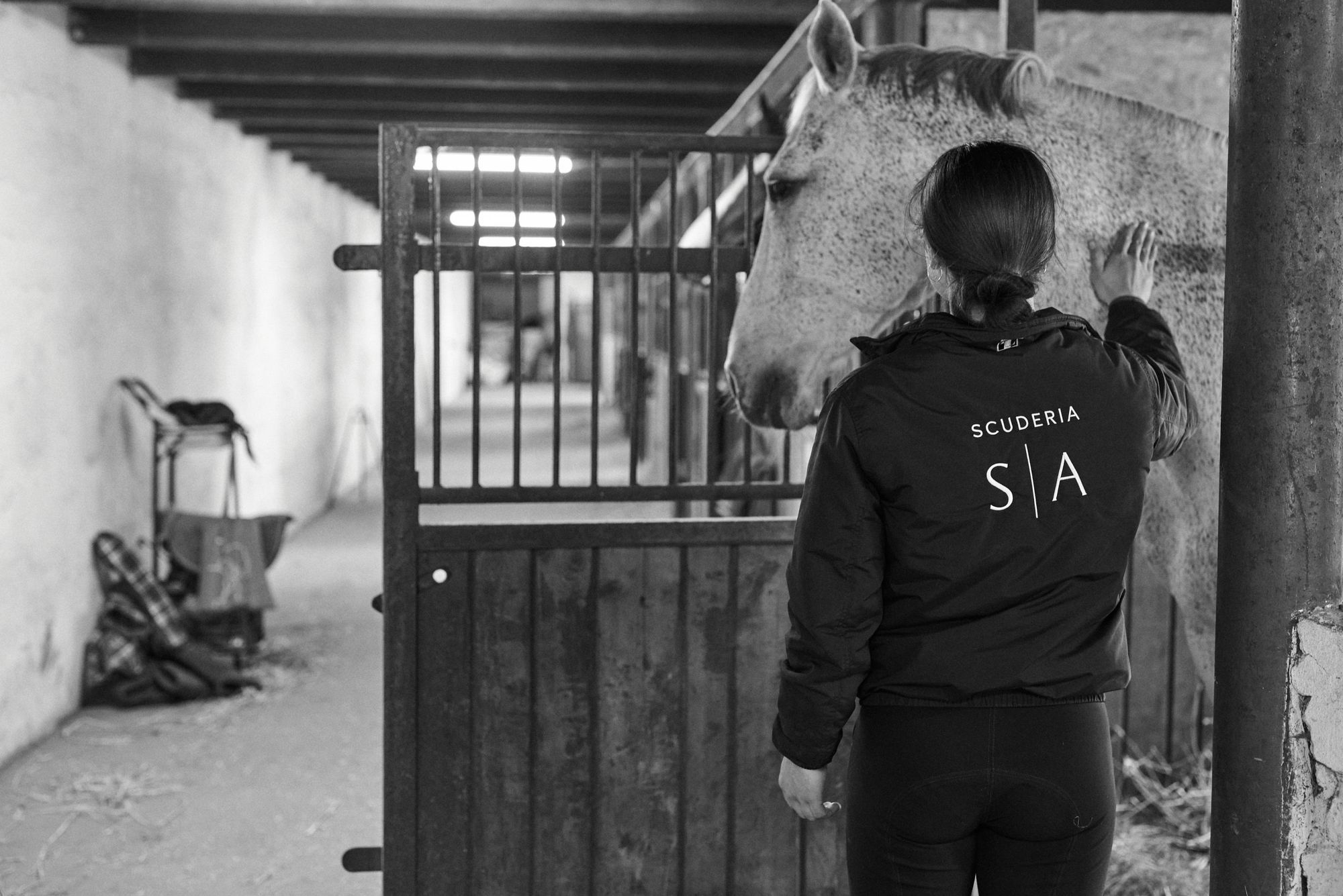
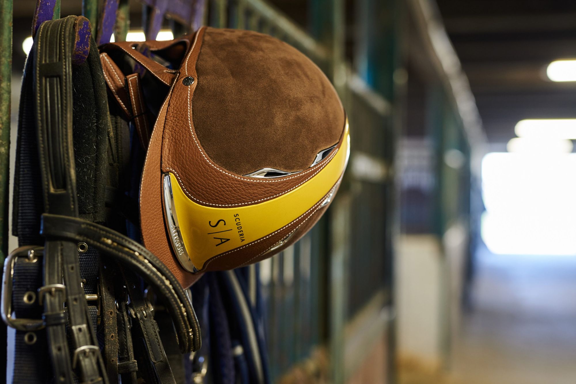
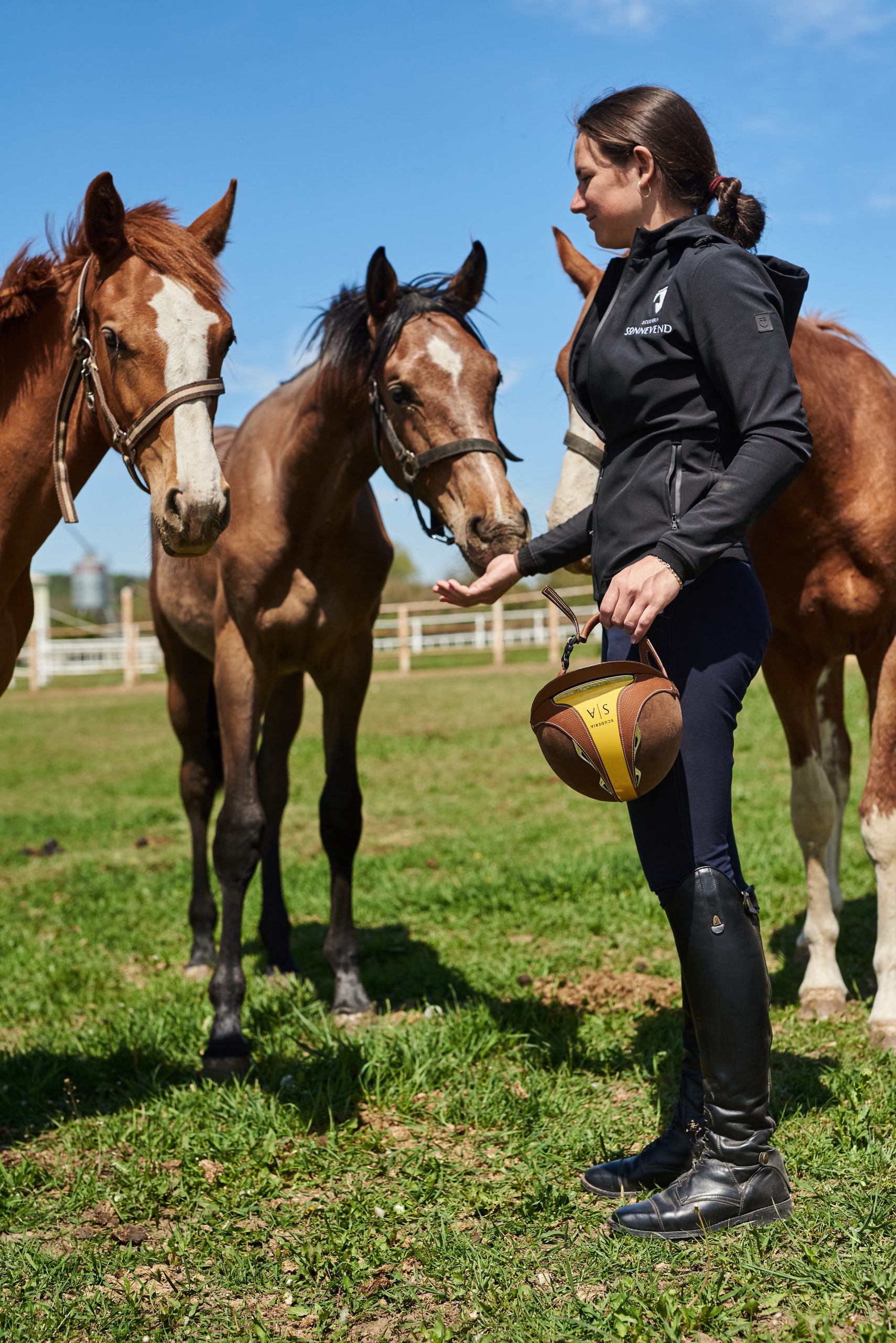
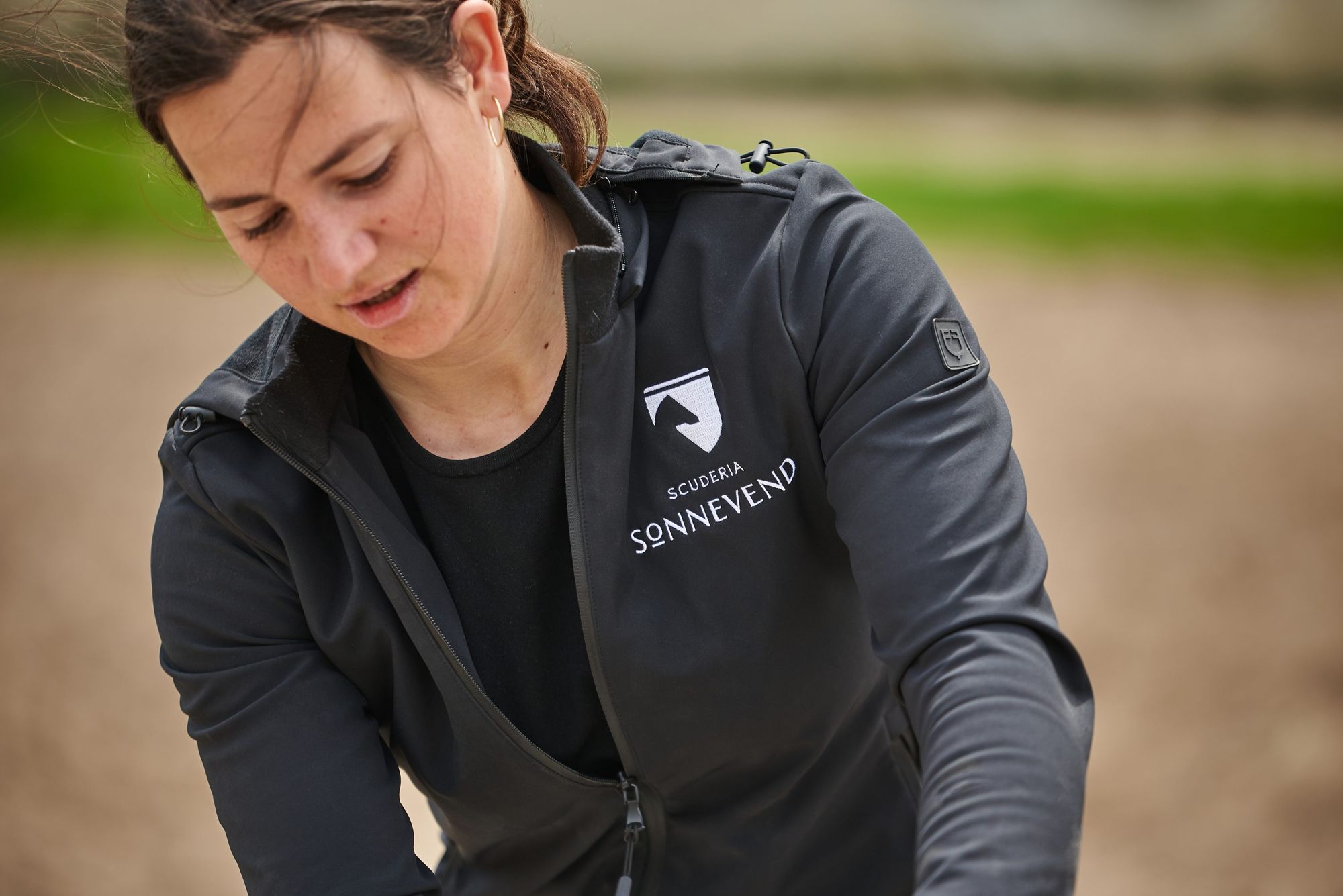
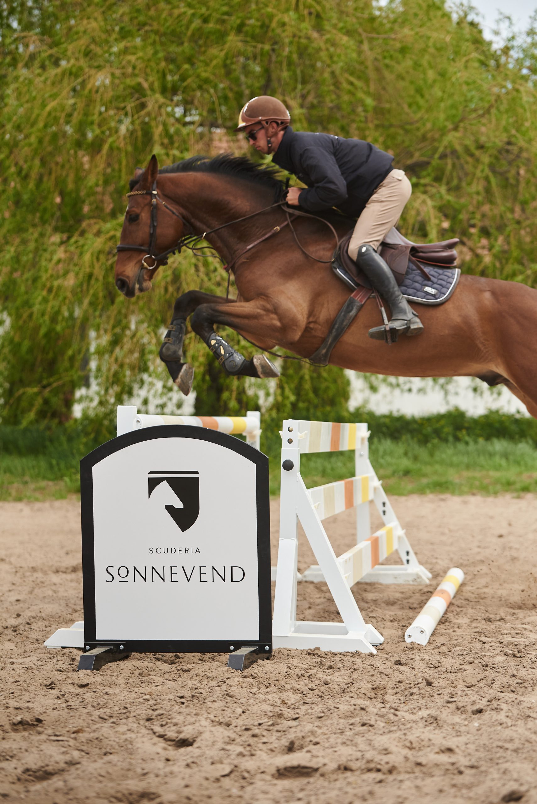
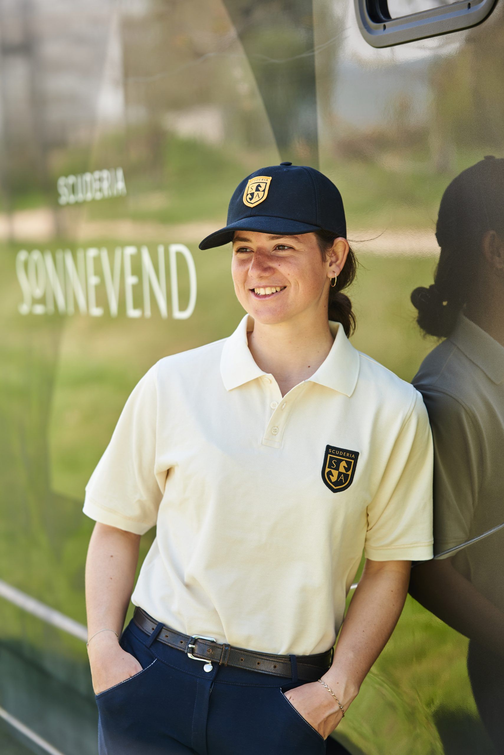
The logo is also echoed on countless equestrian devices, helmets, clothing and textile badges, and the colors of the brand identity also appear on the horse jumping obstacles.
Photos: András Zoltai
Studio NUR | Web | Facebook | Instagram
Scuderia Sonnevend | Web | Facebook | Instagram
Rustic atmosphere and rising alcohol levels | YOD Group x MAD Bars House
