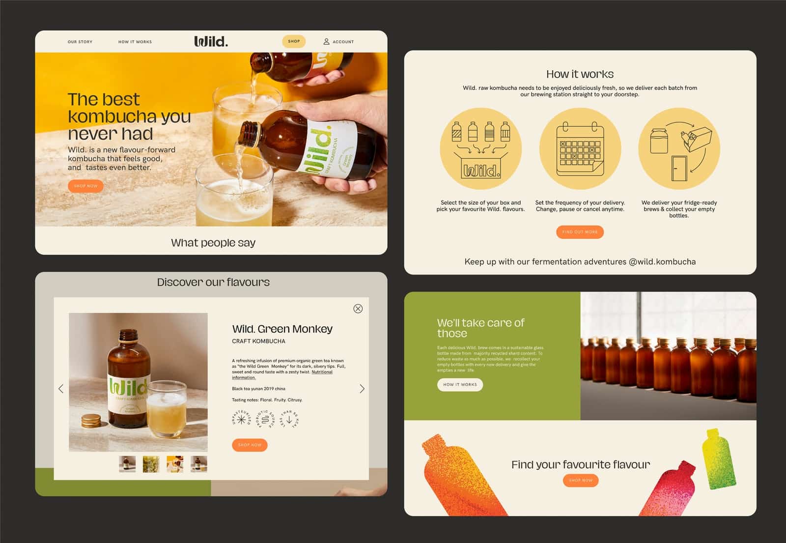
Wild. aims to make a handcrafted kombucha that is 100% natural, contains no additional flavors or artificial carbon dioxide, and is even tasty by the way—freshly delivered to the consumer’s door based on a subscription model. The Czech Marlon Studio was asked to design the complete visual identity of the product.
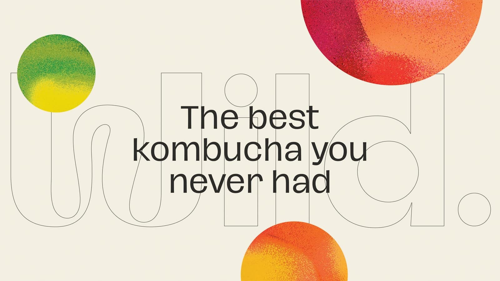
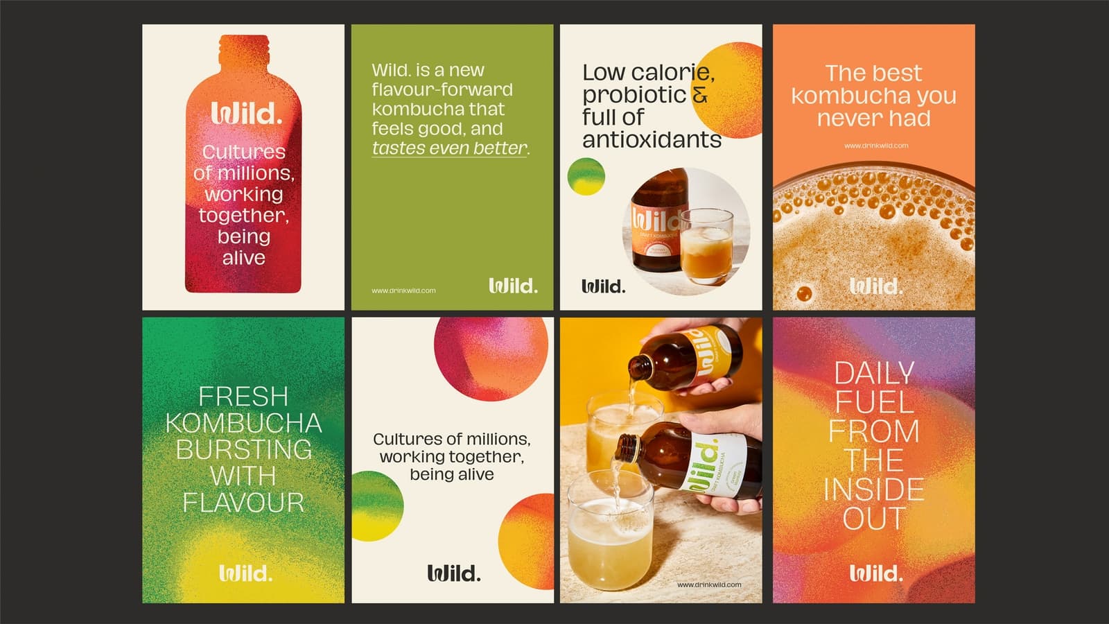
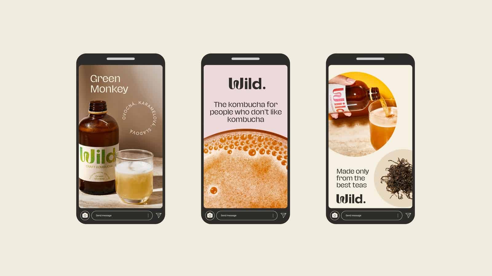
Communicating freshness, sustainability and playfulness was a primary consideration when designing the brand identity. The starting point was the slogan of the Wild. kombucha: “Fermentation is a culture of billions, working together, being alive”. Therefore, referring to the cultures of bacteria responsible for fermentation, a dynamic identity was created—with a logo evoking a living organism. This typographic logo is at the heart of the label design, and textured details play a role in marking different flavors.
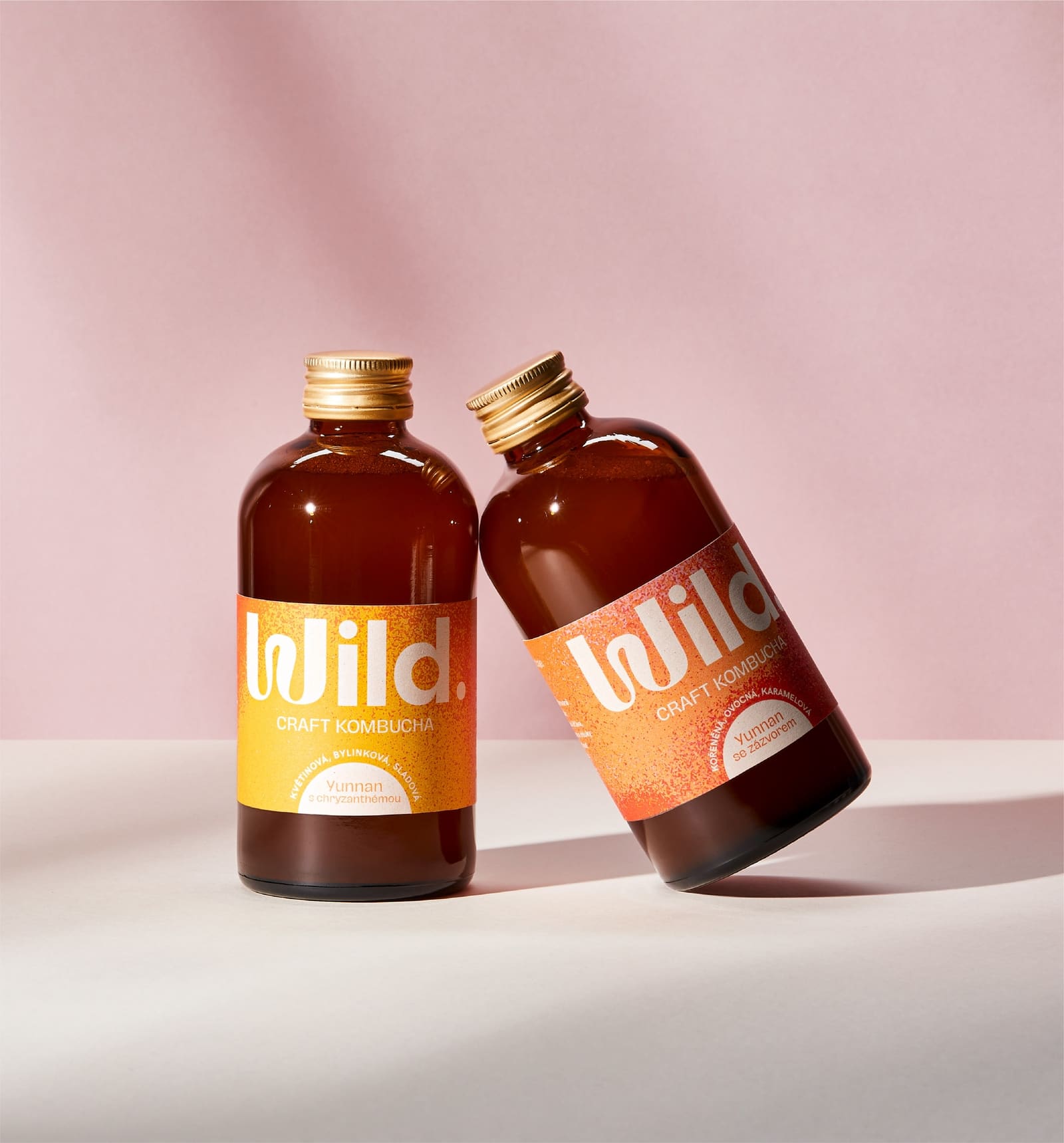
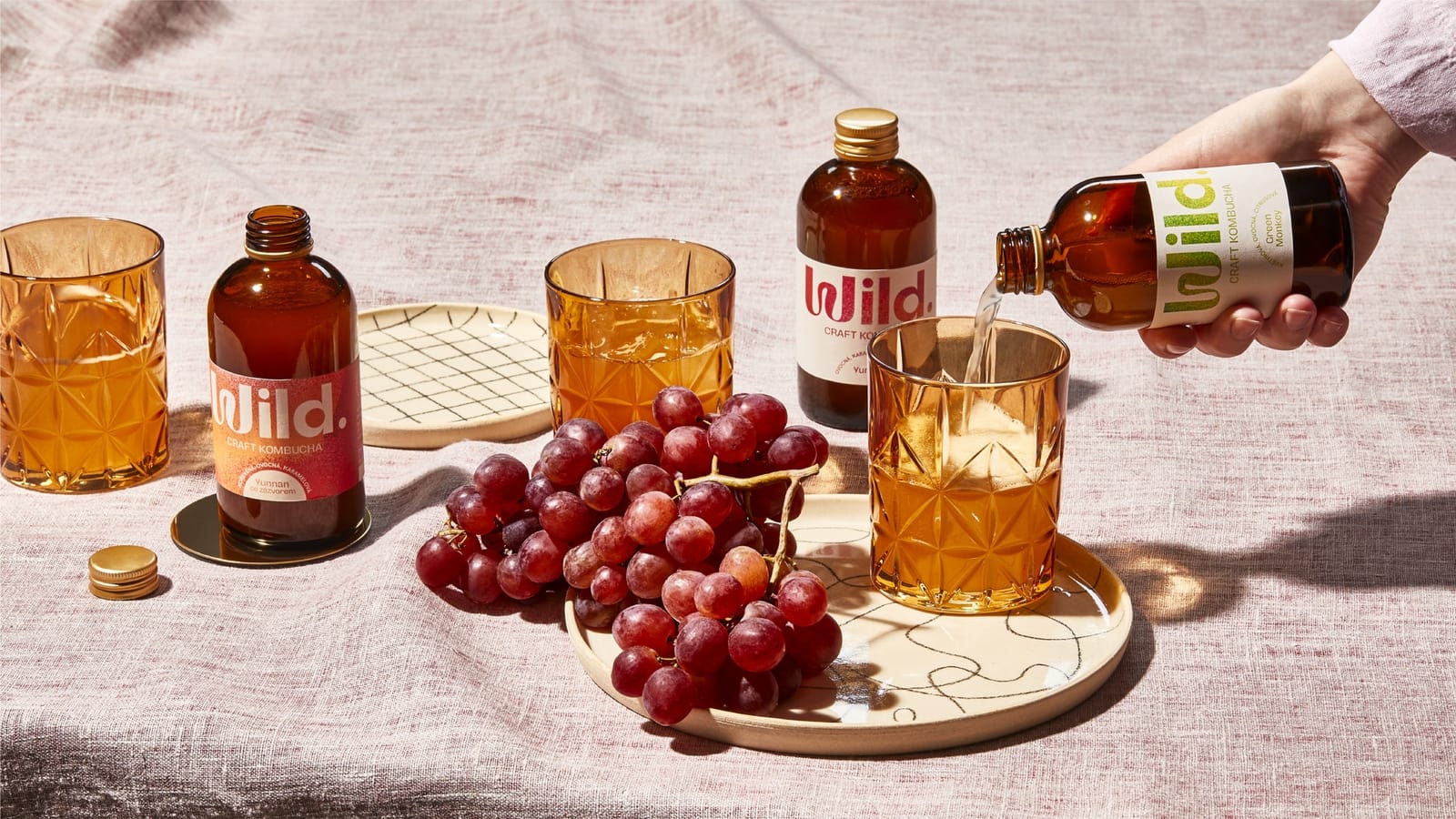
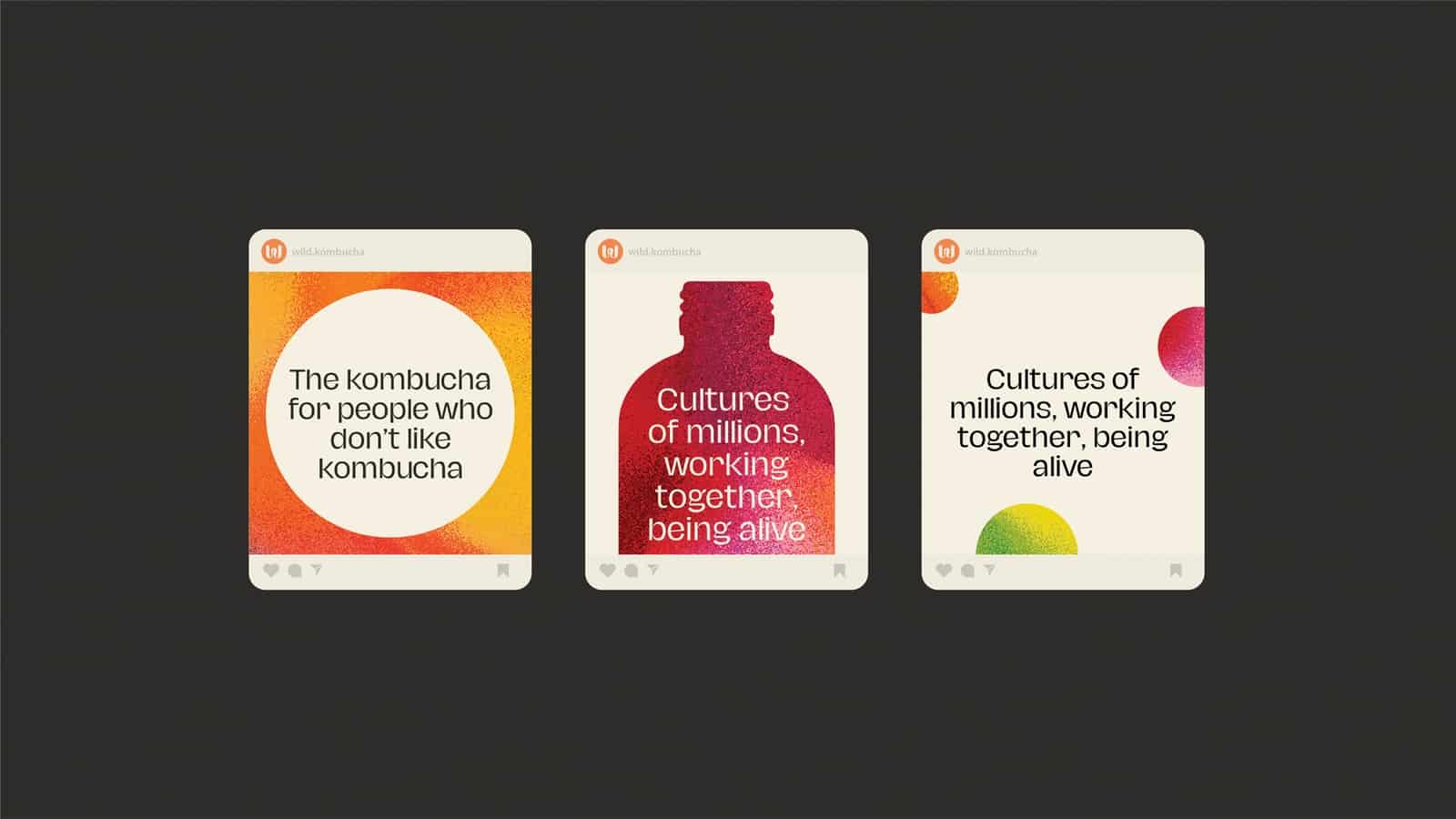
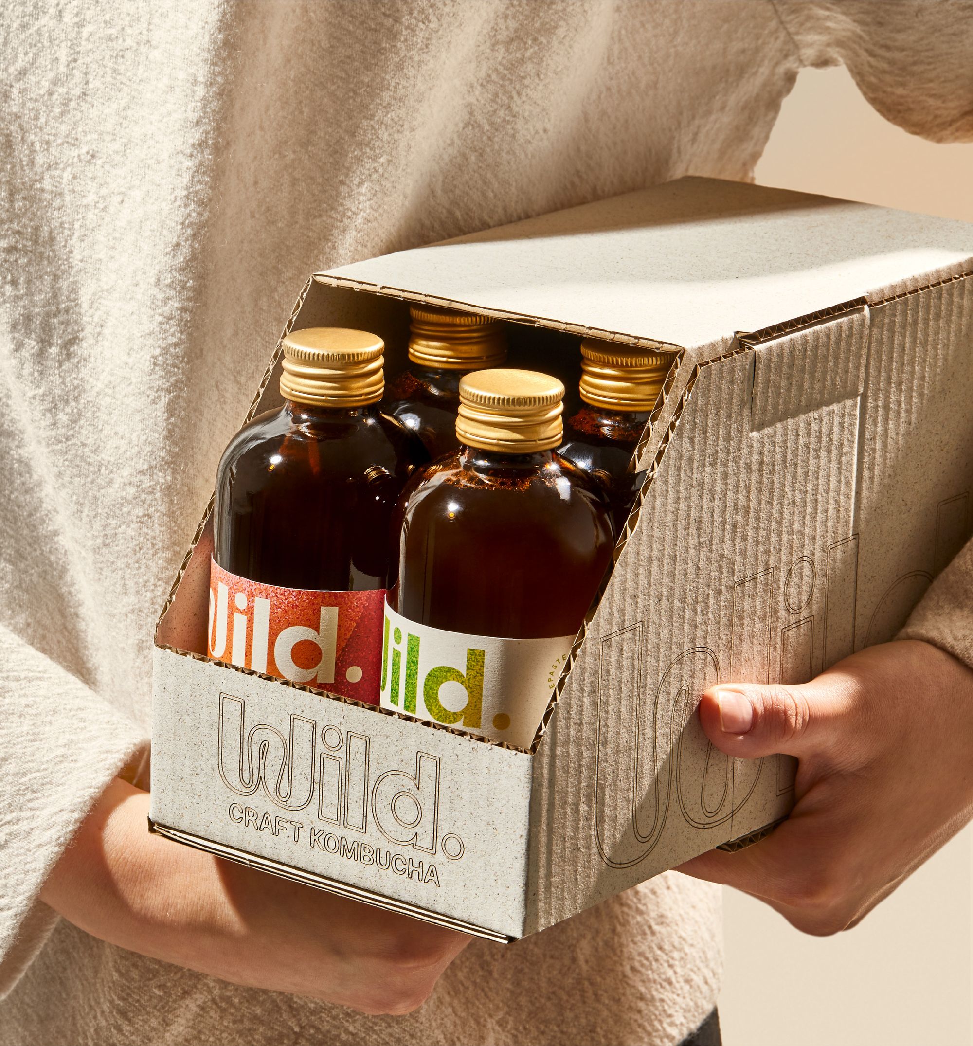
The core values of the brand, including sustainability, were not ignored in the design of the packaging either. Not only the labels, but also the shipping boxes are made from recycled materials, plus the latter along a minimalist design. The colors were abandoned here and there is no printing on them—the logo was completely laser cut on the surface of the carton. So the result is a refined branding based on contrasts, layering and textures!

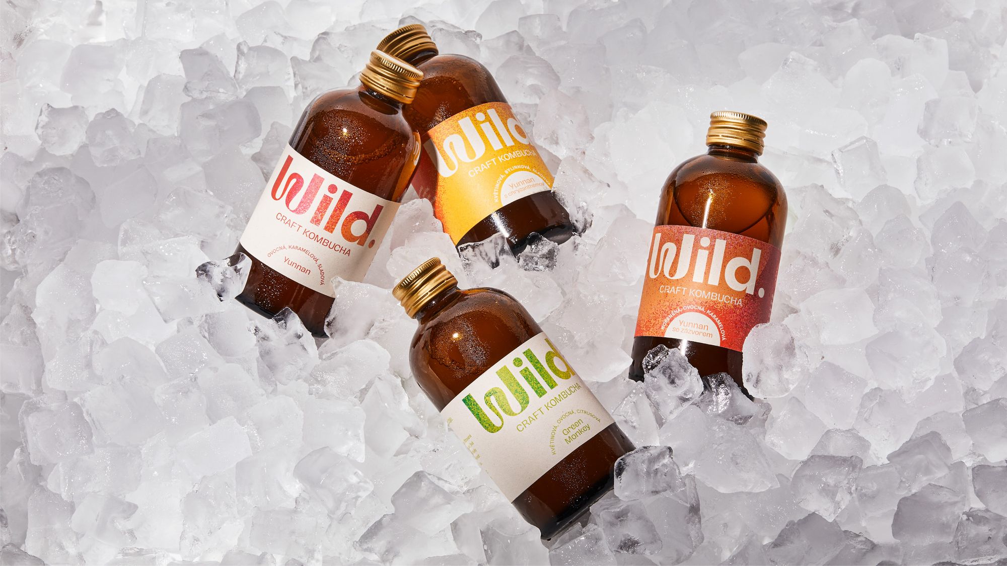
Photos: Marek Bartoš
Marlon studio | Web | Behance | Instagram
Wild. kombucha | Instagram
Source: Marlon Studio
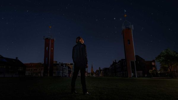
A Dutch city's lights were switched off to reveal a starry sky as a heritage

Nike acquired a company that makes virtual shoes


