The kitchen where marketing, branding, communication and design are the ingredients: Paula Maior and Noémi Kruppa, the founders of Cluj-Napoca-based design & advertising firm The Kitchen Studio help various brands find their own voice and identity in a complex manner.
Paula Maior was born in Marghita, a small town in Transylvania, and studied advertising and economics later on. Noémi Kruppa comes from a movie and animation background. After studying in Budapest, she returned to her hometown, Cluj-Napoca, where everything came together slowly. Many years ago, Paula and Noémi worked at the same advertising agency, and then a year ago they decided to continue their work in a different format and to establish their own studio – representing a simple yet progressive approach.
Your studio is known under the name The Kitchen: what’s the message behind your choice of name?
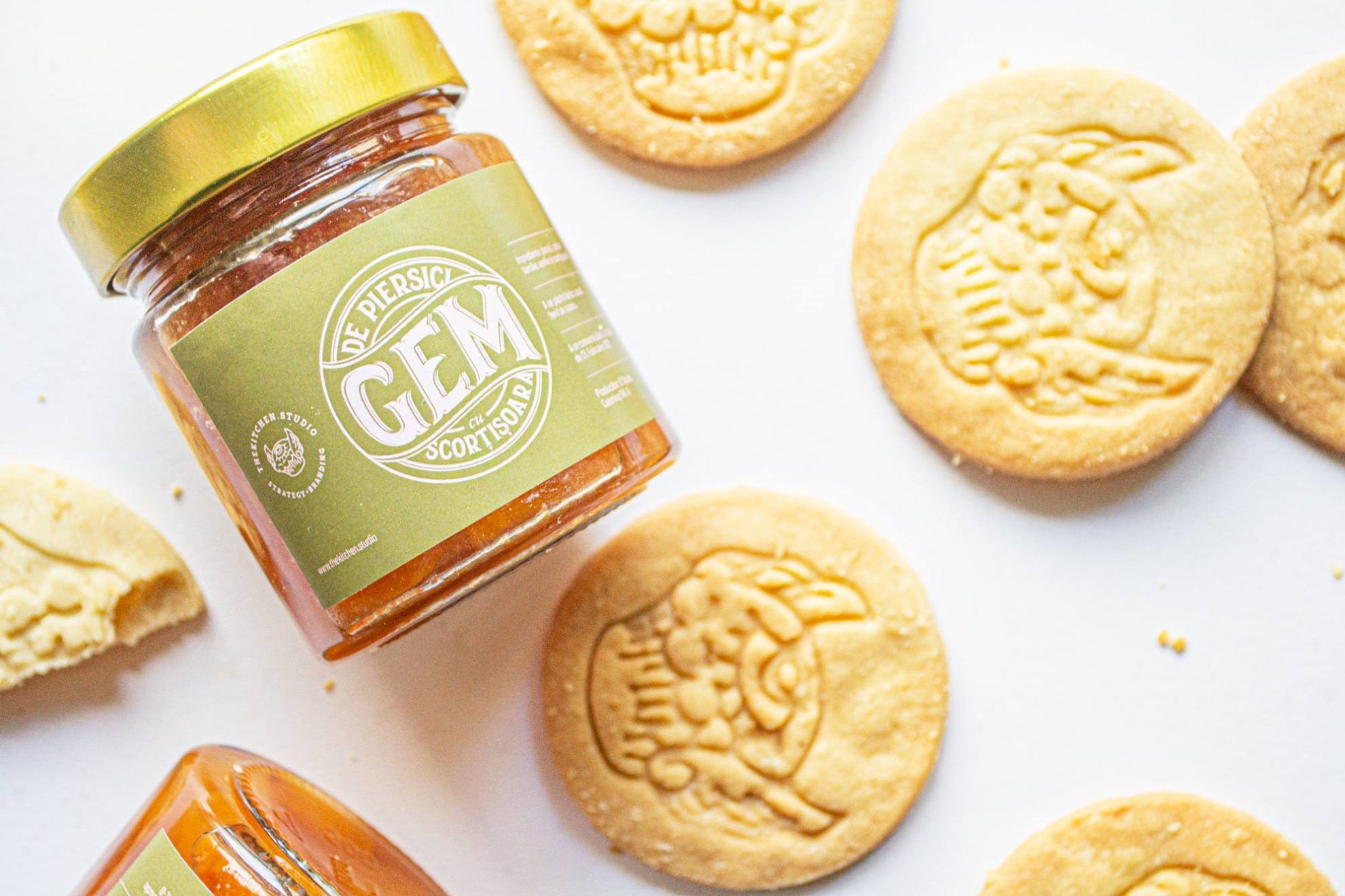
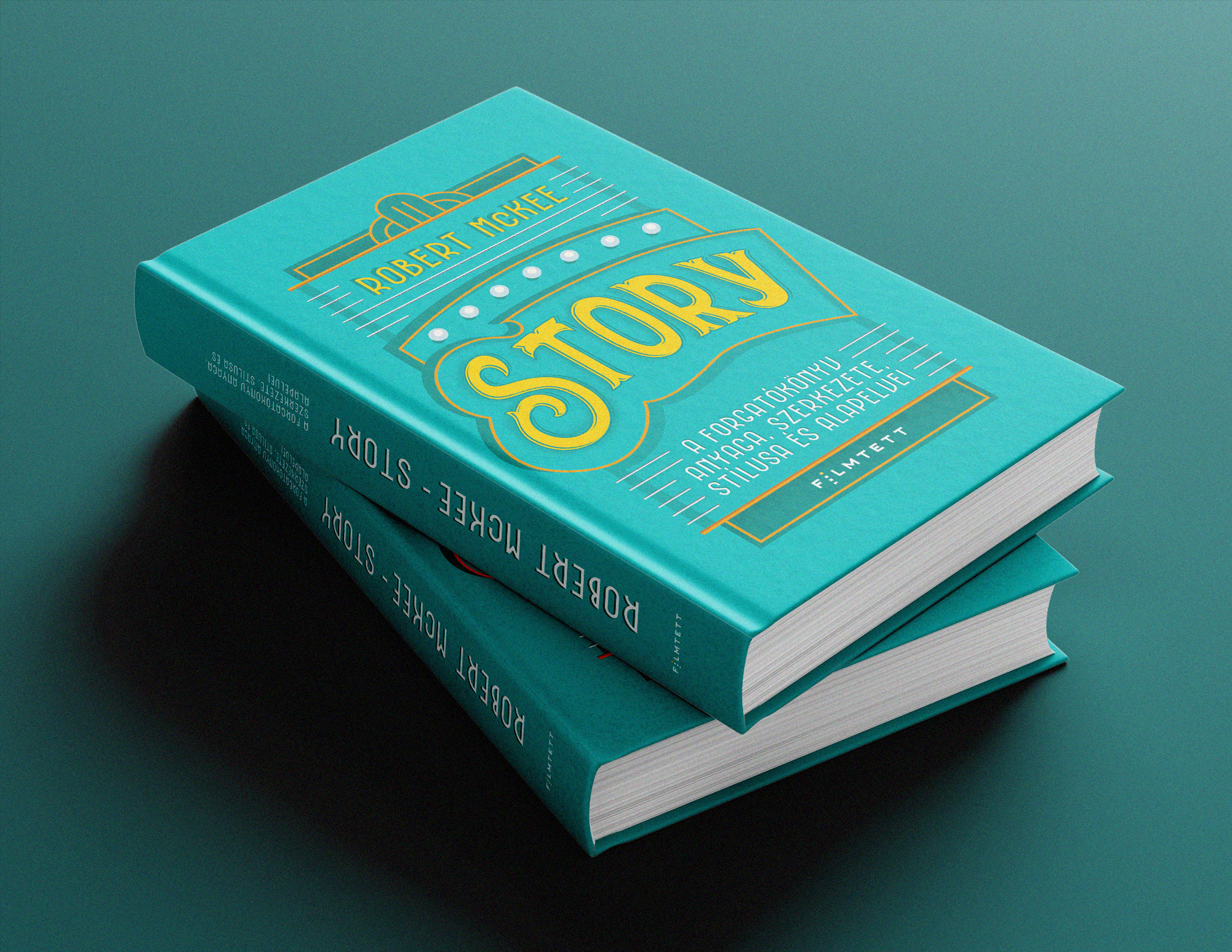
Paula Maior: In our opinion, a successful advertising agency works in a similar way as a professional kitchen, where creativity is combined with science and expertise. We always say that branding is not only about appearance: we must be able to decode the message of a brand with all our senses. This is what our PEACH & CINNAMON project is about, in which we gave custom peach jam with a packaging designed by us and cookies displaying our logo to clients and friends – this is a good example how to use brand identity through a completely different medium.

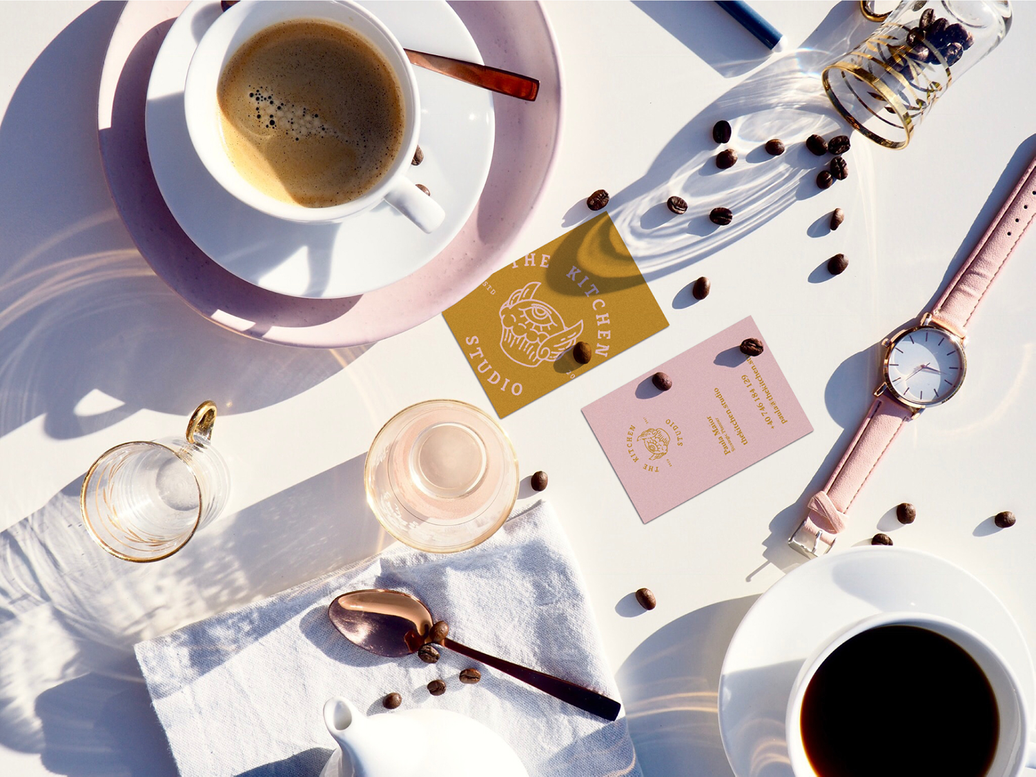
Your logo does not lack humor either, but at the same time it has a very clean and recognizable silhouette. What was the basis of your concept here?
Noémi Kruppa:We wanted to create a symbol, a logo that is unusual, eye-catching and memorable, something you haven’t seen before. As a designer I many times feel the urge to create visuals that no client in their right mind would approve. Thus I get a kind of satisfaction when I get to design for ourselves.
How would you describe the visual style you represent?
N.K.: I would say it’s shocking and dissentive – this is not a visual style, but I don’t think we follow any set rules when it comes to how we express ourselves visually. I see and have seen a lot of what the “design scene” has to offer over the last 10 years, and I felt that something was missing: globalization has its perks, but it makes us look all the same, and I had a very clear desire to make something that stands out from the visual noise.
You have quite a colorful palette and portfolio. Which projects do you prefer, and what inspires you the most?
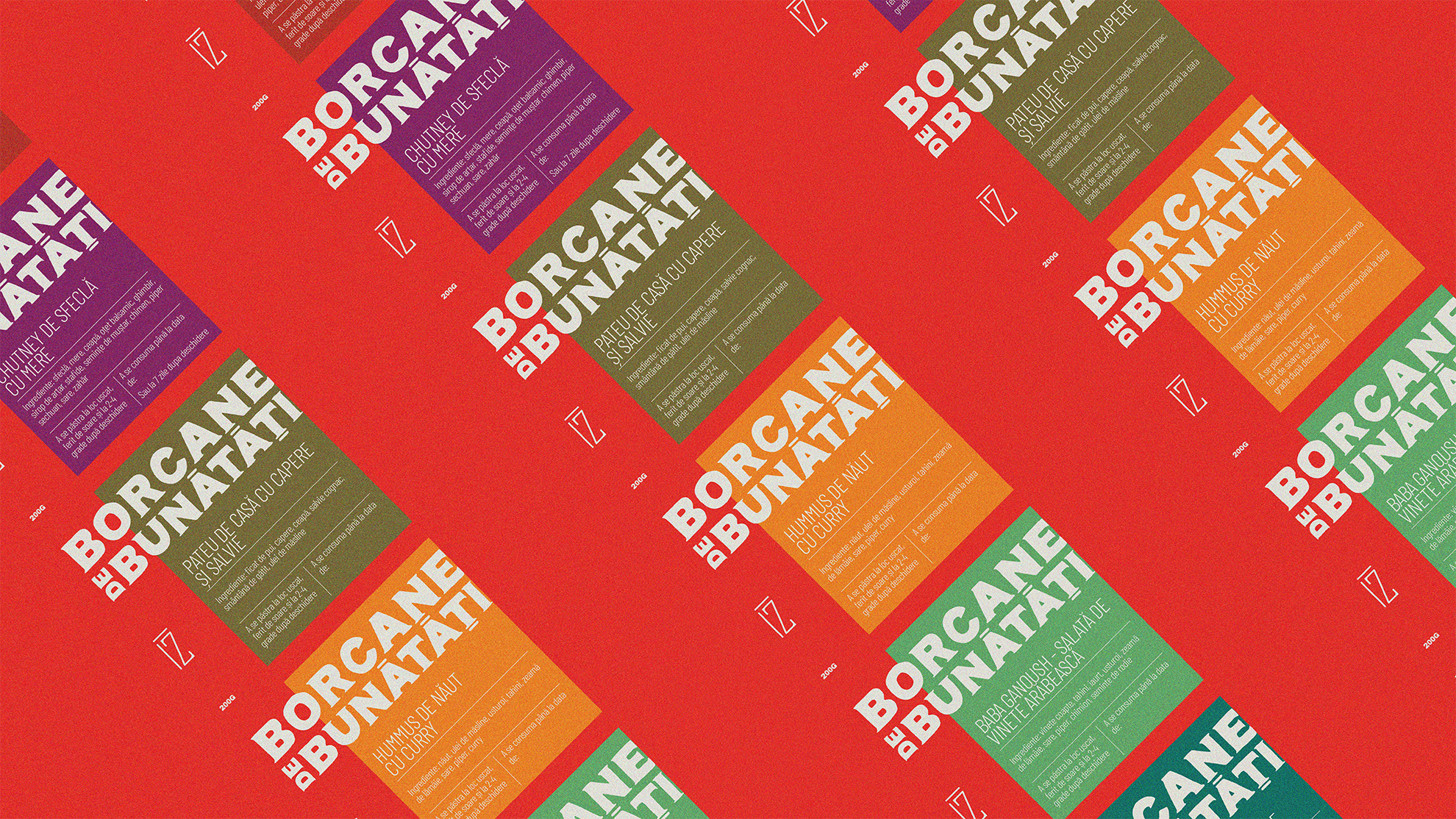
N.K.: We’ve worked for a wide range of industries, including food service or legal, but we also have jobs from the fields of banking, IT, tech and FMCG. For example I love the FMCG sector because nothing beats seeing your packaging design on a supermarket shelf. That being said, there’s a certain type of project, regardless of industry, that challenges us as creatives, and we just know right away that you have the power to really make a difference for the client, and in a lot of the cases for the client’s client as well. Including, for example, ÍZ Studio catering business that became our client right before the pandemic. Considering the events, we created various creative methods and an extensive communication plan for them, to help them keep their business afloat during the epidemic and to help them be visible. Thus the studio now sells various ready-made dishes and gourmet snacks, for which we created an ecommerce platform with a very limited budget and deadline.

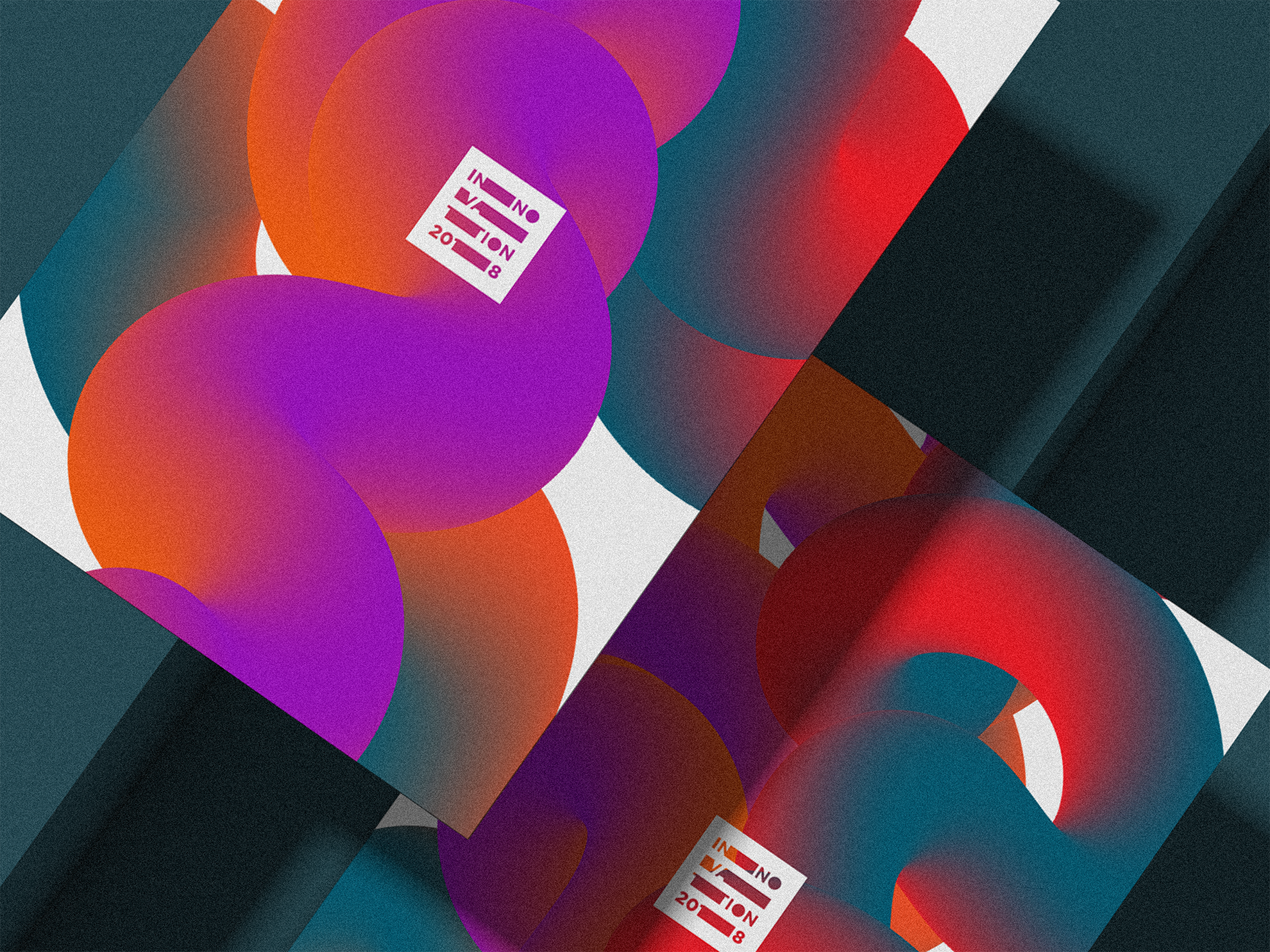
M.P.: Another good example is the Innovation international festival in Warsaw. Here we had to make a bold and brave brand identity, which would be able to evolve with every edition of the event. The concept was nature, which was tricky for an event dealing mostly with cutting edge technology: finally we opted for showing nature as an innovator itself and stylizing it using fractals, movement and organic form as reference. We received a lot of compliments on this final output and people really remembered it.
In the creative industry it is still very common for the client to not know what they want, or even not being aware what a complete corporate identity is. What is your take on this, and what challenges have you met so far?
M.P.: It’s our job to understand the needs and point of view of a client. A lot of people in this industry take a patronizing stance and use language like “educating the client” and that’s not at all what we think is appropriate: like in any human relationship, we are equals and partners in this case, too and we aim to find the best means for effective communication and good relationships. We’ve found that the best approach lies in simple communication, when both parties speak the same language and we describe our work processes and how each of our small decisions will influence the final output without using technical terms or big words. It always feels nice when clients trust us and we understand what they need.
What are your future plans?
M.P.: We want to continue to do great work. The Kitchen just turned a year old and it was a great first year. We have a lot of ideas but instead of rushing things we’ll just save them for the right time.
N.K.: We both want to find new, interesting ways of reaching the right clients; I want to continue to learn new techniques and perspectives to keep a fresh eye on things. I also think that once international travel restrictions are lifted we’ll go on a well deserved team building.
The Kitchen Studio | Web | Facebook | Instagram
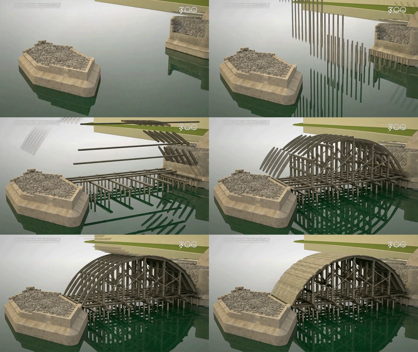
Charles Bridge construction condensed into an animation
SQUARE-ANGLE – Péter Kántor
