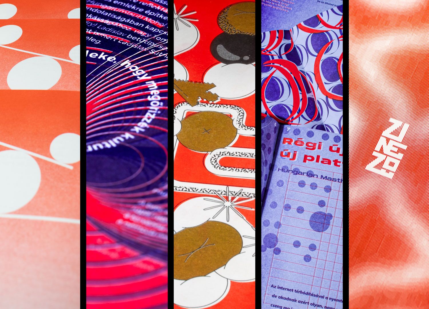
Selected articles of Hype&Hyper were given five different character designs by second-year master’s students of 2022 at Eszterházy Károly Catholic University in Eger, Hungary, and then turned into riso-printed publications. We would like to express our admiration in the form of this article.
“Zinező is a biannual design periodical of the Media and Design Department of Eszterházy Károly University and a featured project for graphic design master’s students. While freshmen translate articles into the large-format (Broadsheet) magazines they design, second-year students are given more freedom in terms of the source and size of their articles. The latter are usually produced in a smaller format and using risograph printing techniques,” says Szabolcs Süli-Zakar, student consultant and editor of Zinező. Furthermore, students compose the publications by browsing renowned professional forums for articles, interviews or studies on current graphic design issues, which they then process using their own visual tools. “However, second-year students suggested that it might be interesting to look for articles from recognized Hungarian professional sites, so we approached Hype&Hyper, you guys, to recommend articles from your site, from which we selected a few,” Szabolcs noted.
It’s no secret that we were deeply touched by the designs, so we asked designers participating in the project how they see the limited edition zines. After a virtual “taster” of Zinezők, we also learned about Swiss Style and the excitement of risograph printing for graphic designers. Enjoy!
Sebestyén Boér
To our followers, Sebestyén Boér’s name might ring a bell, as we did an interview on his label design for Săniuş vodka, but some of his other projects have also caught the attention of Hype&Hyper’s editorial team. Sebestyén says he is most comfortable in the fields of web and image design, but publication design is the love of his life. As he emphasized, “the work of a graphic designer is varied and constantly challenging, and the end result is in most cases tangible in the most literal sense of the word”—for him, this is the real attraction of his profession. Hype&Hyper’s articles are published in Zinező, which he himself designed, marked by Sebestyén’s style based on a rigorous grid system and geometric illustrations. As he admitted, applying the risograph technique pushed him out of his comfort zone during the project, as he usually does not use colors, but as he noted, ignoring shades “would have been a spoilt opportunity in the case of riso-printing.”
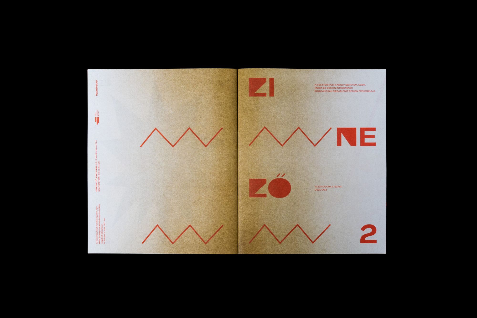
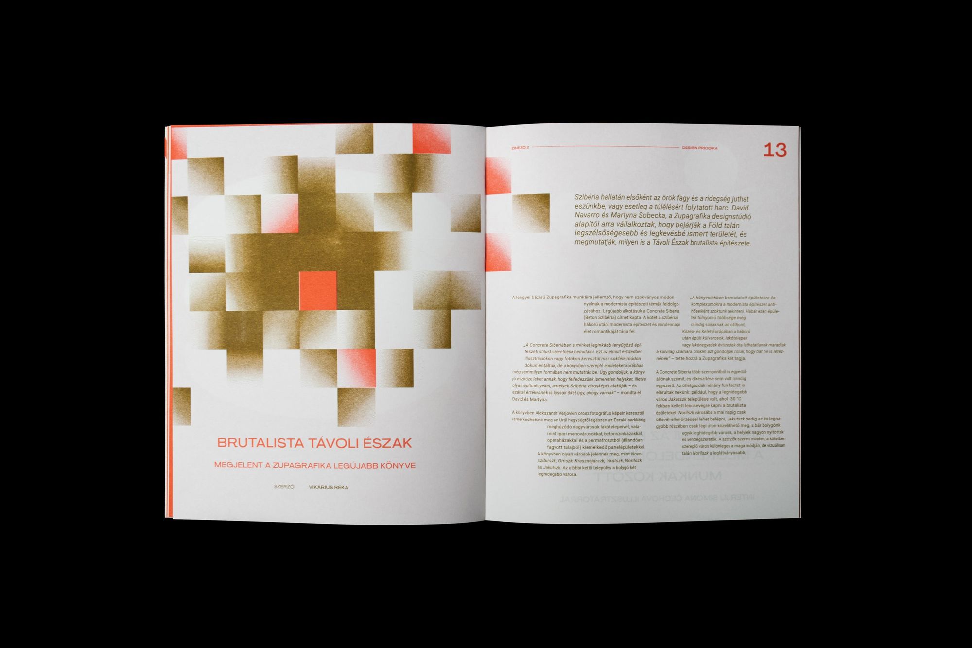
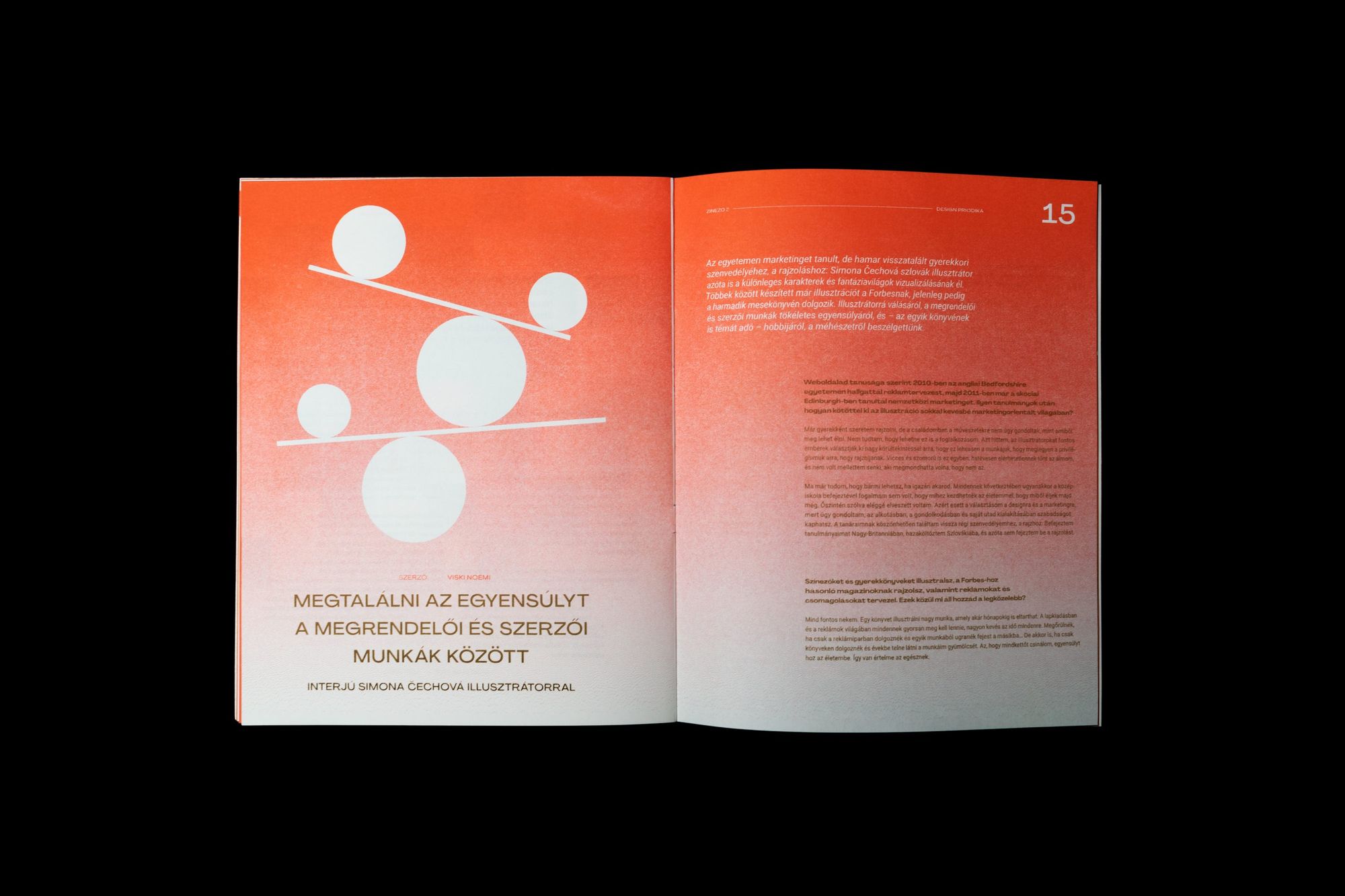
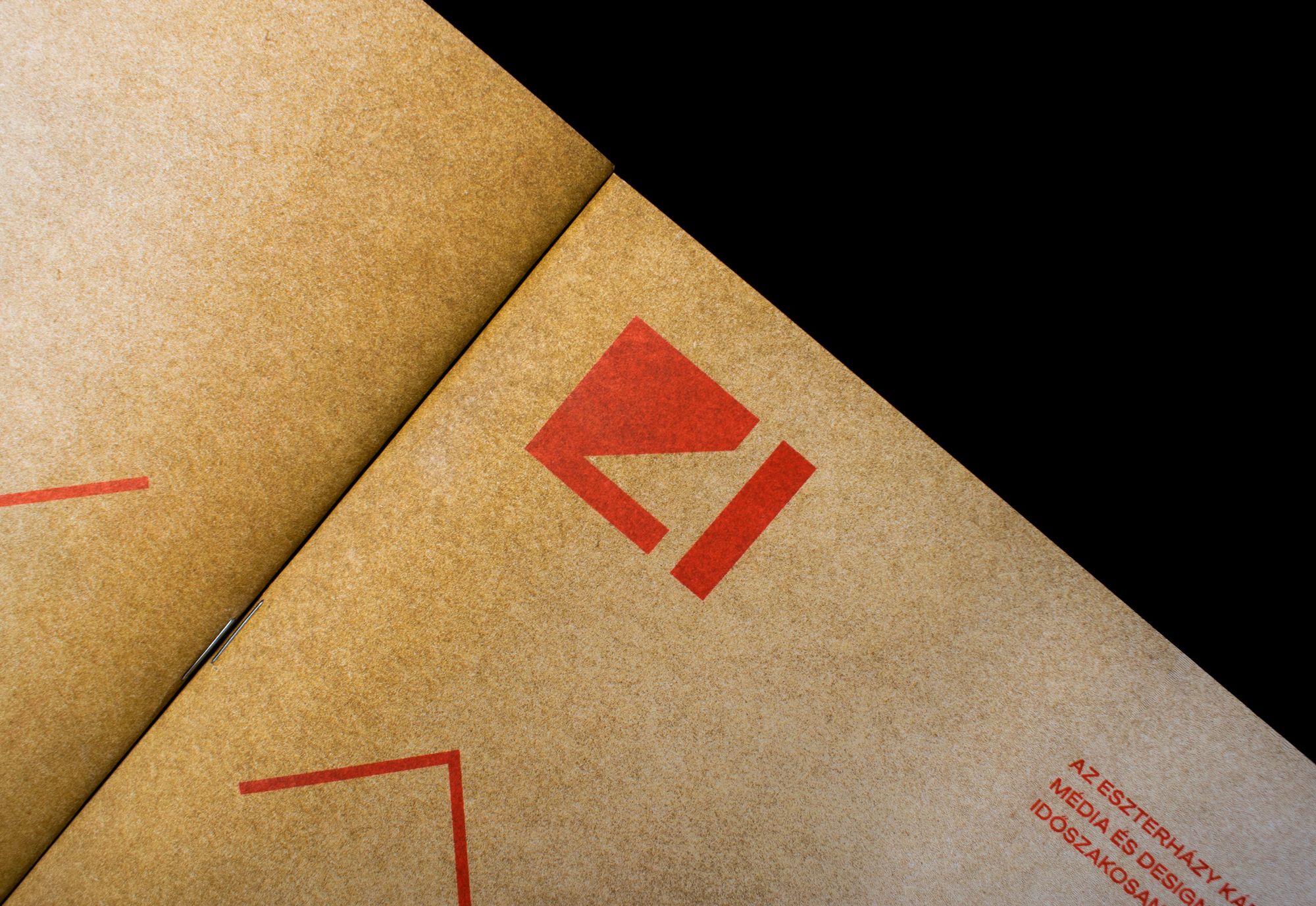
Sebestyén Boér | Behance
Emma Gál
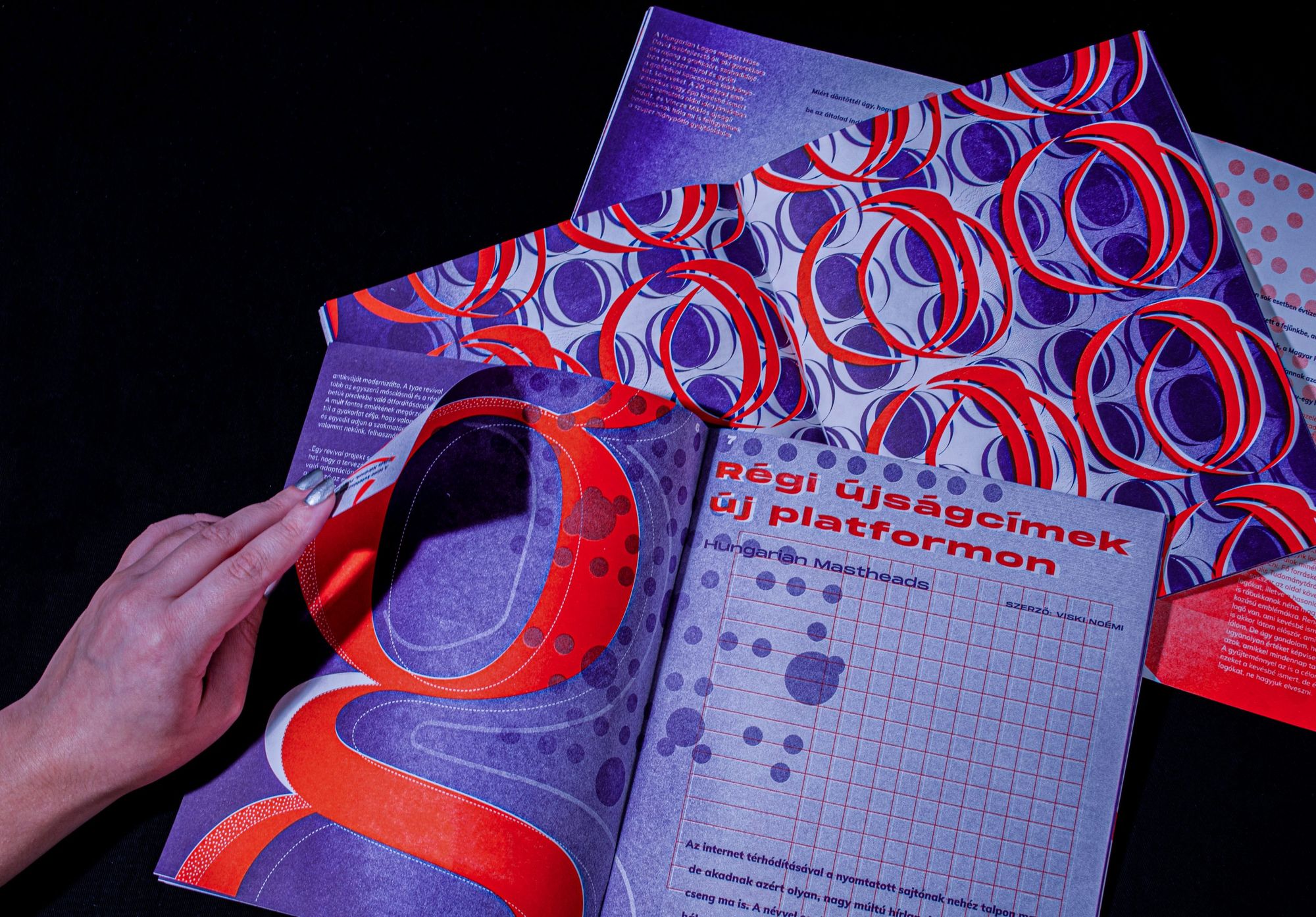
Emma has been surrounded by art since her childhood: she believes that culture, visual arts, fashion, music or photography all enrich her visual mindset. During her early years of study, as she explains, she did not like the field of publication design, so, as she puts it, it is a twist of fate that this eventually became her main focus. Although she has yet to discover the source of her enduring enthusiasm, the hallmark of her work is the constant presence of the circle in all its forms. “For me, it’s an unforgettable and perfect form,” she stressed. She also likes to work with bright colors, and to maintain a sense of clarity, she associates this with a visual expression called Swiss Style. The graphic design of the zine she created naturally included the circle motif and its abstractions, which she completed with a gradient of black, red and purple. Emma also added that, strange as it may seem, the risograph technique is environmentally friendly, as the film for printing is made from rice paper and the inks are plant-based, so she definitely wants to continue with risograph publications in the near future.
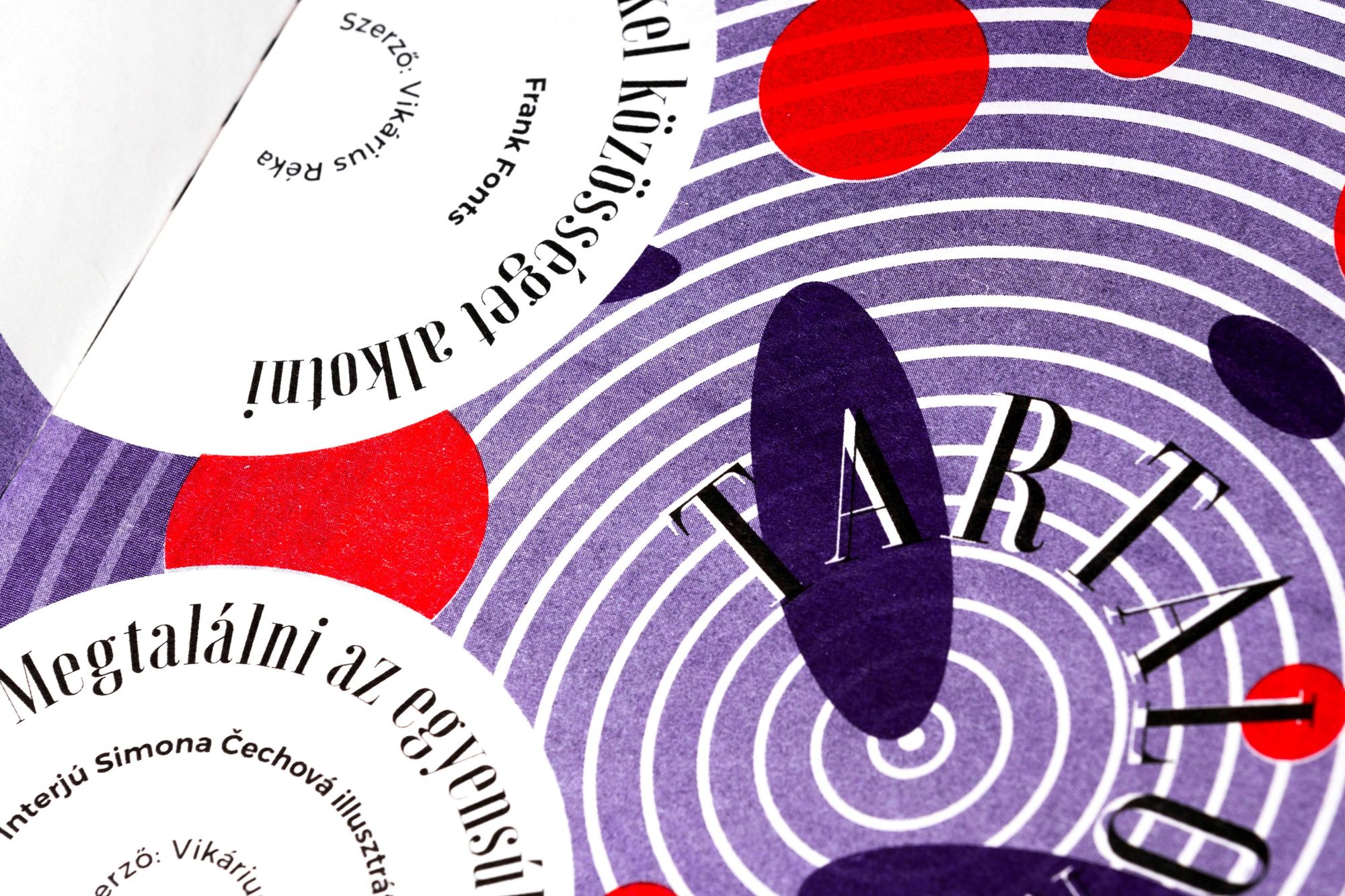
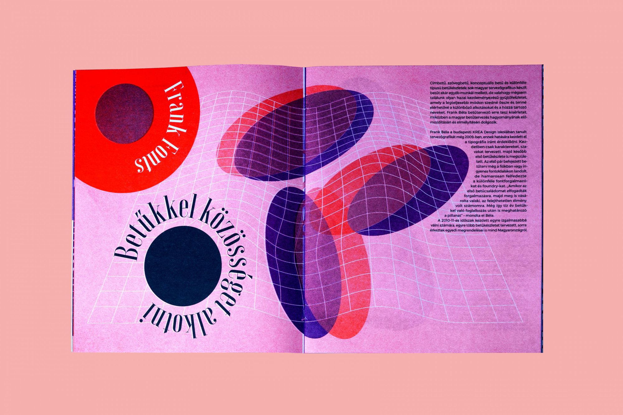
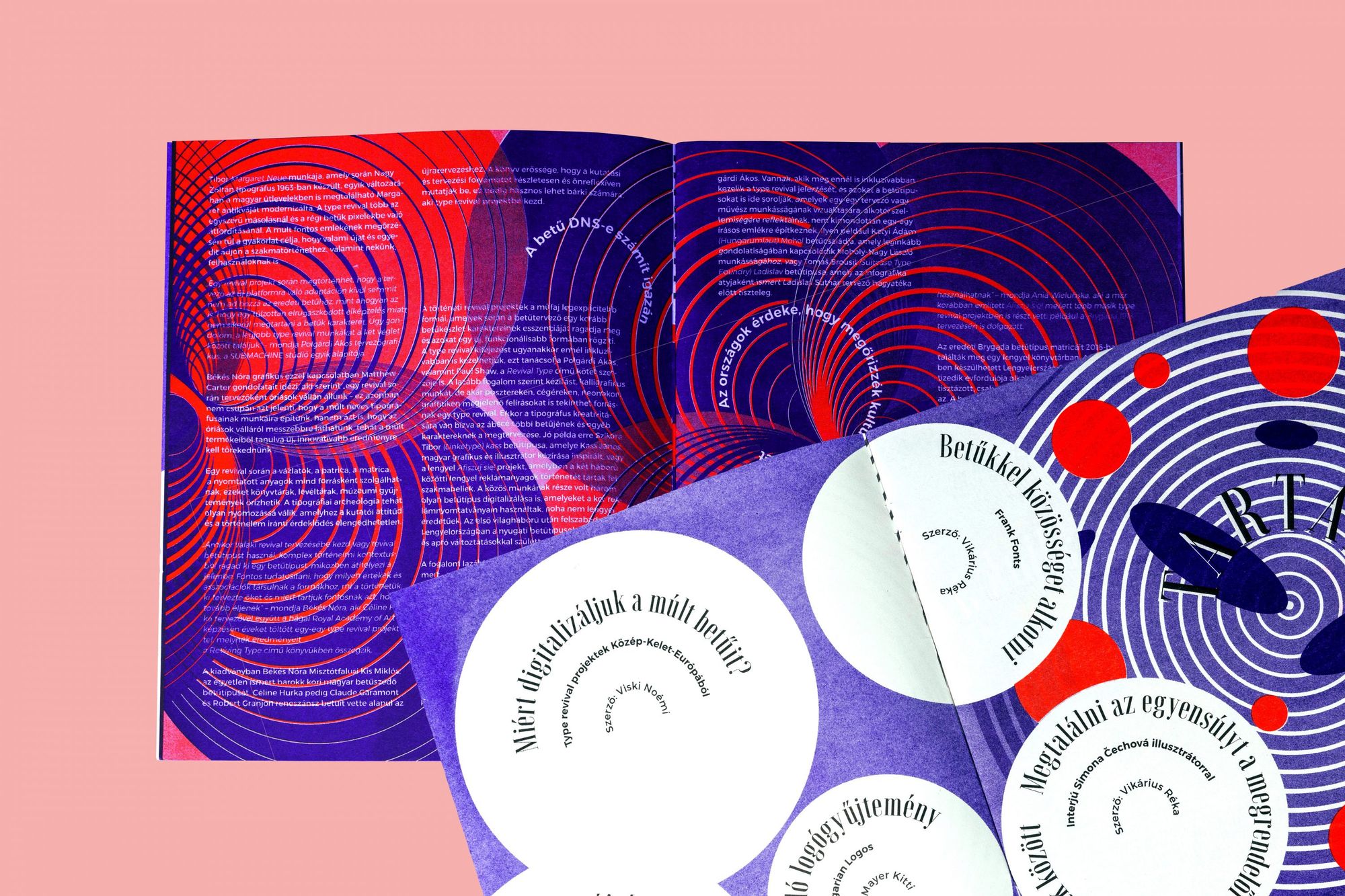
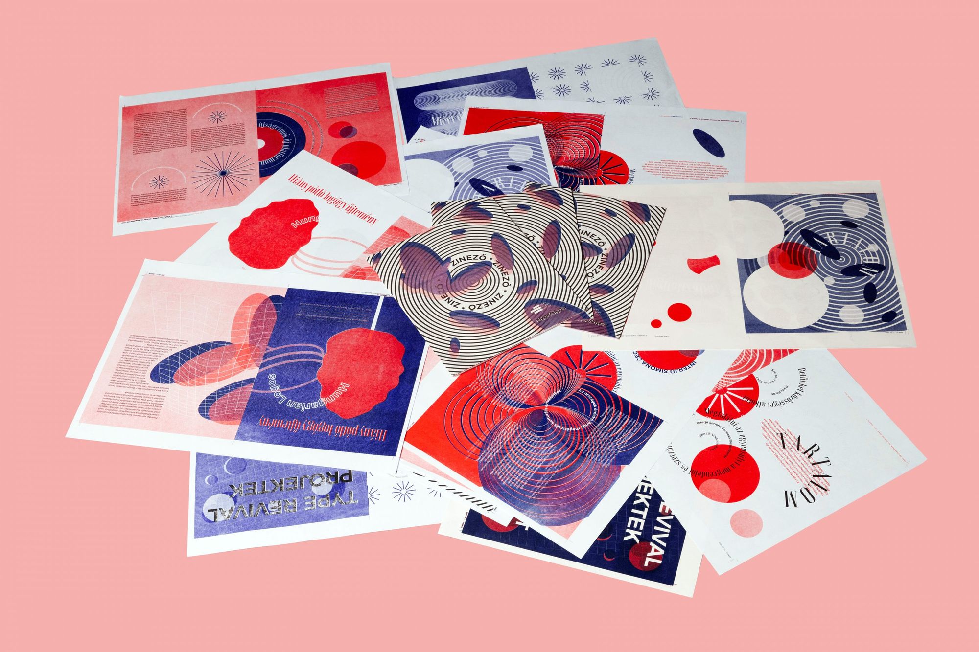
Emma Gál | Behance
Lilla Keresztény
As Lilla puts it, she’s been studying arts for as long as she can remember: in addition to graphic design, she has also dabbled in 3D design, animation and creative coding. Her work is also characterized by experimentation, which is why almost all her projects are completely different. The Zinező issue designed by Lilla captures this atmosphere, with risograph printing as the starting point for the main concept. “One of the characteristics of this technique is that the colors are not printed exactly on top of each other, but shifted—this reminds me of the old Windows. I remember when the error window would pop up on the screen at least fifty times. So the visual basis of the zine was inspired by the old Windows and the video games at that time,” she explains.
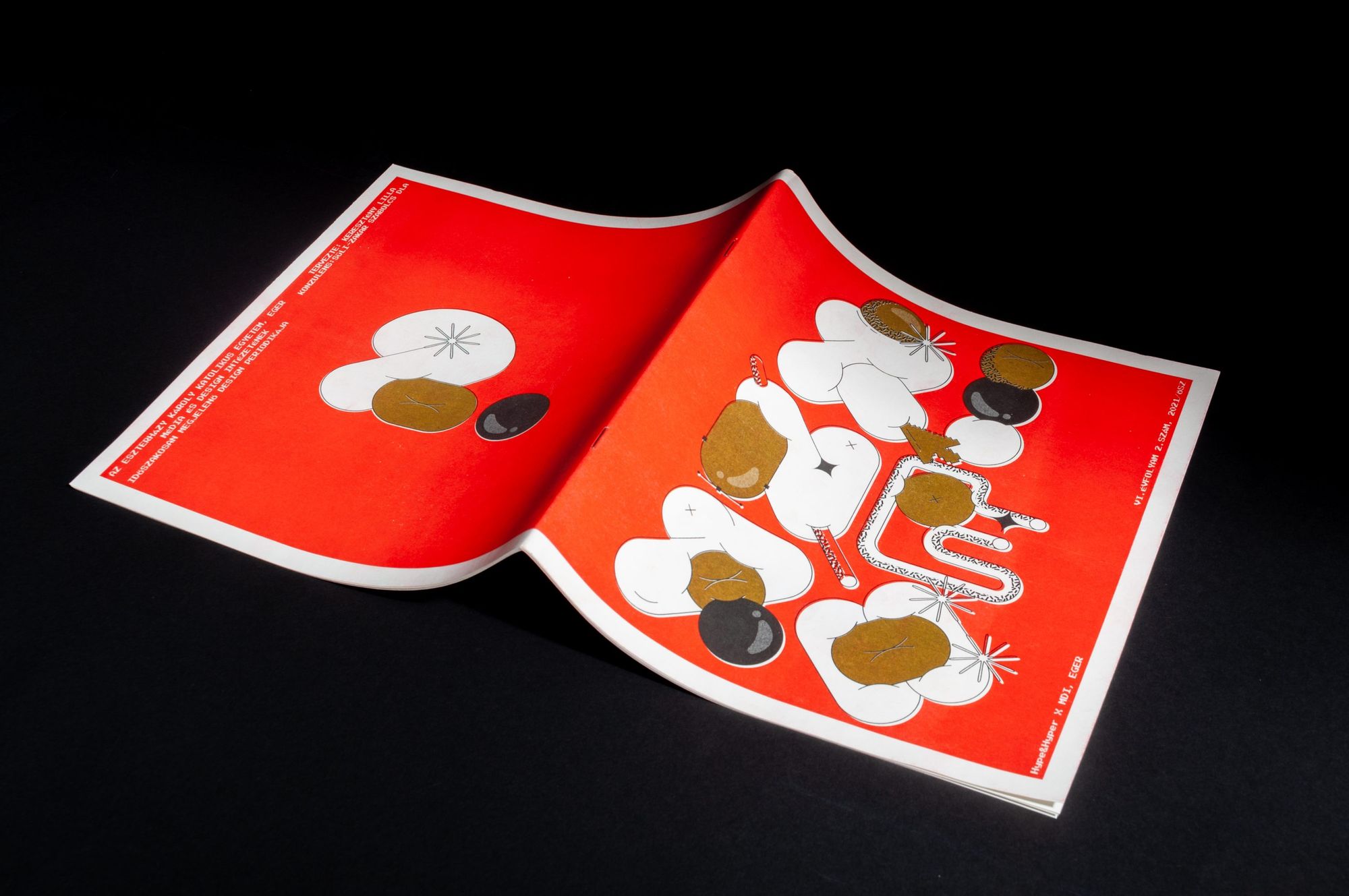
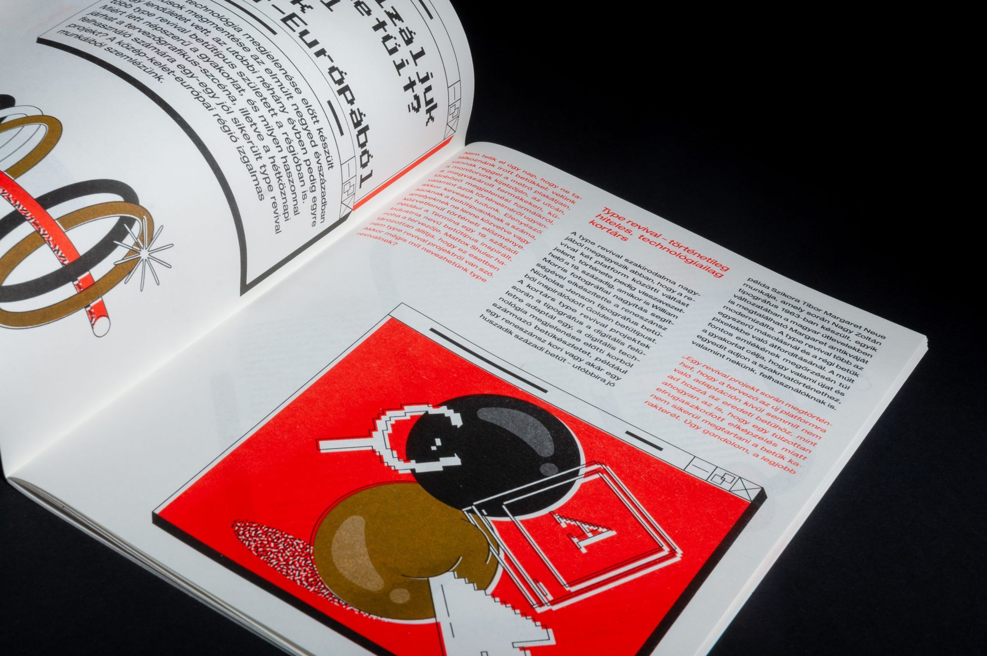
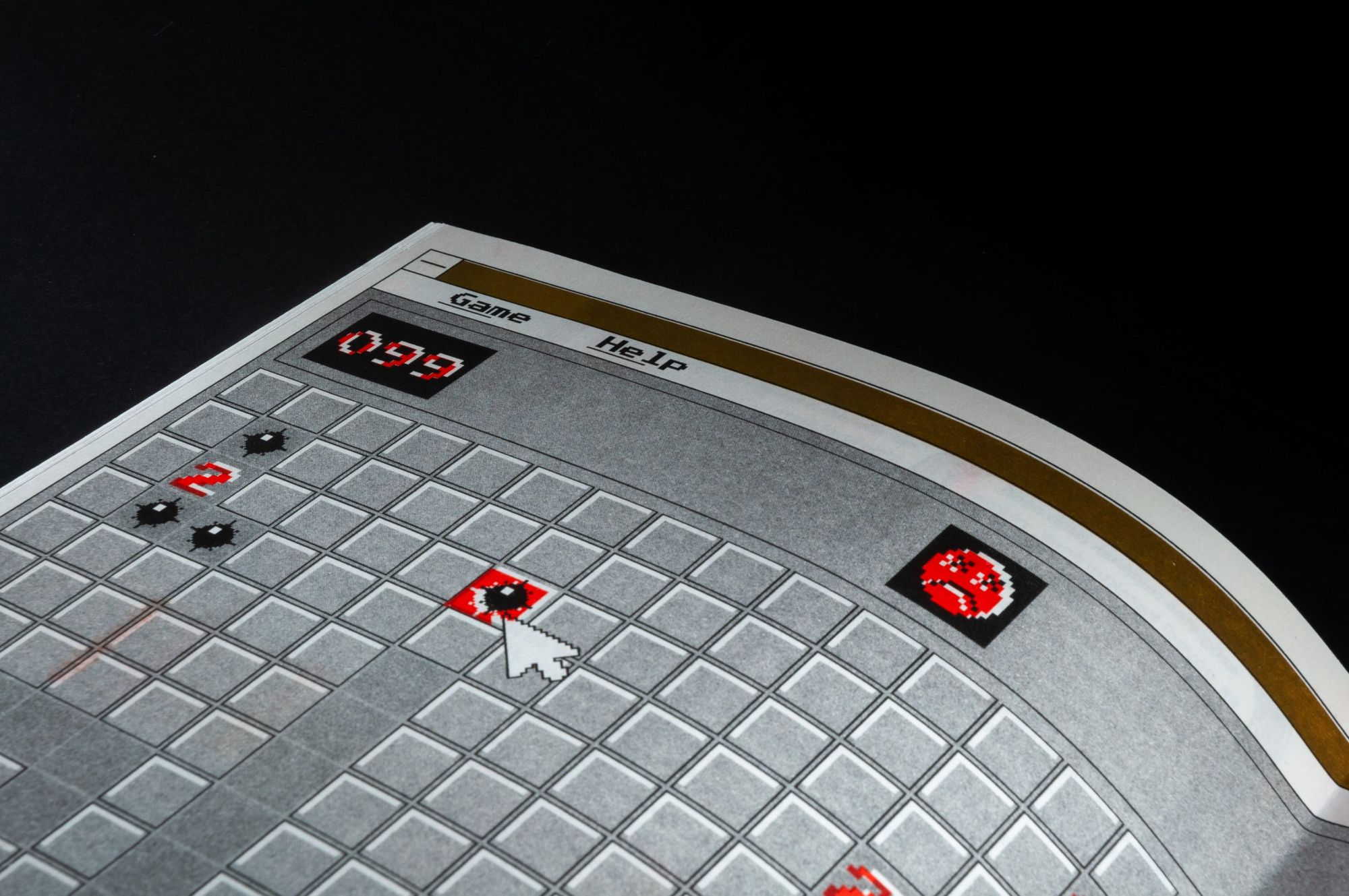
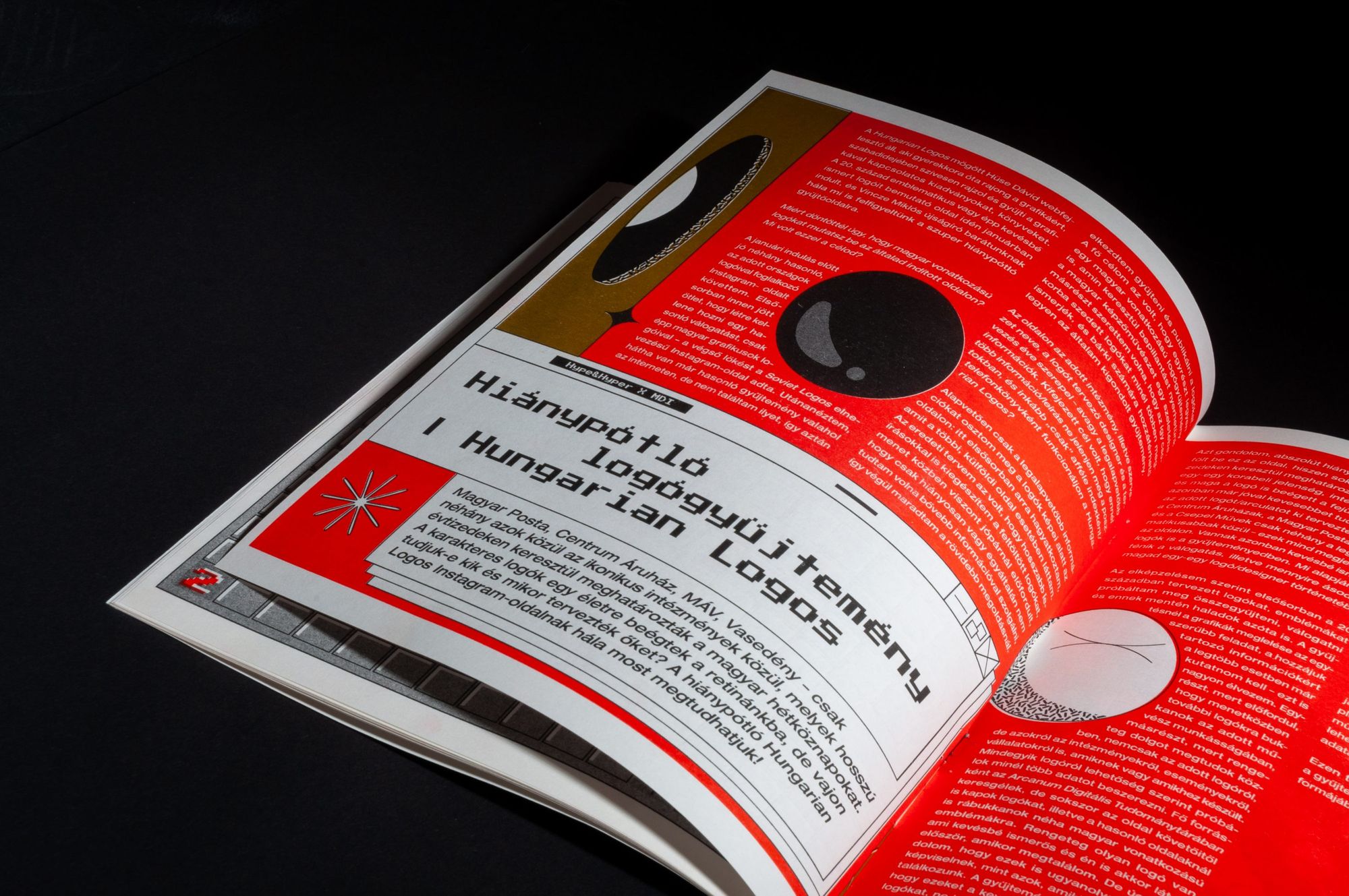
Lilla Keresztény | Behance
Kitti Mihucz
Kitti has tried her hands at different creative fields before discovering graphic design. As she explained, it’s the versatility that attracts her in this profession. “The designing phase starts on several paths and in the end, it all comes together in one direction: that’s the process I like, the way a project is finalized,” she highlighted. Her work is most characterized by intense use of color and, in many cases, illustrative lines. The layering and decomposition resulting from the applied printing technique were the main inspirations for the creation of her issue of Zinező, so Kitti balanced the geometric shapes decorating the pages of the zine with organic tulip motifs, true to her signature. She made this contrast even more exciting with her use of bright red and purple.
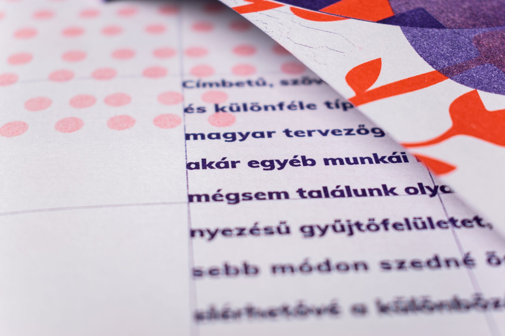
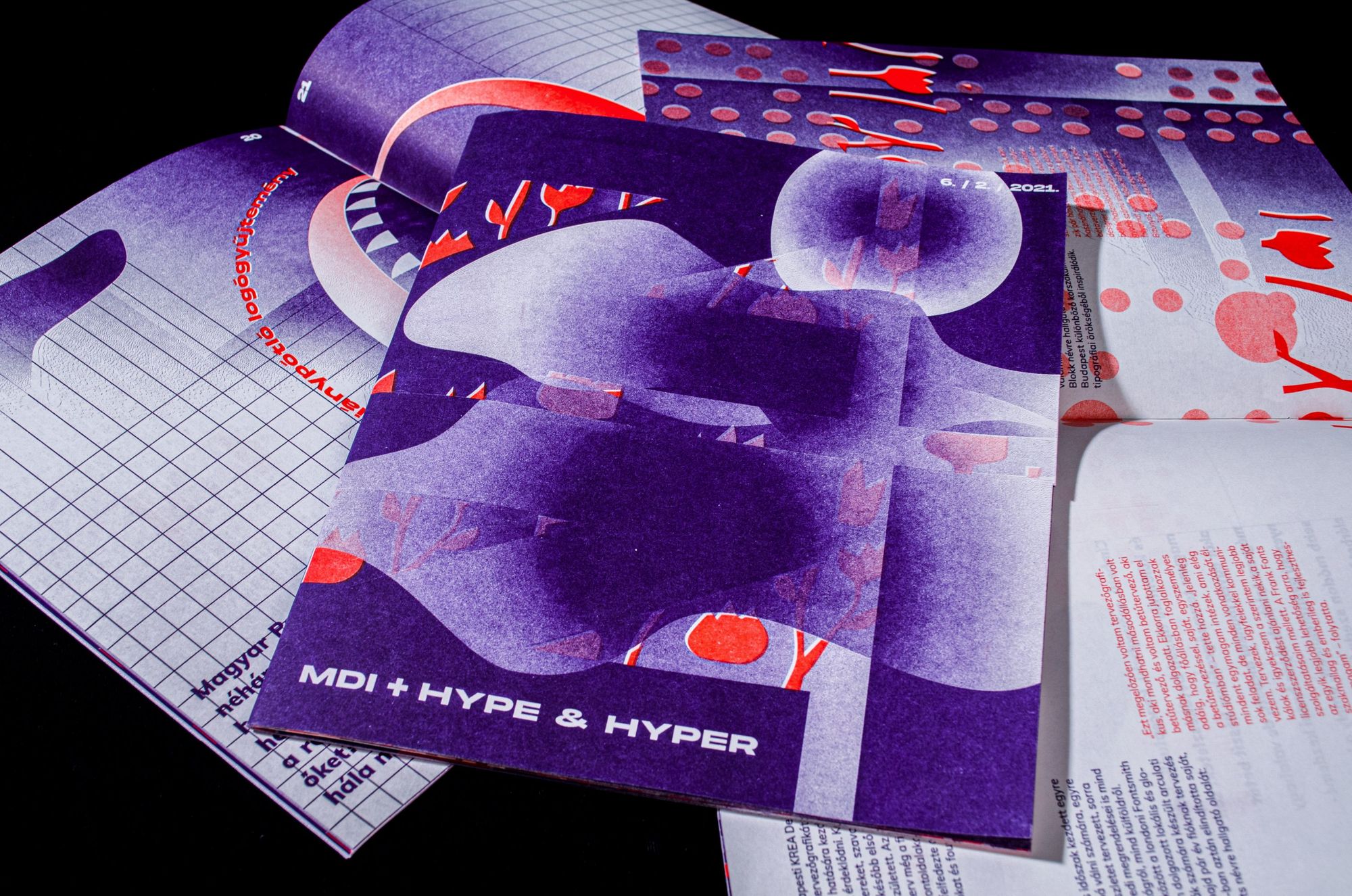
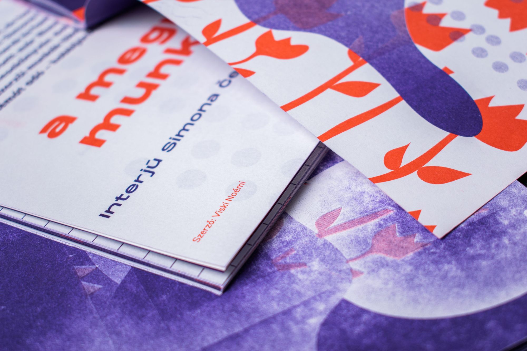
Kitti Mihucz | Behance
Erik Pál
Erik is comfortable not only with graphic design, but also with animation (one of his animations is featured in our #stayhomecreative series—the Ed.). His animation background has a strong influence on his expression and style, and he considers it important to experiment with animation, visual art and typography in his work. Experimentation was also the starting point for his zine, as Erik wanted to create a graphic for the publication that, when viewed from a distance, evoked an optical illusion. As he adds, judging by the printing technique, he was worried about how the fine details he had designed would look, but as he points out, the Riso machine only added to and exceeded his expectations. “This job was the perfect opportunity to be free and artistic. While an art magazine or publication has obligatory rules, here, we were free to play around, experiment with the layout and graphic elements: we could enjoy our artistic freedom,” he said.
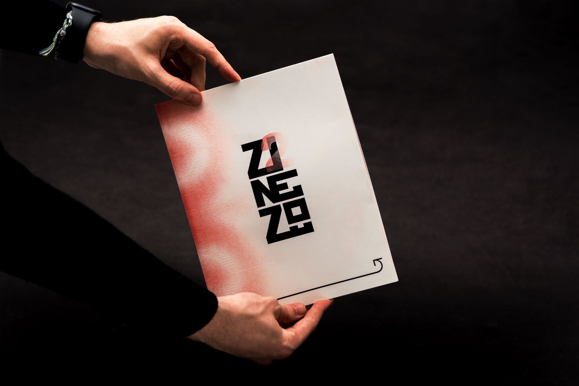
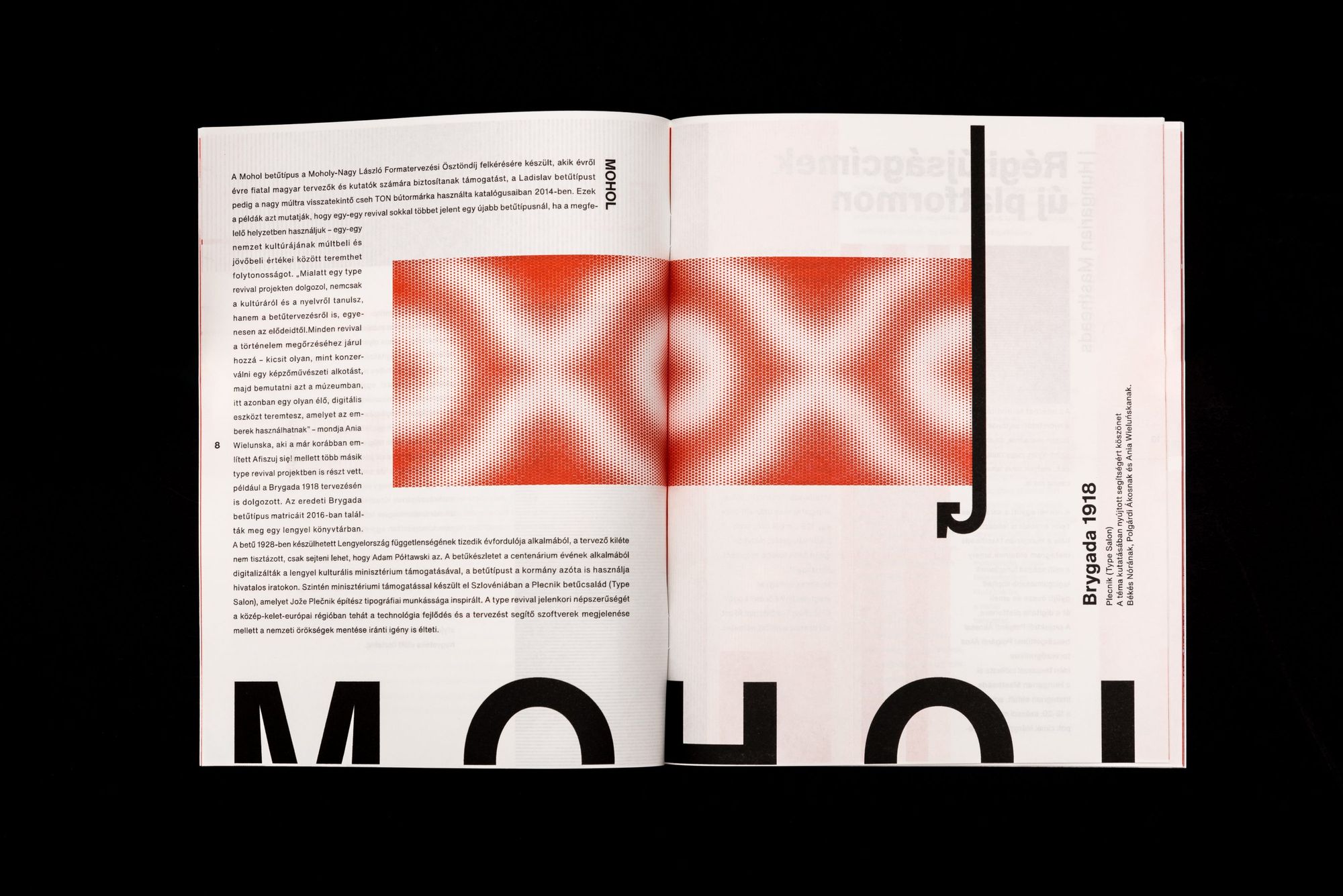
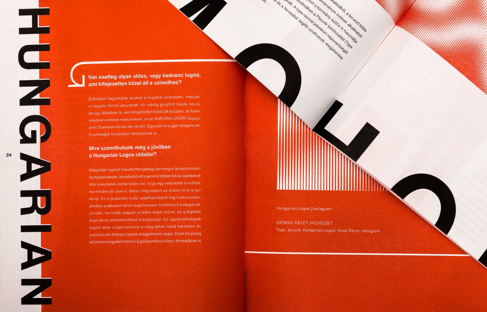
Erik Pál | Behance
Institute of Visual Arts, Eger | Web | Facebook | Instagram | Behance
The Iron Dome would defend Romania
Interactive show at the BME Researchers’ Night


