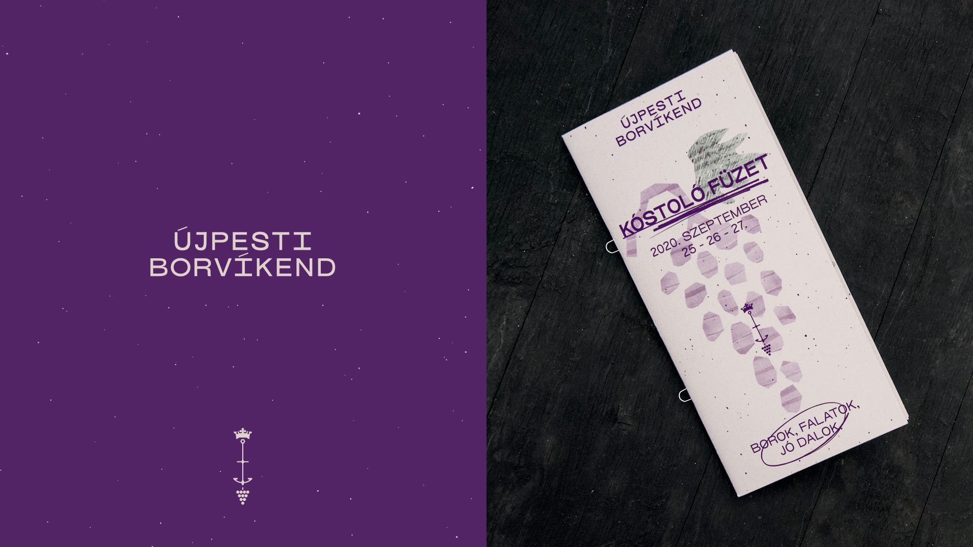
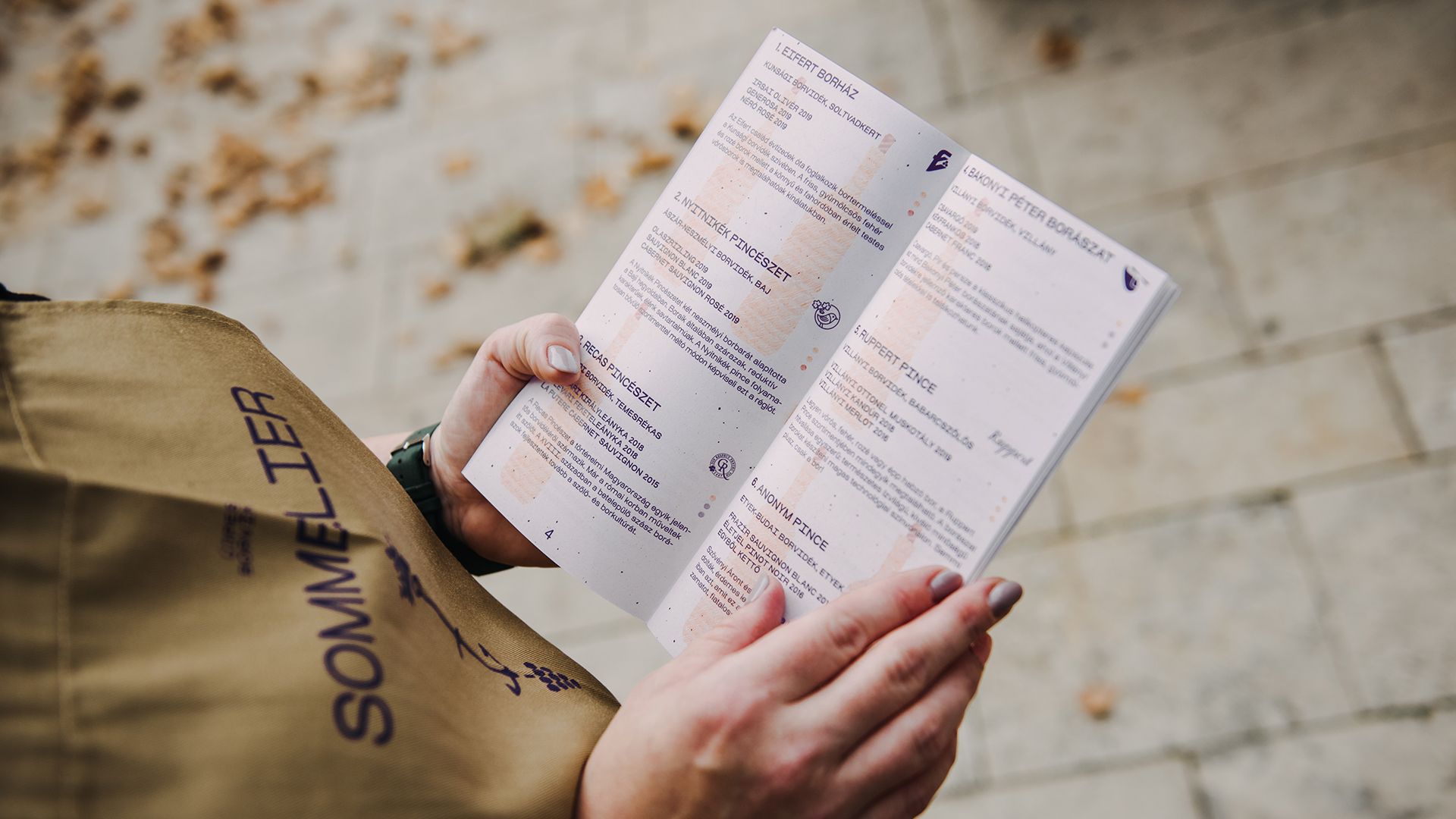
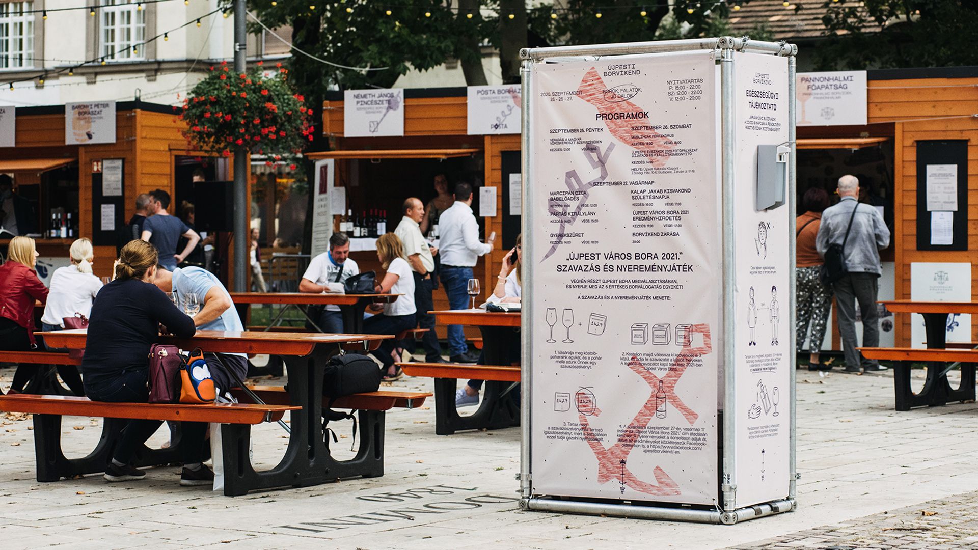
Finally Újpest’s wine festival has a visual identity it deserves: the team of Faraway Design redesigned the visual appearance of the event just the way it was supposed to. Let’s see the result!
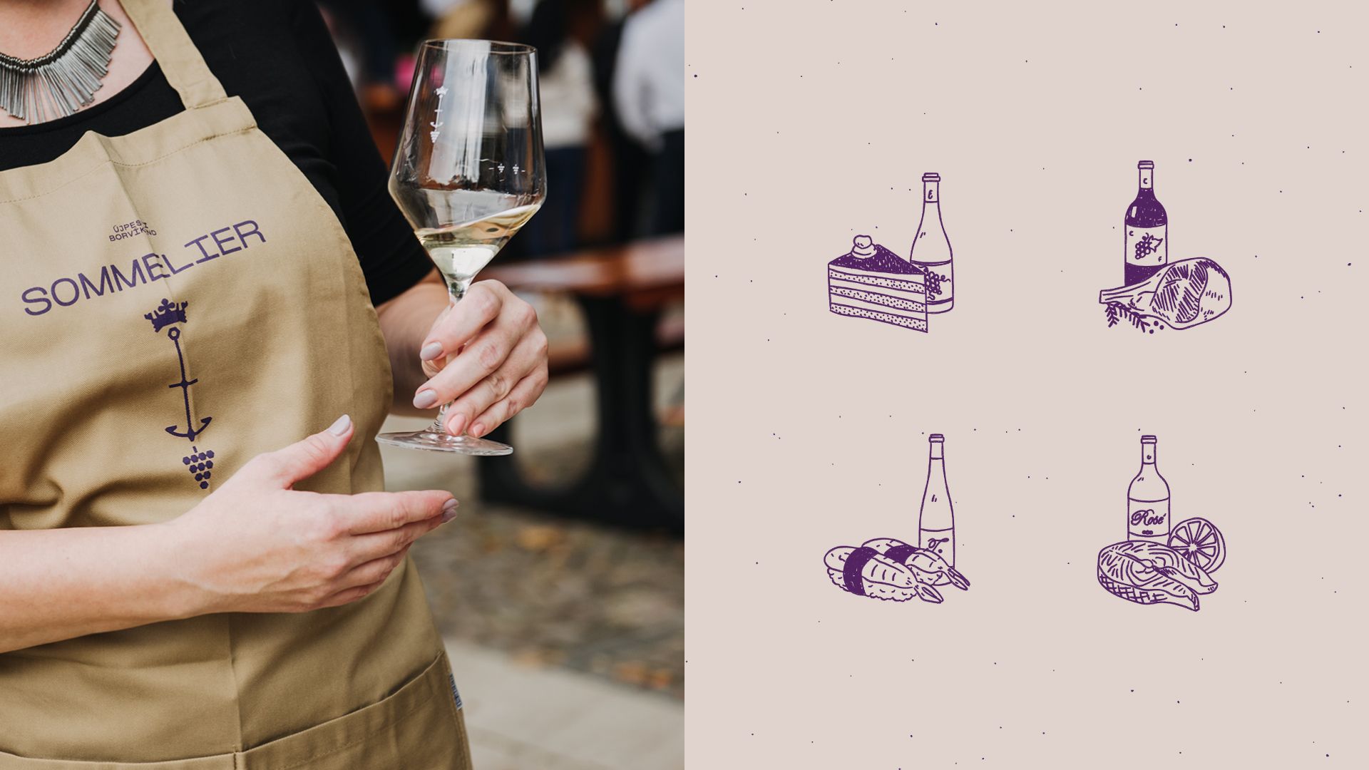
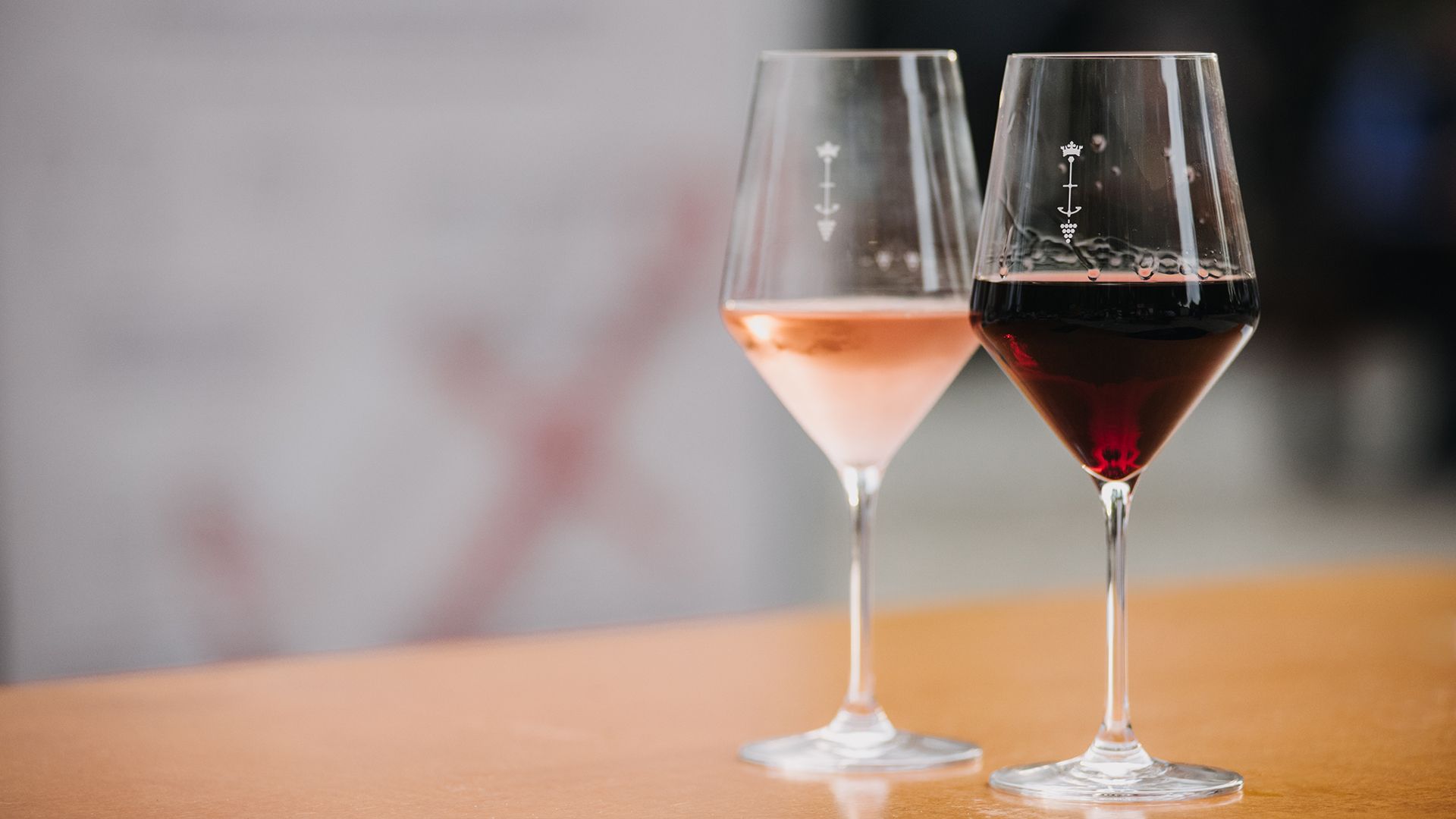
The two-pronged hook of the fourth district of Budapest, a cluster of grapes, a calabash and a crown – symbols we have seen many time and which could easily be boring, but not in the case of this year’s Újpest BorVíkend. We finally get to see a visual identity that is fresh, friendly and universal at the same time, one that does not make do with the usual use of tired symbols. Designing the visual identity of products and services related to winemaking may seem simple, but it’s far from it – especially if we are talking about a wine festival that has to meet the requirements of many age groups, and where the designers have to create a new visual language, a set of symbols that many people can resonate with.
And the team of Faraway Design managed to do just that. Owing to the design studio offering design, branding and communication services, the wine festival of Újpest has now become loveable in a visual sense, too, and not only for the residents of the district.
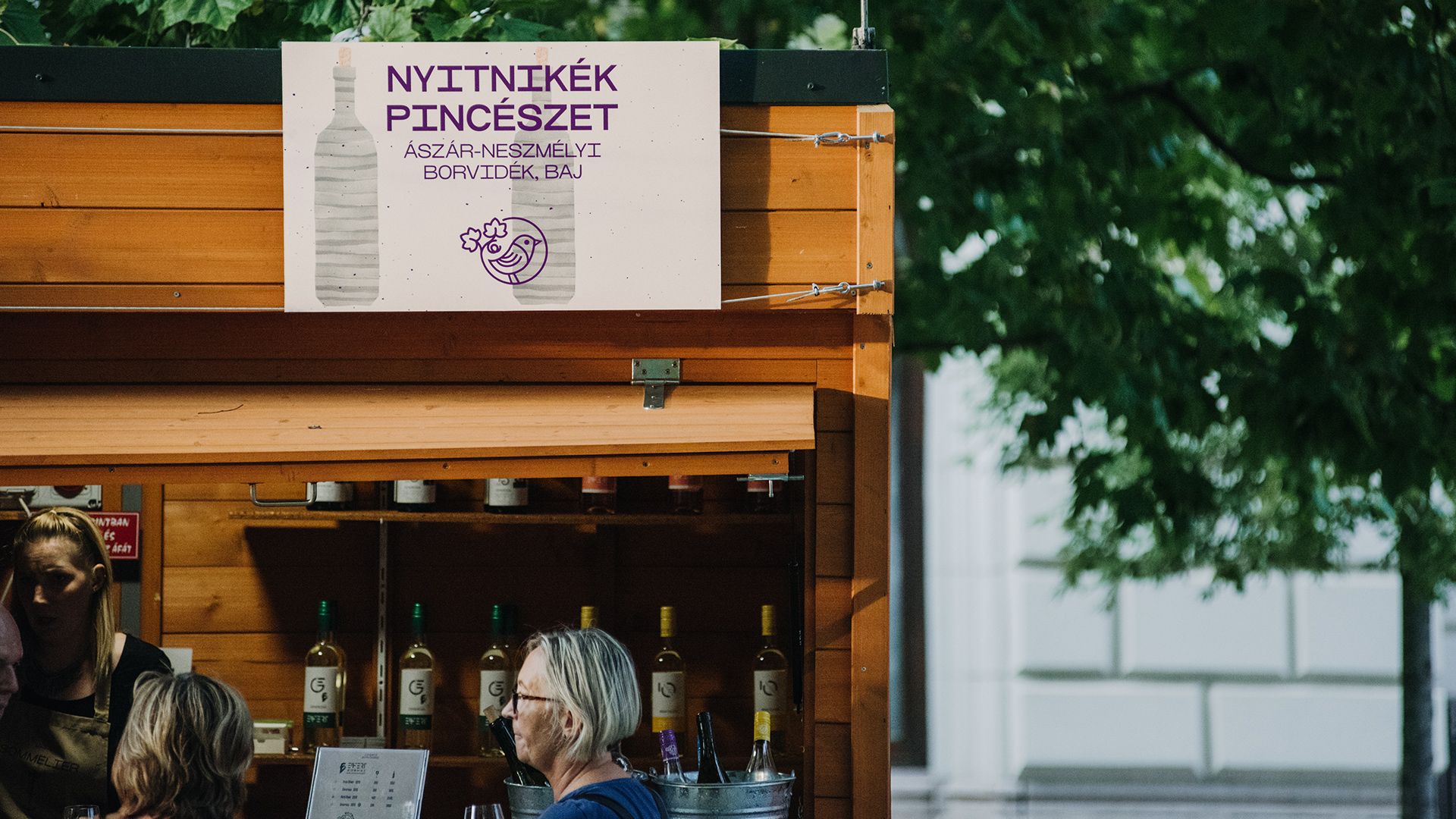
“We wanted to put the festival launched two years ago on track finally, in line with the original ideas. Újpest, this famously local patriot part of the city is not only open towards beauty, high quality and added value, it is also ready to take it all in and identify with it” – says András Tóth, the organizer of BorVíkend. András, the originator of the event and mayor Kata Bedő supporting the initiative were the ones who promoted the redesign of the visual identity of the event – and commissioned the team of Faraway Design to execute the task.
In the previous years, a professional jury selected the Wine of the City of Újpest out of the wines of the exhibitors of the given year, however, from this year on, the audience also gets a vote. The wine that receives the most votes will represent Újpest on various official events all throughout the year. The related wine label – which has permanent elements related to Újpest as well as changing components related to the given winery – has also been redesigned by Faraway’s team, and soon the audience will also get to see it.
In addition to the fact that the project encompasses a collaboration of entities from Újpest only, a part of Faraway also has a personal connection to it: Bence Kovácsik, Faraway’s creative director and his brother, Levente, the managing director of the company were both raised in Újpest. The print creatives were implemented by Inkredible Letterpress operating in Újpest, run by Balázs Lákics and his team.
We asked Bence Kovácsik, the creative director of the team about the project.
How did you receive the enquiry to redesign the visual identity of the Újpesti BorVíkend?
András Tóth, the main organizer and originator of the event is a former client of ours. At first he contacted us to redesign the label of the Wine of the City of Újpest selected at BorVíkend each year, which ultimately also brought the task of designing the entire communication of the event.
What were the main guiding principles you followed during the design process? What was your source of inspiration?
The biggest challenge in the course of designing was the broad target audience. The BorVíkend event addresses the young generation, the elderly, families, residents of Újpest, residents of the capital, as well as people knowing their way around Hungarian quality wines and those only starting to get to know them. Our goal was to create a visual framework system and a comprehensive communication strategy in which the high quality inspired by the participating exhibitors meets a familiar and cozy atmosphere. In addition, it was also important to ensure that the dwellers of Újpest could resonate with the event and at the same time that the new visual identity be able to address all residents of Budapest.
Who worked on the project out of the Faraway Design team and how? How much time did you have for designing?
We had a relatively short time to create the visual identity and to design the communication creatives. The entire process lasted approximately a month starting from the establishment of the communication strategy to delivering all final materials. Due to the intensity of the project, three of us worked on it: Zsófi Láposi and Kristóf Balla as graphic designers, while I was in charge of art direction and project management. In addition, Csenge Katinka Szabó also contributed to the project for a week, and Fruzsi Nagy participated in the project as a social media manager.
What projects are you working on at the moment?
We are just about to finish a visual identity and website design for Woodtub, a Hungarian business manufacturing tubs. We have just started to work on a similar package for an Austrian company focusing on online marketing, we are currently in the ideation process of the image of a starting Hungarian landscape gardening company, and we are preparing the communication strategy for the introductory materials and website redesign of Equinox Consulting, a consulting company. In addition, we also work on a project close to our hearts, related to textile designer Lilla Pápai: we design jungle, ocean and forest-themed illustrations for sleeping bags for babies. They will be very cute.
Faraway Design | Web | Facebook | Instagram
Újpesti Borvíkend | Facebook | Instagram

Highlights of Hungary 2020 | Franciska Törőcsik
Hum to Search
