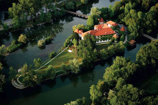
In the heart of Transylvania, in the mountains, at an altitude of one thousand hundred meters, is the campsite that hosts the Wonderest festival, which is not only about total escapism, but also about environmental awareness. The basic idea of the event is also reflected in its visual identity: freedom, playfulness, and organic, natural elements play the main role. We asked the founders of Studio Ü graphic studio, Bettina Szücs and Eszter Tücsök. Interview!
In the previous part of our HYPE X WONDEREST series, we presented one of the important elements of the festival, the Copper Thinking Bench made by the AU workshop in Budapest, which emphasizes not only recharging but also the community experience. Now we focus on the visual appearance of the festival.
How long have you been a team and when did you decide to start a joint graphics studio?
Eszter Tücsök: I worked in the advertising industry for several years, but I always knew that I wanted to start my own studio. I’m basically a team player, and after a year and a half of freelance, I felt like I needed a design partner with whom we could come up with ideas, with whom we could inspire each other, with whom we would go through the projects together. In addition, everyday consistency is important: we are not only co-workers but also very good friends.
Bettina Szücs: We went to the same university, we both graduated from the Art Department of METU, Eszti in graphic design, I in textile design. After graduating, I realized that I was really interested in graphic design, so I started training myself and started working as a graphic designer. We met Eszti again at a concert, after that we started working together. It was a lucky collaboration, and it soon became clear that the teamwork was going very smoothly. We have been working in a creative studio with our interior designer friends for five years now. The name Studio Ü comes from our last name, we both have the short “ü”, which can also represent two people.
How would you describe what makes a brand identity or graphic Studio Ü-style?
E. T.: One of our strengths is that we are not stuck with one particular style, we always design the visual identity for the given brand, taking into account the whole brand and most of all the personality of the customer. We love working with people and facing new challenges. We are constantly evolving and shaping the events around us. We are mostly inspired by a trip and other cultures.
B. Sz.: We consider it important to create an identity that is not only selfishly about us, but that the person for whom it is made fully finds themselves in it. For example, we recently created a visual identity for a Chinese restaurant during which we were able to spend a lot of time with the owners and they even invited us to a small family dinner where we could sample authentic Chinese food. This way we could get even closer to their personality and vision. In addition, we have already designed for other restaurants: we also designed the brand identity of the Digó pizzeria, Rézkakas or the Ristorante Azzari restaurant in Dunaújváros. In addition to restaurants, we have also worked on the visual appearance of architectural studios, ice cream parlors, cosmetic studios and optics. We don’t have a specific favorite area, we like it best if we have the opportunity to expand the visual identity and show it on as many surfaces as possible.
This is not the first time you have worked on identity elements designed for a festival: what was most inspiring about Wonderest for you?
E. T.: We first met Hanna, the mastermind of Wonderest, at a pop-up fair where it turned out they had already organized a festival a year before. She liked our work and we liked the concept of the festival—that’s how the brainstorming started. The music part was already familiar to us, as we designed materials for the community platforms of A38 for a few years. Of course, Wonderest is completely different.
B. Sz.: Wonderest is a special festival in many ways: in addition to being located in a fantastic environment, one has the feeling that they are not only coming to a festival, but are completely disconnected from reality and retreating to recharge—there is no signal, no noise, which reaches us in everyday life. Besides, Hanna and her team place a great deal of emphasis on environmental awareness, which we believe should be a requirement for a festival today as well. It is important that we pay attention to the world around us and protect it. I really liked the idea of reusable cutlery and bottles in the concept, among other things, and that the plastic would be omitted from the event as much as possible. This is a defining direction in our lives as well, so we could easily identify with the approach of the festival.
The Wonderest, as you have highlighted, is built on total detachment and environmental awareness, and the venue has a distinctive atmosphere. How do the visual elements you create communicate the vision of the festival?
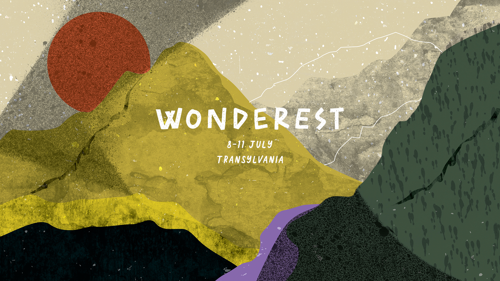
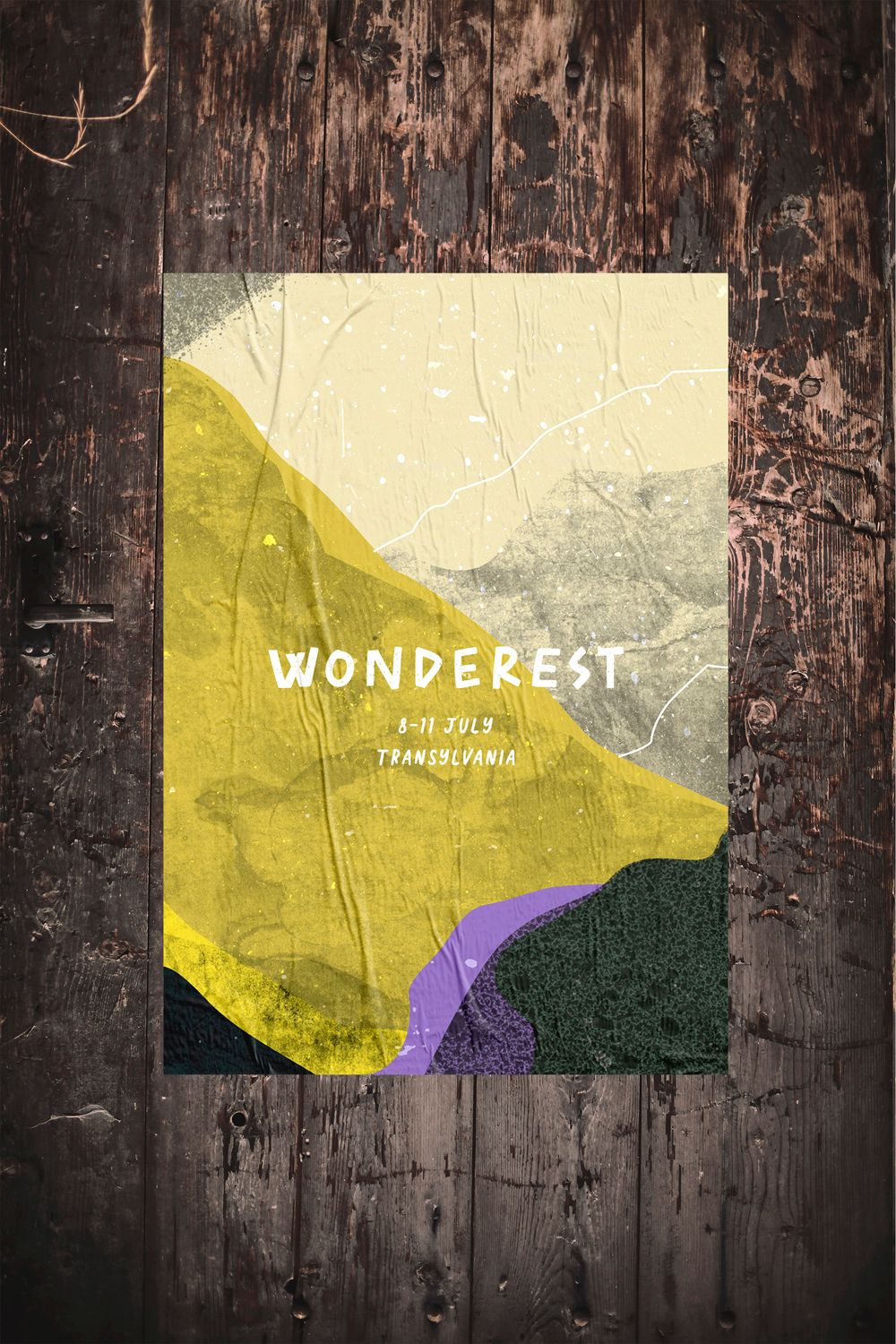
B. Sz.: The general concept was the adaptation of closeness to nature, organic elements and the nature around the festival. We wanted to keep this—we didn’t want to create a very simple brand identity because we wouldn’t have found the atmosphere of the festival in it. With the textures, we also reflected on the closeness to nature: for example, the organizers showed a performer last year who created a visual background for his DJ set by placing various plants under a microscope. The textures found in nature provided a lot of inspiration, and of course the mountains surrounding the festival.
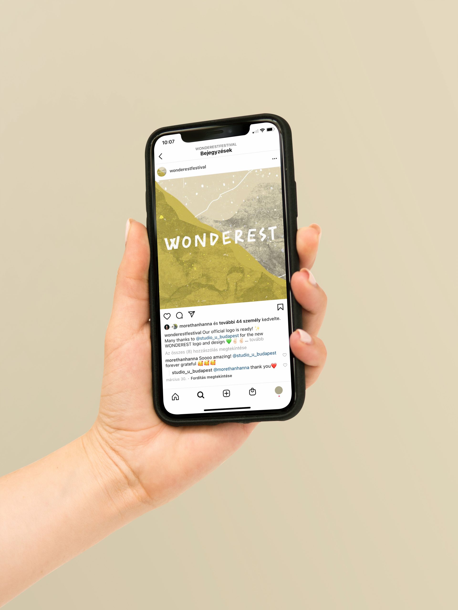
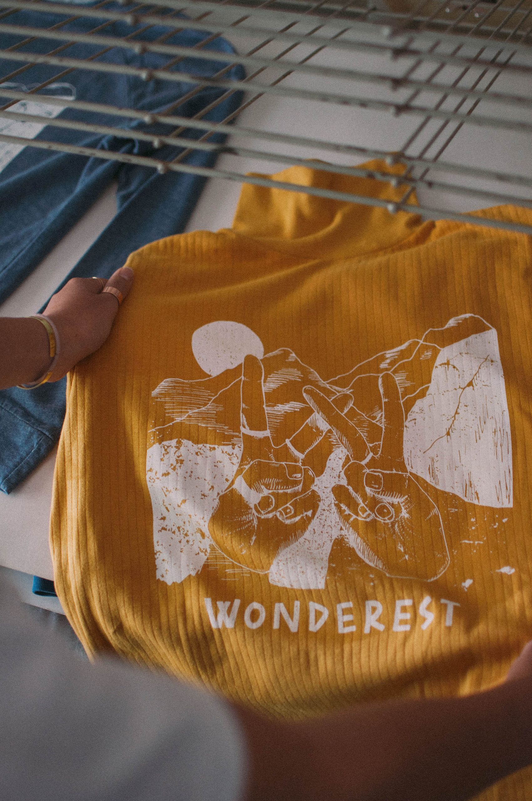
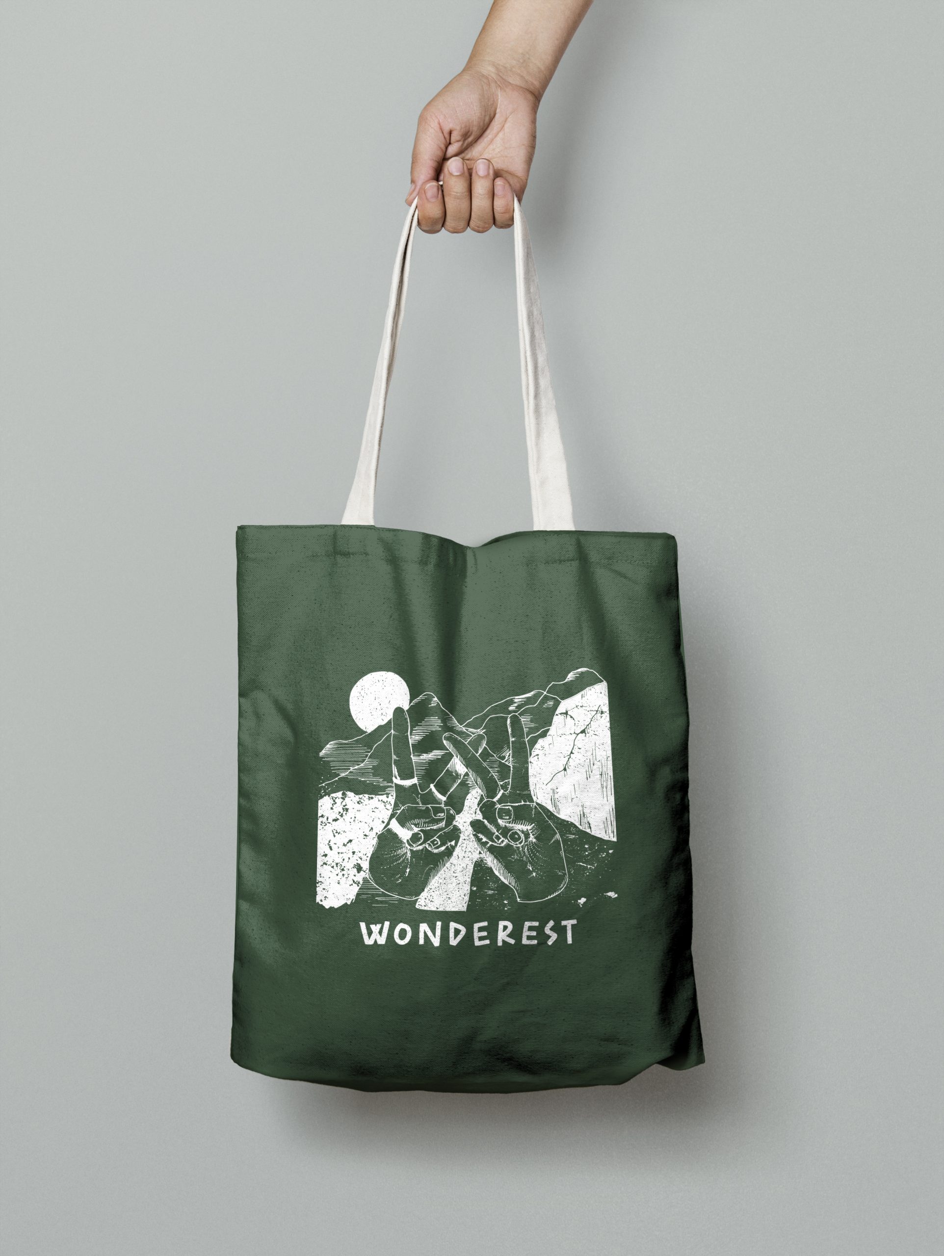
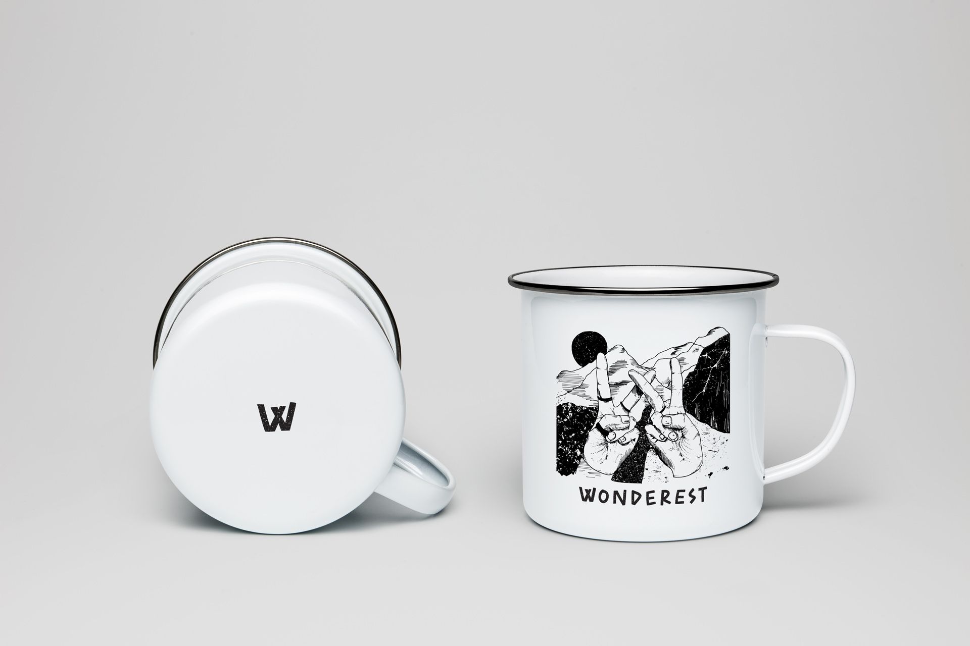
E. T.: But we dared to play with colors, to bring liveliness to the visual identity. The design of the logo was based on an inscription made of wooden slats for last year’s festival, which the organizers made for the main stage. This logo reflects Wonderest’s free, playful and organic approach. The mountains surrounding the festival venue, the setting sun, the river are all recurring elements: we considered it important to display them because the environment itself has quite specific features.
What other elements are added to the graphic appearance of the festival?
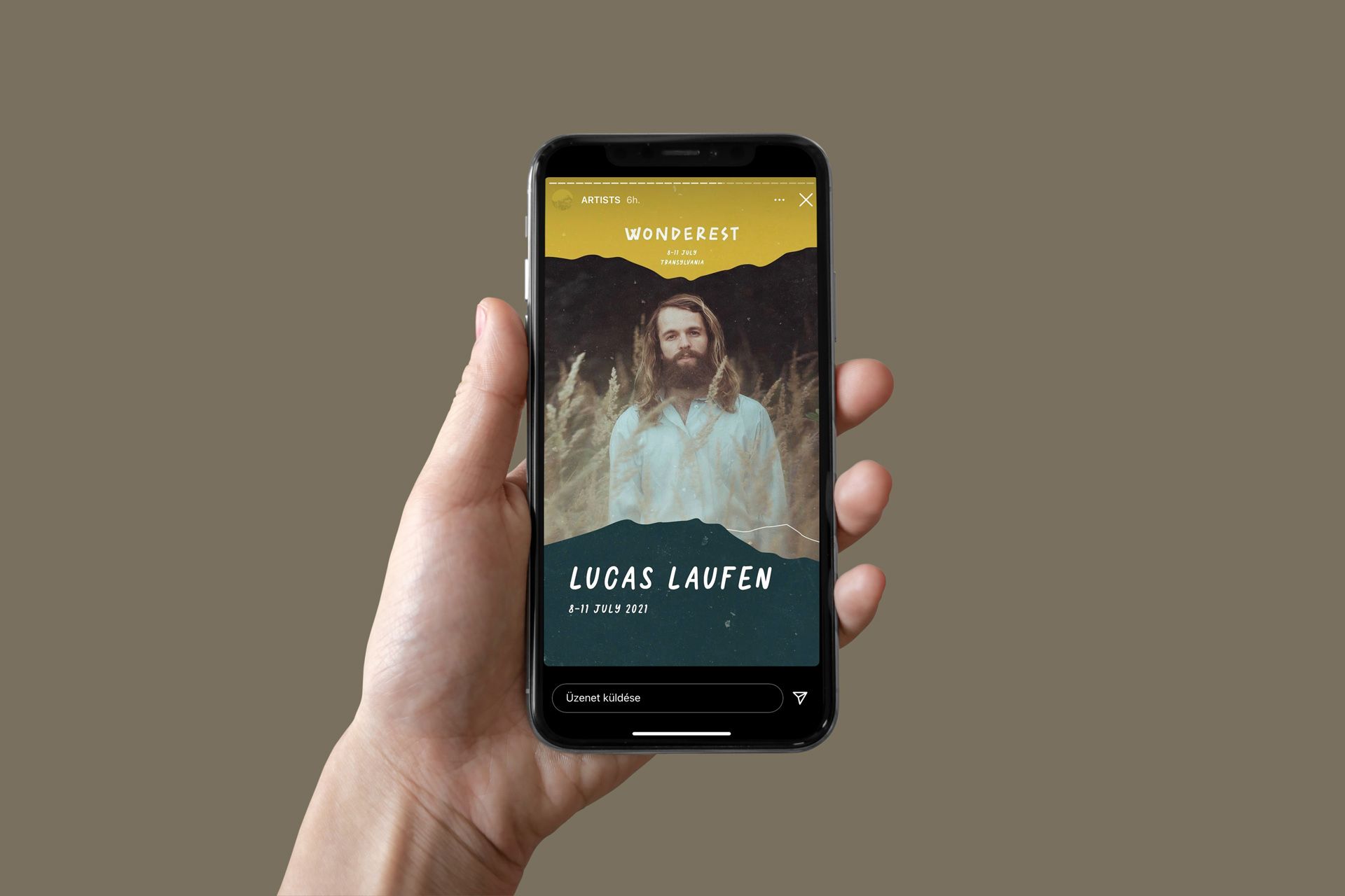
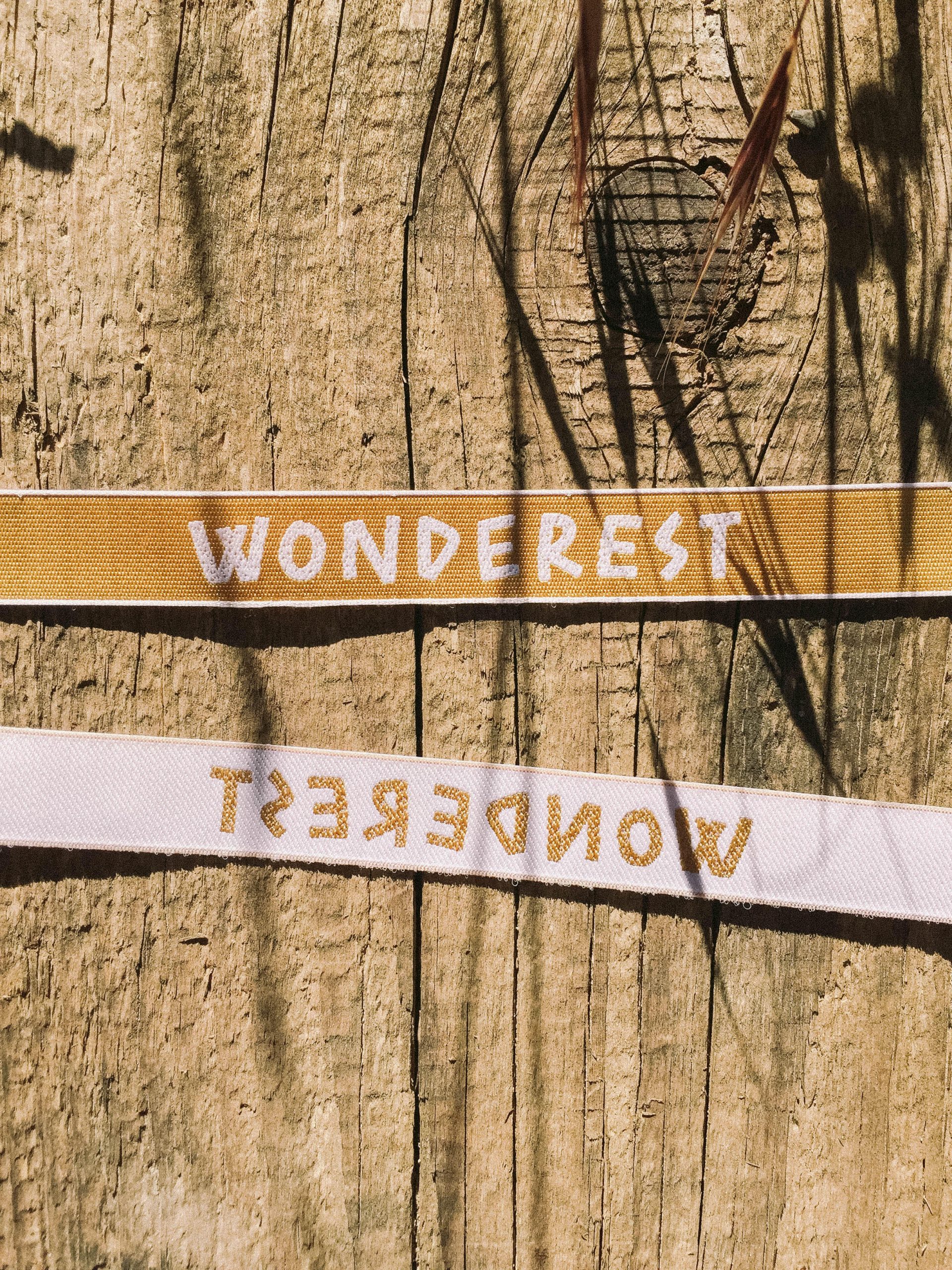
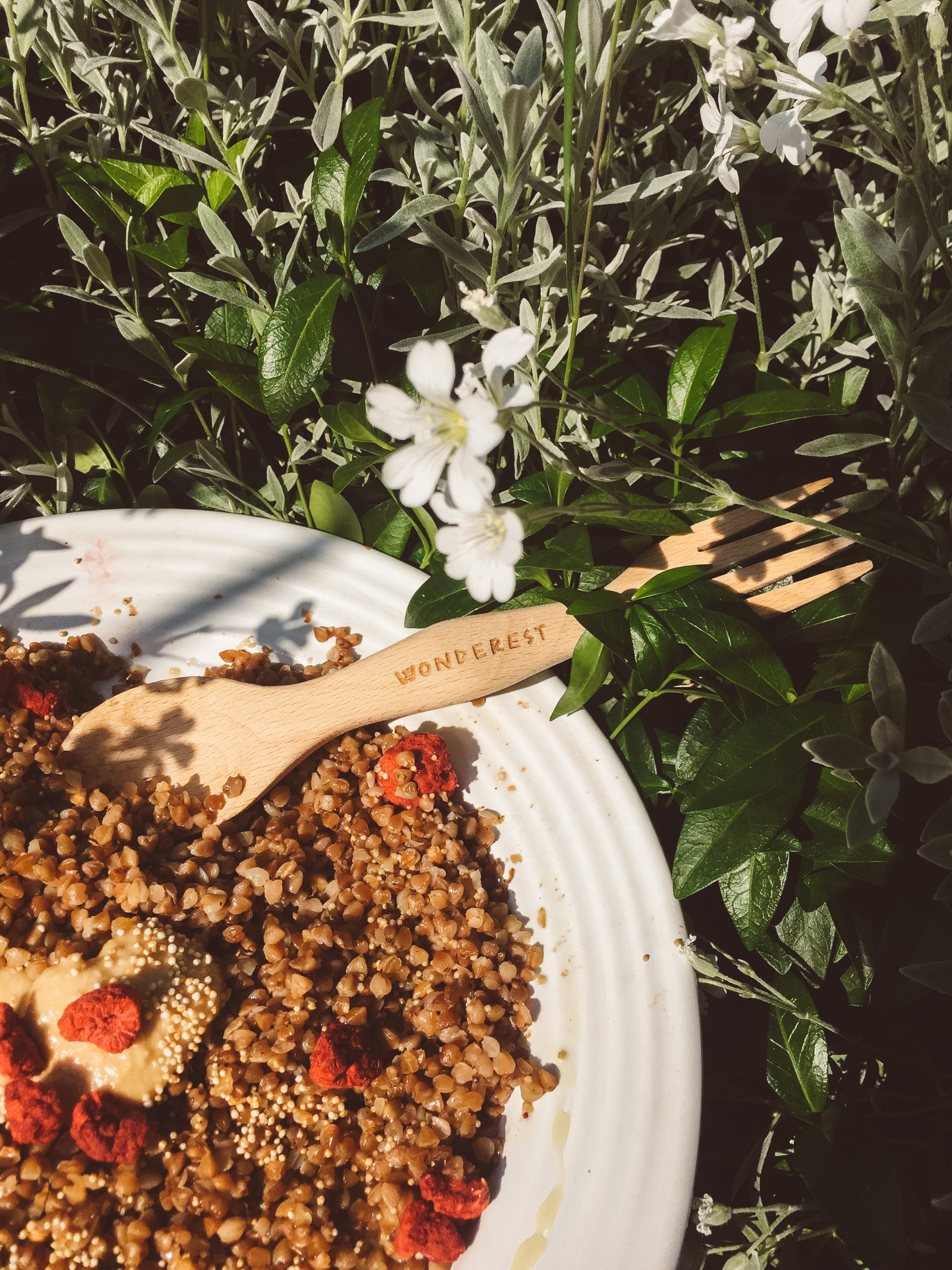
E. T.: The visual identity has been designed so that the letter “W” can also be used as a separate logo. When designing the souvenirs, Hanna’s younger brother also got into the project, the hands forming the “W” were created by him, and we designed it into an illustration. Hanna got plenty of second hand t-shirts, these were screen printed by the team of VALAMI produktív. This illustration can even be found on mugs and canvas bags. We also designed a festival map, communication creatives for the performers, tent graphics and a program booklet.
What projects are you working on now, what are your future plans?
B. Sz.: Last time, we were creating the complete brand identity and packaging of an ice cream parlor and currently of a coffee brand. We also have smaller projects and regular customers. In the future, we want to expand our team and try to put more emphasis on presenting our own work.
Studio Ü | Facebook | Instagram | Behance
Wonderest | Web | Facebook | Instagram
Wonderest festival will be held soon, between July 8 and 11, at a height of 1100 meters in the heart of Transylvanian mountains. The event offering a familiar atmosphere takes place in the spirit of slowing down, disconnecting and eco-consciousness: there’s no reception, but in exchange there is a breathtaking view, indie folk and experimental performers, sunrise concerts and an unforgettable community experience. And how is a micro-festival made up? In the upcoming weeks, we’ll introduce the unique atmosphere of Wonderest festival to our readers element by element, through a creator or performer coming from a different field each week. Click here for tickets!

Aviation could become sustainable | Rolls Royce
World Design Day in the spirit of diversity