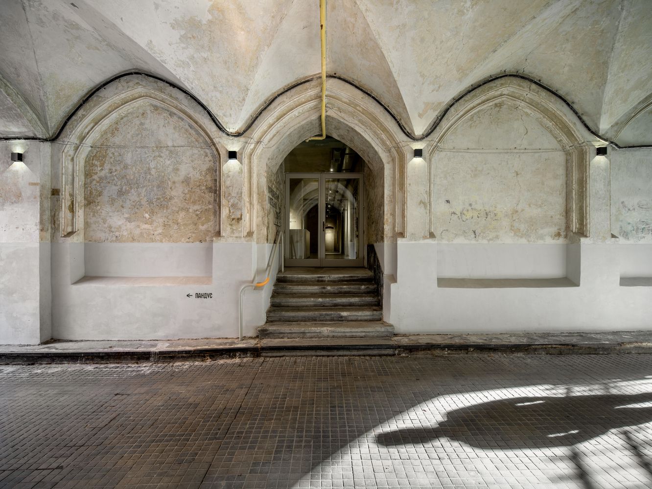
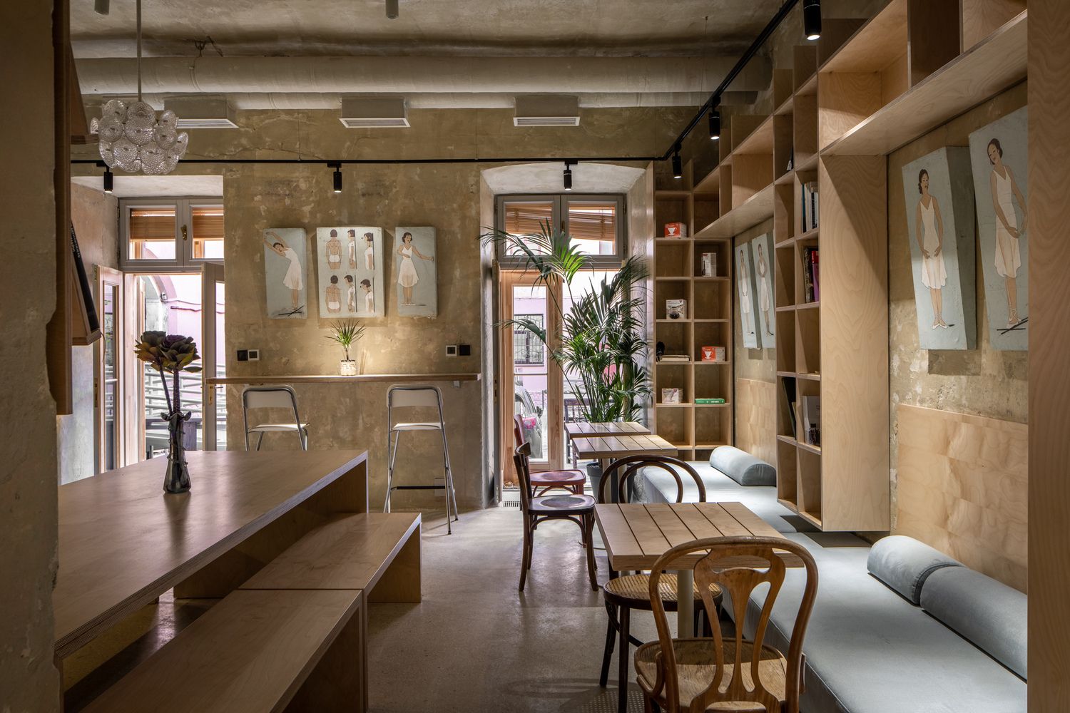
Elements of neo-Gothicism, authentic murals, a multimedia library, modern furniture and barrier-free solutions: this is the environment which the first Municipal Art Centre in Lviv, Ukraine was placed into. The clean and contemporary interior was designed by studio replus design bureau.
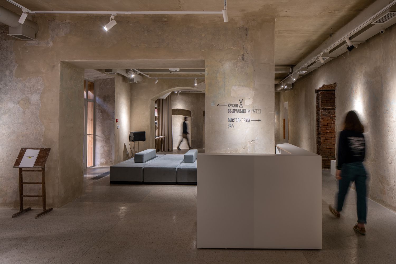
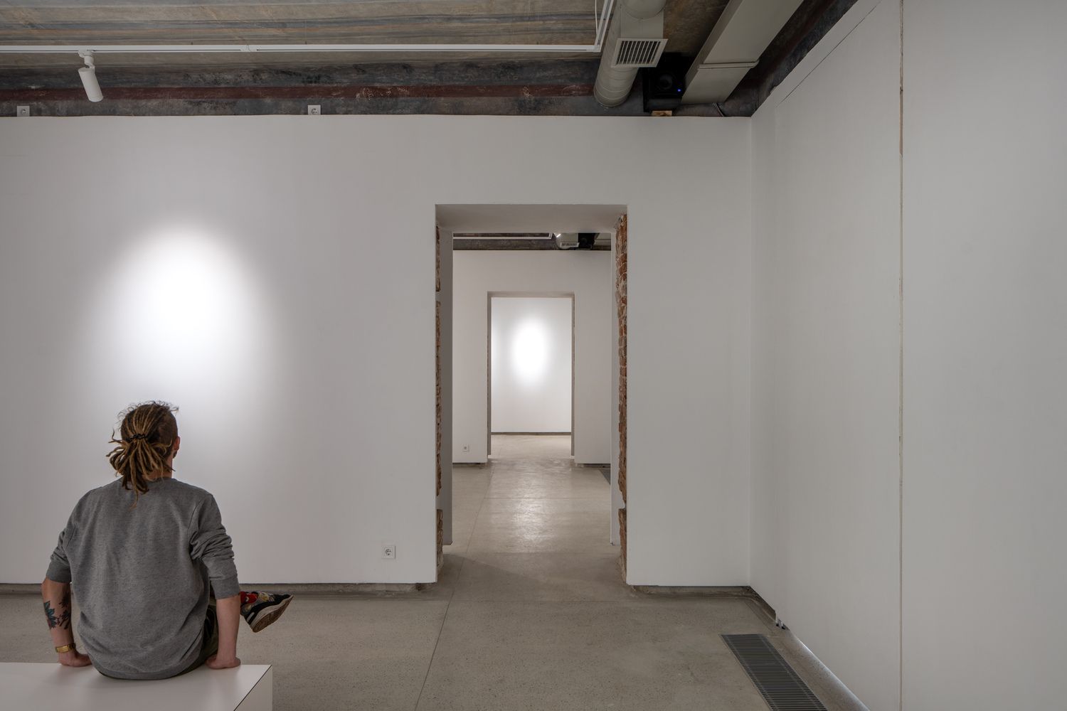
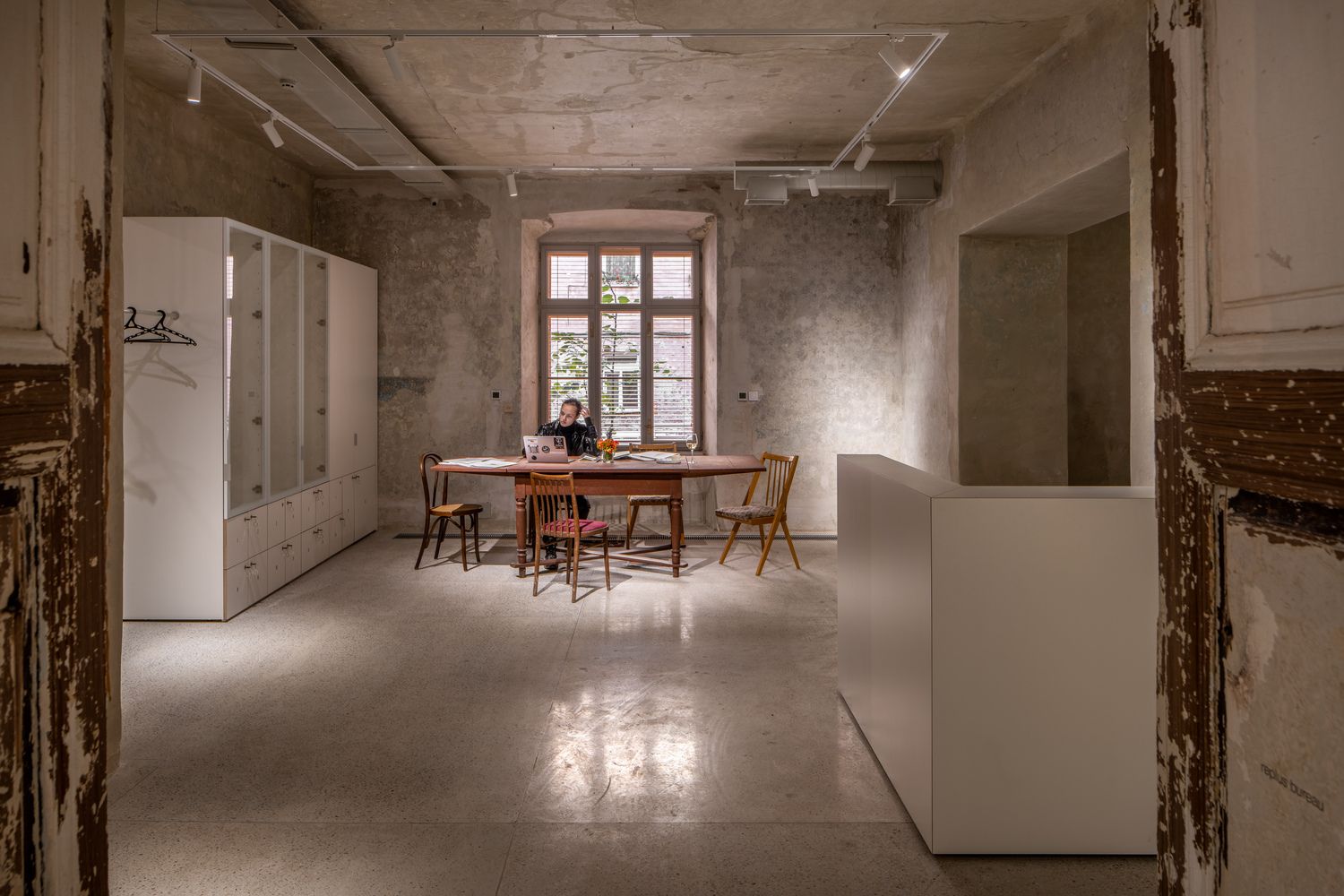
The art center is located in a late 19th century building, which used to give home to various offices and a press, but has been standing abandoned for more than 20 years. Instead of reconstruction, the architects opted for renovation, thus keeping the original character of the building—they only removed one internal wall to create a larger and more open space.
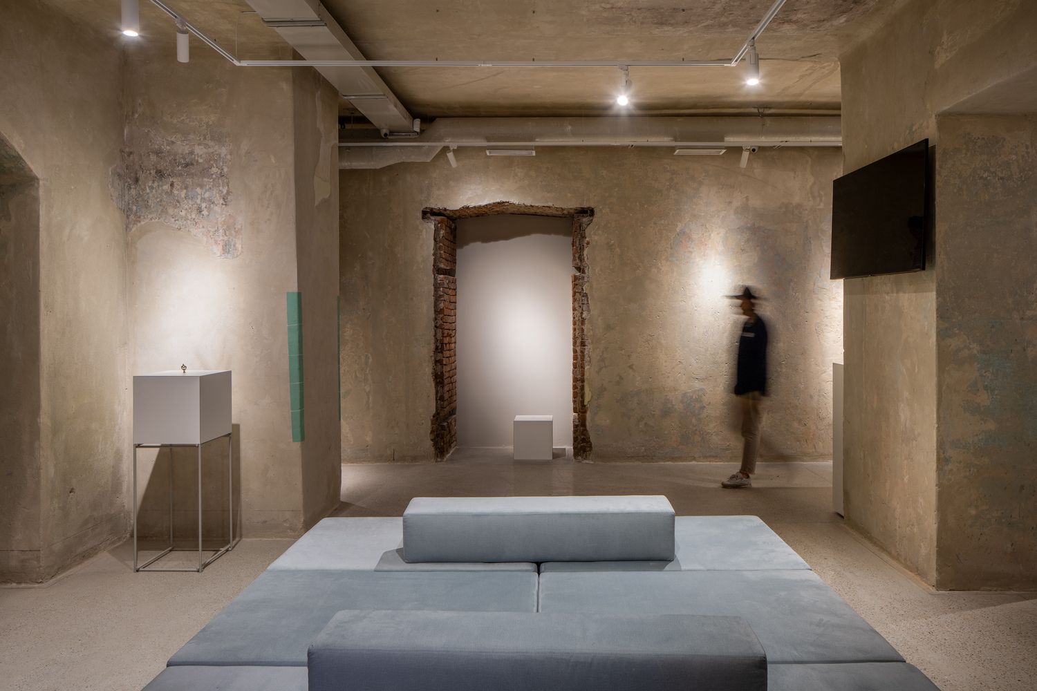
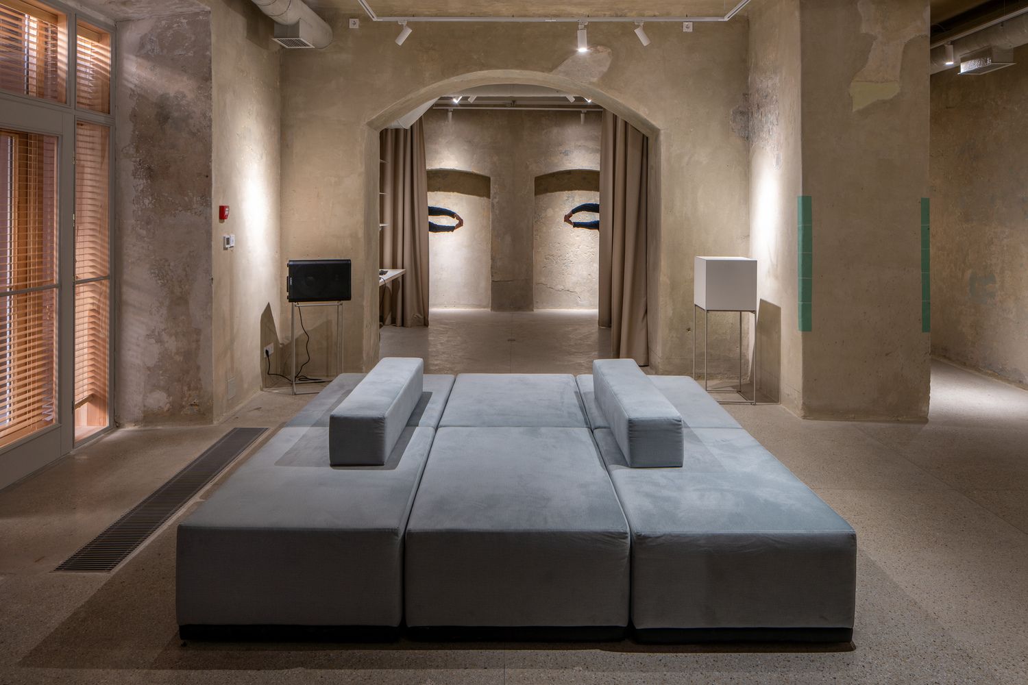
Since the premises were not used for a very long time, they thought the original ceiling paintings could still be present under the layers of plaster. Thus, painter and restorer Iryna Hirna joined the project so that the walls would be cleaned under her professional guidance and supervision—the paintings will be visible at the entrance of the building once they are fully restored.
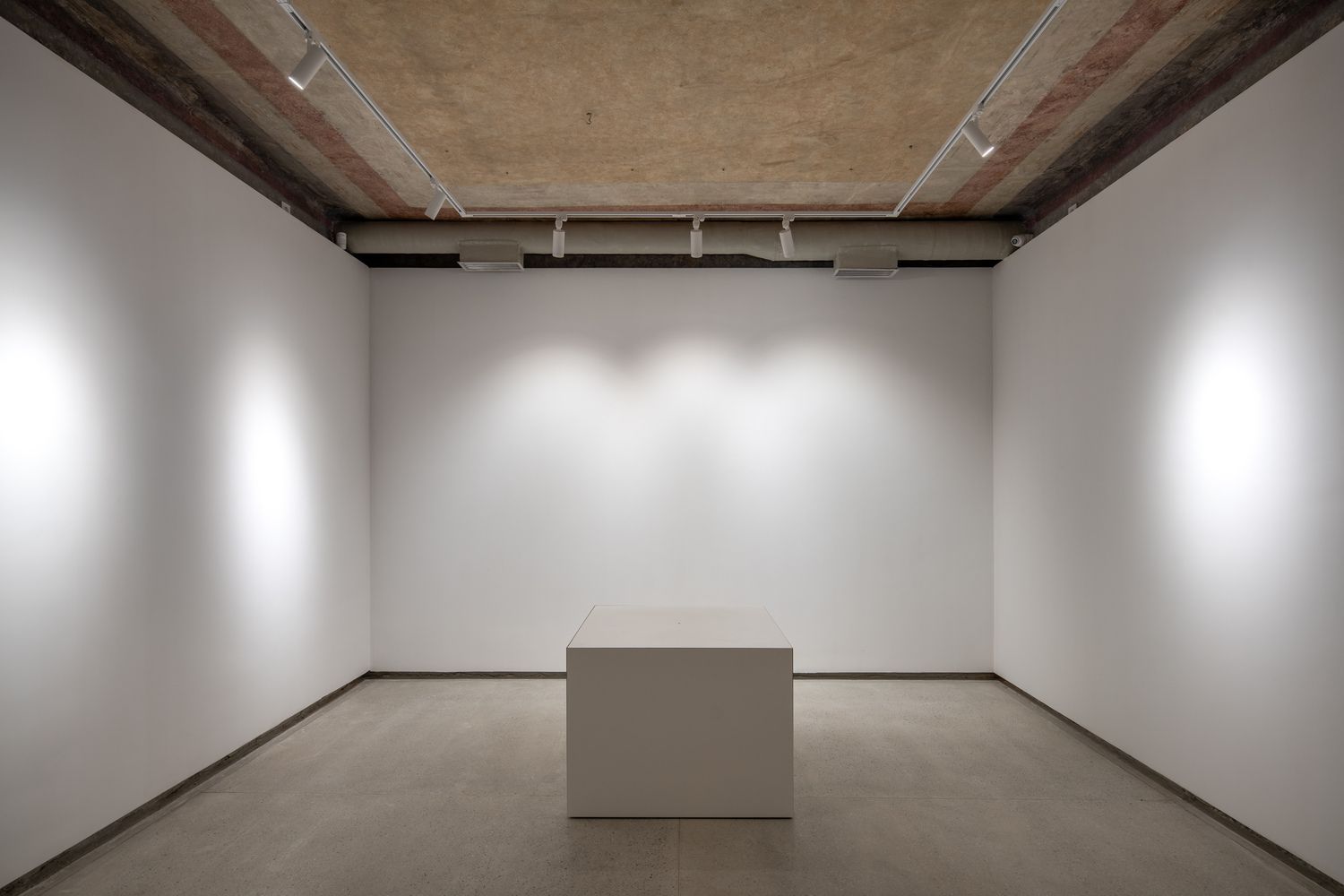
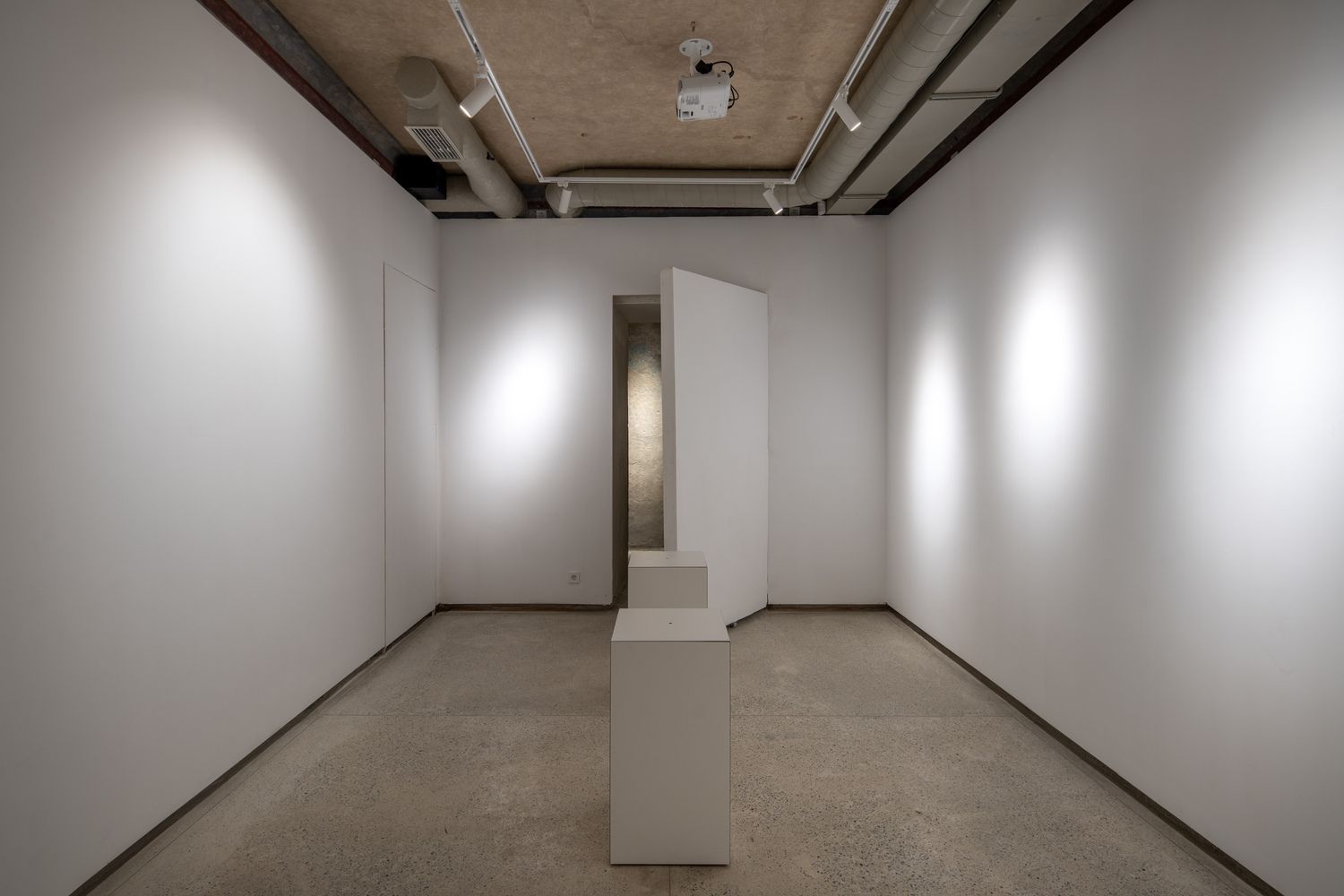
One of the central elements of the building is the gallery, occupying 30% of the institution’s area. To create the emblematic white cube aesthetic so characteristic of galleries, they built white plaster walls and kept the authentic ceiling opened and untouched.
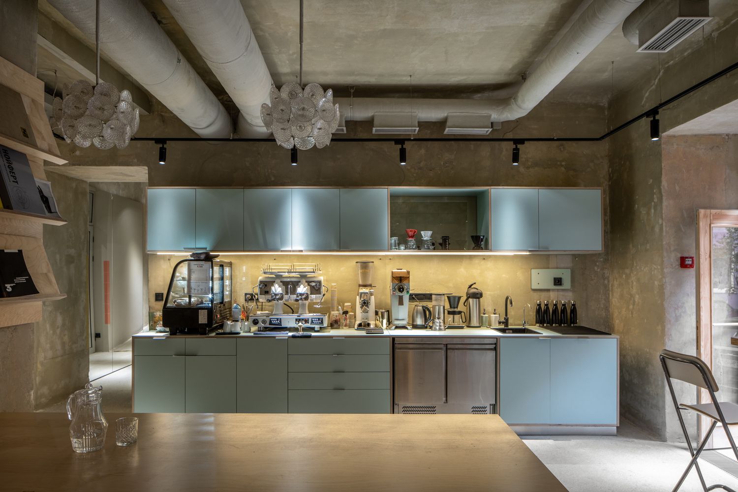
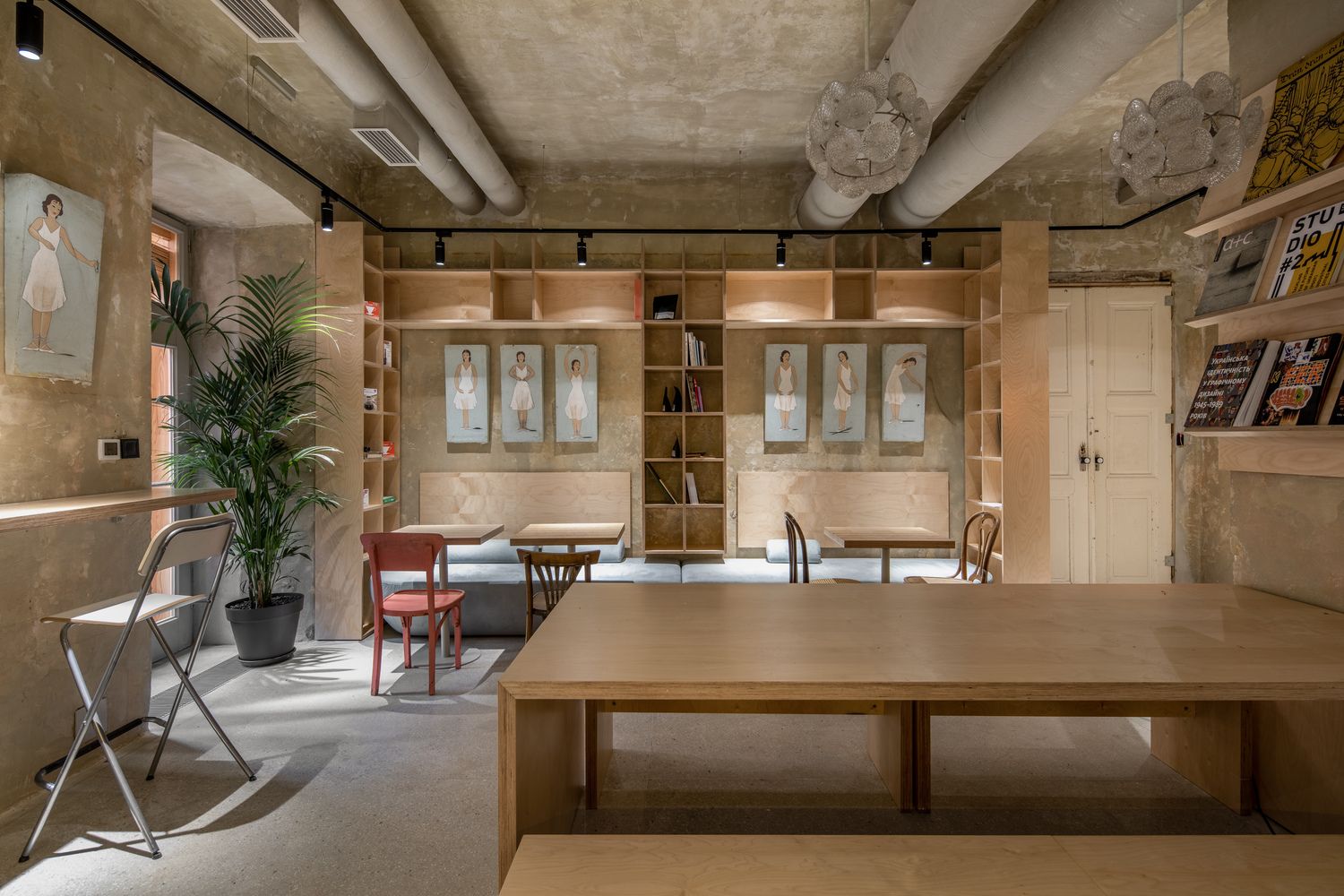
Additional characteristic spaces of the center include the kitchen-cafe, where the designers placed lamps and painted boards recycled from the Lviv Conservatory. In the course of the renovation, they also found glazed tiles in one part of the kitchen, which are thought to be products of the factory of Ivan Levynsky, a famous Ukrainian architect. As these types of tiles were only used in hallways previously, their use in an interior is considered a unique solution. They used the tiles to separate spaces with different functions, as they can facilitate orientation for people with visual impairment by forming a contrast with the wall surfaces, while a 3D map is also available at the reception for people with low vision.
Inclusivity was one of the key aspects when designing the spaces, so that art could become accessible to all. The barrier-free solutions, the various ramps and rails were designed with the help of Yaroslav Hrybalskyi, a social activist who also uses a wheelchair himself.

Photos: Andrej Bezuglov
replus design bureau | Web | Facebook | Instagram
Source: Archdaily
The Life of One Man Is One Whole Universe | A book by Peter Sit

Jaguar will only manufacture electric cars by 2025
