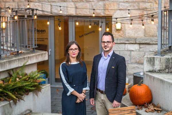
When visiting a catering unit, we focus primarily on gastronomic experiences. The taste, appearance and serving of the food are undeniably important in creating the image of a restaurant, but we should not forget about the design of an interior that fits the theme and the matching brand identity. In our selection today, we present restaurants where everything from the logo to the font on the menu creates a unified, stylish look!
Wschód Bar | Krakow, Poland
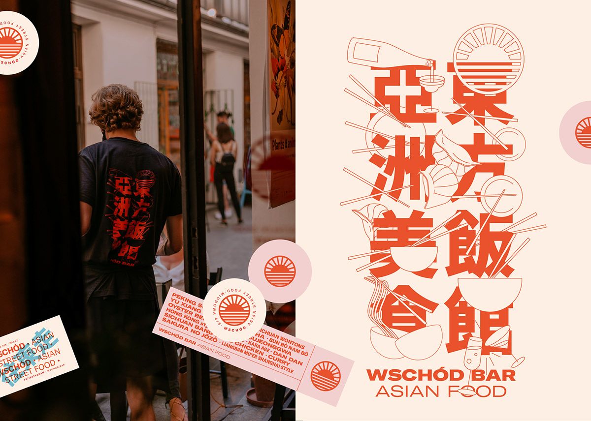
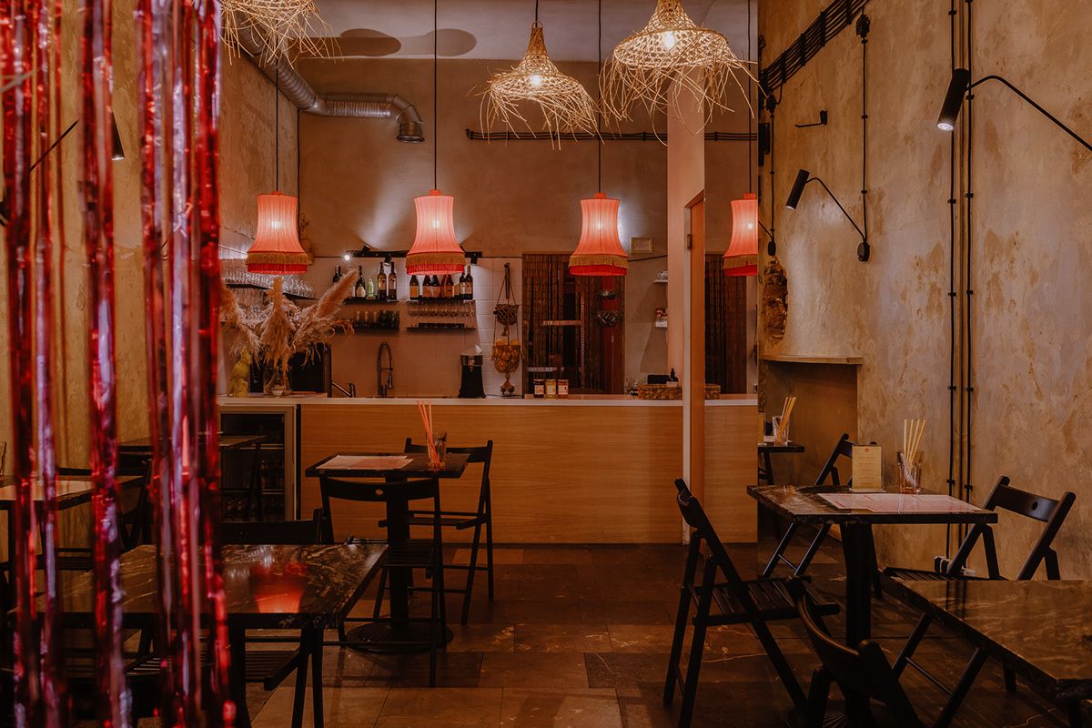
The Wschód Bar in Kraków, which serves Asian food, wishes to display the flavors born from the combination of soy sauce, rice and sesame seeds, as well as stories related to special dishes with different elements of their varied menu and vibrant visual identity. The play of different shades of red and pastel colors is complemented by simple yet stylish graphic design.
бранч / Branč | Belgrade, Serbia
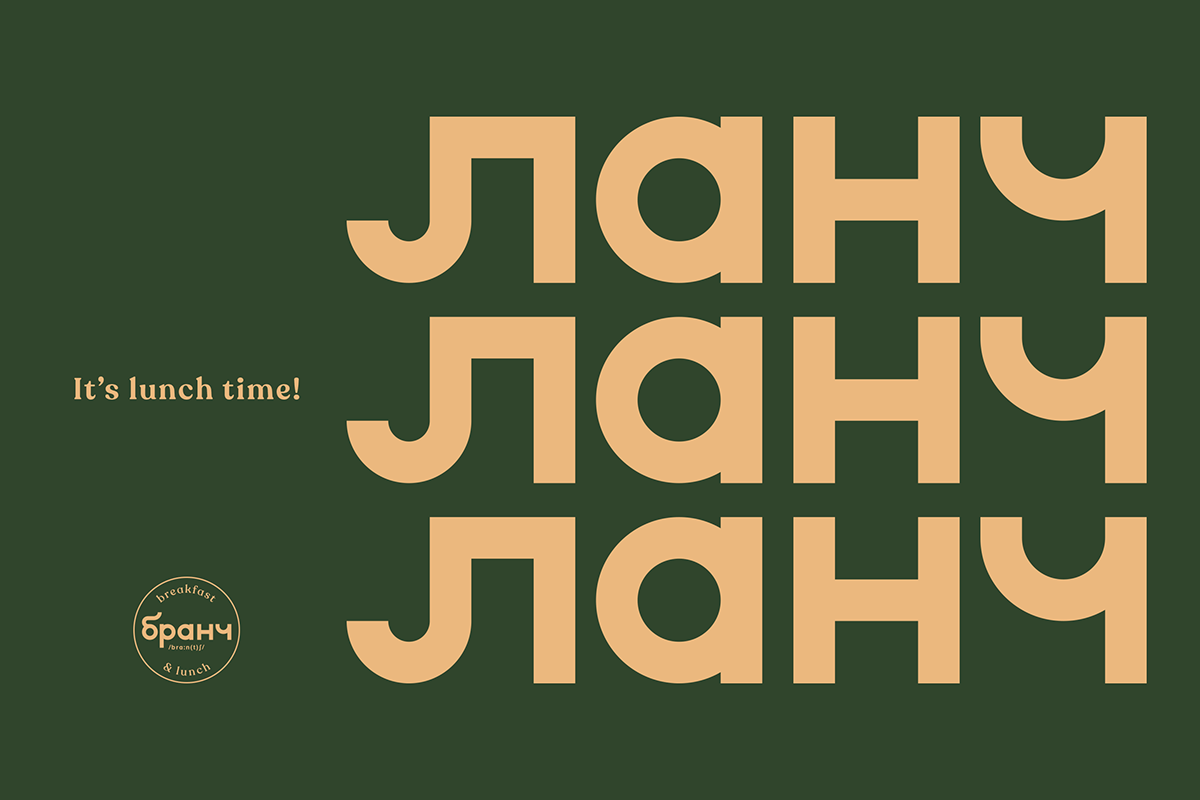
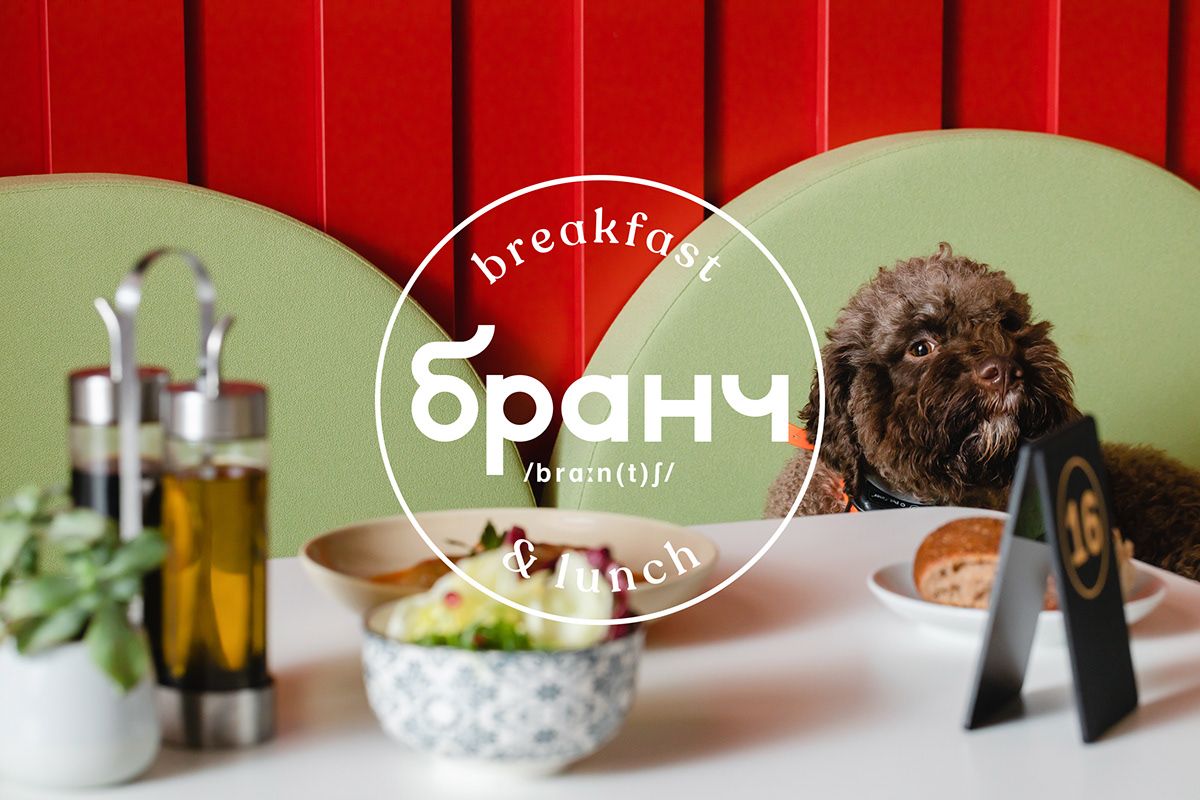
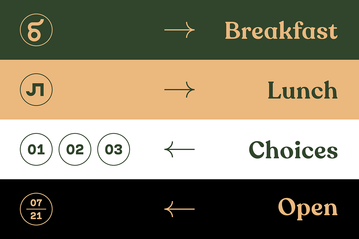
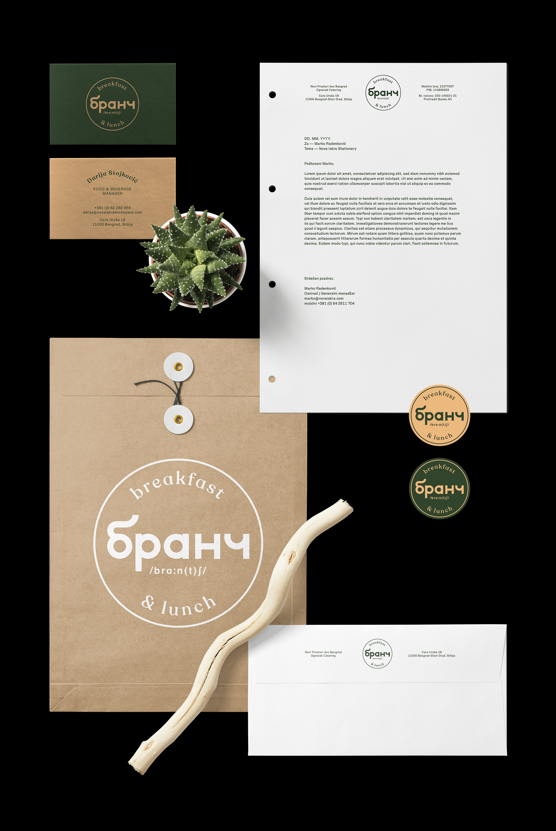
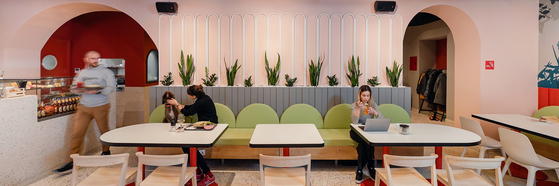
Office canteens are not usually the epitome of sophisticated design and bold aesthetic elements, but the canteen of the Nova Iskra community office in Belgrade called бранч / Branč proves the opposite to everyone. The restaurant, which offers breakfast and a daily menu, swears by fresh, nutrient-rich ingredients, so naturalness has been chosen as the defining theme of their identity, which is most evident in the natural colors and the depictions of plants.
Cupákos | Budapest, Hungary
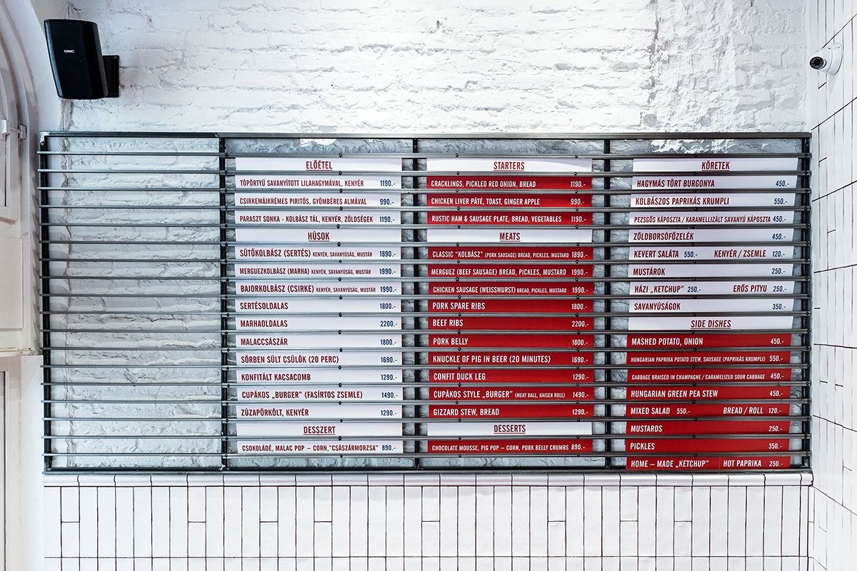
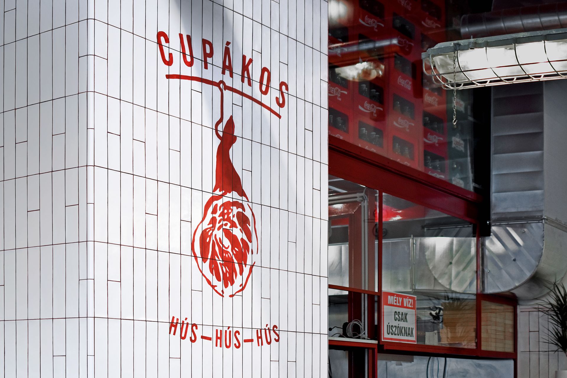
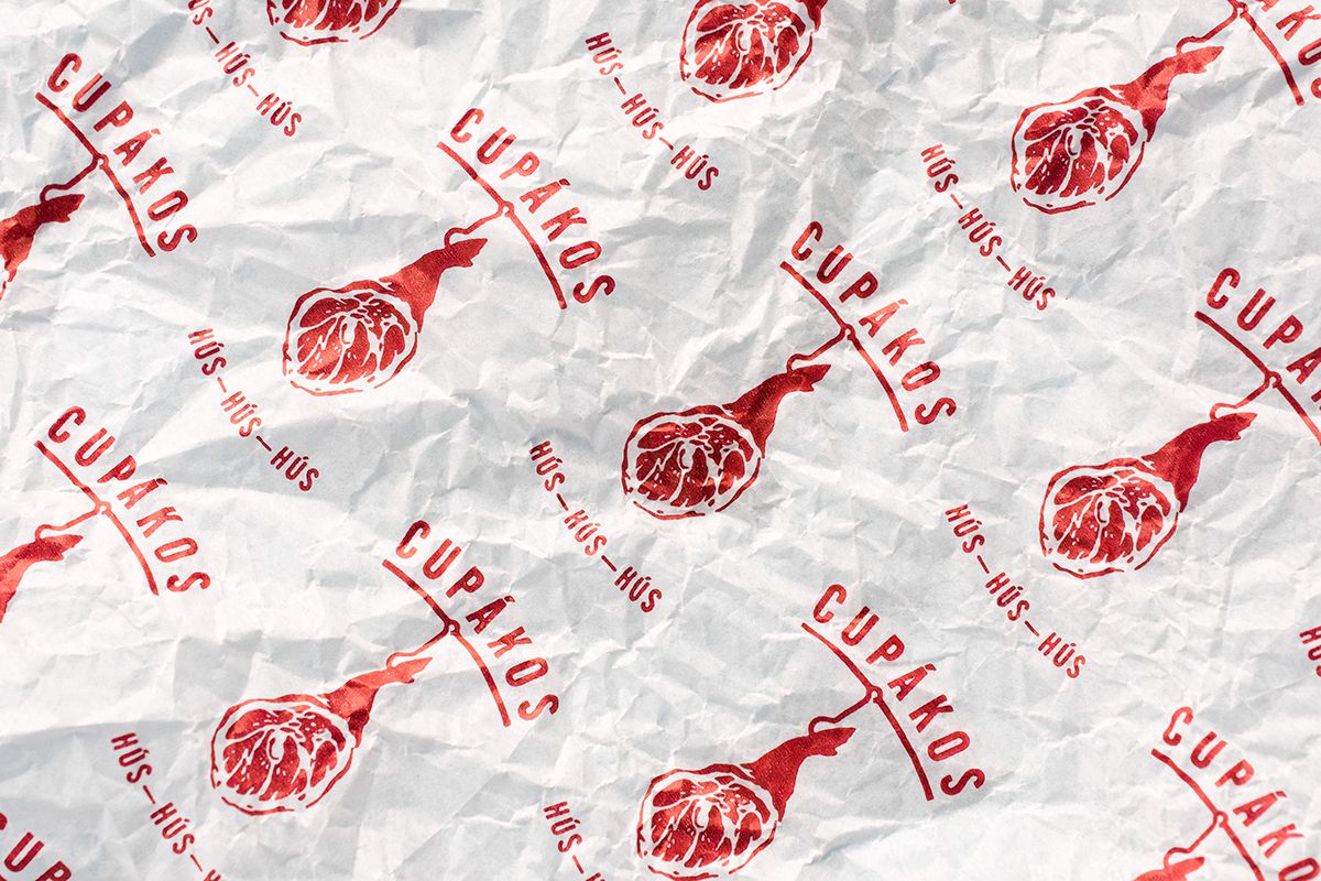
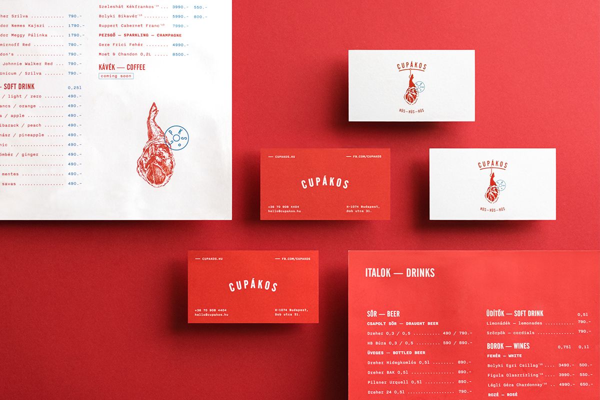
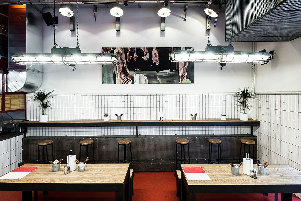
Downtown Cupákos is now present with a new name, but it was once known as a favorite place for meat lovers, not by chance! At the restaurant, which offered the highest quality sausages, crispy duck legs, huge knuckles and a wide selection of stews, we couldn’t find any vegetarian dishes. The walls covered with snow-white tiles evoke the traditional butcher shops, and this line is followed by the brand identity with its refined details and white-red color combination.
LIFT | Tirana, Albania
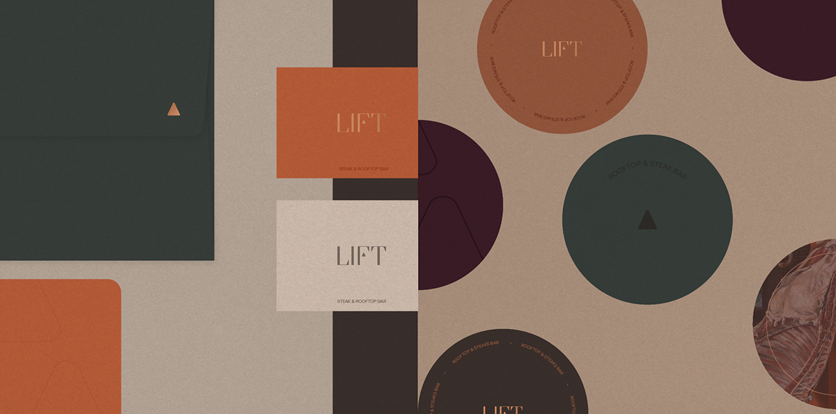
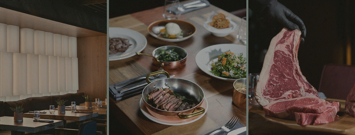
Steaks, fish, top quality wines and exclusivity: not everyone can enter the LIFT restaurant in Tirana. The place strives for sophistication, so guests dressed in casual clothes or in a hooded sweater are not welcome. That is why the visual identity is characterized by elegance and sophistication: we can find dark shades, clean lines and simple decorative elements.
Eska | Prague, Czech Republic
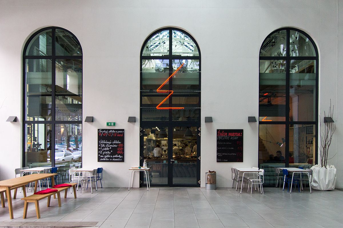
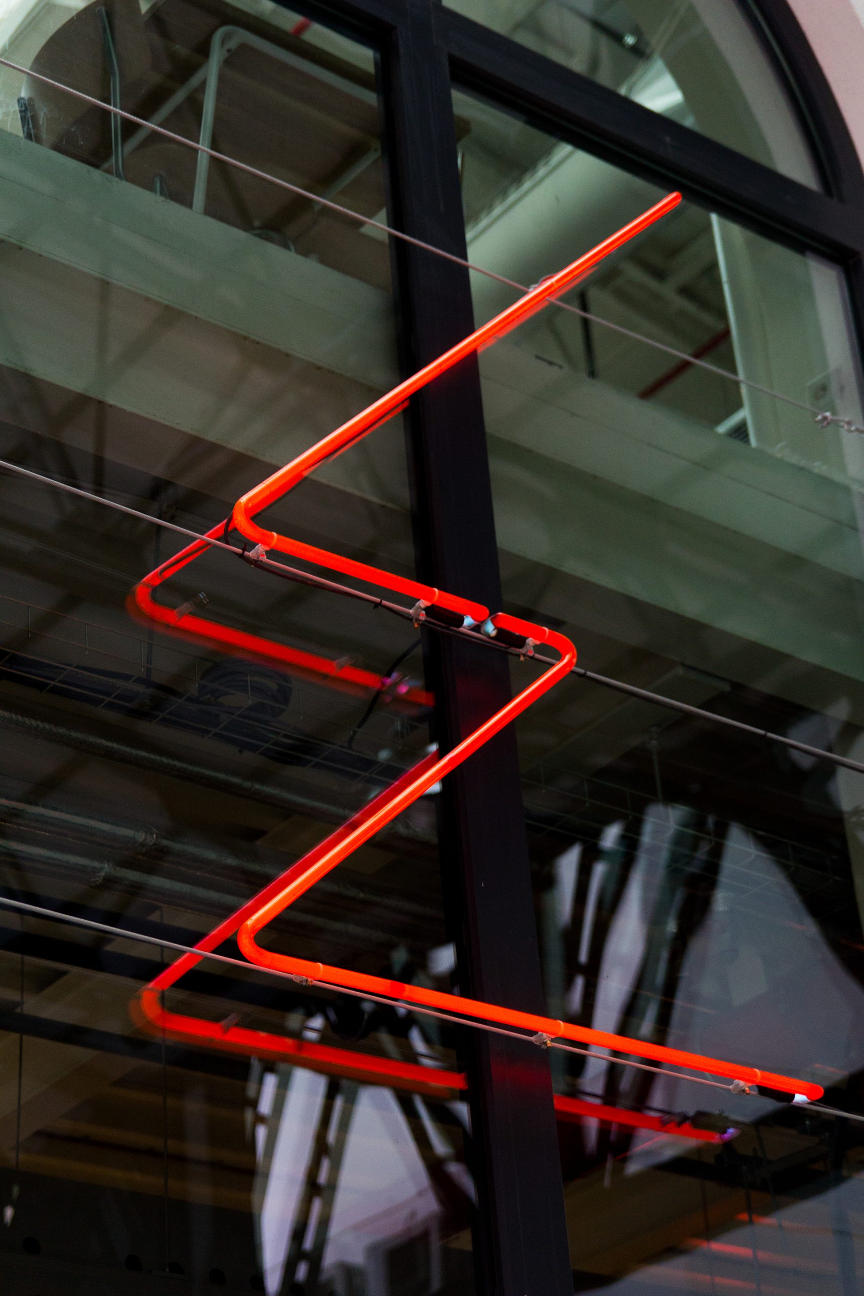
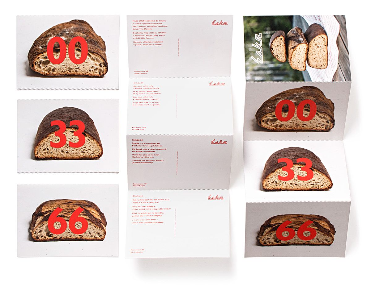
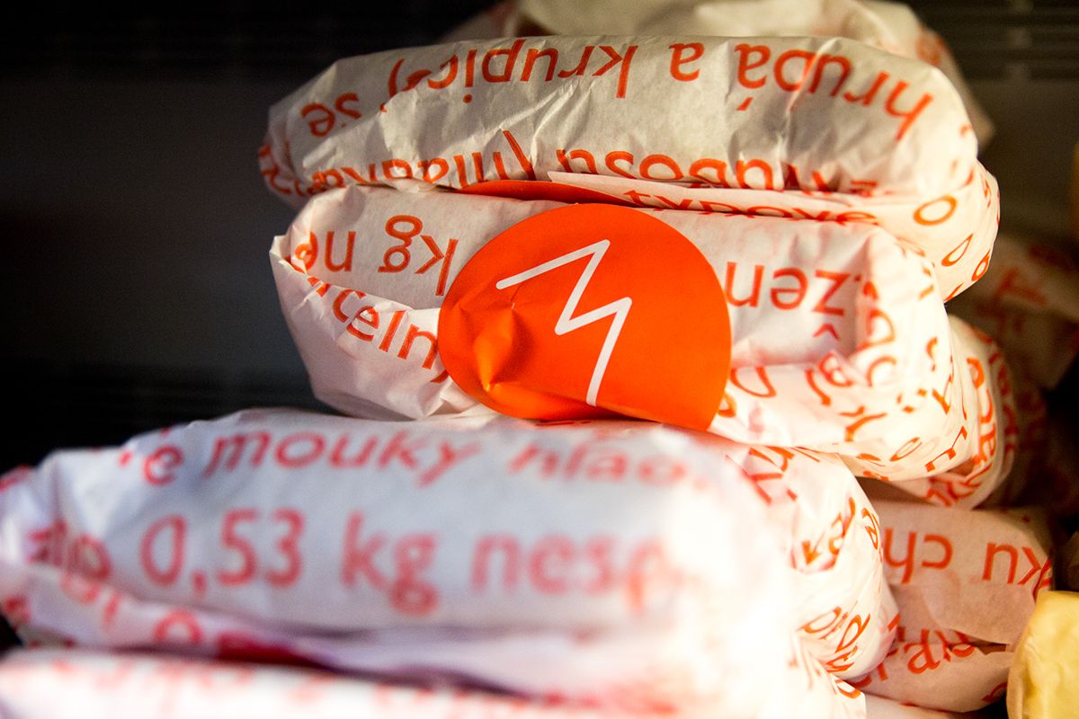
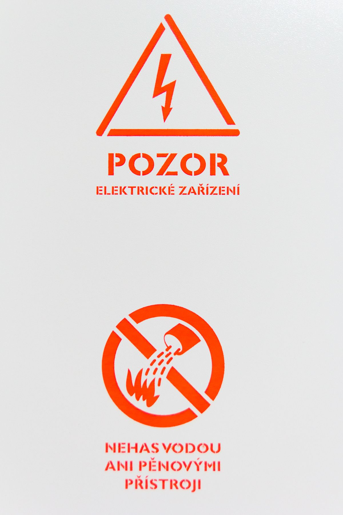
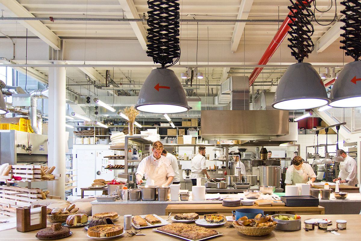
Set in an industrial setting on the site of a factory building and approaching Czech cuisine with a Northern European perspective, the Eska in Prague is both a mouth-watering bakery and a minimalist restaurant. Although the building has been transformed, the industrial character comes to life at several points in the identity: the neon tube in the window evoking the seventies, the symbols painted on the wall and the font all refer to the original nature of the place.

Wschód Bar | Web | Facebook | Instagram
бранч / Branč | Web | Facebook | Instagram
Cupákos | Web
LIFT | Web | Facebook | Instagram
Eska | Web | Facebook | Instagram
Source: Behance
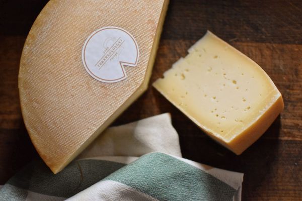
Cheese manufactury in the surroundings of Lake Balaton—Tekeresvölgyi Családi Birtok
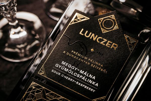
Traditional values in a modern form
